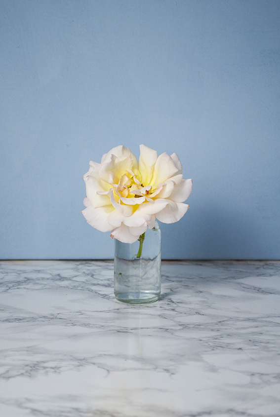
 Forgive me. I couldn’t resist sharing a picture of this beautiful rose snipped from our garden. It’s just so soft, peachy and pretty.
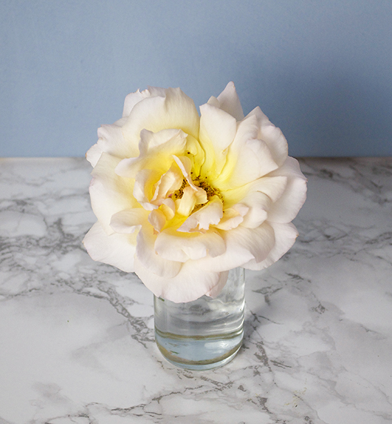 This rose is so delicate and as we experience the last days of the hot weather (well here in Essex at least). I wanted to celebrate the simple pleasures that life can bring us. Sometimes it’s important to notice the small things.
Category: Ella’s Edit
At Home with Sarah Campbell
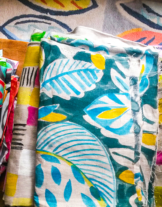
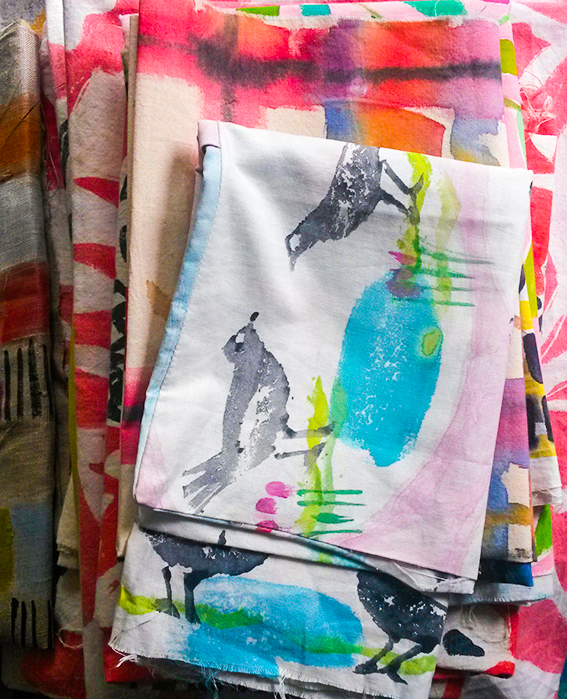
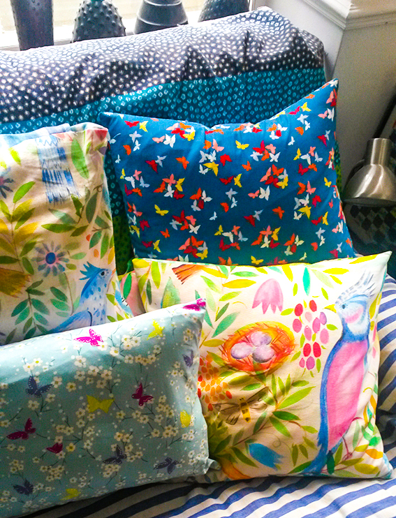
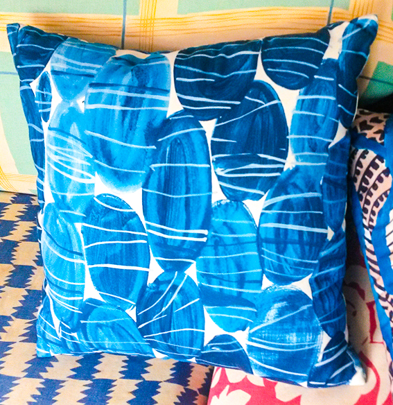
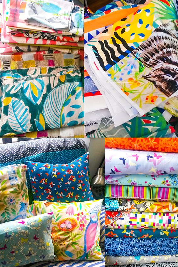 It’s rare to meet a true design icon, rarer still to be welcomed into one’s home. So it was a great pleasure to be invited to Sarah Campbell’s colourful and exciting abode.
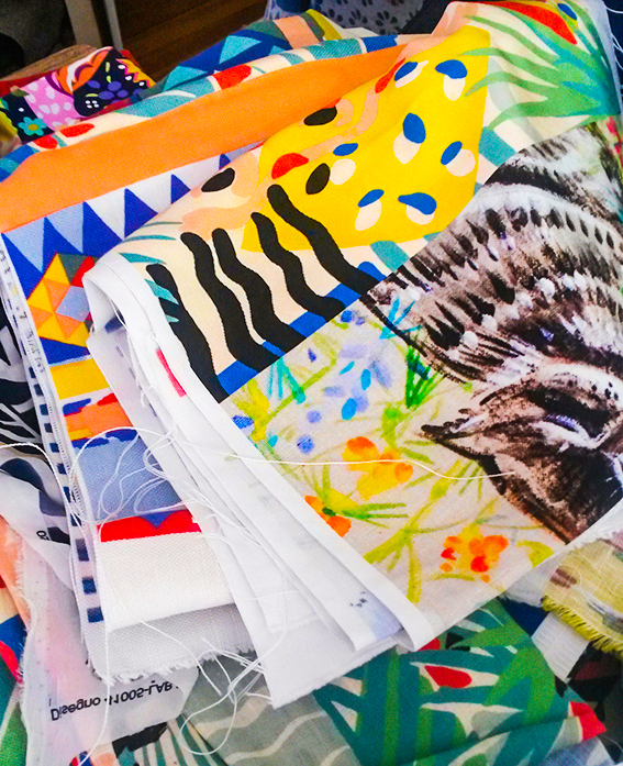
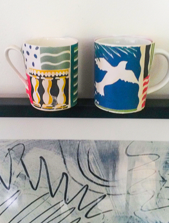
You may think you don’t know Campbell but believe me you probably do. Working with her sister Susan Collier since the sixties, their vibrant creations have charmed design and illustration junkies like myself over decades, with collaborations with Liberty, Habitat, Jaeger and Conran. In fact when I was researching Sarah I was delighted to discover that I had some of the Liberty designs at home.
After her sister’s death in 2011, Sarah has been working independently and as a lover of her vibrant, painterly style and celebration of shape and colour I couldn’t wait to ask her about her practice and, if I’m being honest, get some tips of making my own work as exciting and effortlessly original as hers.
 Warm welcome
As you walk into Sarah’s fab mid-century modern home, you are immediately struck by colourful designs and a delicious array of textiles. It was heartening to see this – I was pleased it wasn’t a sterile space or simply too cool for school. In fact the exuberance and vibrancy of her illustrative work truly extends to her main room, with vivid soft furnishings and a bright green wall enhancing the foliage outside.
“Colour is the stuff of life,” she says. “When babies are very young we’re told they see colour as the contrast of black and white. But they very soon come to love real colours. It’s very important, colour is a magnet – people are drawn to it. Even in a home that’s all white or cream, I’d be hoping to see a bunch of red flowers or a merry postcard.”
There is an emotional connection too, she adds. “I went to a magnificent newly refurbished house recently where they had painted their kitchen wall a lovely turquoisey green. I couldn’t help but remark upon it. They told me that they’d had the colour in their previous home and just couldn’t live without it. I thought that was wonderful – a great anchor for a new ship if you like. It’s like they know they’re home.”
 As well as the attractive combination of textures, shapes and hues in the house, I was also pleased to be greeted by a Matisse poster in the sitting room. Sarah’s work has always reminded me of this artist (one of my favourites) and I couldn’t help but ask her about this…
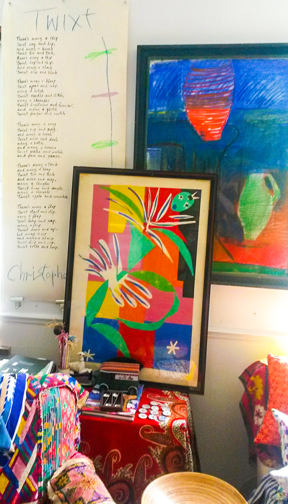 “Well you can’t do better than Matisse as an inspiration. I think of him as a friend. There are lots of aspects of his work I love. He was brought up in a weavers’ town in northern France so he really understands textiles. They way he uses patterns in his paintings reflects his childhood surroundings. When I look at something like his painting The Pink Studio, I imagine him under the weaving machine observing all the different angles of the pattern.”
I think Sarah shares Matisse’s understanding of shape and composition, and while this looks free and playful, it is of course much more complex than that.
“You look at people like Matisse, Picasso, Dufy – they can all draw. You can’t reduce something to its simplest form unless you understand it. Drawing is the key. An artist’s essential line is a wonderful thing – it’s just lovely.”
 Mark making
I see a lightness of touch in Sarah’s work, the approach feels joyful and I get a strong sense of maker’s hand in her products. She credits this to being open to influences and enjoying the process of creating.
“My pieces start with painting on paper so it is a very tactile process. People at my workshops say happily that the work is hard but like playing and I say ‘well you can see why I’m so cheerful.’ Everything has influence. I have a very large storage cabinet in my brain. New work can be inspired by a new type of paper, or a simple set of pens or brushes that make me think in a different way, so I can approach it with an inquisitive attitude.”
“When I do workshops I say, ‘we’re not all going to be old masters but we can all enjoy making marks’. Everyone can get something from this experience. People so often have their creative urges curtailed at one point or another. The words, ‘can’t’ and ‘I’m rubbish’ are often used when it comes to creative endeavours – these words are banned at my workshops. I encourage people to have fun and surprise themselves by their own capacities. ”
 The pleasure of creating
It is this sense of enjoyment and a child-like curiosity that Sarah believes keeps her work fresh and enables her to innovate.
“I have to earn a living, I need to send things out to clients for their approval but the sense of exploration has to be at the heart of work. I consider myself extremely fortunate to have had a lifetime of painting patterns. I still enjoy that exploration.”
 As a commercial artist, I imagine she must have been under pressure to ‘churn out what has worked’, so I ask her if she’s ever tempted to repeat past glories or stick to a particular formula that she knows to be popular.
“I have thought about revisiting some of our classics, and indeed have reprinted some of our most famous designs, like Cote d’Azure, as scarves and cushions and possible yardage – they stand the test of time and I still want them to be seen by a wider audience. The old designs certainly retain validity, no doubt. And, of course I do have my own style and way of working. I know what colour combinations and compositions work and naturally I want to make the best use of my experience. When I look back over the archive I can see there are interests that come and go, and motifs and ideas that reoccur, but I’d be a bit embarrassed to go back to the same thing again and again. The market changes, fashions and interests move on all the time, and production possibilities are developing constantly. The main impetus of work is looking and going forward, not back – after all, that’s the designer’s job.”
She continues… “Although it’s clear that building a brand successfully can be done by relying on a very succinct design look, Susan and I built our identity by creating lots and lots of different patterns for our many varied customers. Possibly commercial life might have been simpler if we’d only developed one or two signature motifs… but we enjoyed thinking of new things, couldn’t help it – and I still do.”
 Trail blazers
In such a crowded and competitive arena, Campbell is still very active; collaborating with West Elm, producing collections with Michael Miller Fabrics plus producing a new range for homewares and ceramics, Viva, with Magpie. So what advice would she give to up and coming designers?
“There is still a huge appetite for colour and pattern. Wherever you come from, I believe drawing and the enjoyment of it is fundamental. Keep listening, keep looking, keep your observation skills honed and keep working at your designs. Don’t dismiss what you think of as the mistakes – they are useful. Keep records and date your work, sketches and all that way you know what you did, what you learnt and achieved during that period.”
As you can tell by that last comment, while Sarah is a warm, friendly, unpretentious person, she’s tough. Of course she is, she has been working in the design industry for more than 50 years and there is a strength and wisdom to her that I found very inspiring.
“I’m most proud of still being here doing it. It’s not easy. My sister and I did, I suppose, break through a number of barriers but there were two of us and we brought our individual talents and qualities to the partnership. It’s great to still be working. I welcome new commissions and mainstream customers. I also love working with individuals on bespoke designs for curtains, furniture, clothes and walls. It continues to be great fun and very rewarding.”
See more of Campbell’s work at sarahcampbelldesigns.com
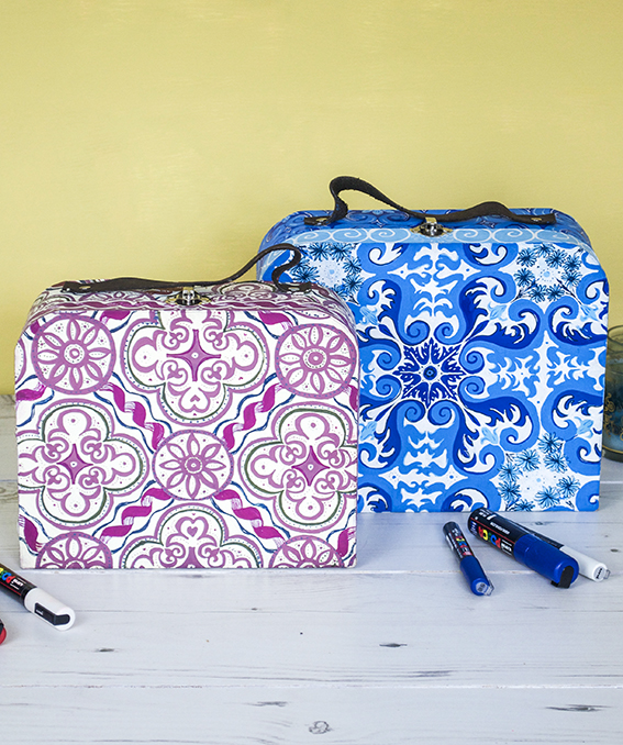
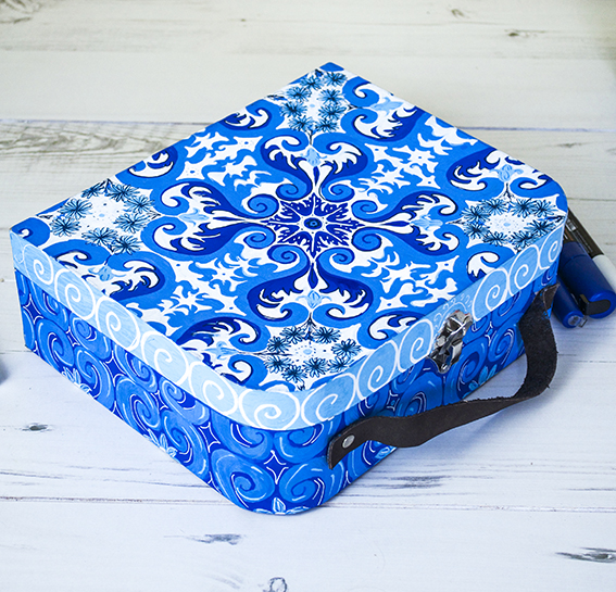
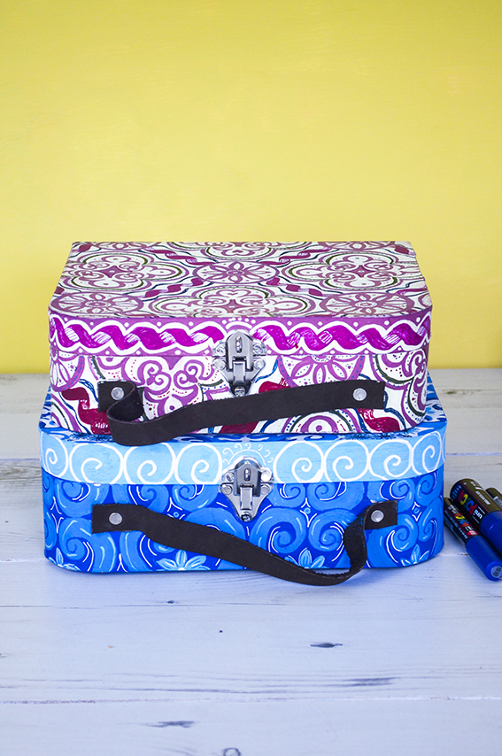
DIY: Ornate cases
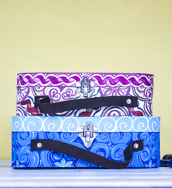 I’m not gonna lie, these ornate cases took ages to create but they are quite a cool DIY. I have had a brief from the guys at Uni-Ball to create a selection of products updated with the company’s pens. I wanted to make a number of items at various sizes and using the wide range of pens they had on offer.
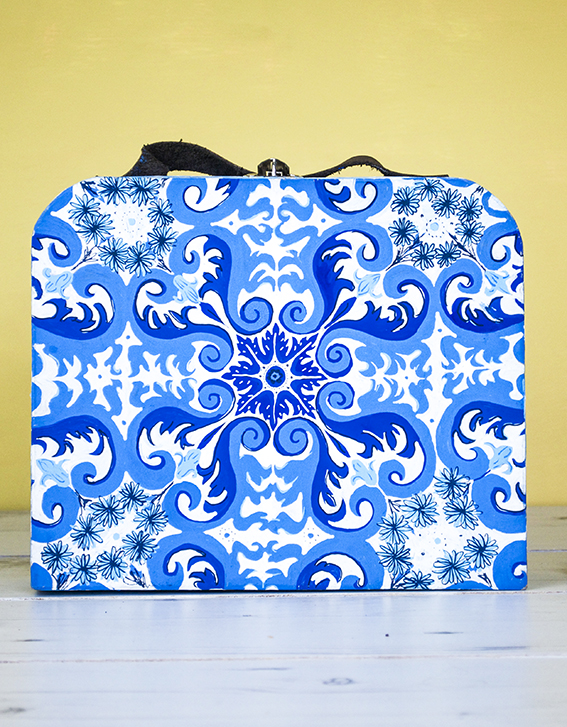 I also wanted an excuse to play with an ornate pattern idea I’ve had for a while. Because Uni-Ball’s Posca pens have a wide range of colours and shades I thought they would perfectly lend themselves to a pattern that utilised various shades of the same hue.
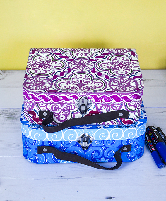 I have looked through loads of tile designs to come up with the ones I have worked out here.
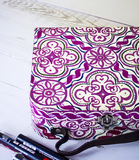 These cases were plain brown mdf boxes. I traced on my design before filling in the light colours then layering with darker shades.
7 Strong AW16 Home Looks
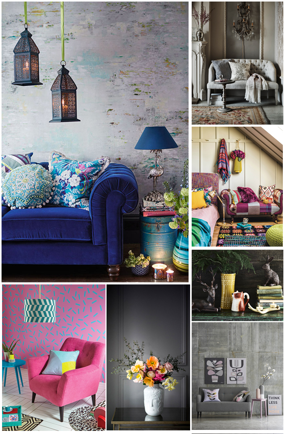
Summer is nearly done (yes, sorry to let you know about that one) and I’m looking forward to refreshing JB towers with some new looks for AW16.
I’m very excited about this season – there are so many looks I love that can be enjoyed and adapted to suit your style. There are seven really strong themes that would work well in any kind of interior, large or small, grand or modest.
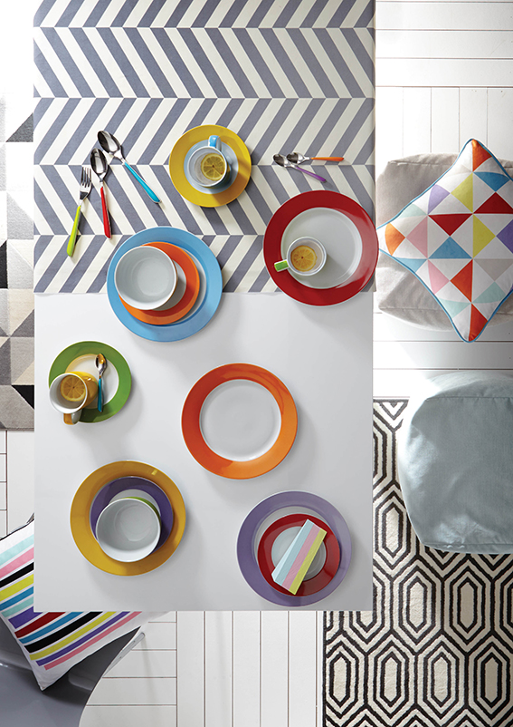
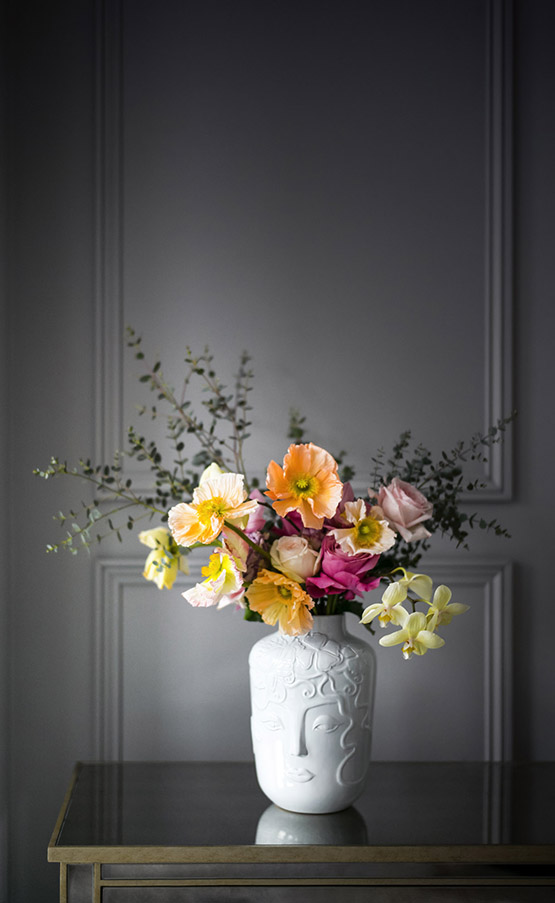
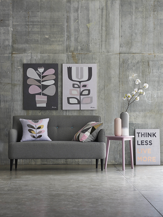
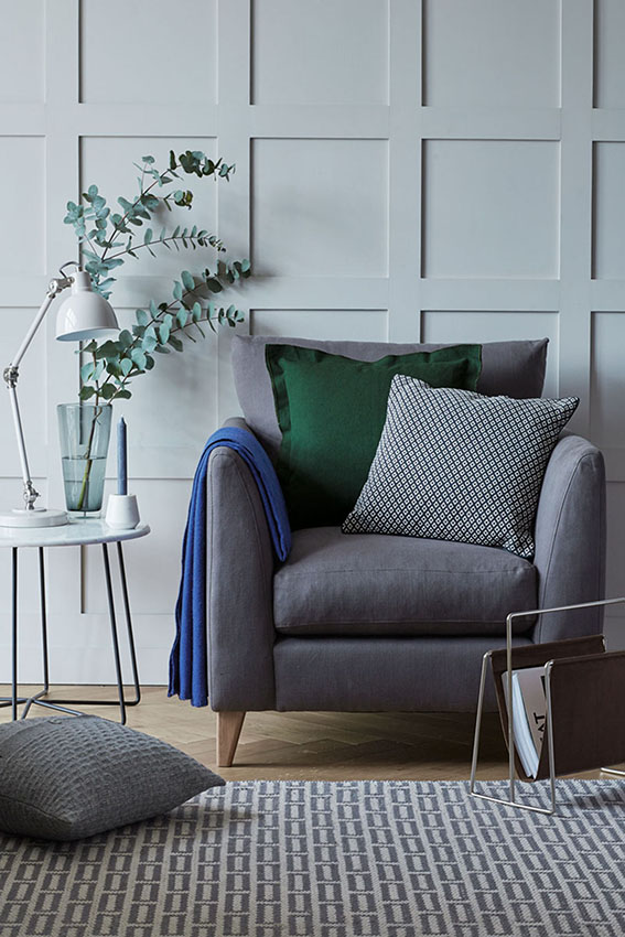
Colour pop fun
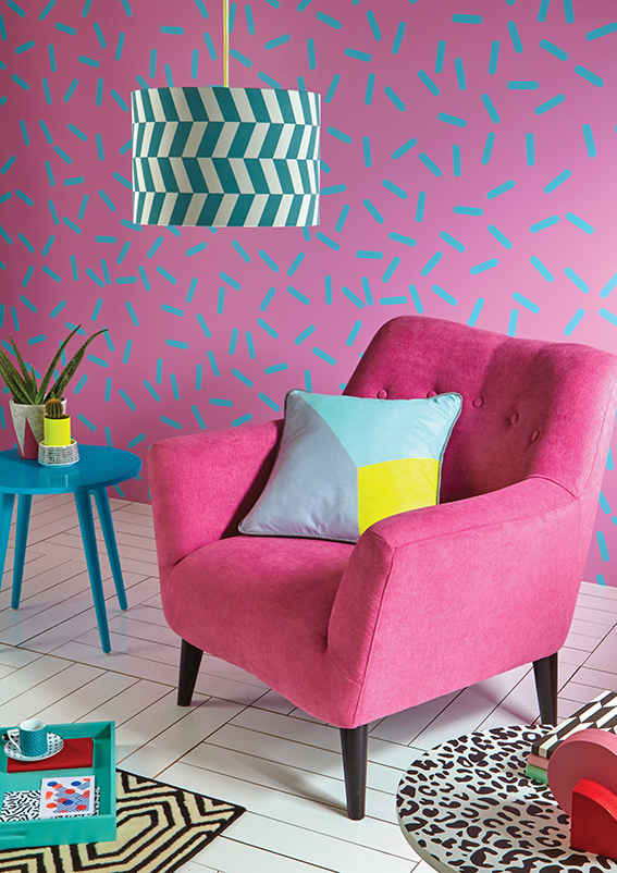
I can’t resist a pop in colour in my rooms. You can go bold with a Memphis-inspired scheme like the one from Very above or you can simply add colour accents to a more restrained room with accessories. How about some bright crockery or a statement lamp or piece of brightly coloured furniture.
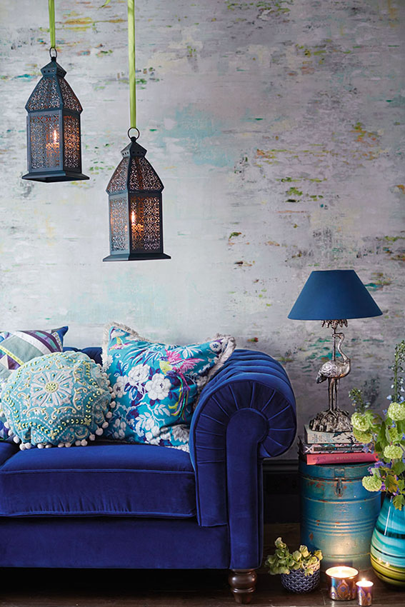
Lush and plush
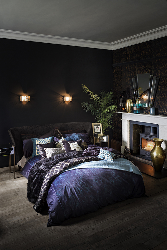
We all love a bit of luxe; gorgeous fabrics and textures that are tactile, soft and warm that make us feel warm and snuggly while still retaining a sense of style and opulence. Key colours are navy, purple and turquoise and beautiful metallic touches. Oh, and don’t forget a bit of greenery!
Understated luxury
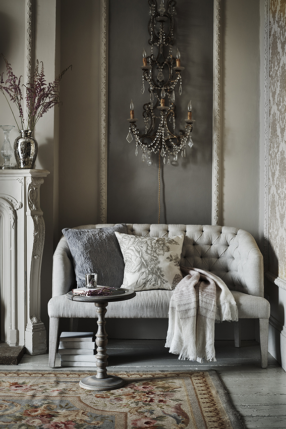
This look reminds of years ago when, in another life I think, as production editor on Restaurant Magazine I went on my first press trip. It was to the Martel Chateaux in Bordeaux and it was really quite something. Woven carpets and tapestries, distressed wooden panels and floors. Studded sofas, elegant candelabra and pretty chandeliers – the whole place was just divine and now is rather easy to evoke with a few high street buys.
Quirky classics
If you’ve had a look at my menagerie pages you’ll know I love a home with a sense of humour and a touch of the unexpected. So I’m pleased to see accessories from so many leading retailers that make you smile this year. I’m particularly taken with this vase from Marks and Spencer.
Cool and clean
A calm colour scheme and well chosen, minimal accessorising can be a really rather wonderful thing. Its certainly something I like in a bedroom and this was definitely my approach when I lived in a small flat. There are so many collections available in terms of furniture and accessories that you can co-ordinate to get this grown-up look.
Cosy eclectic
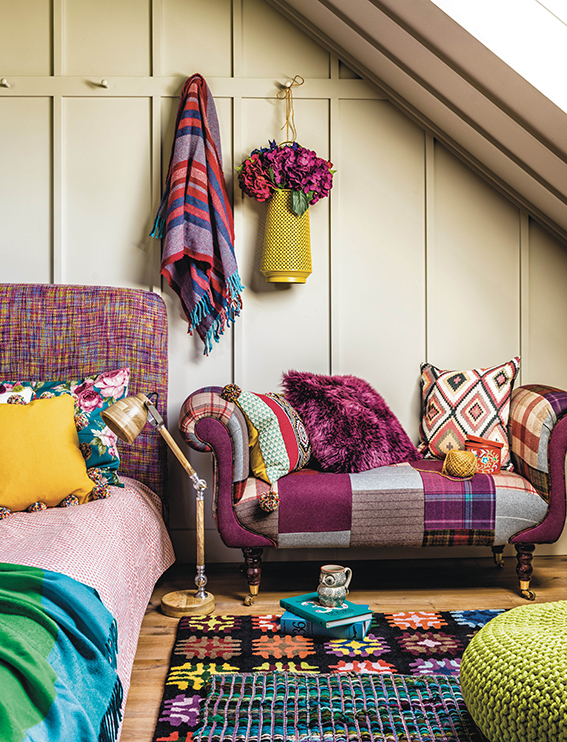
As a former editor of craft mags I’m always drawn to a mismatched style that showcases knitting, crochet, patchwork, weaving and a nice bit of trimming. Check out this room scene from Homesense – it’s colourful and cosy sure but it also has such a cohesive style, it’s just so inviting.
Woodland wonders
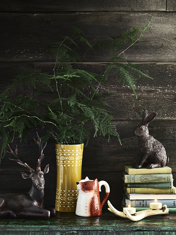
No autumn round up would be complete without this season’s take on nordic and woodland. I think these ceramics and ornaments from George are really cool; contemporary and fun.
DIY: Easy Fancy Votives
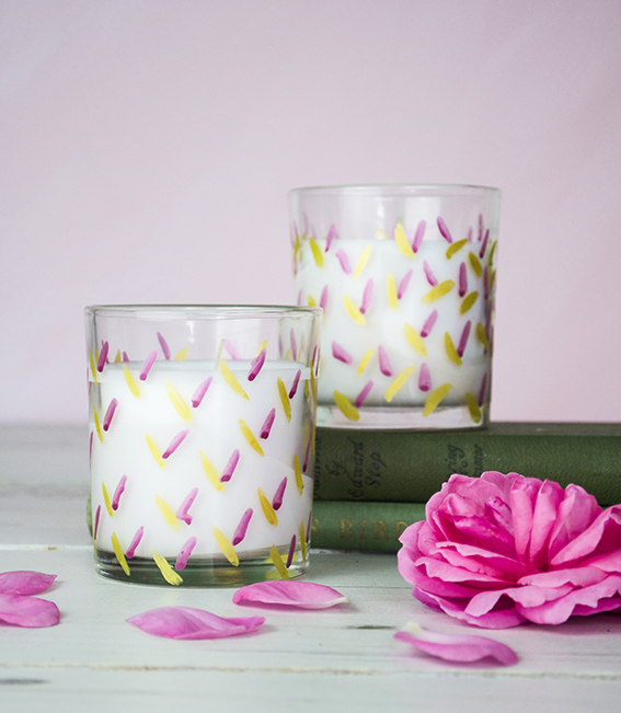
This is a really easy DIY – a pretty pen project to make fancy votives that give cheap filled candles a designer feel.
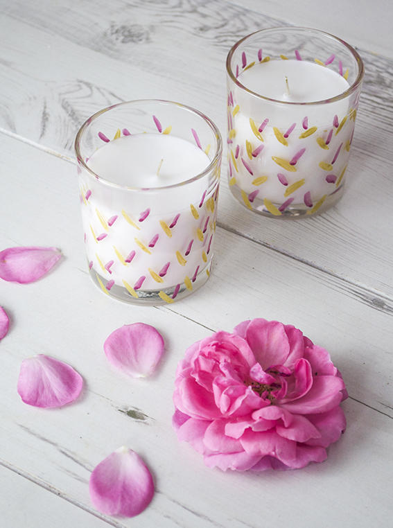 As you know I love a scented candle and I do occasionally splash the cash on some expensive ones. However, because I go through quite a few of them, I do get some cheaper ones to light on a Friday and Sunday night when I’m relaxing with Dr B or when I have a cheeky Saturday afternoon bath.
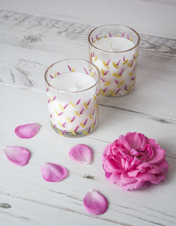 Plain filled candles can look a little drab and I like to give them a nice look. As I’m currently doing some work for Posca pens I’ve got loads of various colours lying around – I’ve chosen beautiful gold and berry coloured pens and gave them a simple leaf pattern.
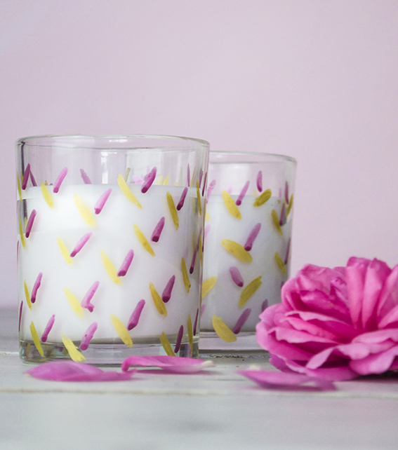 I wanted to create something really quick and easy as the last thing I wanted to do was spend ages doing an intricate pattern. So these are just scribbled little lozenges drawn on an angle.
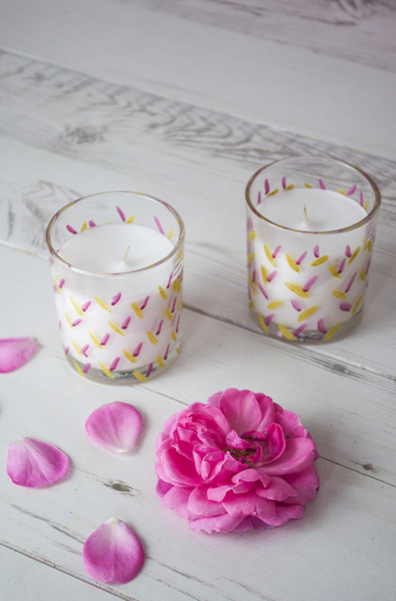 In the spirit of all things green I recycle my glasses once the candle has been burned. Once I finish with them I will use them as vases. The lovely thing about this project is I can pop these glasses in the oven at 145C to seal in the design and I have some lovely gold and berry containers.
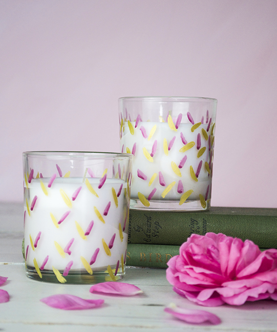
Friday fun! Botanical love; more spoils from the garden
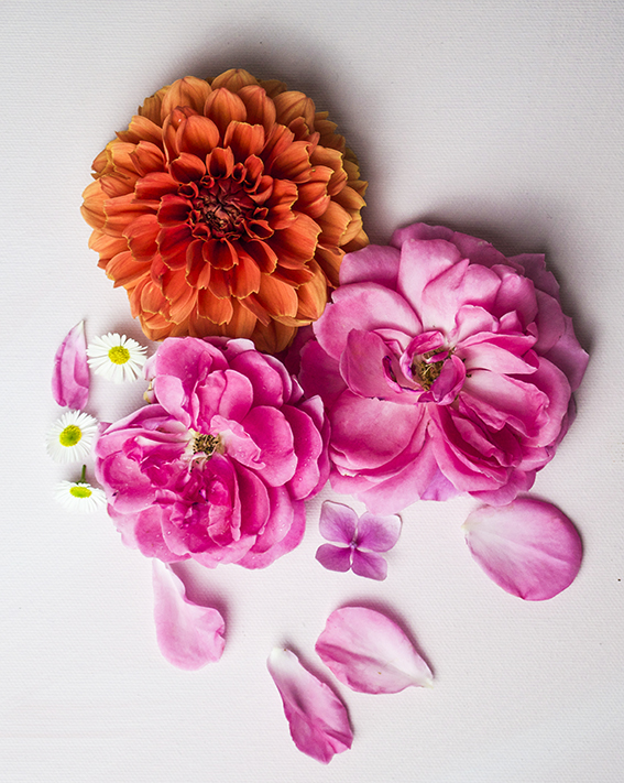
More indulgent love for botanicals from me. My garden just keeps giving. 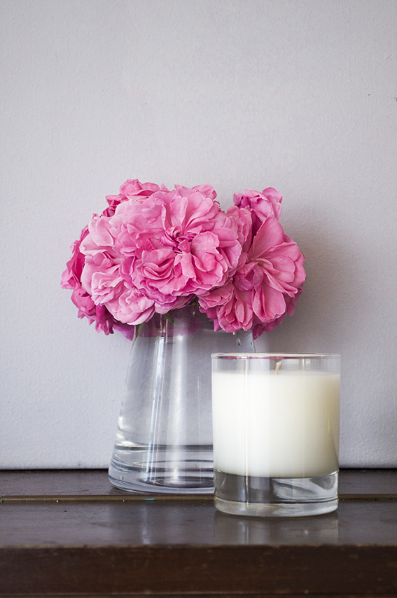
What a beautiful, beautiful summer it’s been so I’ve been reaping more spoils from the garden.
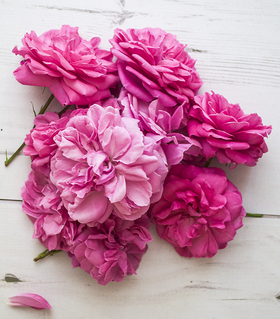
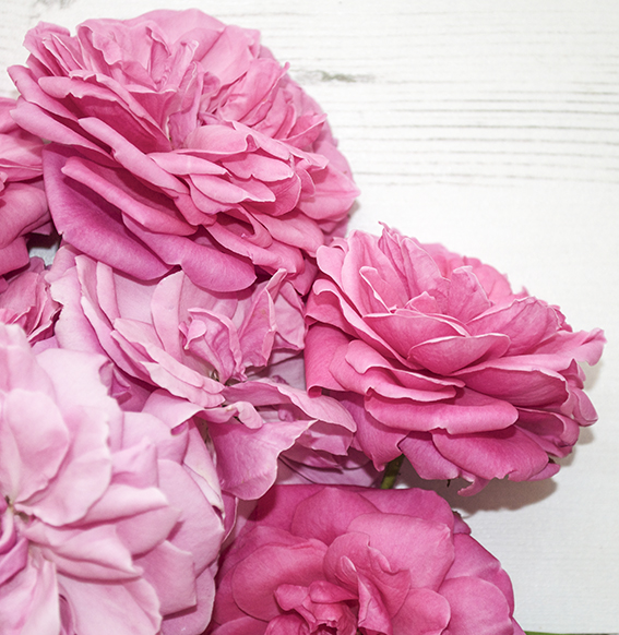 We have beautiful bright pink roses which need constant pruning – they just keep blooming. This is great for us as we have an abundant supply of vibrant blooms to grace our rooms with.
 Luckily we’re also in dahlia season so everyday I’m checking which heads I can chop to bring indoors and display in our home.
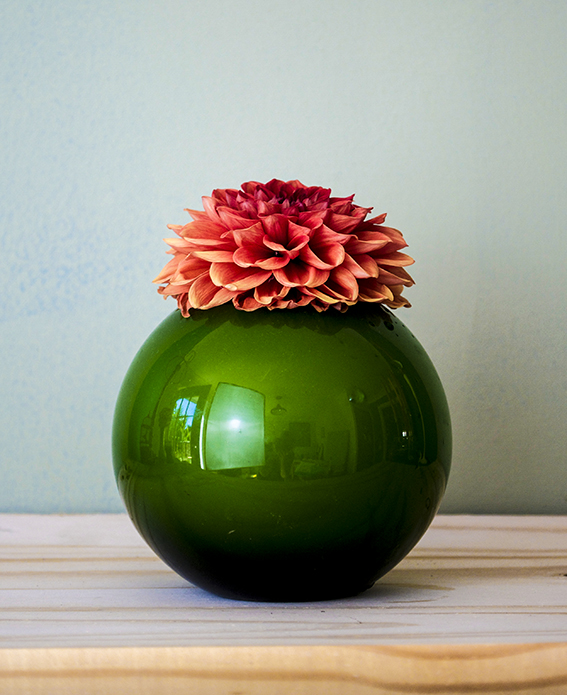
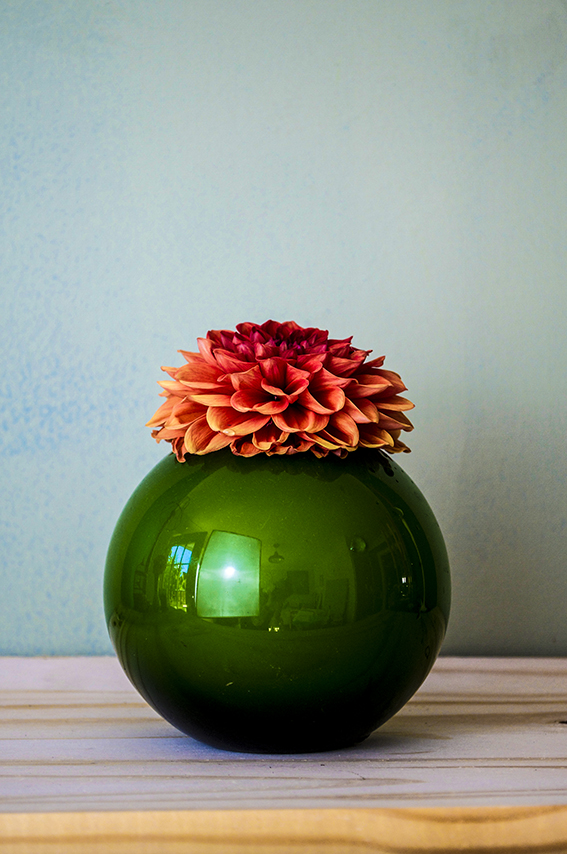
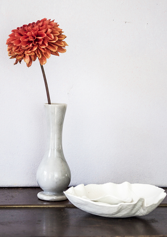 I love a big fat dahlia bloom – you can display a single stem and enjoy its wonderful structure and architecture. So I’ve placed one of my orange flowers in this lovely marble effect vase I found at a charity shop and the other in my favourite green fishbowl vase (sorry about the reflections, I’ve still got so much to learn about photography and picture editing)
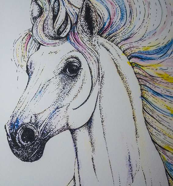
Drawing of the week: A rainbow unicorn!
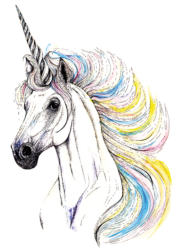
I know. Me? A rainbow unicorn? Drawing of the week? Yes, yes and yes.
The unicorn is a very special drawing for me as it meant doing something out of my comfort zone and taking a bold step.
Last month I visited the Not On The High Street partner day – it’s a great event for all the sellers on the site to come together learn from each other while also getting insights and advice from the NOTHS team. One of the services they offered was a clinic looking at my shop and evaluating all my products. To be honest this was a big deal for me – after creating the illustration, designing the products, shooting them, writing the products and marketing them, sometimes criticism, however useful, constructive and helpful, can be hard to take. But I have resolved this year to take the advice, learn from any criticism and act on it and most of all not to take things personally. So I made use of this years clinic for my shop.
Actually I received very little criticism. I was on trend, my products and photography were really good and I got the word ‘beautiful’ a lot (always good). I just needed to work on my SEO and put some of my products into a more lifestyle setting. After all that stealing myself it was one of the most positive experiences I’ve ever had.
 God, this is getting to be a long story, sorry.
Anyway I asked the women running the clinic if there was anything I could do to improve my offering, anything my style could be suited too, anything new I could try. “A unicorn” they said, “Create a range with a unicorn.”
Okay.
But I don’t do girly stuff. I don’t do fanciful stuff.
Why don’t I?
Why don’t I try something I’ve not explored before?
So I set about answering this brief. I wanted to do it with enthusiasm, integrity, honesty and love, like I do with all of my illustrations. After lots of visual research, I got really excited about this new challenge and set myself seven days to create the illo then get it onto a print and get it into the shop.
I picked up my watercolour paints and fine nib black pens and went to work. Dr B was quite surprised, he envisaged a mythical, goth type creation instead he got a handsome steed with a rainbow mane – a girly unicorn!
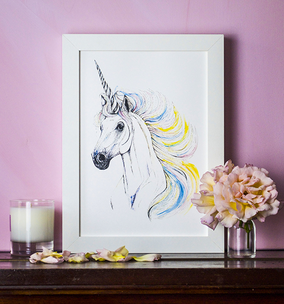
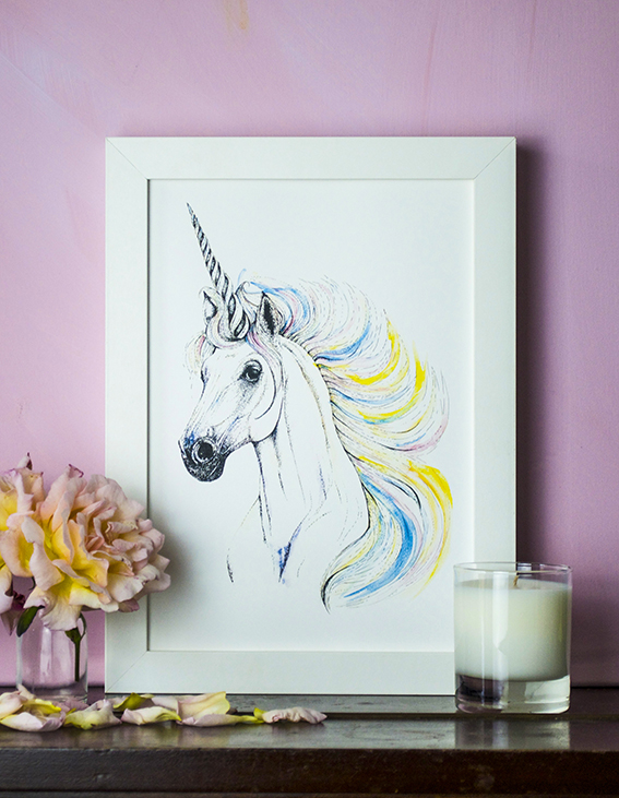 So here is the unicorn print. I’m immensely proud of it as it represents more than a drawing but is a symbol of my journey as an illustrator and as a person, leaping into the unknown and trying something new. I’m hanging this bad boy in my office now to show me why it’s so important to keep striving. You can buy my print on Not On The High Street.
Monday Moodboard: Midcentury Modern

I’ve many go-tos for inspiration and although you may not think it, mid-century modern design and illustration is one of my favourite sources. That’s why it’s made this week’s Monday Moodboard.
Although my drawing style is heavily influenced by classical botanical illustration, I actually came to it via the route of mid-century modern. How? Well, when you look inside the original mid-century homes, as well as all those gorgeous geo designs, amazing furniture, playful use of line and fearless colour combinations, there would always be a classic print or two hung on the wall, so I thought “if it’s good enough for them…”
Anyway this is one of my most loved periods for design and illustration I suppose it came from the fact that Dr B and I lived in mid-century apartments for the first 14 years together so we both became interested in this style in terms of design and architecture. For pure nostalgia value here are some pics of our old flat.
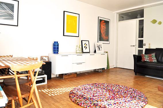
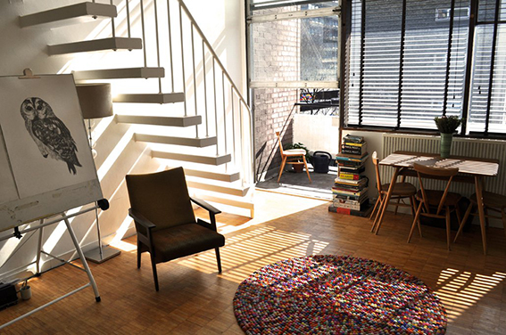
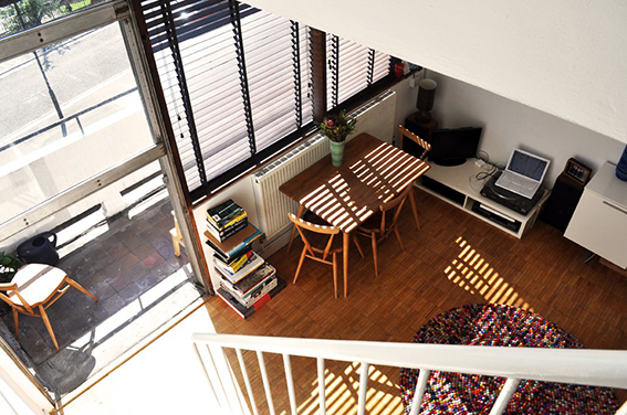
There is so much to find in mid-century modern design, which is why it is such a rich source of inspiration. I mean just look at the examples on the moodboard. It’s not all about Lucienne Day Calyx fabric (although I blatantly love that design and would have it in every room in the house if I was allowed) or Ercol furniture (although again I adore it and have a lovely 1960s original Ercol dining table and chairs in the kitchen). Design from this period can be ornate and playful and also simple, concise and elegant.
Why this week? I’m currently working on a poetry book for Dunlin Press, an indie publishing house run by me and Dr B. I wanted something that keyed into classic book cover design with a bit of an edge so I’ve been trawling the internet and my design books and the mid-century vibe seems to be the route to explore. I’m not saying our book will look anything like the above but whether you are designing a book cover, thinking about a fabric pattern or imagining a room scheme, in fact whatever creative endeavour you’re undertaking it’s good to have a starting point to kick start your work.
Real homes: my display shelves
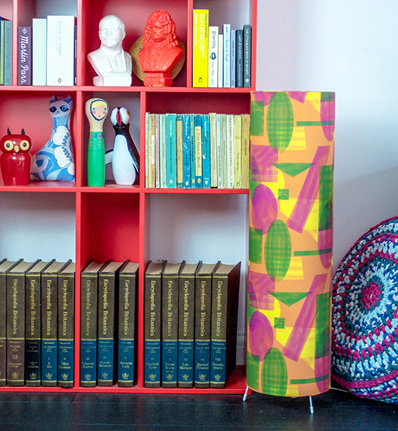 At Ella’s Place I like to keep things real – especially when it comes to homes stuff. So here’s a peek at my display shelves unit, which lives in my lounge.
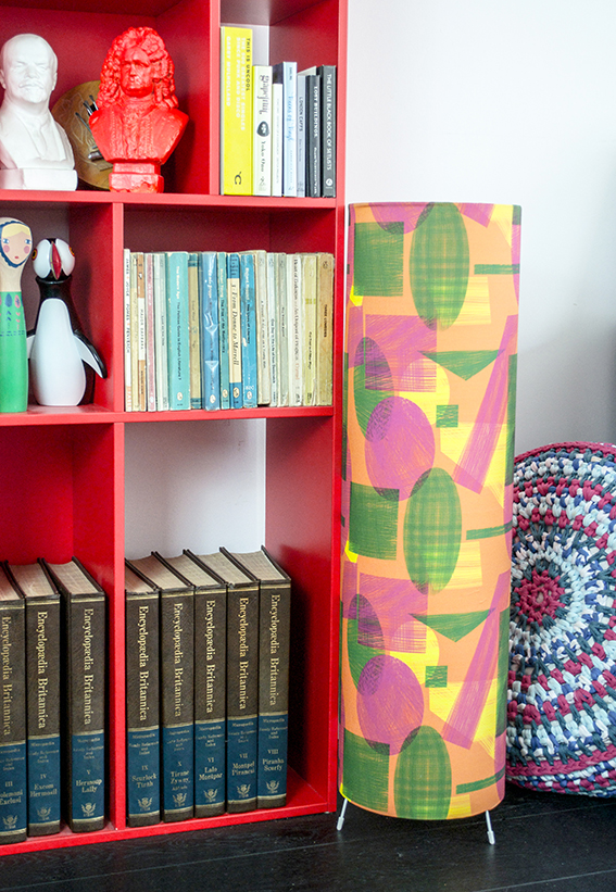 The shelf itself was picked up ages ago at a Habitat sale and I think it was about £100. We loved the bright red colour and its different sized square and rectangular cubby holes – great for both books and little bits and pieces.
We’ve filled a lot of the cubby holes with mini art and design books, vintage plays and poetry collections, a complete edition of the 1974 Encyclopaedia Britannica, which we got from a neighbour. We’ve placed various ceramics we’ve picked up over the years in the rest of the shelves. We’ve also used the unit as a home for some of our various characters from our menagerie – you can read about their back stories here and here.
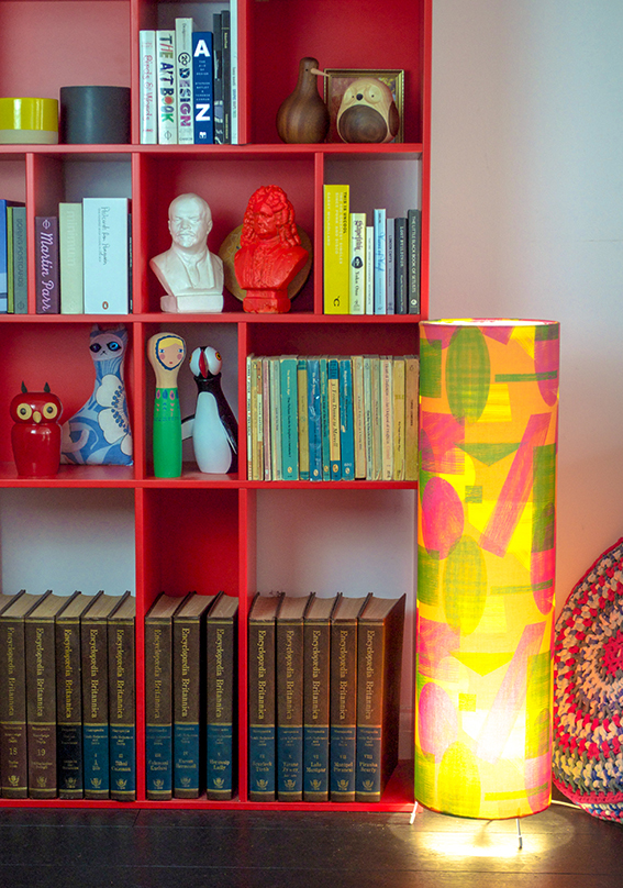 I designed the fabric for the floor lamp to suite in with the shelving, everything else in the room is rather dark so both the unit and lighting provide a little pop of colour we need. I made this light with a Dannells Floor Lamp Making Kit and got the fabric printed via Spoonflower.
Monday Moodboard: Christmas in July
 No I haven’t gone mad. July means Christmas in magazine and design circles so this moodboard is dedicated to all things festive.
Both this week and the last have/will be spent trawling the Christmas 2016 press shows spotting trends and looking out for key themes. I’ll let you know what I find with my yuletide round up later on in the year.