Posted on

Monthly Moodboard: October, Still Life

October Moodboard Still life

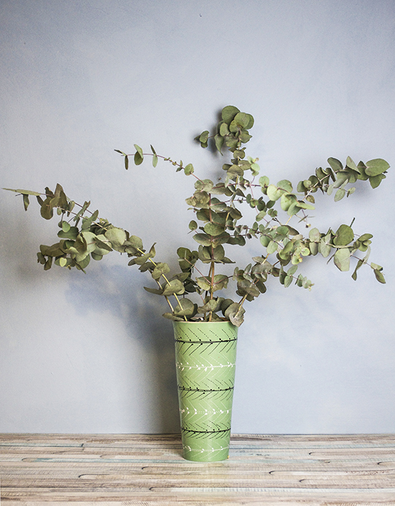
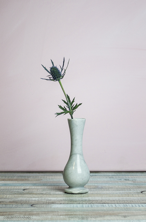
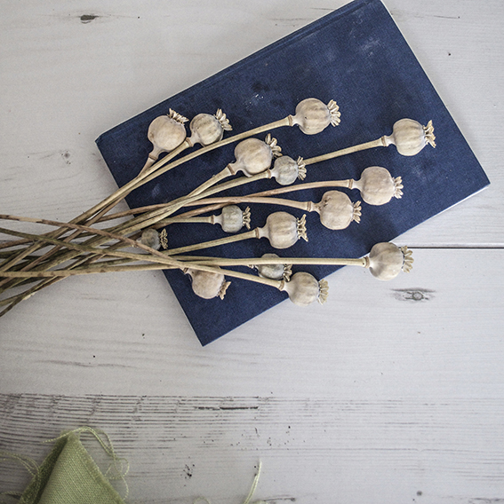
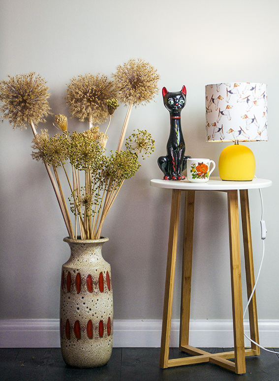
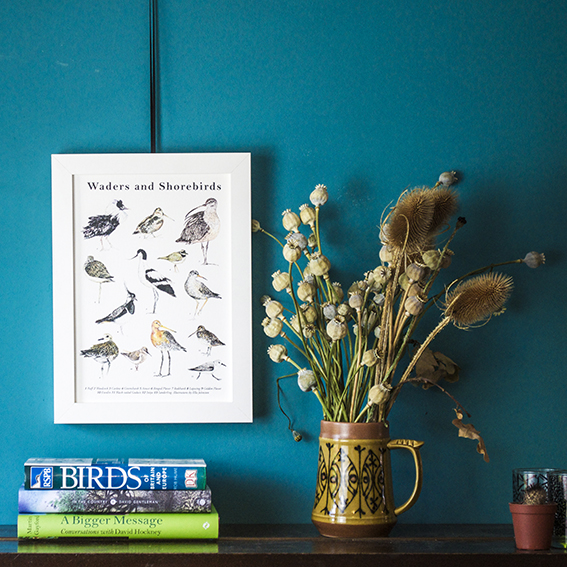
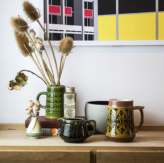
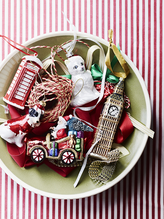
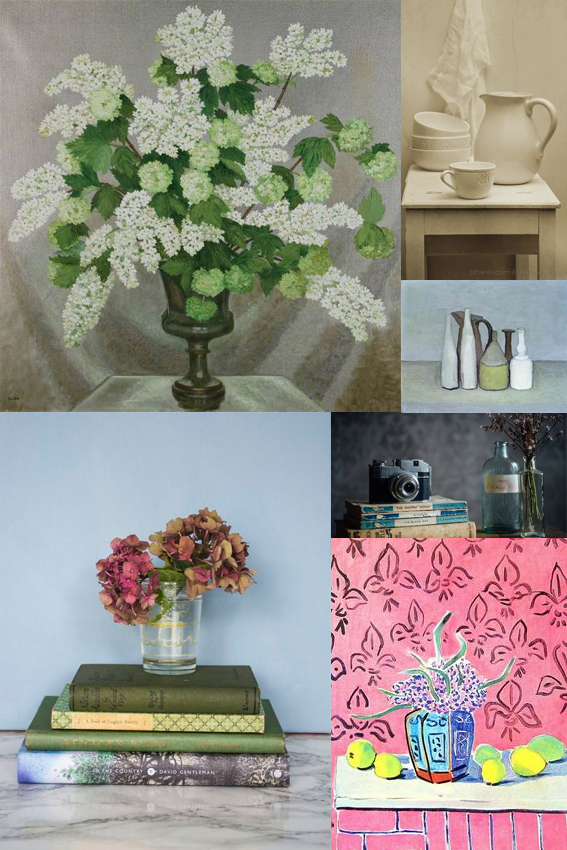
This month’s moodboard is dedicated to the still life.

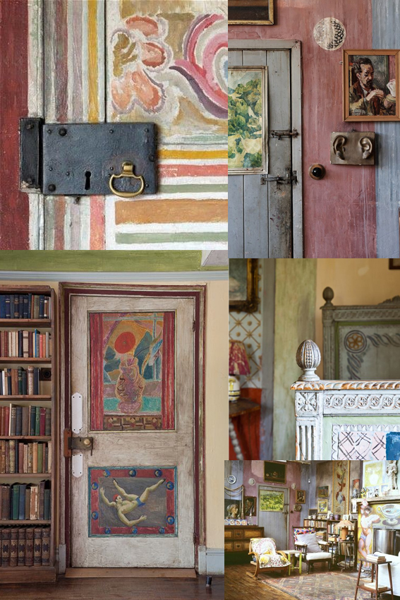
A couple of weeks ago I went to see the Matisse in The Studio exhibition at the Royal Academy. Ever since then I’ve been obsessed with still life painting and photography.

The exhibition explored the objects in Matisse’s home and how they manifested themselves in his work. Strangely I’ve never really considered doing still lives myself but the exhibition really got me thinking how the pieces we have in our homes hold such a personal place in our hearts.

I genuinely don’t feel particularly materialistic but I admit that I have very deep attachments to certain vases, books and other objet so maybe recording them in my illustrative work would be an interesting process.

It got me thinking about the concept of taste and what objects and arrangements I’d select to depict and the reasons why I’d do this. Also, in the world of Instagram I see so many people doing little tableaux on the channel as a way of representing their brand maybe the still life is the modern day portrait?

Also I’ve included another great painting I’ve seen recently in the moodboard; Gluck’s Lilac and Gelder rose still life. I saw this at the Tate’s Quiet British Art show and I was blown away by its mastery and tenderness. On watching a documentary about the artist, it’s been said that Gluck’s work focused around whoever Gluck was having a relationship with at the time. This was painted around the period where Gluck was having an affair with Constance Spry so there you. Again, it illustrates what a powerful medium for social and personal commentary the still life can be. Watch this space for some watercolour and fine line still lives from me in the future.

Posted on

Home hack: Lovely everlasting botanical display

Eucalyptus (c) Ella Johnston

An everlasting display is a lovely thing plus a cheap and easy home hack to boot.

Thistle (c) Ella JohnstonRegular visitors to Ella’s place know how much I love creating floral displays – they are a lovely way to give the place a refresh without costing you a fortune. Plus I think it’s important to bring elements of nature into your home.

Eucalyptus and thistles are great to buy fresh and then let them dry in the house. The make a lovely permanent arrangement as they fade into silvery tones and provide a lovely structured display.Poppy heads (c) Ella Johnston ellasplace.co.ukLast summer I also gathered spent allium and poppy heads from the garden to decorate our spaces. Again, the faded hues and structured shape look really effective all year round.

Doglamp and seed heads Ella Johnston

Posted on

Spring finds from The Contemporary Home

Naturally Beautiful Range of Products from £4.00

This is my first of four monthly posts for The Contemporary Home. When I worked on magazines, me and the team were for ever trying to get TCH products into our shoots as they always hit the spot in terms of trends and the photography is just delightful as you can see.

I thought I’d kick these posts off with my favourite buys for spring.

Jade Vase, £33
Jade Vase, £33

As regular readers of this blog will know I am very fond of displaying fresh flowers; some as big arrangements, others in little posies. So the jade vase above and set of clear glass receptacles are ideal for me. That jade colour is a lovely neutral, one I can see on my dining room in fact (hmmm). I’m also a big fan of those little bud containers in the very top image – they look so lovely when grouped together.

Set of Three Tall Clear Vases, £12

Dear friends of Ella’s Place will also be aware of my obsession with natural forms and a cheeky tea light. This artichoke tea light holder combines both – isn’t it cute? And it ties in with the Pantone Colour of the Year Greenery.

Artichoke Ceramic Tea Light Holder

Now I don’t normally decorate the place for Easter but I couldn’t resist highlighting the image below. This daisy garland is really pretty and would make an adorable centre piece for a stylish egg-themed party.

Daisy Garland, £25
Daisy Garland, £25

Visit The Contemporary Home Website for more seasonal home ideas.

Posted on

Home Inspiration: Nina Kullberg

Nina Kullberg

Although my own work is detailed and intricate using fairly muted shades, I’m actually a very big fan of strong graphic pattern and bold colours in my home, especially in my soft furnishings. So when I saw that Nina Kullberg was launching a new set of cushions I had to take a closer look.

I’ve been fond of Nina Kullberg’s work for a while – I’m a little obsessed with her instagram account truth be told. The simplicity of her pattern and her vibrant palette in her cushion collection is just lovely. And, she’s not scared of a muted tone either, just check out her exquisite throws in beige and grey.

Anyway as all good designers know, it’s vital to respond to trends so the designer has embraced the Pantone Colour of the Year 2017 Greenery in her new collection of cushions. I think these are perfect for spring and summer and would look lovely in a crisp white bedroom or sunny conservatory.

Take a look at Kullberg’s website for more.

Nina Kullberg Palm Springs in Alfalfa £67
Nina Kullberg Athens in English Ivy Green £67
Nina Kullberg London in Hemlock Green
Nina Kullberg London in Alfalfa
Nina Kullberg Paris English Ivy Green
Posted on

Monday Moodboard: Seed heads

Monday Moodboard Seed headsToday’s Monday Moodboard is a homage to my teenage self. I was obsessed with seed heads when I was doing my A-Levels and after looking at this collection of images I can see why.

In fact I’m tempted to revisit this as a theme for my illustrations. They are structural, almost architectural in their form and the faded colours would look amazing in watercolour. I’ve got loads of dried allium and poppy heads displayed through out my home (see below) so I may have a little bash drawing at some still lives in ink I think the medium would work with its wild, ragged nature – I’ll keep you posted.
Poppy Heads Ella JohnstonDoglamp and seed heads Ella Johnston

Vintage Pottery Vignette ellasplace.co.uk

Posted on

Monday Moodboard Bloomsbury

As you know by now I develop little obsessions over the course of my research and this Monday Moodboard is dedicated to my latest obsession, The Bloomsbury Group and in particular Charleston House.

The Bloomsbury Group was a collective of friends and relatives who were intellectuals, writers and artists. They had all lived, worked or studied together in the London district of Bloomsbury in the early part of the 20th Century that include figures such as Virginia Woolf and her sister Vanessa Bell, the art critic Clive Bell, painter Roger Fry and John Maynard Keynes. Artists Vanessa Bell and Duncan Grant (with his lover David Garnett) moved to Charleston House in Sussex at the start of the First World War and stayed there for decades, holding gatherings galore.

The house itself is a work of art in itself; Inspired by Italian fresco painting and the Post-Impressionists, the artists decorated the walls, doors and furniture at Charleston. It’s my mission to visit next year and I will make sure I’ll report back.

Posted on

It’s time… Get set for Christmas!

From George Home
Decorations From George Home

It’s mid November so I feel it’s a respectable time to start getting set for Christmas. I thought I’d just do a really image-led post featuring some key festive looks that I like for home, gifting and decoration.

Retro shimmer

Decorations from Dunelm

This look brings out the little girl in me. I would imagine the six year old me would have loved a shimmery, glittery tree in pinks, golds, turquoises, silvers and purples. When I was that age, the shinier the better and, while I try to be a grown up, this look still shouts “Christmas” to me.

From Next
From Next

Kiddie Christmas

From Sainsbury's
From Sainsbury’s

Now it if was up to Dr B, this is what Christmas would look like at our place.

When it comes to wrapping, I  go classy with kraft paper and twine or black/white iridescent wrap with contrasting ribbon and tags, Dr B goes all out with robins, trees, snowmen, santas and Christmas puds. His go-to colours are red, green and white because it is “proper”. He likes the fun of this look, the playfulness and, like my retro shimmer look, it reminds him of childhood. I like it too but I’m not sure if it would suit my gaff.

Totes trad

From Marks & Spencer

Love this. The sumptuous textures teamed with the plaid, plus the traditional motifs and colour ways combined with twinkly lights and little finishes such as berry and fir wreaths and centre pieces create a warm, cosy feel that immediately references this time of year.

From Dunelm
From Dunelm

The totes trad look feels both festive and grown up. You kinda feel Christmassy as soon as you see it and just looking at these pictures makes me want to reach for the hot chocolate and my slippers.

From Sainsbury's
From Sainsbury’s

Light luxe

From George Home
From George Home

This metallic style is a kind of grown up version of the retro shimmer look.

From Marks & Spencer

I like the way you can be playful with this look – you can do glitter, you can adorn gifts and decorations with baubles and frosting – but the overall effect is quite chic. I love the art deco references of this and think it really comes together through the coordinating colour way of pinks, navies, silvers and gold/bronze metallics.

From House of Fraser
HyperFocal: 0
From George Home

Frosted 

From House of Fraser

You can do two versions of the frosted Christmas – the one above (trad touches, cosy finishes etc) or the one below (minimal styling, subtle references). Whatever your style the look shares the same cool colour suite teamed with pretty metallic accents and snowflake and wreath motifs.

From Sainsbury's
From Sainsbury’s

Scandi Lodge

From Amara
From Amara

I know everyone has been talking about ‘hygge’ of late and I suppose this look reflects this.

From Amara
From Amara

This graphic style is perfect for me but I know that some find this look a little too austere and maybe too stark. However you can soften it up by being more playful with your decorative elements and use of pattern like the examples below…

From Dunelm
From Dunelm
From George Home
From George Home

Latin winter

From Paperchase
From Paperchase

This is my wildcard but I can’t resist showcasing this range from Paperchase. The colours are warm and vibrant while the motifs are so playful and fun. It’s a great alternative for those who aren’t keen on snowflakes.

From Paperchase
From Paperchase
Posted on

Make a personalised clock in 20 minutes

Flamingo2_20cm

Yes you can make a clock in 20 minutes, personalised to suit your home.
80sI used a kit from Dannells and teamed it with my flamingo print paper and a fabulous design (Leah Duncan’s Brooklyn Bridge Flare) from Art Gallery Fabrics.

Because the kits have all the bits you simply cut the fabric or paper to fit the sticky backed template, fix it to the hoop and attached the clock mechanism – easy.
Flamingo deat3_20cmFlamingo_20cm80sdeat

Posted on

Moodboard Monday: Blush

Moodboard Monday BlushAs an avid pinner I’ve been struck by just how many images I’ve seen this past year featuring photography, illustration and fashion pieces showcasing a range of blush pink shades.

The hues look great on their own and teamed with light colours. It also works incredibly well when contrasted with darker green or grey shades as well as more vibrant rosy pigments.

It’s been hugely inspiring for me in creating new stationery collections and prints. By replacing my usual white backdrop with soft, gentle blushes it has really warmed up some of my pink flamingo pinks and patterns (I’ll be showing you them soon). I’ve also used it as a background for my more dramatic drawings such as my raven couple piece that you can see on my moodboard.

I’m looking forward to playing with these shades a bit more, not only with my artistic work but also exploring options for adding depth to accent walls as well as seeing how I can incorporate a bit of blush with my home accessories.


Posted on

Moodboard Monday: Green and white

Ellas Place Moodboard Monday

As an artist, illustrator and journalist, observation, research and image gathering are key to the success of my work. So from now on I’m letting you in on my working practice every week with my Monday Moodboards.

I’m always taking pictures of things that catch my eye and (much to Dr B’s chagrin) spend at least a couple of hours a day on Pinterest (probably not very healthy I know) collecting all kinds of images that reflect trends and serve as inspiration for my home and my drawings. Making them into a moodboard distills my thoughts and allows me to think about the vibe I want to create with my own endeavours.

I’ve recently become fascinated by green and white. It is so representative of this time of year. During the past three weeks I’ve been greeted with this glorious colour combination on my daily morning woodland and riverside walks. Lush grass, delicate hawthorn flower and cow parsley abound the environment creating delightful glades and giving everything a soft, elegant appearance. Beautiful.

This simple palette has so much potential in terms of design and it’s versatile too; a simple flower arrangement, artful grouping of fern and minty coloured objet, delicate planting or full-on statement floor and wall tiles, there are so many ways to incorporate this look into your home.  Used wisely it can look stylish in a laid back, understated way. And even if you’re not actually using natural elements or motifs it suggests a natural, organic feel. The clean, fresh scheme and simplicity reflected in my mood board has also given me food for thought when it comes to my illustrations – sometimes maybe less is more?