Posted on

Moodboard Monday: Blush

Moodboard Monday Blush
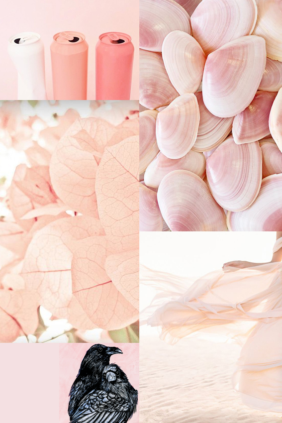
As an avid pinner I’ve been struck by just how many images I’ve seen this past year featuring photography, illustration and fashion pieces showcasing a range of blush pink shades.

The hues look great on their own and teamed with light colours. It also works incredibly well when contrasted with darker green or grey shades as well as more vibrant rosy pigments.

It’s been hugely inspiring for me in creating new stationery collections and prints. By replacing my usual white backdrop with soft, gentle blushes it has really warmed up some of my pink flamingo pinks and patterns (I’ll be showing you them soon). I’ve also used it as a background for my more dramatic drawings such as my raven couple piece that you can see on my moodboard.

I’m looking forward to playing with these shades a bit more, not only with my artistic work but also exploring options for adding depth to accent walls as well as seeing how I can incorporate a bit of blush with my home accessories.


Posted on

Moodboard Monday: Green and white

Ellas Place Moodboard Monday

As an artist, illustrator and journalist, observation, research and image gathering are key to the success of my work. So from now on I’m letting you in on my working practice every week with my Monday Moodboards.

I’m always taking pictures of things that catch my eye and (much to Dr B’s chagrin) spend at least a couple of hours a day on Pinterest (probably not very healthy I know) collecting all kinds of images that reflect trends and serve as inspiration for my home and my drawings. Making them into a moodboard distills my thoughts and allows me to think about the vibe I want to create with my own endeavours.

I’ve recently become fascinated by green and white. It is so representative of this time of year. During the past three weeks I’ve been greeted with this glorious colour combination on my daily morning woodland and riverside walks. Lush grass, delicate hawthorn flower and cow parsley abound the environment creating delightful glades and giving everything a soft, elegant appearance. Beautiful.

This simple palette has so much potential in terms of design and it’s versatile too; a simple flower arrangement, artful grouping of fern and minty coloured objet, delicate planting or full-on statement floor and wall tiles, there are so many ways to incorporate this look into your home.  Used wisely it can look stylish in a laid back, understated way. And even if you’re not actually using natural elements or motifs it suggests a natural, organic feel. The clean, fresh scheme and simplicity reflected in my mood board has also given me food for thought when it comes to my illustrations – sometimes maybe less is more?