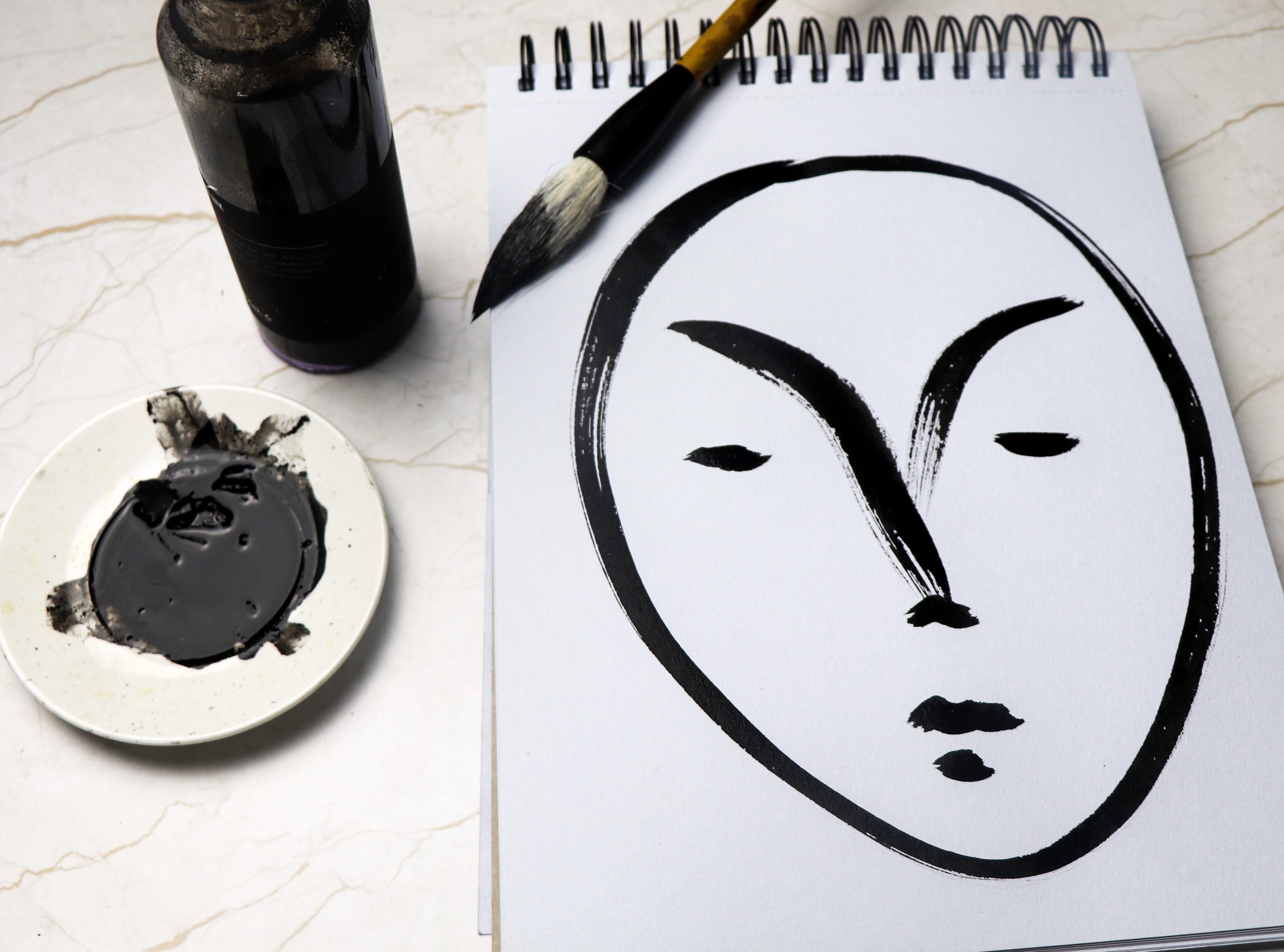
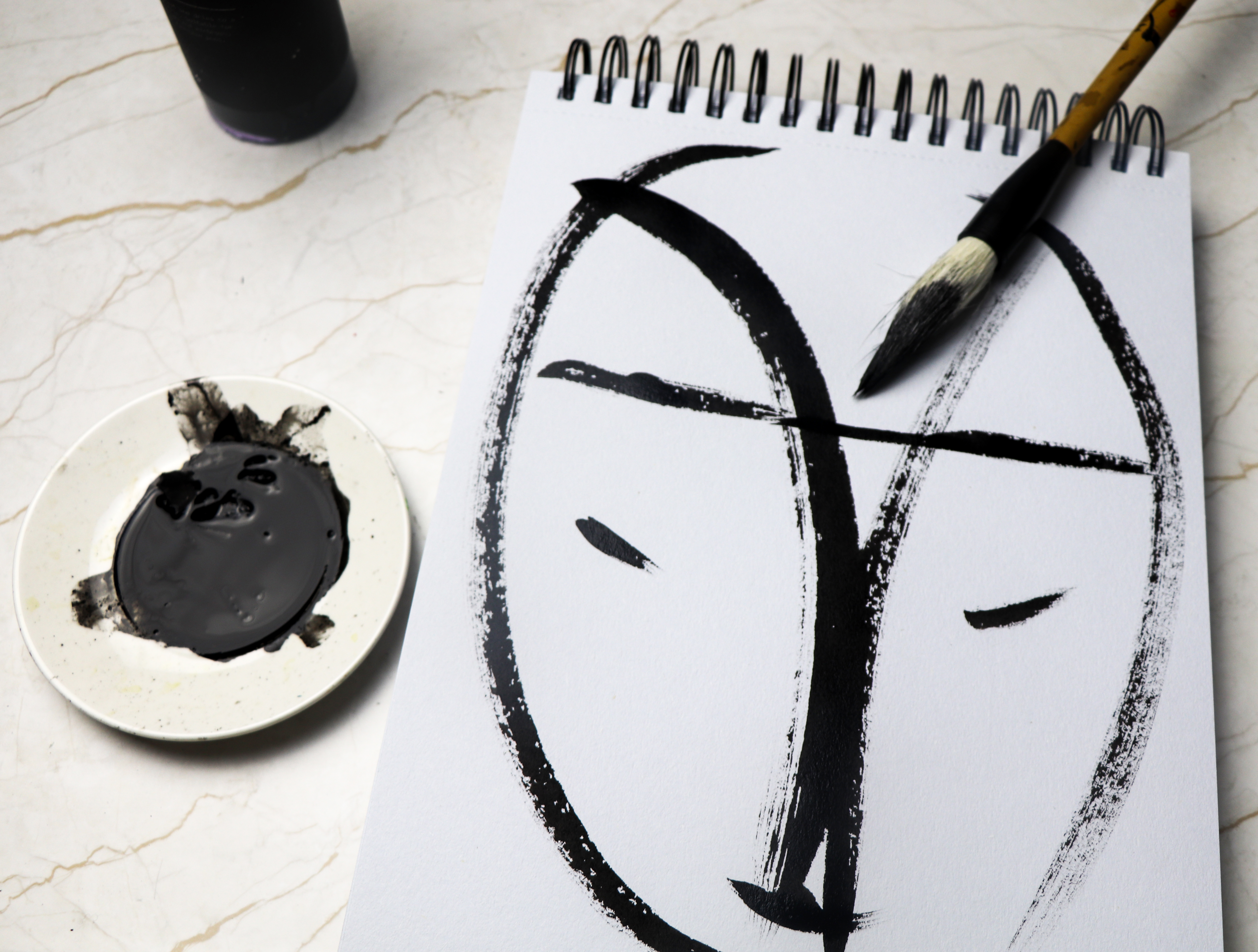
This year I decided to take part in Inktober. In typical Ella style I haven’t followed the #inktober drawing prompts. However I have enjoyed taking part in the art challenge, particularly my black and white brush-drawn faces.
As regular readers of this blog will know I am hugely influenced by Matisse and Japanese brush drawings. So this is me working through my influences and trying new drawing techniques and styles.
I feel a bit indulgent creating these face drawings. I love using a Japanese calligraphy brush with this free flowing Indian ink. I really enjoy the easy curves and marks this brush makes. However I’m aware I need to develop my own style. It’s a really stage in developing new work.
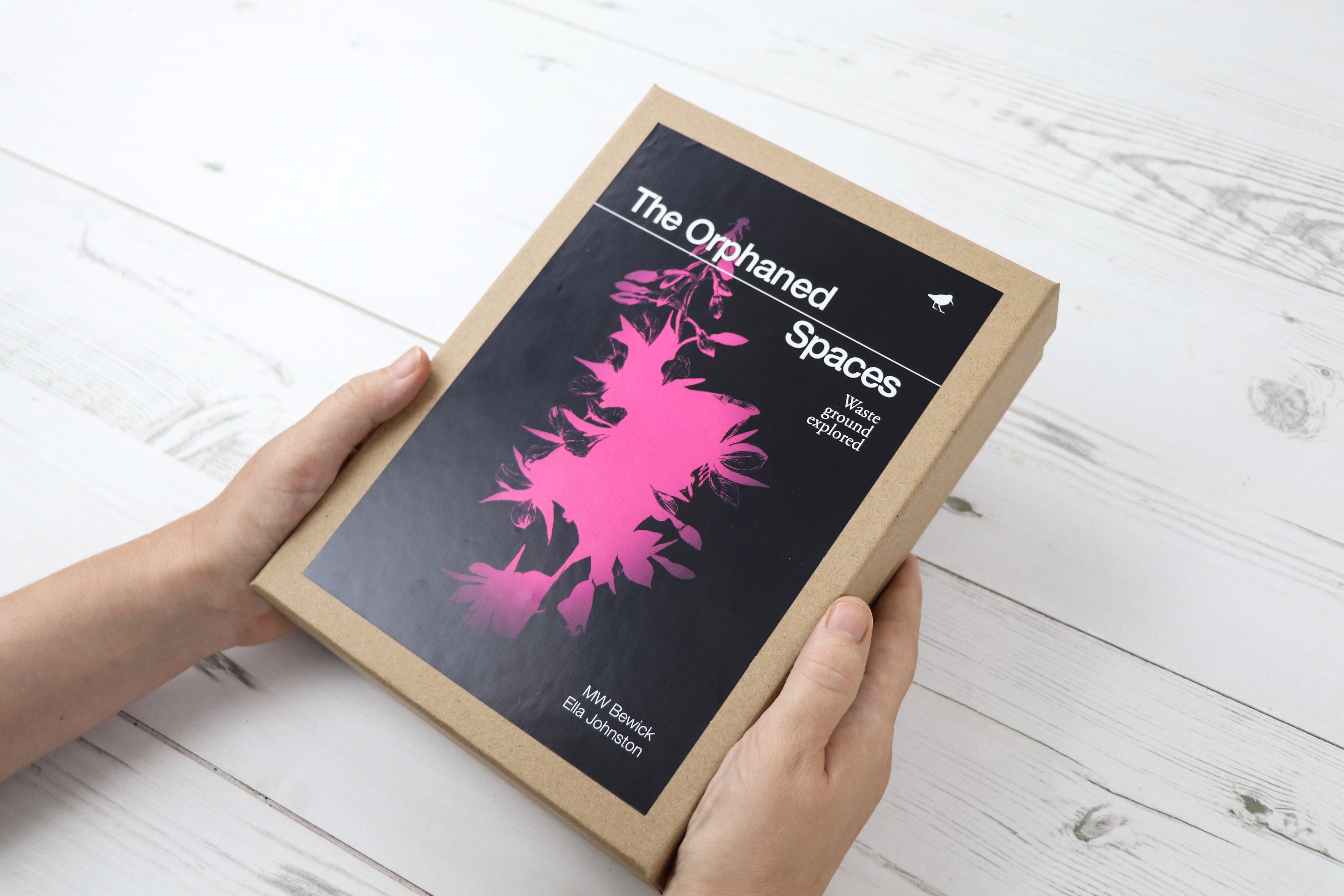
Last week I told you about my new illustrated book (with MW Bewick), The Orphaned Spaces published by our indie publishing company Dunlin Press, well here is the box set.
The Orphaned Spaces box set is such an undertaking of work that I had to give it a separate post.
When working on Dunlin Press projects, we’ve often described each book as ‘time capsules’. We aim for every publication to embody the mood and spirit of a place or region at a particular period of human history – like pressing a pause button or taking a picture. The Orphaned Spaces box set is a physical manifestation of this concept.
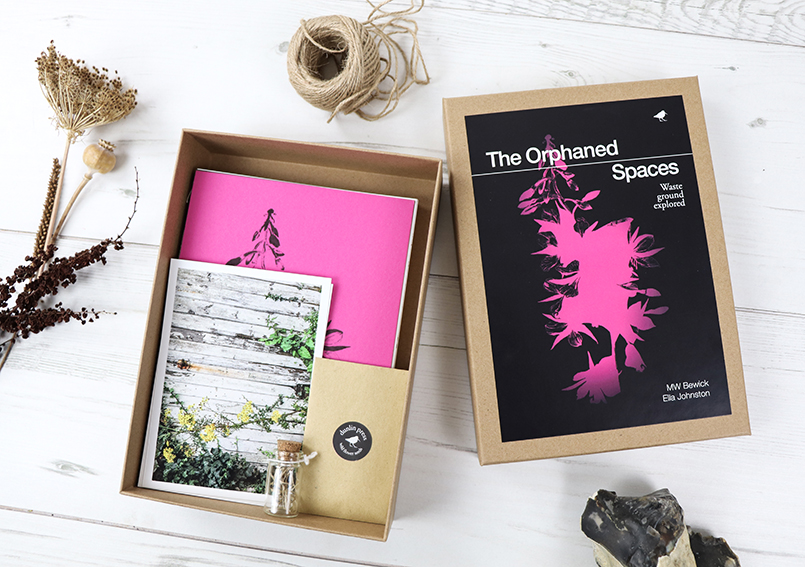
Hand-stitched still lives bookletLimited edition postcards, reliquary, seeds and archival prints. The Orphaned Spaces Box Set
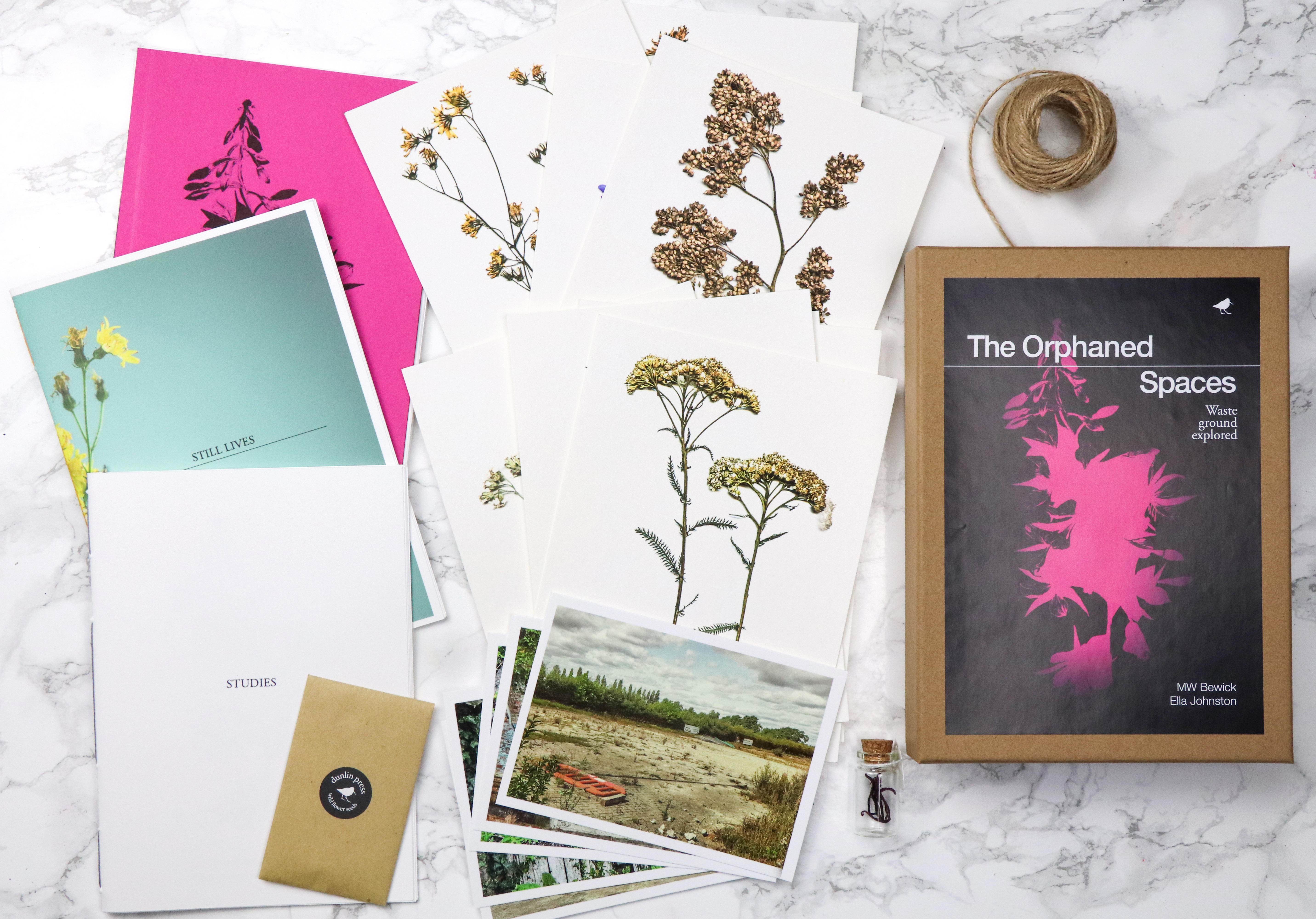
This highly limited edition, made-to-order box set, deconstructs the book The Orphaned Spaces, breaking it down into hand-stitched booklets, postcards, archival prints and a reliquary.
The box set contains the following elements:
1: Hand-stitched ‘Journal’
Coverstock: G.F SMith, Colorplan, fuchsia pink, 270gsm. Inset pages: G.F SMith, Colorplan, dark grey, 135gsm. Inner pages: ZANDERS ZETA, Unwatermarked Textured Paper, linen 100gsm,
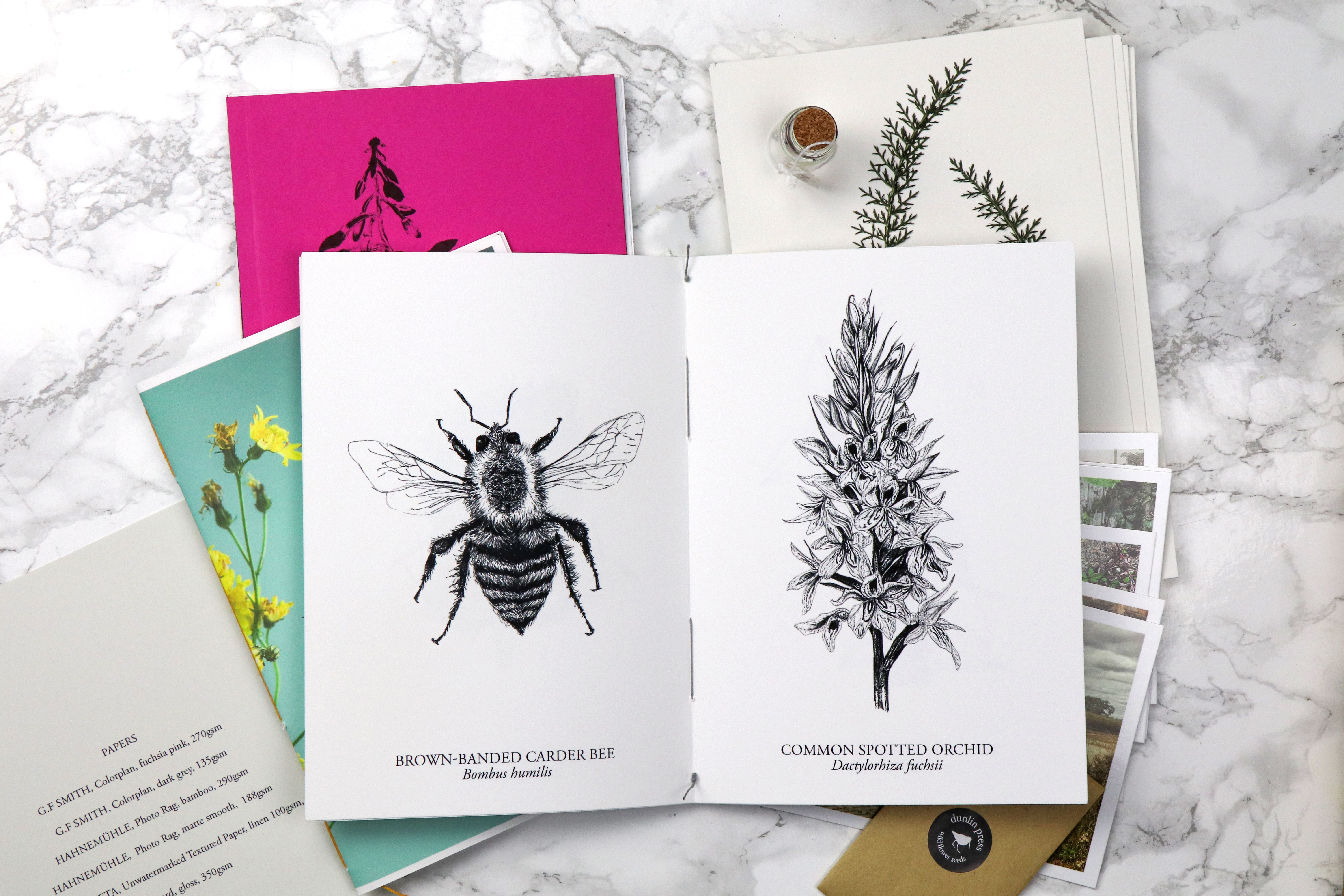
2: Hand-stitched black and white studies booklet
Paper stock: Hahnemühle, Photo Rag, matte smooth, 188gsm
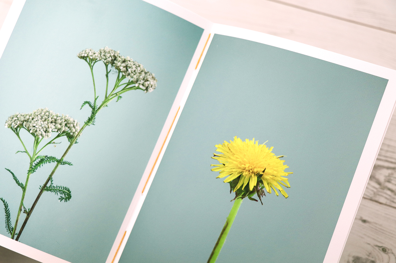
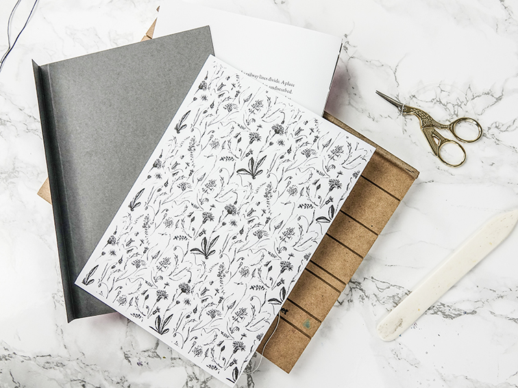
3: Hand-stitched wild flower still lives booklet
Paper stock: Hahnemühle, Photo Rag, matte smooth, 188gsm
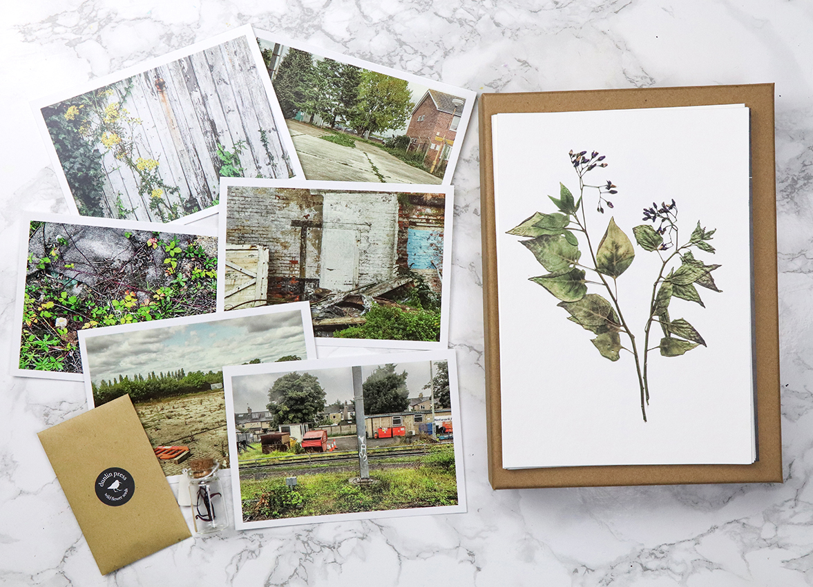
4: 10 pressed plants fine art giclée prints
Printed on archival Hahnemühle, Photo Rag, bamboo, 290gsm
5: Six landscape postcards
6: A glass bottle ‘reliquary’
7: Wildflower seeds include a mixture of annual and perennial wildflower species and grasses.
8: Bookmark using G.F SMith, Colorplan, dark grey, 135gsm
The Orphaned Spaces box set includes three individually hand-stitched books and archival prints plus seeds and reliquaryThe Orphaned Spaces box set includes three individually hand-stitched books and archival prints plus seeds and reliquary
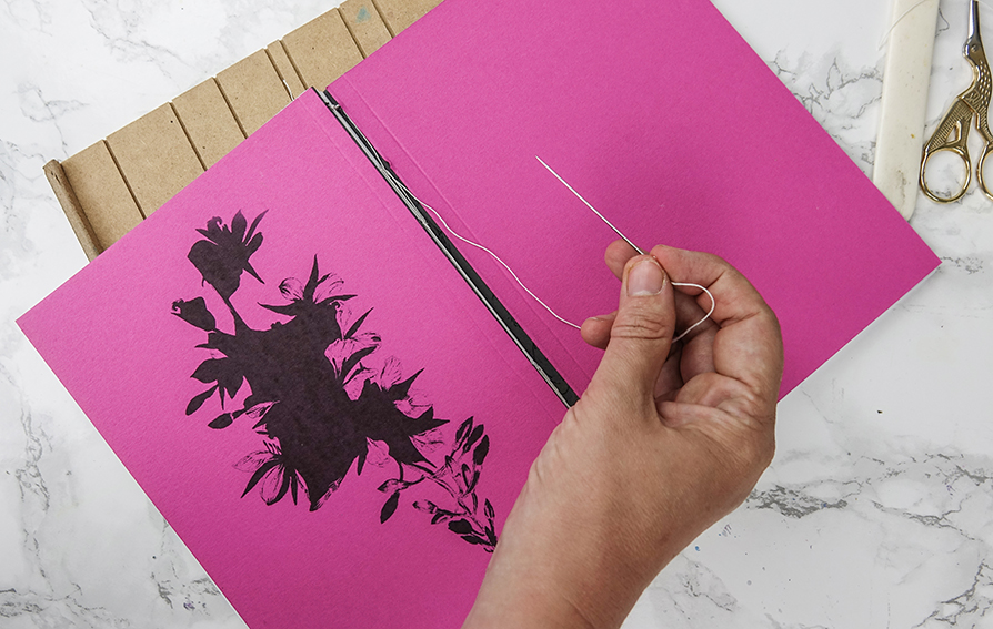
I’ve really made use of the 2010 Central St Martin book-binding summer course I attended during the past eight years. The box set features three hand-stitched booklets all bound by me. I really enjoy book-making so, what would feel like hard work for some feels like a kind of zen meditative process for me.
Making the hand-stitched books for The Orphaned Spaces.Making the hand-stitched books for The Orphaned Spaces.
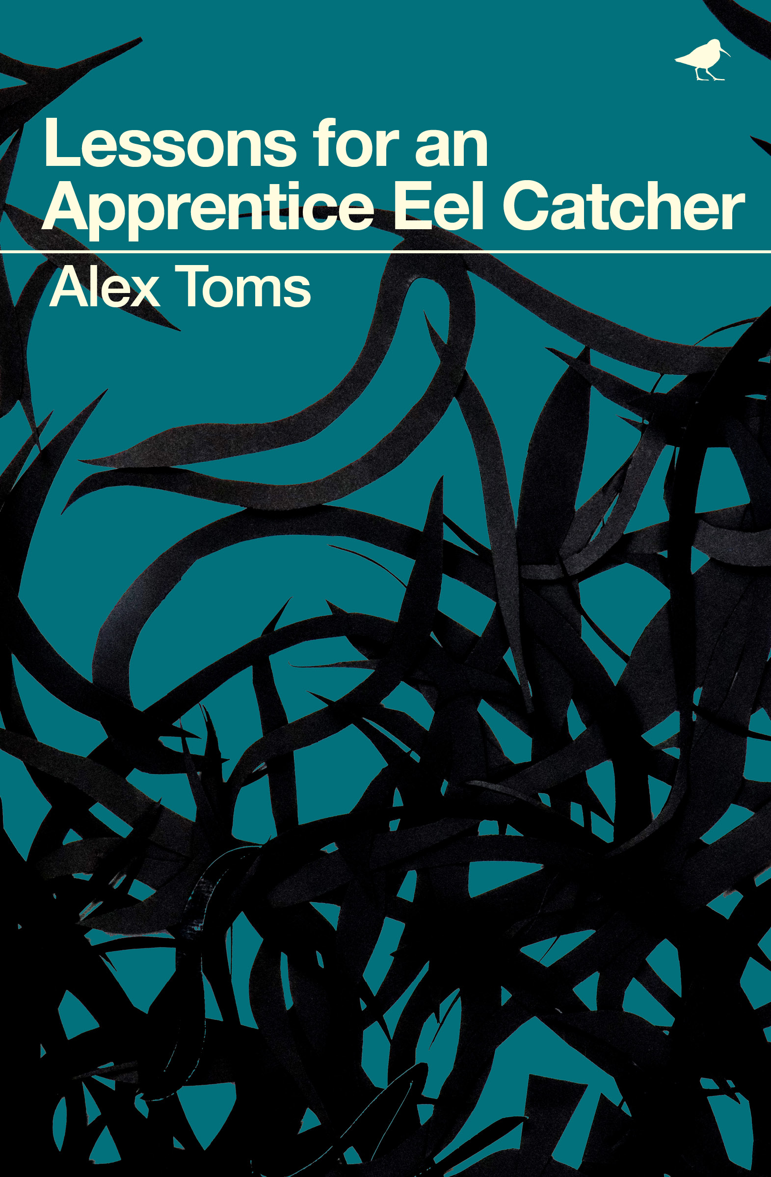
Cover, Lessons for an Apprentice Eel Catcher, Alex Toms. Published by Dunlin Press.
I’m excited to tell you about new book illustration project with Dunlin Press: Lessons for an Apprentice Eel Catcher, by Alex Toms. The debut poetry collection launches on Thursday 11th October 2018 and the words inside it are simply stunning.
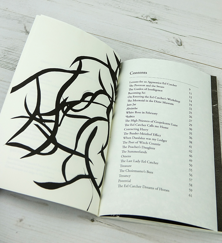
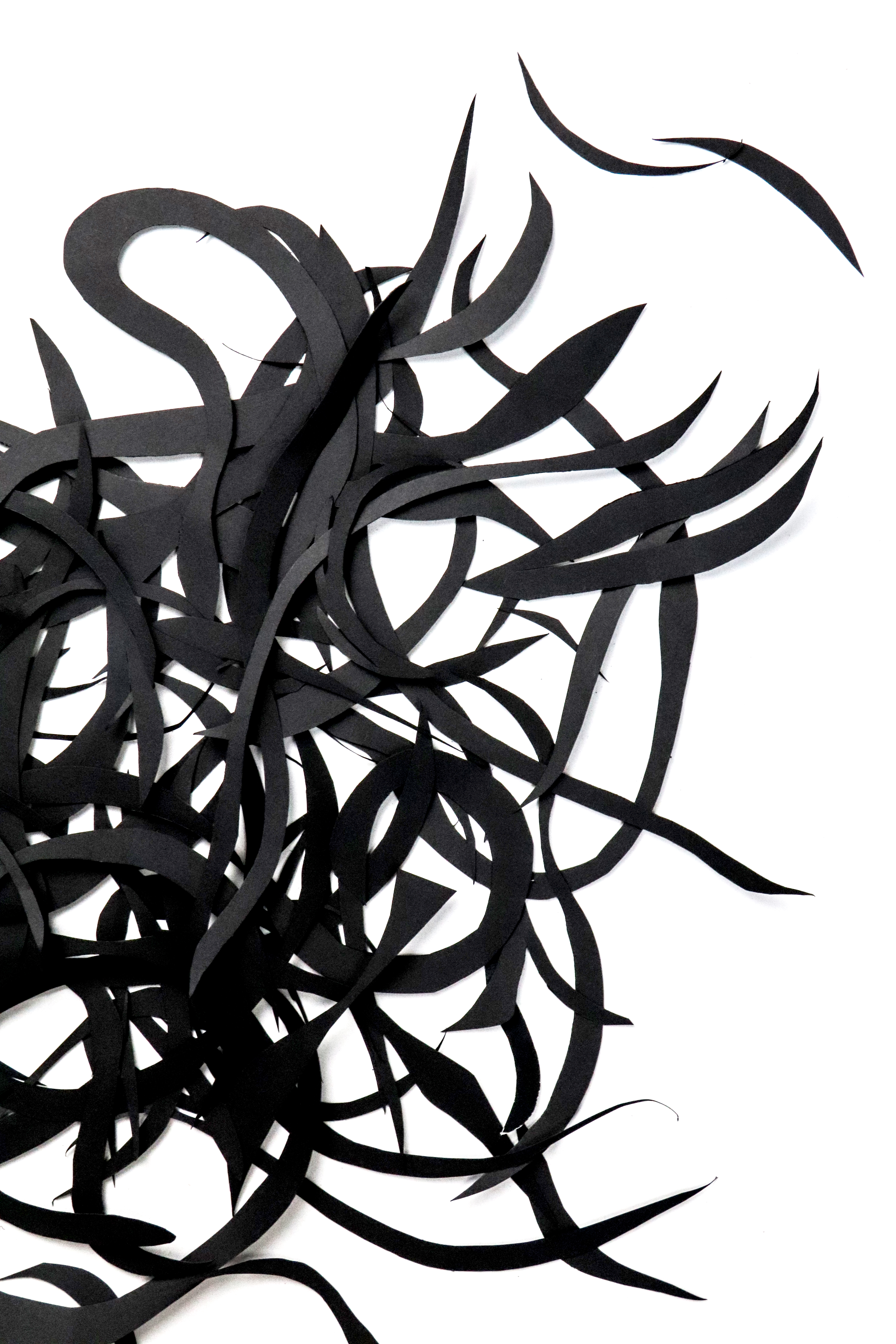
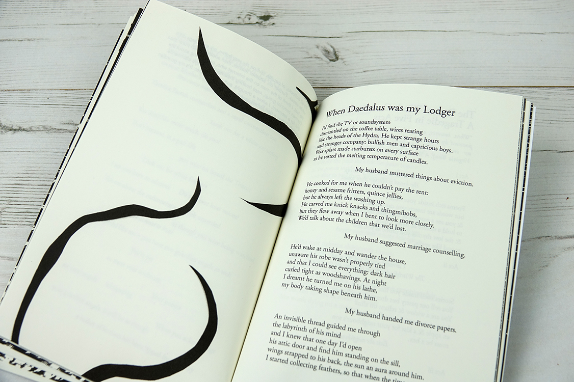
Inner paper cut illustrations for Lessons for an Apprentice Eel Catcher, Alex Toms. Published by Dunlin Press.
We already had beautiful photography from MW Bewick for the poetry book but we wanted an illustrative element too. In illustrating this book I really wanted to do the poems justice. I was mindful not to interfere with the reader’s experience of the words by being too literal in my illustration. My work had to convey a mood and atmosphere while allowing the amazing imagery that Alex creates to breathe.
Lessons for an Apprentice Eel Catcher, Alex Toms
When approaching this illustration commission I do what I always do, go back to my art history books and my old sketchbooks. My studio is packed with sketchbooks and folders stuffed full of experiments and ideas that I’ve parked for later and my ever-growing art book collection is a constant resource. Alongside a scrapbook of cut-out collages I did about 10 years ago when I was hungover in my art studio in Tottenham (never throw away your sketchbooks kids), a book on DADA and a book on Matisse’s cut-outs, the visual concept for “Eels” was born.
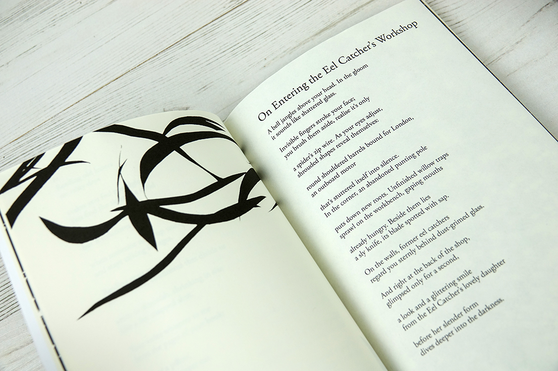
Inner paper cut illustrations for Lessons for an Apprentice Eel Catcher, Alex Toms. Published by Dunlin Press.
I love paper cuts, I could swear I love them so much but I have never found a way to incorporate paper cuts into a project. Seeing my old scrapbooks and work by very different artists using cut-up and collage techniques freed me to create something visceral, with a sense of movement, depth and physicality that is so alive in Alex’s poems.
Inner paper cut illustrations for Lessons for an Apprentice Eel Catcher, Alex Toms. Published by Dunlin Press.
Originally I had little, delicately trimmed paper shapes on painted backgrounds but everything seemed too polite and restrained. So I went big and got to work drawing with scissors on A2 and A3 black matte paper, creating lots and lots of rough eel, sea kale and old fashioned eel catcher net shapes.
Inner paper cut illustrations for Lessons for an Apprentice Eel Catcher, Alex Toms. Published by Dunlin Press.
I then arranged the shapes randomly on a large piece of card, set-up my camera and tripod over the card, and made a series of compositions with the cut out paper. The results were exactly what I wanted.
The book launches on Thursday 11th October 2018 and you can pre-order it HERE
The Orphaned Spaces, illustration and design by Ella Johnston (c) Dunlin Press
The Orphaned Spaces is a rumination on life and loss through the prism of liminal spaces – derelict land, brownfield sites, edgelands – caught between moments of dilapidation and regeneration.
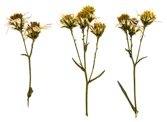
Wild flower pressings. The Orphaned Spaces, illustration and design by Ella Johnston
The Orphaned Spaces project was meant to be a small artistic endeavour. Our original idea for The Orphaned Spaces was to have a brown paper bag containing fragments of writing, the odd drawing and some landscape photography, all loosely themed around ‘waste ground’. About a month in however, it had already started to take on a life of its own. As is the way of things, it escalated into something bigger, encompassing a 148-page book and handmade book box set.
The Orphaned Spaces, photography, illustration and design by Ella Johnston (c) Dunlin Press
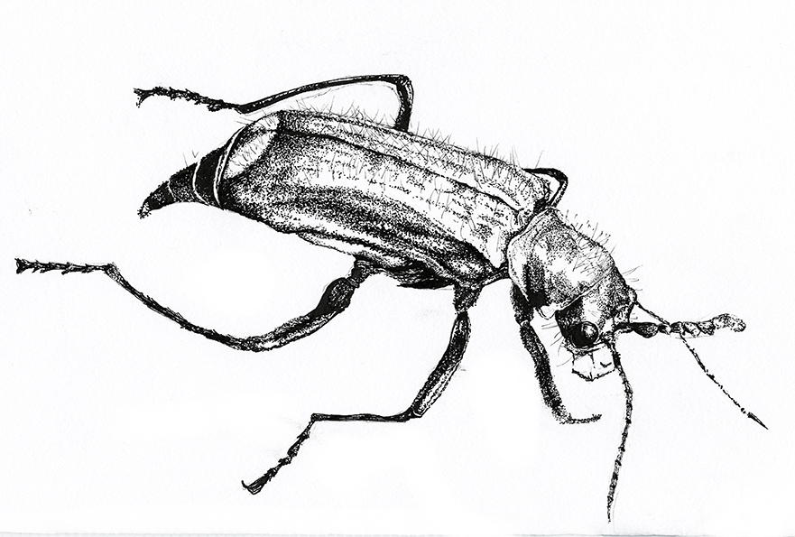
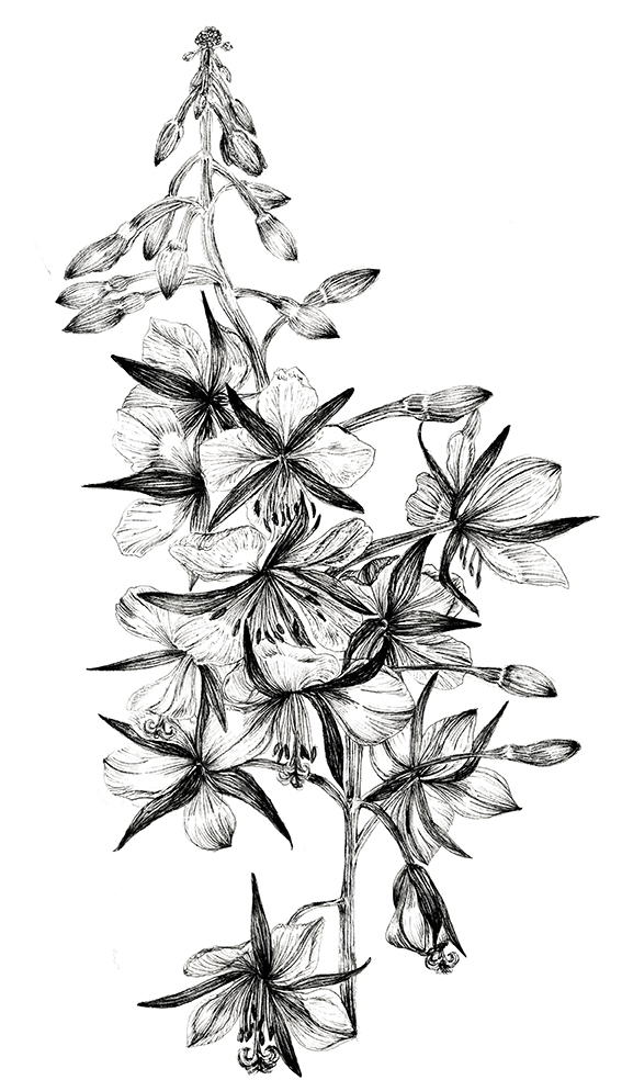
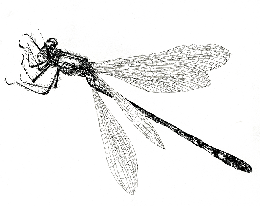
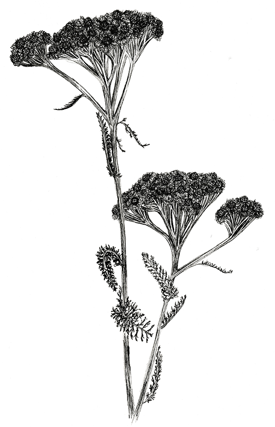
The Orphaned Spaces features exquisite words and visceral landscape imagery from MW Bewick and my quick brush sketches that I spoke about in this previous post. Both the book and the box set also include fine line botanical and insect studies in black and white (see below), ikebana-inspired still life plant photography plus wild flower pressings, all created by me.
Green Malachite Beetle, black and white fine line insect illustration. Ella JohnstonRosebay Willlowherb, black and white fine line botanical illustration. Ella JohnstonScarce Emerald Damselfly, black and white fine line insect illustration. Ella JohnstonRosebay Willlowherb, black and white fine line botanical illustration. Ella Johnston
The black and white studies were created with fineliner pigment ink pens.
Ikebana-inspired botanical photography, (c) Ella Johnston/Dunlin press
I’m really pleased with the botanical photography aspect of the book – you can read more about it here
Wild flower pressings, The Orphaned Spaces. Dunlin Press
I’m also delighted with the way my wildflower pressings came out. I used to press wild flowers and plants with my mum when I was kid, so I wanted this aspect to be in the book as I felt it needed a child-like, playful aspect to it. Actually as it turned out I think in some ways these illustrative elements are the most plaintive and poignant images of the publication – they are particularly effective as the archival prints featured in the box set but that’s worthy of another post.
Wild flower pressings, The Orphaned Spaces. Dunlin Press
You know last week I told you about the Dunlin Press Waste Ground Project I was working on? Well, here are two short book-making how to films as a sneak peek on what’s to come…
These videos show you how I created our hand-stitched book of photography depicting botanical still lives of plants collected from brownfield sites and a pamphlet of black and white sketches also created by me. This book will form part of a limited edition box set.
The Orphaned Spaces is the culmination of a multimedia collaboration by independent publisher Dunlin Press. The project is centred on a rumination on life through the prism of liminal spaces – derelict land, brownfield sites – caught between moments of dilapidation and regeneration. The project takes the form a paperback book, a highly limited edition box set, featuring hand-stitched booklets, archival prints and a reliquary, as well as art prints and more.
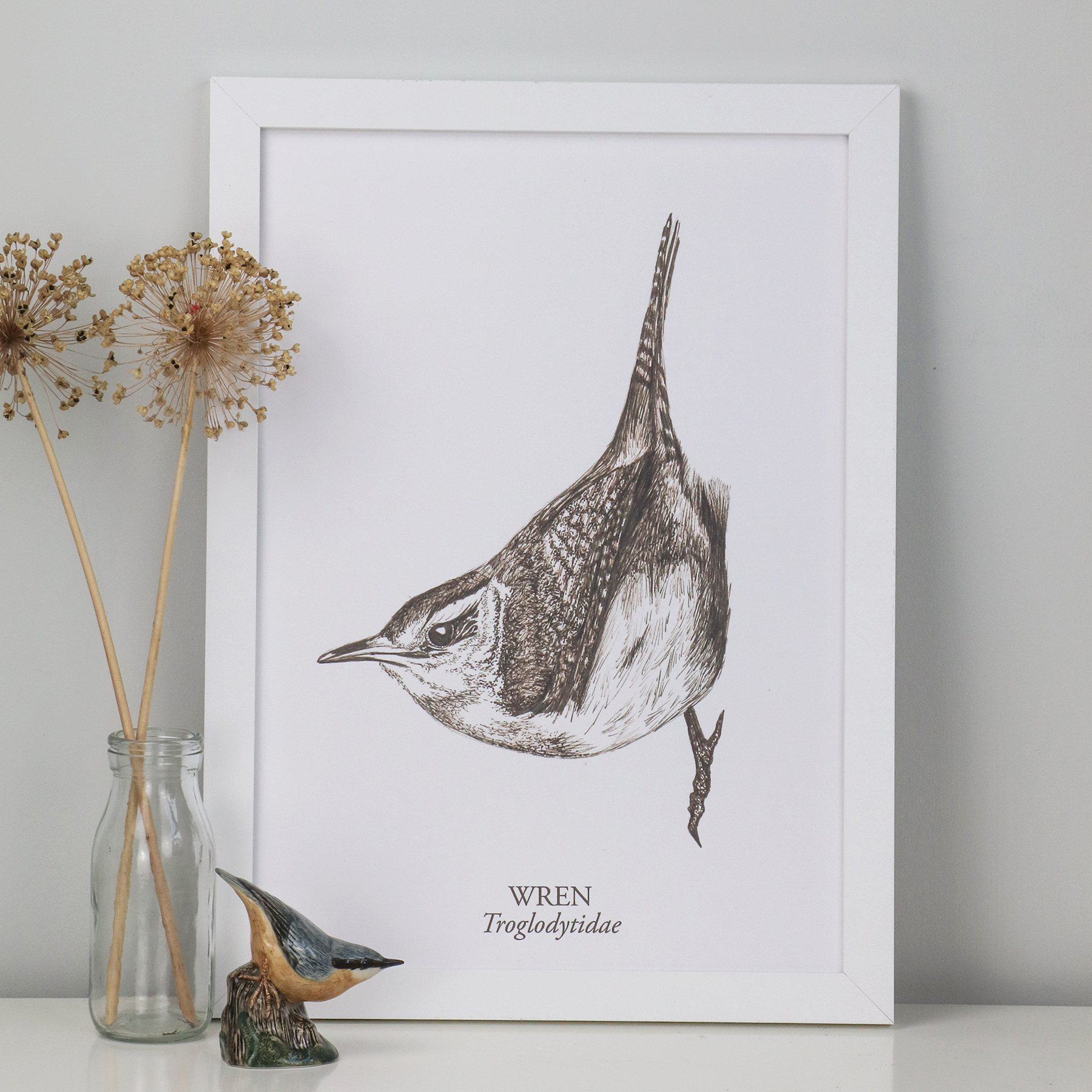
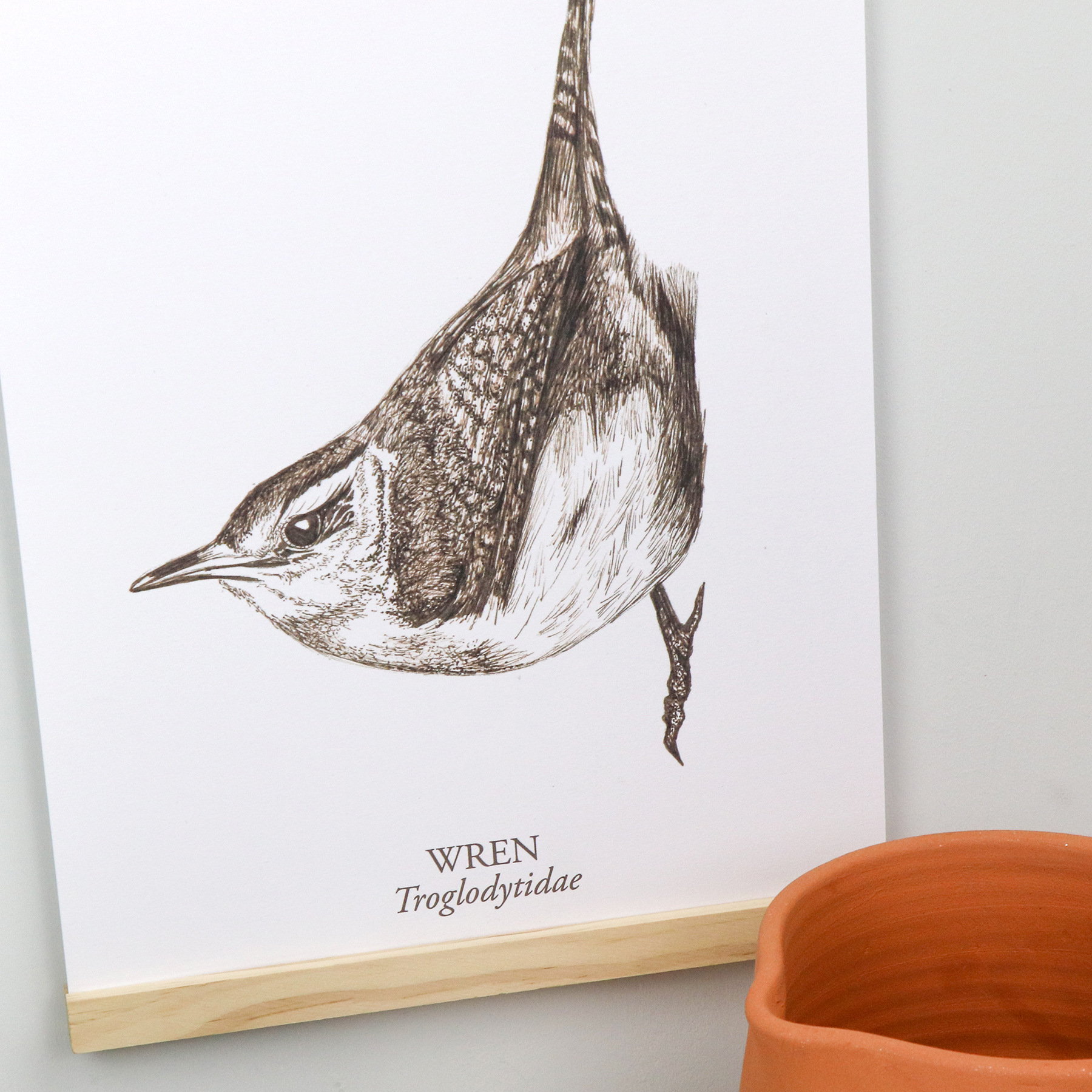
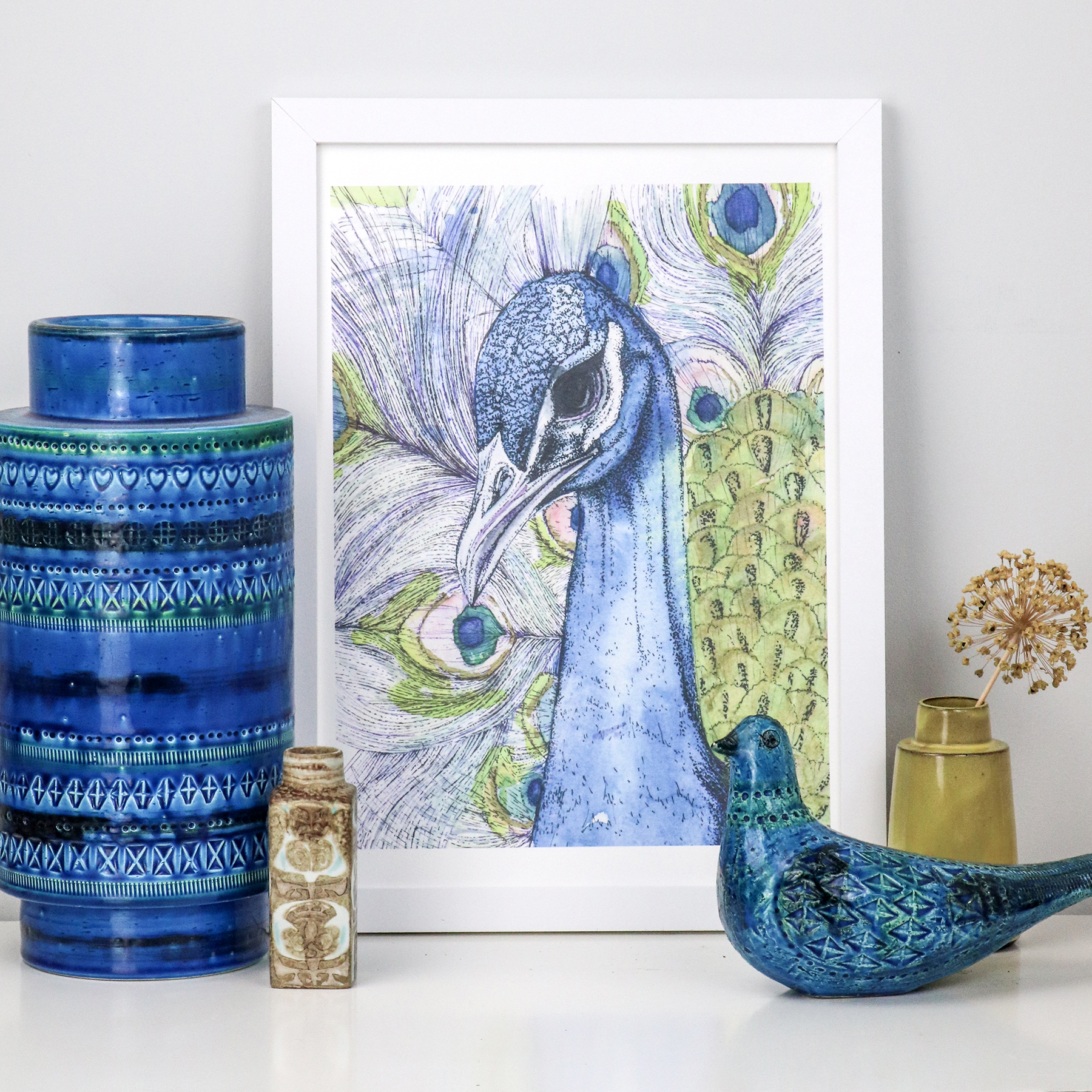
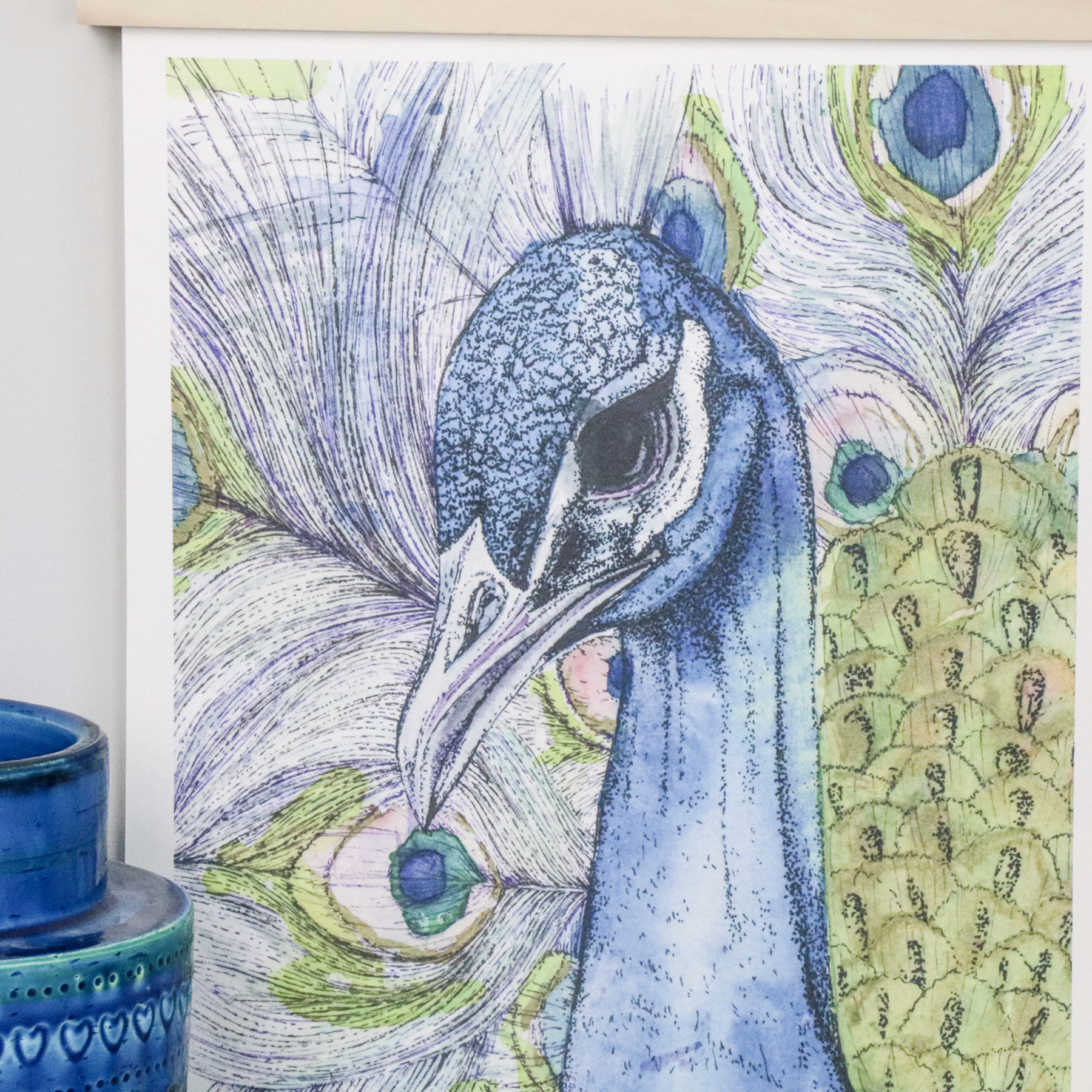
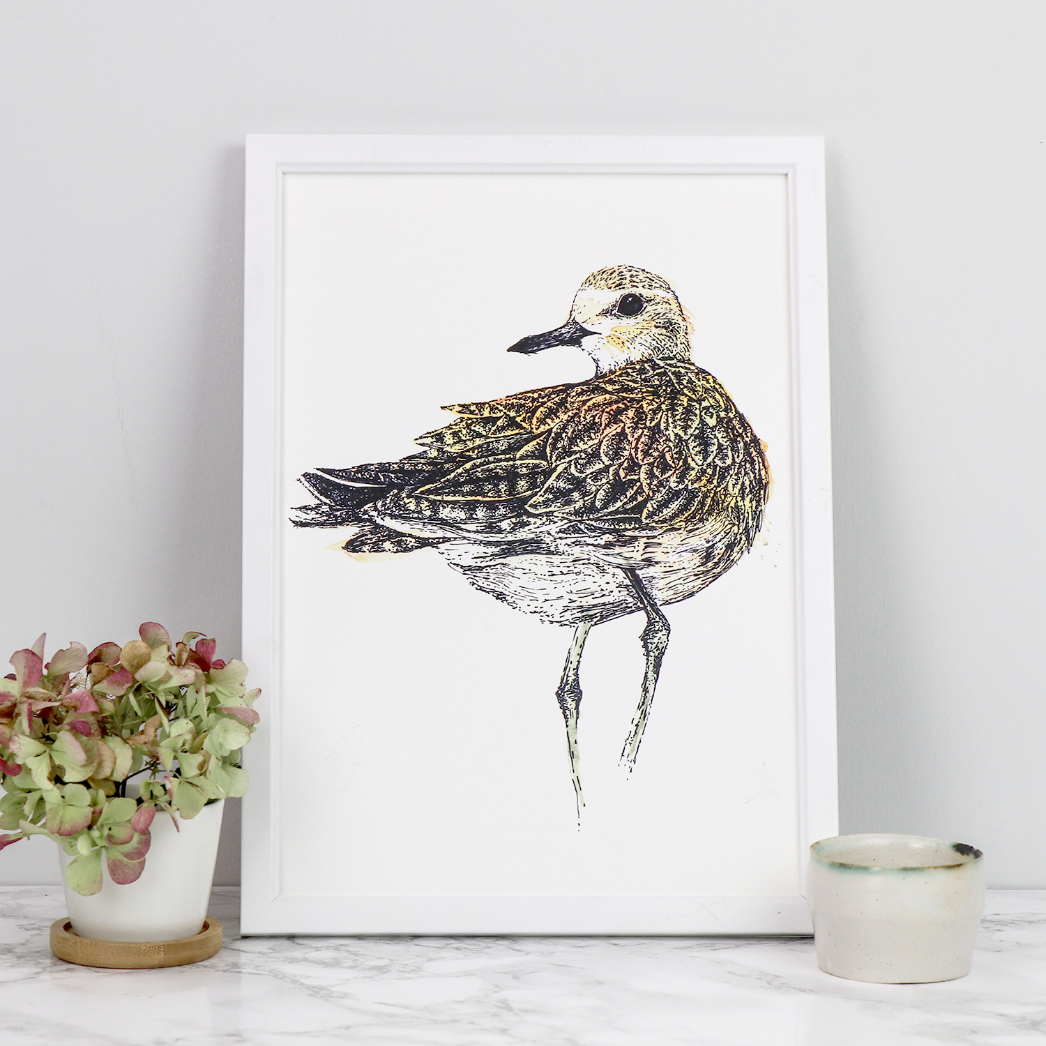
I’ve recently launched a whole new collection of illustrated bird prints now available on my Etsy and Folksy shops.
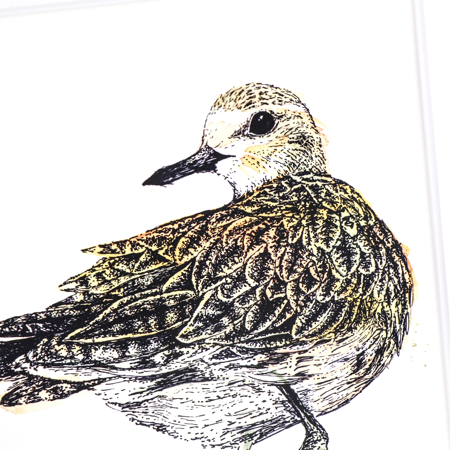
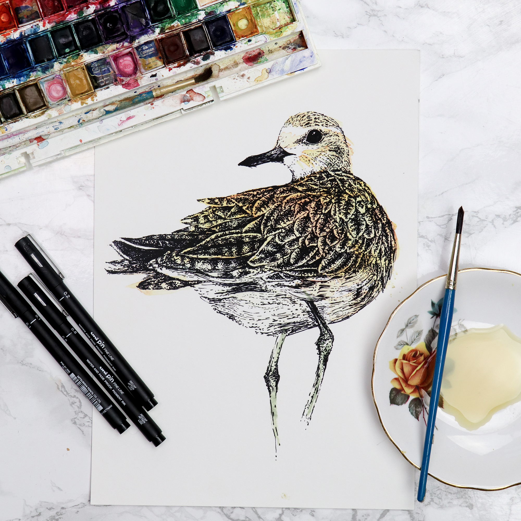
I really enjoyed drawing this wren – I created it using new uni-pin sepia pigment ink pens on watercolour paper. This delicate avian illustration is then scanned and printed as a fine art print on archival paper ensuring that it will last a lifetime.I originally created the watercolour and ink Peacock artwork for an exhibition. The artwork showcases vivid blue, pea green and violet watercolour washes combined with shimmery golden POSCA pen washes. I then overlaid the painting with pigment ink pen. My golden plover drawing was originally created for the book The Migrant Waders, published by Dunlin Press. It was one of my favourite illustrations and I love looking at it, so I had to turn it into a print. Again this is printed on high quality archival paper so it will last a lifetime.
Here’s a preview of some sketches I’ve been working on for an up-coming Dunlin Press project to be published next month.
The Waste Ground Project is the culmination of a multimedia collaboration. The project is centred on a rumination on life through the prism of liminal spaces – derelict land, brownfield sites – caught between moments of dilapidation and regeneration. The project takes the form a paperback book, a highly limited edition box set, featuring hand-stitched booklets, archival prints and a reliquary, as well as art prints and more.
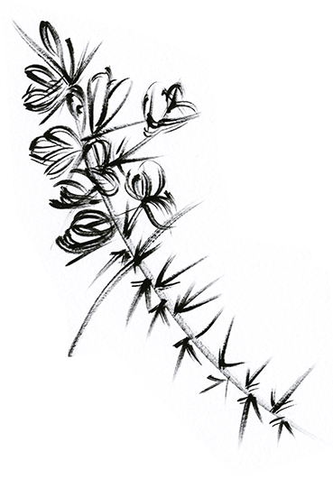
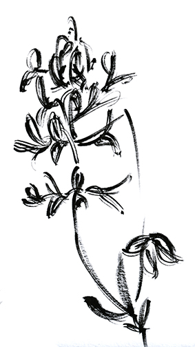
These sketches are for the text element of the piece. They accompany beautiful prose written by MW Bewick.
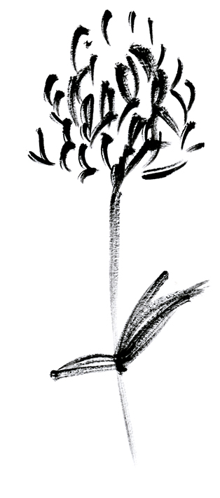
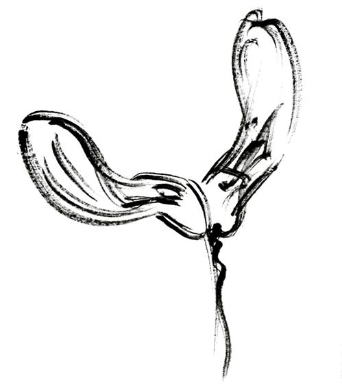
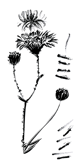
These black and white wild flower and plant sketches have been created with a brush paint pen. They accompany more detailed fine-liner drawings elsewhere in the piece. I wanted these illustrations to be loose, gestural and quick so they feel like they’ve been captured on the fly.
Watch this space for more updates.
Wanna know why I wasn’t posting for two weeks? Well, as well as prepping for workshops I was also off finding inspiration in Florence. I thought I’d give you some little snapshots/flavours of Florence that reignited my creativity.
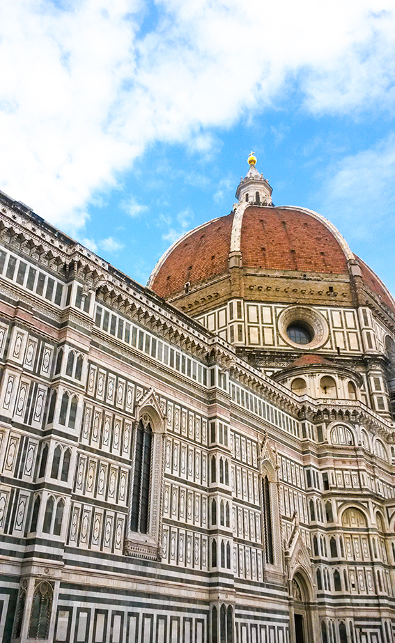
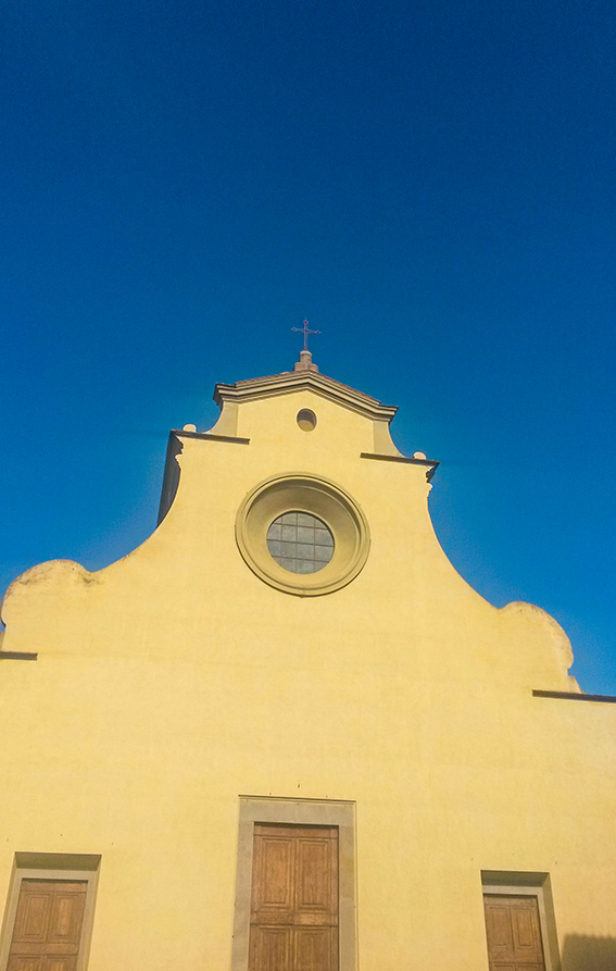
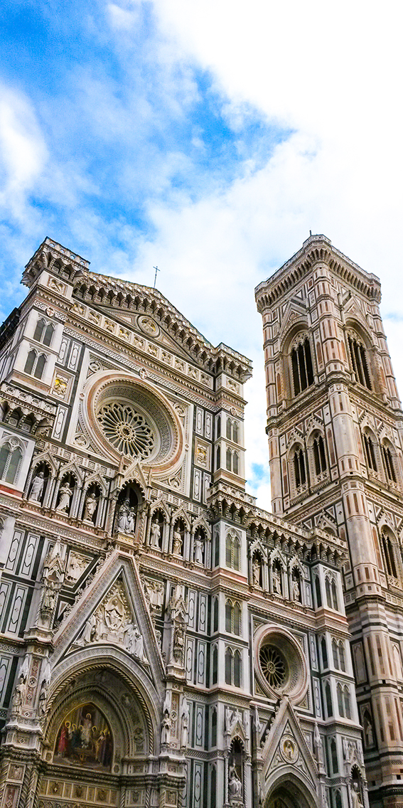
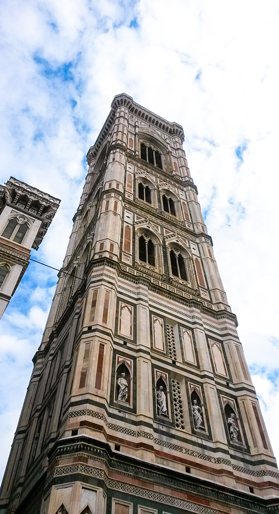
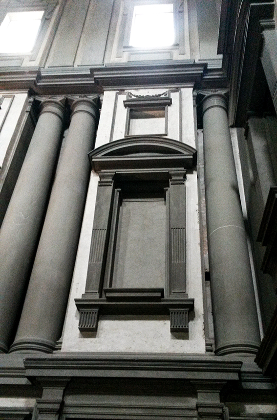
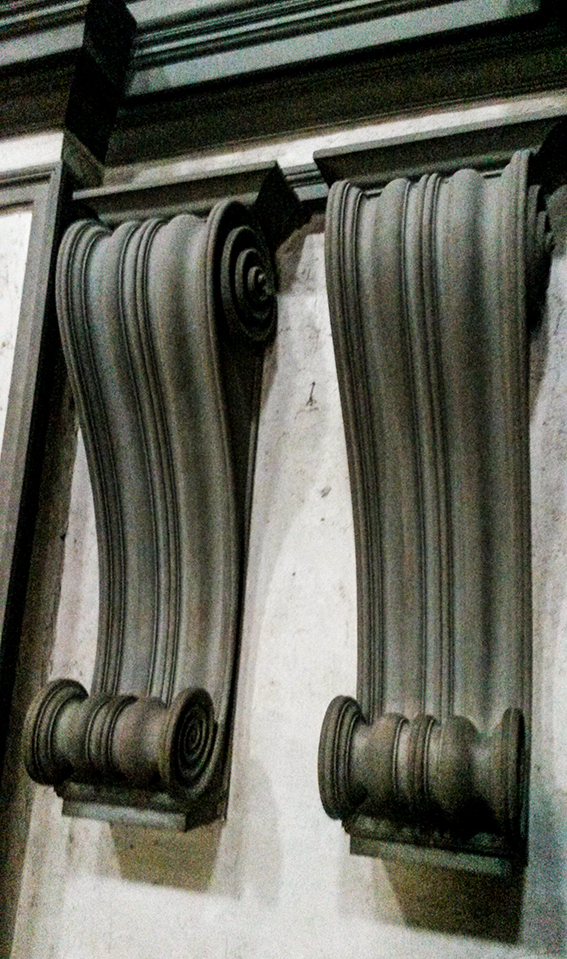
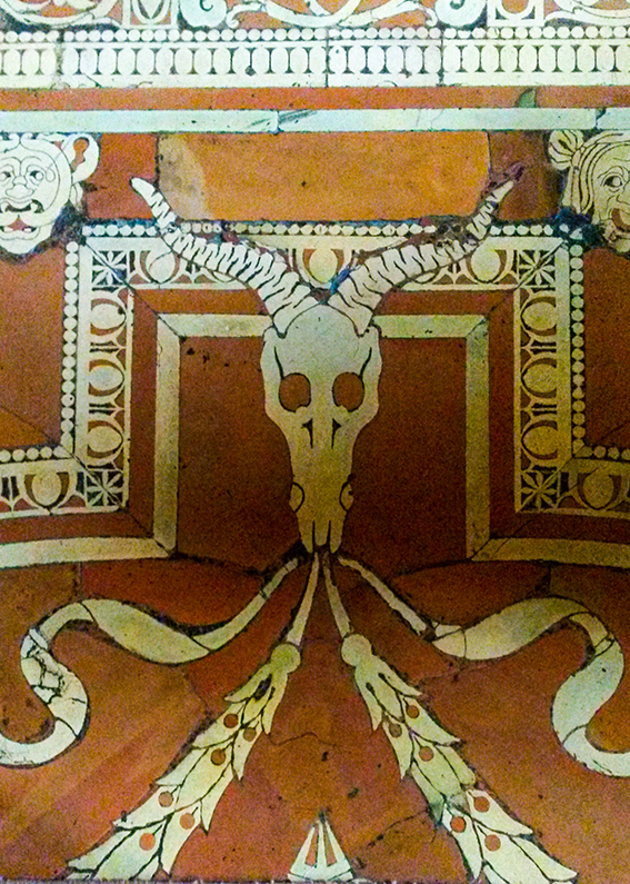
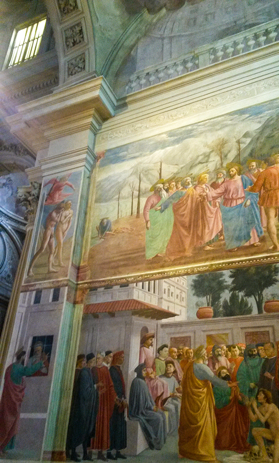
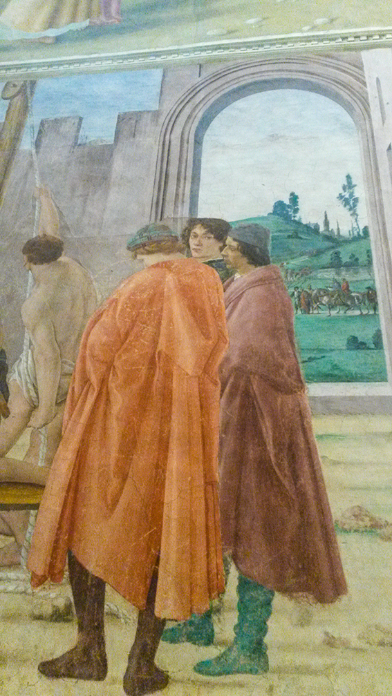
I first visited Florence when I was an Art History student at the University of Essex. It was actually a compulsory part of the degree course (in those free education, pre-fee days) and it was a real eye opener for me academically and artistically. The above image is of San Spirito – inside is a triumph of architecture, every time I visit I’m in awe of its almost minimalist elegance. I also love the fact that the church is unadorned on the outside, simply beautiful inside and out. Touristy as it sounds I love the cathederal (Santa Maria del Fiore above) square with the bell tower, the Duomo etc. Although the facade is a bit bling I adore the sparkly marble and the ostentatious pomp of it although I’m sure the purists would disagree. To me the buildings seem to gleam in any weather. The place that most inspired me on my initial visit was the Laurentian Library (Biblioteca Medicea Laurenziana) planned and built by Michelangelo. It was my mission this time to show Dr B. The library has been a source of inspiration for artists such as Rothko and film maker Orson Wells. It truly is break taking and iconic. The entrance I believe is ahead of its time, I genuinely think it’s the foundation of minimalism and Michelangelo’s finest work. My visit this year didn’t disappoint, it was more breath-taking than I remember. Oh and don’t you love the floor in the library? I also saw a new thing in Florence this visit (well a new old thing). The Brancacci Chapel was being restored when I visited originally and for some reason we didn’t make it there on my second visit so this was third time lucky. All I’m saying is I had a little cry when finally faced with it after spending uni lectures and reading so many books on it. Nothing could compare with actually experiencing it and at such close proximity too. The Brancacci Chapel is actually painted by three artists, originally Masolino and Masaccio then completed by Filiippino Lippi. This journey through the Renaissance painting was just what I needed to reinvigorate my art practice. Although my work isn’t obviously this kinda style, the whole visit, the architecture, the paintings, the stories behind every commission and fresco has spurred me on to explore some themes further and keep pushing.
Good friends of mine will be very surprised by my drawing of the week as I have a pigeon phobia.
I grew up in London so while spiders and mice hold no fear for me it’s pigeons that make me feel ill, yet I love birds.
Anyway I decided to face my fear with watercolour, ink and my powers of illustration. I do like this fell’s beautiful plumage and it does have a rather elegant shape and line. Who knows after drawing this maybe I’ll be able to sit outside in London while they mill about my feet.
Visceral and expressive, paint strokes look so cool. Expect to see a lot of these on homewares and fashion next year as they are set to be a key design trend for 2017, hence this week’s Monday Moodboard. You can go for simple lines or big painterly blocks, either way you’ve got a stark, contemporary look made a little warmer with the suggestion of the human hand.
Est: Collected reports from East Anglia, Dunlin Press. Illustration and design by me!
These simple marks are very effective and are a real short-cut to a stylish, minimal look. They also say so much, I used them as an illustration device in the Dunlin Press book Est, Collected Reports of Easy Anglia to suggest landscape and horizons.
Est: Collected reports from East Anglia, Dunlin Press. Illustration and design by me.
Inspired by last Friday’s Gardener’s World and indeed my own home-grown efforts this week’s drawing of the week is a helenium.
This simple watercolour and ink illustration is taken from some of the few remaining flowers of my garden. Heleniums do really well in our garden and stay so long, so I’m always snipping them and displaying them around the house to make them last longer. I wonder how long they will last.
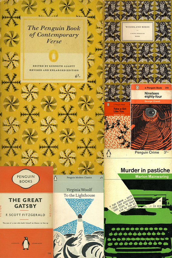
Penguin book design has been an obsession of mine since I was a teenager when I spent an awful lot of time in libraries. Probably too much time if I’m being honest.
In those days I was continually on the hunt for new words, stories and worlds, I used to get lots of books out on spec. I read a lot of duds but I also came across a lot of good stuff too that has stayed with me.
The cover design played a very big part in my decision making process. From the classic orange cover fiction and stylish mid-century illustration to the glorious repeat patterns, it is all the stuff of wonder and as much of an inspiration as the words inside. As a consequence of this I read a lot of books published by Penguin; a great deal of classics and quite a few poetry collections. I’ve now bought a lot of the books that I borrowed and devoured during my teenage years (the ones I enjoyed at least).
As Creative Director of an indie publisher, I design all the books for Dunlin Press. So my youthful interest has become increasingly important now I’m a grown-up. When approaching the layout for each Dunlin Press book I always ask myself, “What would the Penguin designers do?”
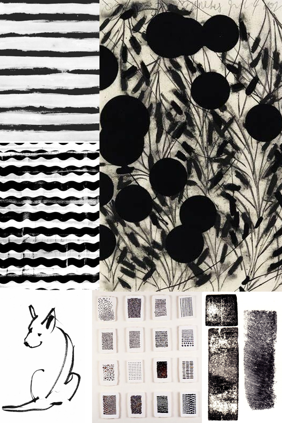
Timeless, classy and striking, I love black and white designs. In fact I can’t believe I haven’t featured this on my moodboard sooner.
I hardly ever wear anything other than black and white clothes (occasionally navy or grey but it’s mainly black and white). I also am a massive fan of simple black and white sketches, print and design. The purity, harmony and general all-round elegance is, for me, a total short-cut to cool.
At the moment I’m working on the design for a poetry book. The publication is printed in black and white so I wanted to think of effective shapes and marks that would look strong on the pages without distracting from the words (which are the most important thing). I’ve done lots of research and have settled on something that I’m quite excited about. You can’t see it yet but the book is set to be released later this year so, watch this space.
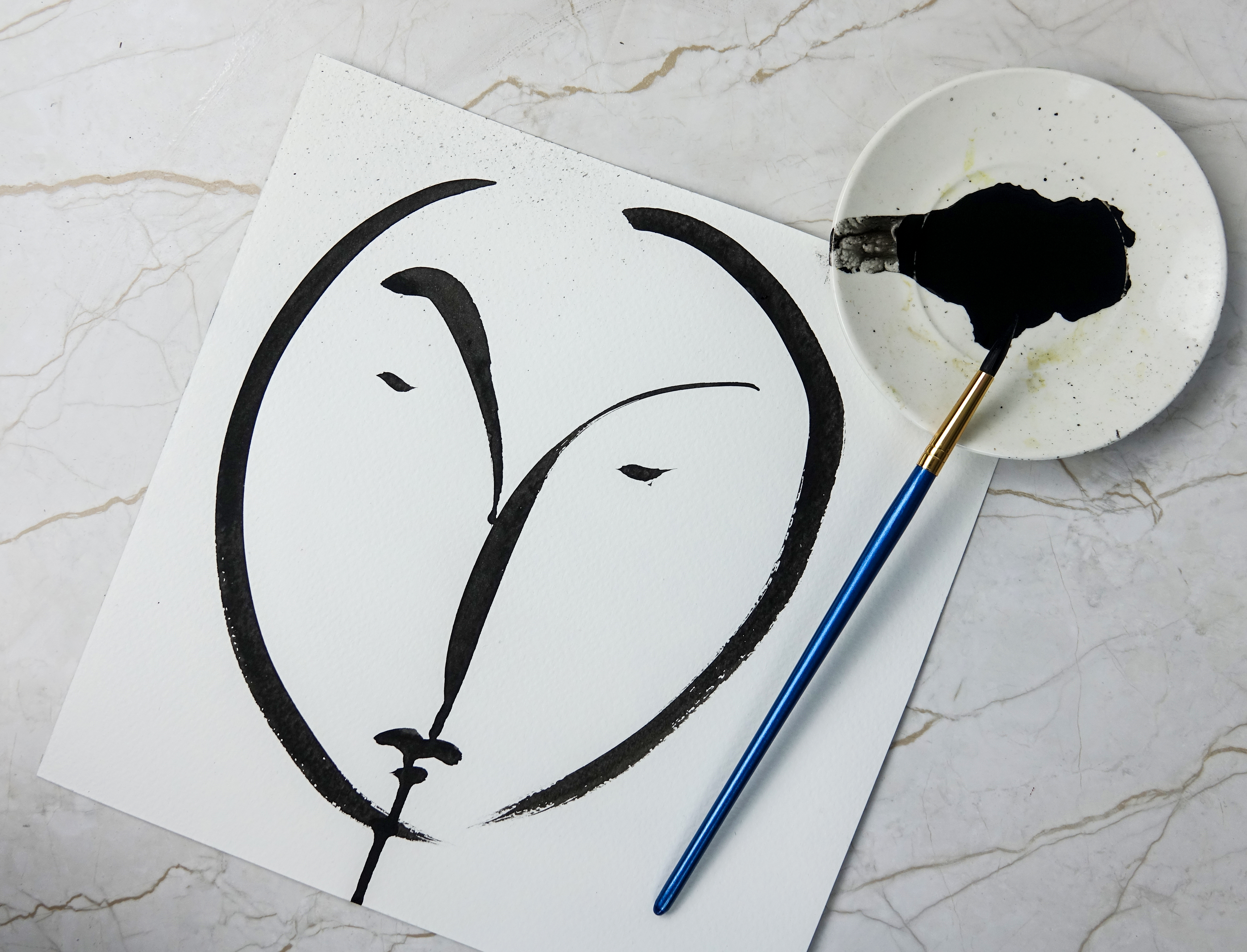 This year I decided to take part in Inktober. In typical Ella style I haven’t followed the #inktober drawing prompts. However I have enjoyed taking part in the art challenge, particularly my black and white brush-drawn faces.
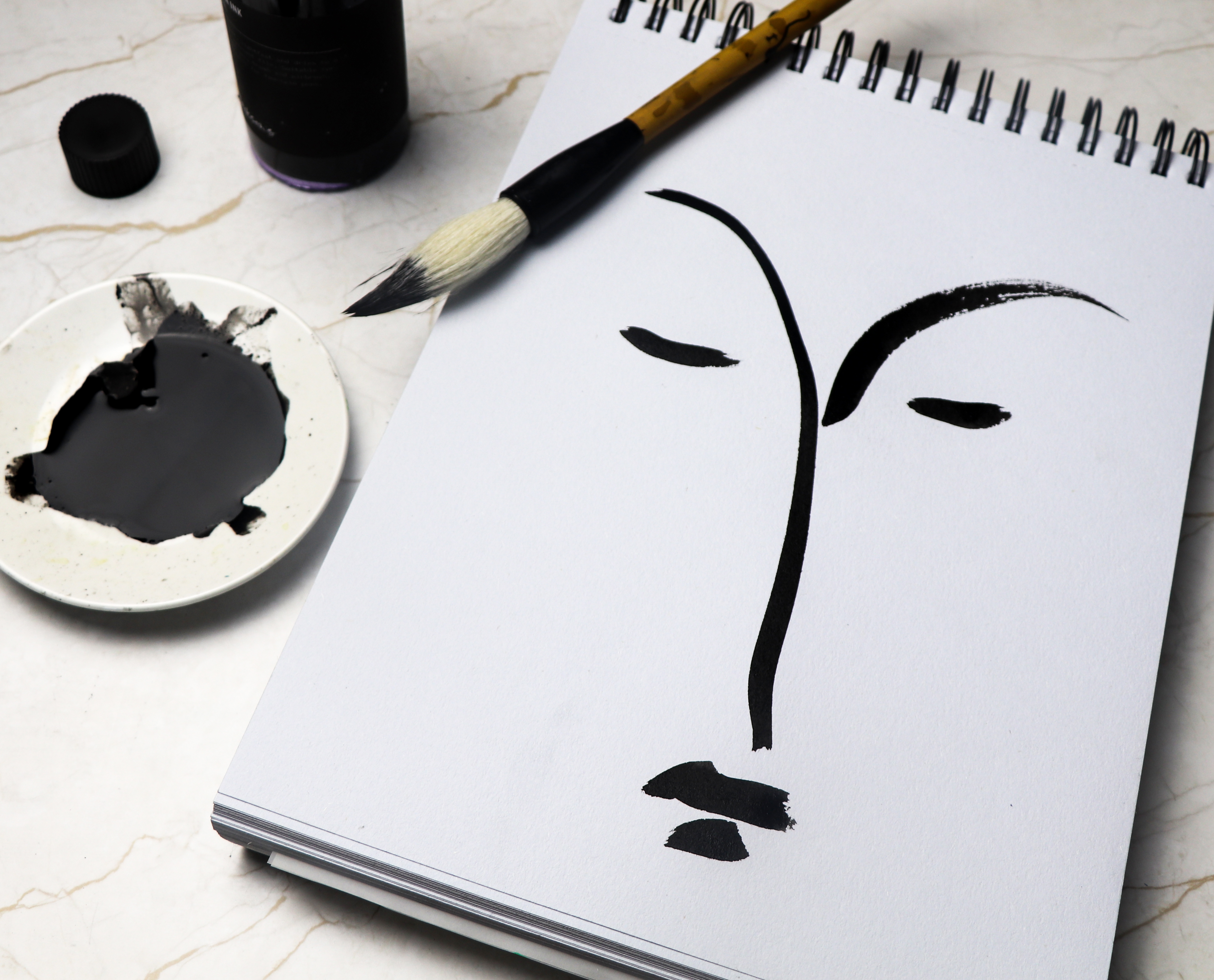
 I feel a bit indulgent creating these face drawings. I love using a Japanese calligraphy brush with this free flowing Indian ink. I really enjoy the easy curves and marks this brush makes. However I’m aware I need to develop my own style. It’s a really stage in developing new work.