My Drawing Practice
Drawing is fundamental to my art practice. It’s where I start and it’s where I have always found my peace. […]
Drawing is fundamental to my art practice. It’s where I start and it’s where I have always found my peace. […]

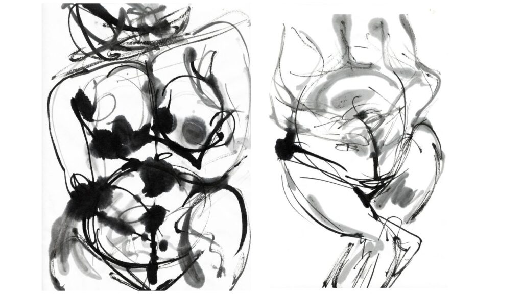
Here’s some examples of my asemic poems. Asemic writing is a is a wordless open form of writing. The

A little look back in time to my Summer 24 paintings… They are inspired by my teenage years; growing up

I’ve been recently working a series of 3D projects; on paper sculptures and some fabric and chickenwire objects. These works

I’ve just opened a solo show at Harwich Arts and Heritage Centre, where you can see new paintings and 3D

A couple of weeks ago I was honoured and delighted to be showing my Shelter paint and bubble wrap piece

I decided to arrive at Studio 459 residency with a completely open mind. I made a conscious choice not to

One of the most amazing experiences I’ve had on The Other MA is our art residency at Studio 459 in

Since May last year (yes, last year!), I’ve been part of the 2024/25 The Other MA (TOMA) cohort — and
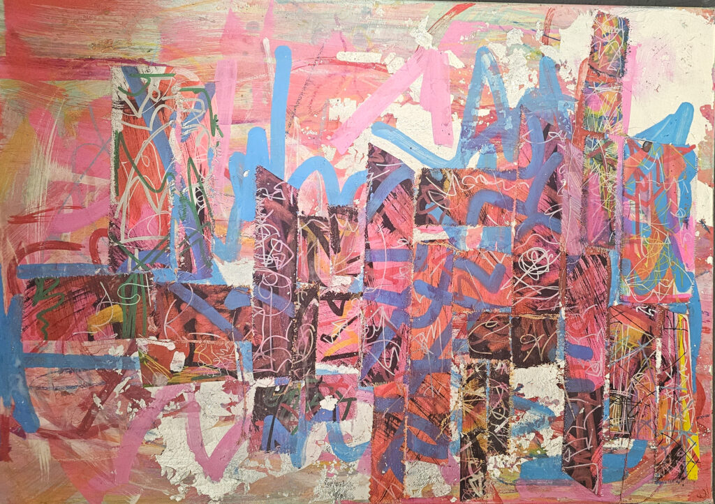
I’ve recently been playing with collage. I’m inhabiting my inner Lee Krasner who often tore old canvas work and
This month I had an art show with Wendy Fransella at Level Best Art Gallery in Colchester. I was really

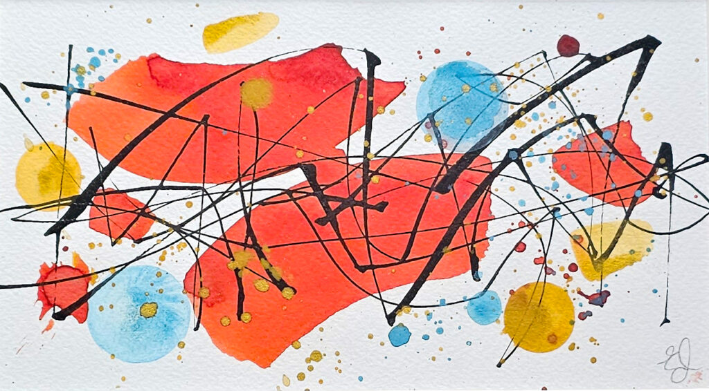
My current work is an exploration of mark making. The marks are a kind of text. Some of the pieces

It starts with playing. I have to let intuition guide me a little. If I use a square brush, I