Posted on

Wordless text and mark making

Ella Johnston, art and illustration. Photography Nathan Jones

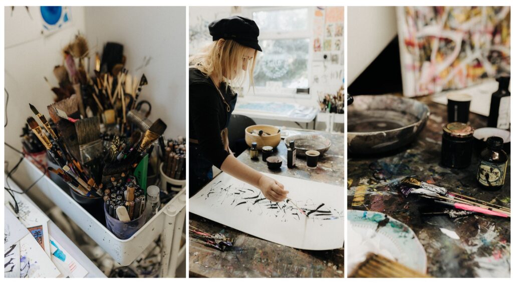
My current work is an exploration of mark making. The marks are a kind of text. Some of the pieces are specifically asemic. They are an exploration of the types of marks I make when writing.

Asemic text, Ella Johnston artist

This is actually very personal. Because of the way I held my pen when I was a kid, I was bullied by a teacher for my writing. Ever since then I’ve been strongly protective over my writing and my mark making. And it’s something that I’ve needed to explore. It’s something that I’ve had to think about from an early age – the marks I was making and how I was making them.

Asemic poem ella johnston

It’s quite a psychological thing for me. I like my writing. People comment on my handwriting. What is ‘my own hand’? What is it to play and experiment with that? Asemic poetry really interests me because it’s about making marks and enjoying these marks without actually writing a text that people can immediately read. But the visual language of handwriting can be found within my own artistic practice. I also once I had my handwriting studied by a graphologist. She noticed all the flourishes and was alarmingly accurate with her analysis. Regardless of what words you write, the marks you make give the game away. I employ all of my handwriting and gestural mark-making in the pieces.

Asemic modernity Ella Johnston


The pieces are definitely wordless texts and there’s a dialogue between the different marks. But they’re also simply about being in the moment when the artwork is created. I might have my reflections or even a particular agenda, and it’s also in some ways a projection of the future, but really it’s simply about the moment, the now, in which the artwork is made. I don’t want to impose my own narrative. The question is just about what it means to make a mark, and to make those marks on the paper.

Water Meditations Sea Glass I, ink on Awagami Factory Bamboo washi paper Ella Johnston

With different papers you get different reactions. I love the experiment of paper. The surface is as important as the ink or the paint. A cheap watercolour paper, made without bleach so it’s greyish in tone, produces a certain effect. Some papers absorb liquid too much, some resist it. A washi inkjet paper and a fine washi rice paper give different results. Some absorb the ink very quickly, some completely blot it. 

Lifeforce poem, Ella Johnston

With a very fine paper, you’ve got to be careful if you want a solid line. You’ve got to be light, like you’re barely touching the paper, because if you apply any kind of pressure or wetness, it’s going to suck it up. It’s really delicate. Or you might use a good quality, heavy paper, and they’re so dense, but they hold colour so well that you’re challenged to be decisive in the marks that you make. On some papers the black ink buckles the paper, it sits and stays shiny on it, raised in relief. Some papers can look so frail against this force of the black. You have to work with that. You’ve got to work with the ink and the paper as equally important components.

Memory of days past, Fraggle, ink on Fabriano UNICA Printmaking Paper

Posted on

Being an artist, some thoughts

art tools. Photography Nathan Jones

 Artists eh? Funny little creatures. Well some are. Some really aren’t. Anyway I was thinking about being an artist and I thought I would share some musings.

Ella Johnston, art and illustration. Photography Nathan Jones

I have no idea why I’m an artist. I don’t know whether it’s a compulsion, a habit or a passion. All I know is that I am more who I am when I’m painting or drawing, when I’m making marks or thinking about marks. 

art tools. Photography Nathan Jones

When I approach each new work, in some ways I don’t have any set thing in mind. I just kind of know I want to get to work on it. I might know I want to work with inks, or paint, or pens. Then, when I’m sat with the paper, canvas, the inks, brushes or pens, I take a bit of time. It’s almost like a sort of meditation. I take a breath, I think about the marks I want to make, and then I start. 

Ella Johnston, artist. Photography Nathan Jones

For me, I want a sense of finding some sort of peace in this chaos, or beauty out of chaos. It has to feel harmonious but have a real sense of visceral life. A lot of that is established in the first layer of black. If that’s wrong, it won’t work. 

Water Meditations Sea Glass II, Ink on Awagami-Factory Bamboo washi paper, Ella Johnston


I’m also very conscious of colour and colour density, and of what remains still against the eruption of other shapes and lines. The pieces are all very spontaneous, and yet in some ways not, too. Ink needs to dry before you add colour. One colour needs to dry before you add another. 

Of course, all the colours have connotations. A deep, vibrant red. A grey. A green. A strong, clear blue. There’s a multitude of stories associated them. You can say so much in what tone of grey you use and how it’s placed against something as visceral and solid as a black or a red.

Memory of days past, Indie, ink on Surrey Cartridge Paper, Ella Johnston

If you put a red and a yellow together, you may suddenly feel more hopeful or invigorated. Putting orangey pinks, blues and yellows together can feel joyous. Some colours give a sense of opulence. But then I might add colours that relate to mid-century design and the London housing estates I’ve lived in or buildings I’ve worked in. Colour and form can be incredibly autobiographical. There’s a whole psychology of colour.

 Brutalist Asemic III, ink on Fabriano UNICA Printmaking Paper, Ella Johnston
Brutalist Asemic III, ink on Fabriano UNICA Printmaking Paper, Ella Johnston


I have no idea what people see when they see my work, or what they think about it. I’m not in control of it and I’ve no desire to be in control of it. That’s not up to me. It’s none of my business. I wouldn’t be so grand as to think I make any particular kind of impression.

Ella Johnston art studio photography Nathan Jones

That’s why I can’t really offer any practical advice for fellow artists. And there is no real reason for me to make the work I do. There is no practical reason for anybody to make art. But when I see other people’s work that excites me, it gets my brain going. I get all itchy. And so regardless of whether people like my work or what their reaction is, it’s that as an artist, and as a community of artists around the world – musicians or visual artists or dancers or writers – we are a network of people that provide a kind of alternative universe, or a reflection, or an opposition. Our function is to unsettle, to reward, to excite, to question, to spark. And if I’m part of that, then that’s cool with me. 

Posted on

Monday Moodboard: Insects

Monday Moodboard: Insects

This Monday’s Moodboard introduces you to my new obsession… Insects!

Just as with the shells last week, this moodboard shows you that my drawing interests are moving towards more organic, smaller forms, exploring their structure and beauty.

As you can see I’m not the first artist to be inspired by these creatures. These vintage anatomical illustrations will inspire my own work and I hope to capture the iconic shapes of these little critters as well as their intricate detail.


Posted on

Monday Moodboard: Blue

Monday Moodboard Blue

After a frustrating weekend  (still trying to master videoing myself and tidying my ever messy photo studio) I needed something to give me joy so this week’s Monday Moodboard is all about BLUE! Yes, while my politics are anything but, blue makes me happy.

Of course, the colour is calming which is why I have it in our bedroom but that’s not the whole story. And far from finding it cold, which I’m told some do, I believe that if you find the right shade, blue can be intoxicatingly rich, and even cosy.

The image on top is from the artist Yves Klein’s Blue Epoch period. This exquisite ultramarine shade is known as International Klein Blue (IKB); a deep hue first mixed by the French artist. This blue is said to have its roots in art history using lapis lazuli as an influence. The finest and most expensive of pigments,  lapis has been used since antiquity due to its intense colour; it was used in the funeral mask of Tutankhamun and by Renaissance and Baroque artists for the clothing of the central figures of their paintings, especially the Virgin Mary.

Posted on

Monday moodboard: Autumn

Autumn pattern

Rich, warm and inspired by nature – this week’s moodboard is all autumn patterns and motifs.

I know we’re only in September but this change of season is very exciting for me. Autumn’s natural colour way is a source of inspiration in itself. Rich purples and reds, faded greens, soft creams and burnished bronzes make me feel warm as the colder weather creeps in. The motifs too – poppy heads, falling leaves and feathers, pine cones and woodland animals – are such rich pickings for illustrators and artists. I’ve blocked out a whole three days of drawing this week to dedicate myself to precisely these subjects… Watch this space!