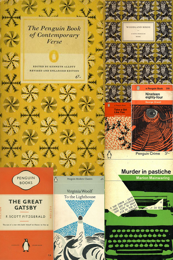
 Penguin book design has been an obsession of mine since I was a teenager when I spent an awful lot of time in libraries. Probably too much time if I’m being honest.
In those days I was continually on the hunt for new words, stories and worlds, I used to get lots of books out on spec. I read a lot of duds but I also came across a lot of good stuff too that has stayed with me.
The cover design played a very big part in my decision making process. From the classic orange cover fiction and stylish mid-century illustration to the glorious repeat patterns, it is all the stuff of wonder and as much of an inspiration as the words inside. As a consequence of this I read a lot of books published by Penguin; a great deal of classics and quite a few poetry collections. I’ve now bought a lot of the books that I borrowed and devoured during my teenage years (the ones I enjoyed at least).
As Creative Director of an indie publisher, I design all the books for Dunlin Press. So my youthful interest has become increasingly important now I’m a grown-up. When approaching the layout for each Dunlin Press book I always ask myself, “What would the Penguin designers do?”