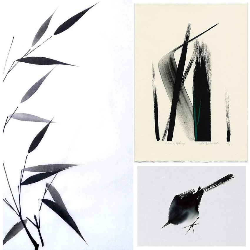
Although my art is quite intricate I actually strive for simplicity. The bravery and beauty of making a few gestural lines to shapes to convey a subject for me is an incredible achievement. It’s building up to becoming an obsession of mine, as this September moodboard illustrates.
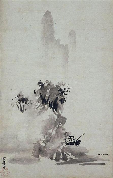
While my desire for simplicity is a long held one, it was compounded this summer by Dr James Fox’s documentary series The Art of Japanese Life where Fox featured Sesshu’s ‘splashed-ink’ landscape (see below), dating back, unbelievably, to 1495. Let me say that again, 1495!
I think this is a glorious painting. I see so much energy in it and I find it exquisite in composition and atmosphere. I’m also drawn to the simple black and white colour scheme (I would be though wouldn’t I?).

It’s also coincided with me getting some brush pens (which I used to create my new header btw), so I’ve been playing around with them try to make simple, gestural images. I find minimalism and knowing when to stop more difficult than adding clever little details and additional descriptive strokes – it’s a real challenge for me. I’m using the work of Toko Shinoda as further inspiration as well as ancient Japanese brush painting of bamboo, birds and butterflies.
What do you think of this style of painting? Do you like those simple strokes? The black and white? Or do you need a little more colour and detail? I’d love to know.
