Posted on

Level Best Art Gallery Show

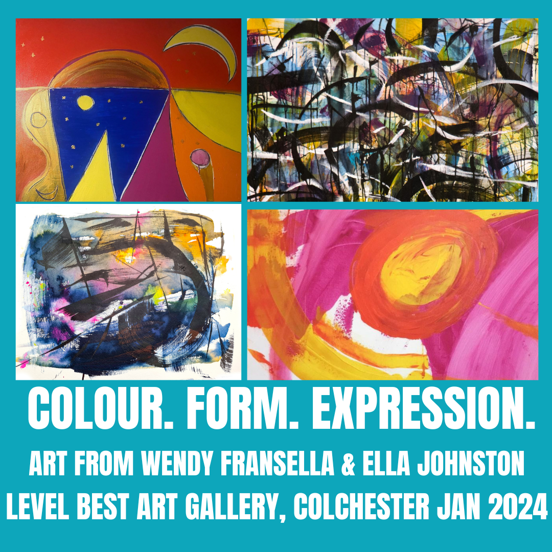
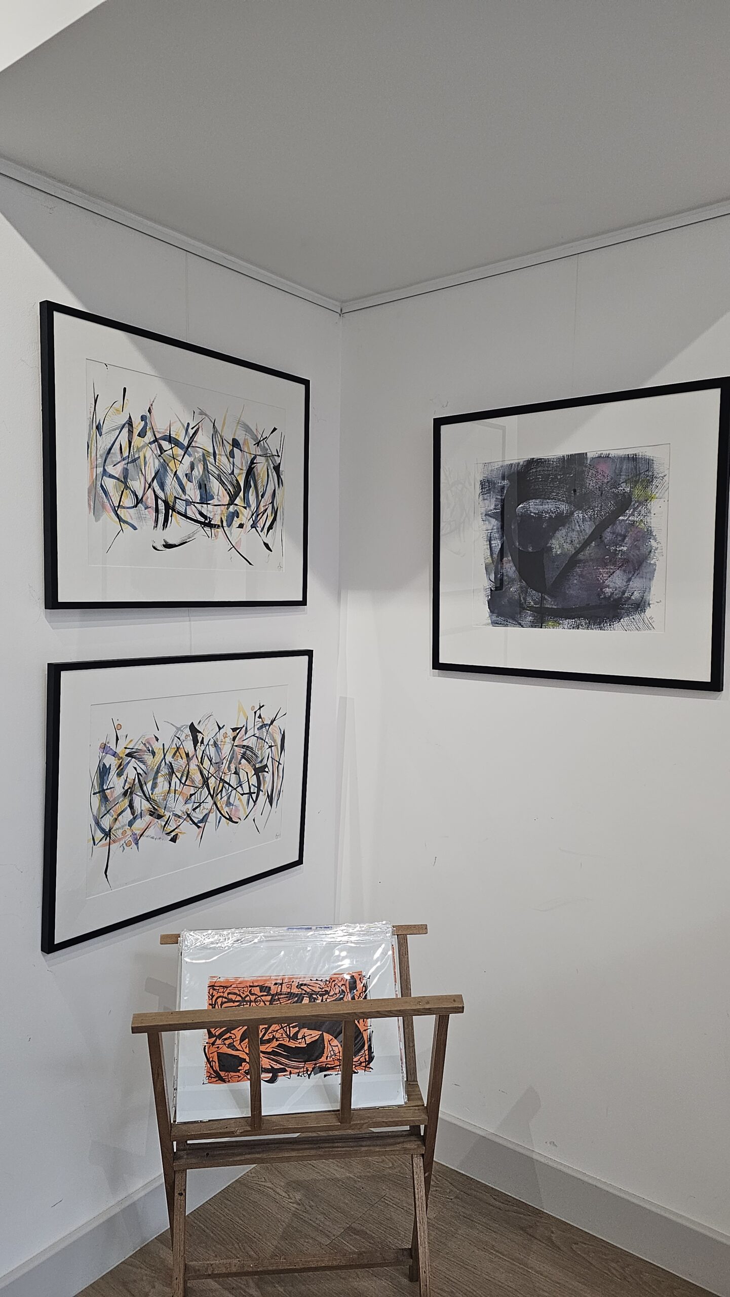
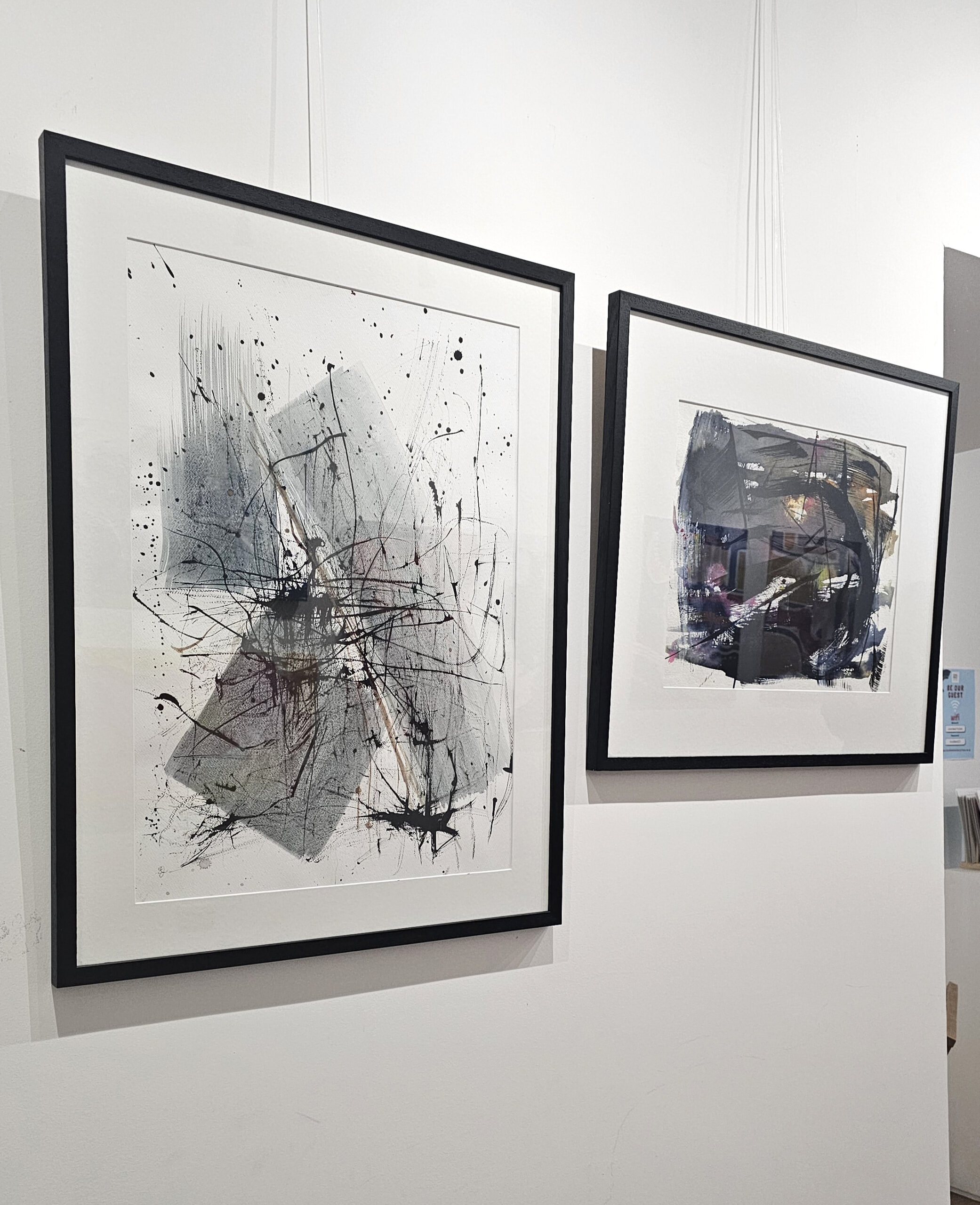
This month I had an art show with Wendy Fransella at Level Best Art Gallery in Colchester.

Colour Form Expression art gallery show Ella Johnston Wendy Fransella

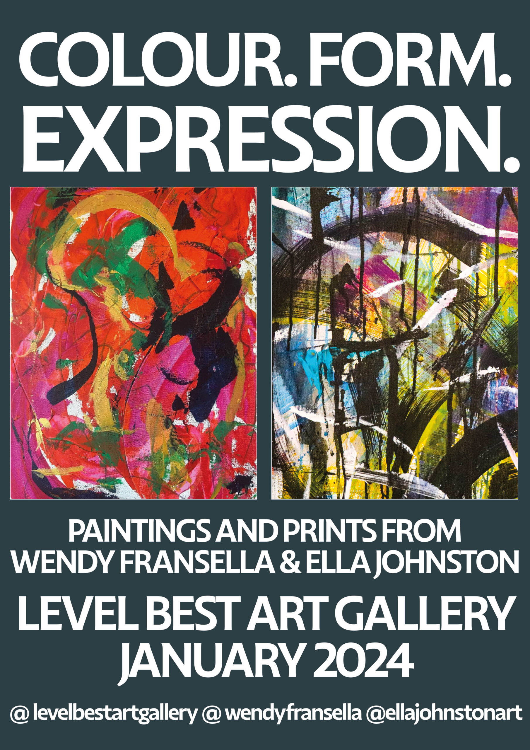
I was really pleased with the show. Level Best Art Gallery is an exquisite space and it was wonderful to see my work and Wendy’s wonderful paintings in such a beautiful setting.

Collaboration

I enjoy working with other artists and have adored Wendy’s work for a while now.

Wendy is a pleasure to work with and I felt there was a meeting of minds as well as a synergy with our art.

Our pieces really spoke to each other at the show. Our love for abstraction and mark-making was evident. While our work is different, I felt there was a harmony in the show and a conversation was being had with the pieces.

Ella Johnston paintings and drawings at the Level best art gallery show
My paintings and drawings at the show


Paintings by Wendy Fransella
Paintings by Wendy Fransella at Level Best Art Gallery.


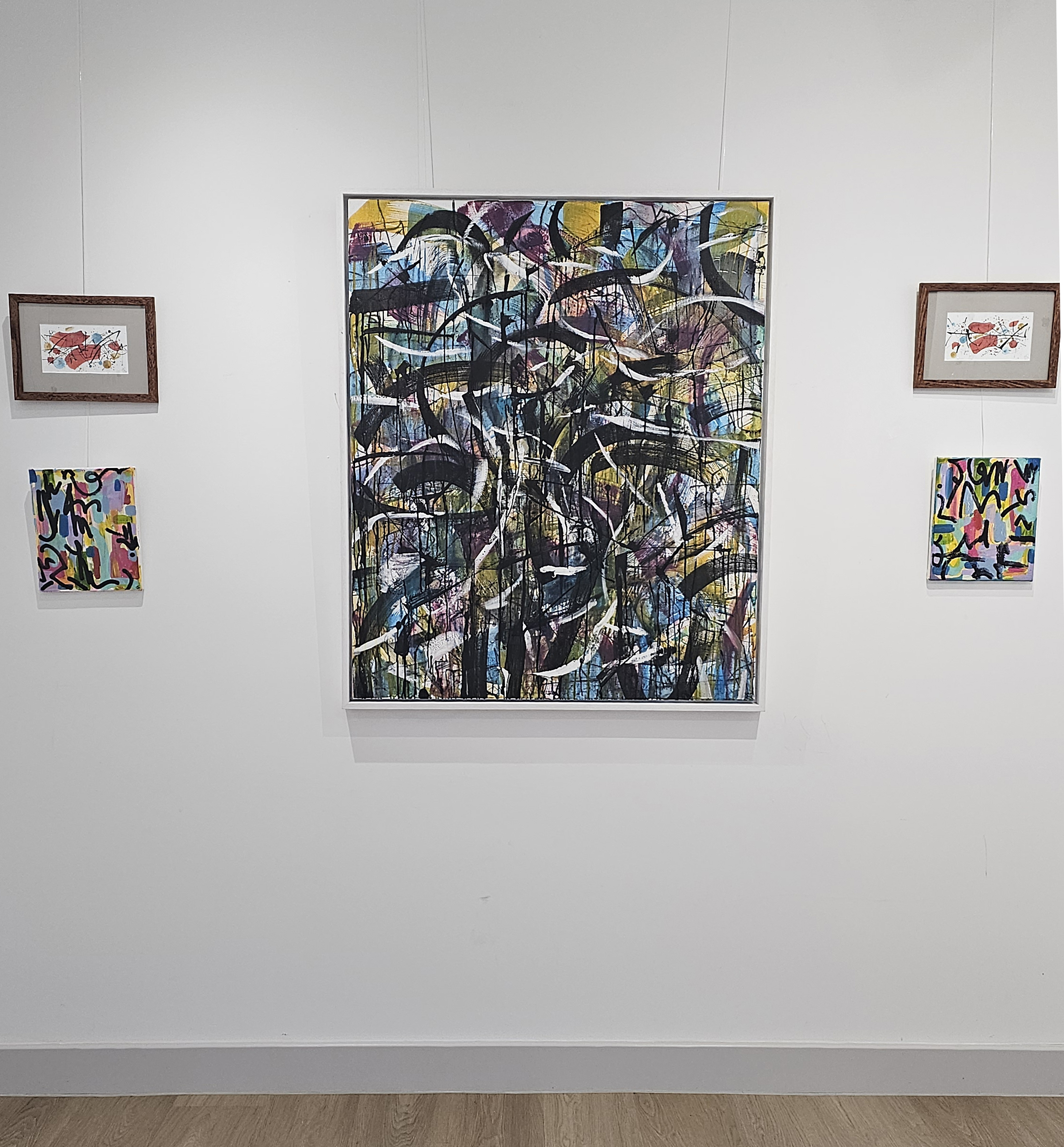
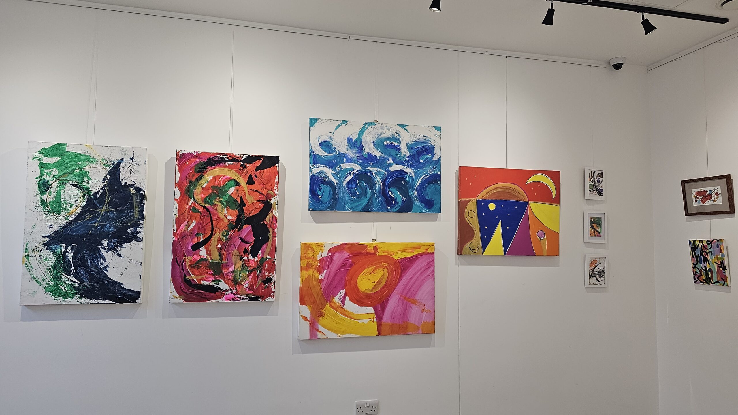
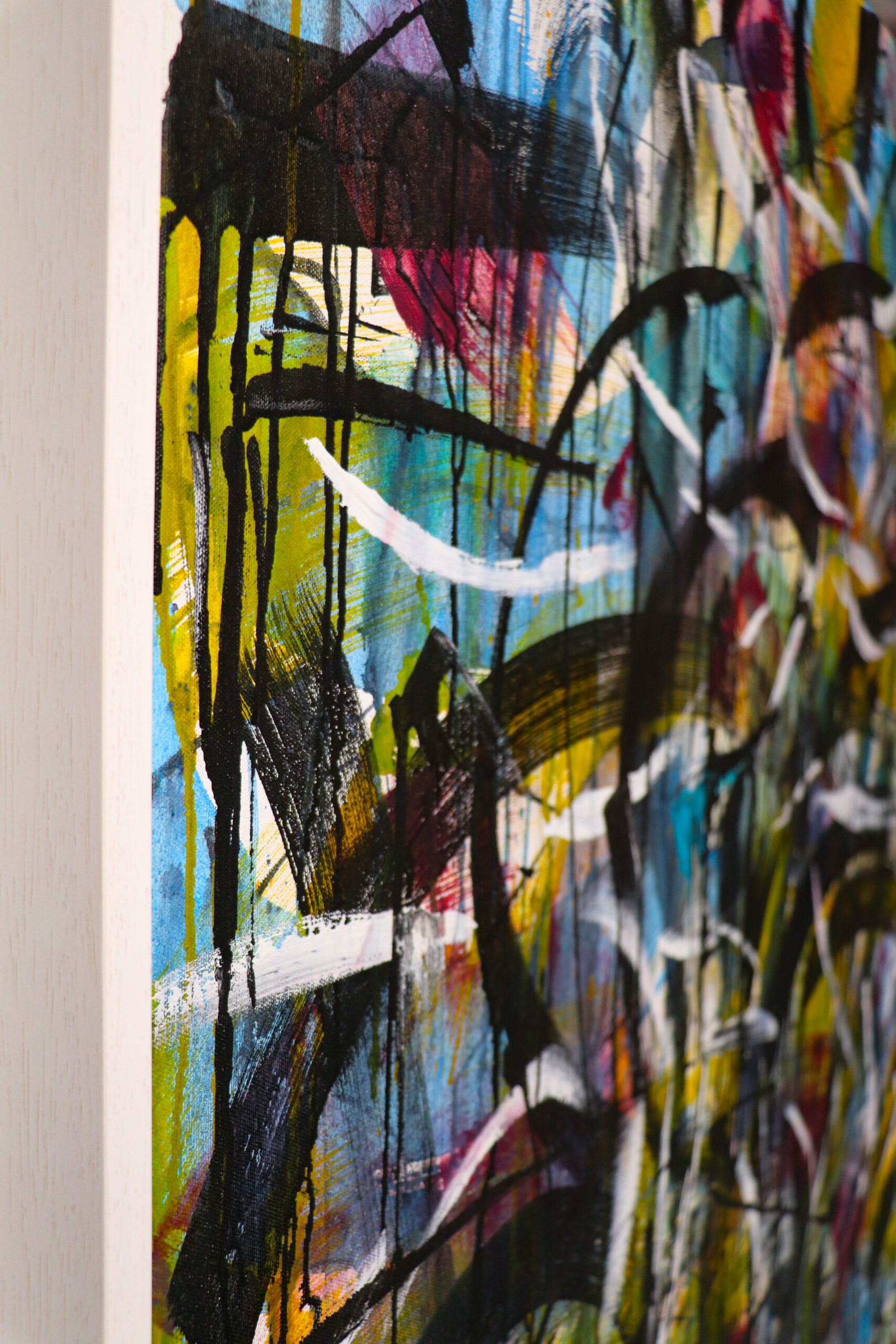
The work I chose to  display in this show is a deep exploration of mark-making, spontaneity and memory. The pieces are also a record of my interior thoughts and reflections on my own history and the lives of people that have influenced me. With this in mind I thought I’d give you my motivations and thoughts behind the individual pieces in the show.

Musical landscapes and hard remembered conversations

Musical landscapes Ella Johnston
Musical landscapes

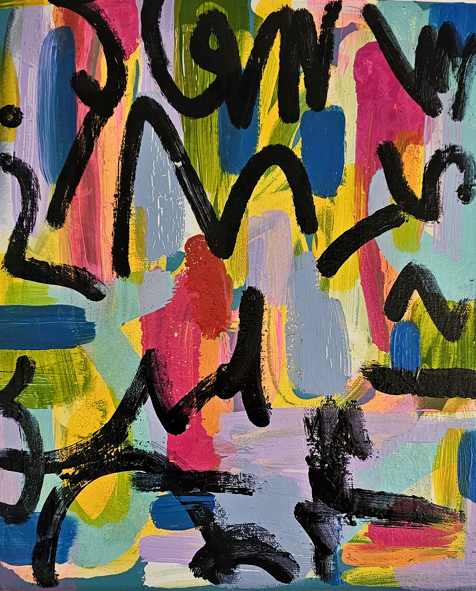
My small MUSICAL LANDSCAPES are miniature abstract music scores that reference asemic text and pay homage to the artist Victor Pasmore. 

Half remembered conversations, paint on canvas

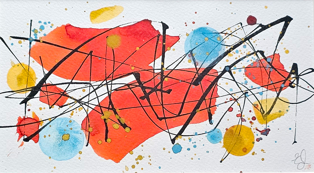
My HALF REMEMBERED CONVERSATIONS paintings further explore asemic mark-making and recall the vague dreams and plans I’ve made on hopeful sunny days.  These pieces also reference  the calligraphic line seen in graffiti and are a reference to my urban upbringing. 

Live generously

Live generously painting Ella Johnston
Live generously

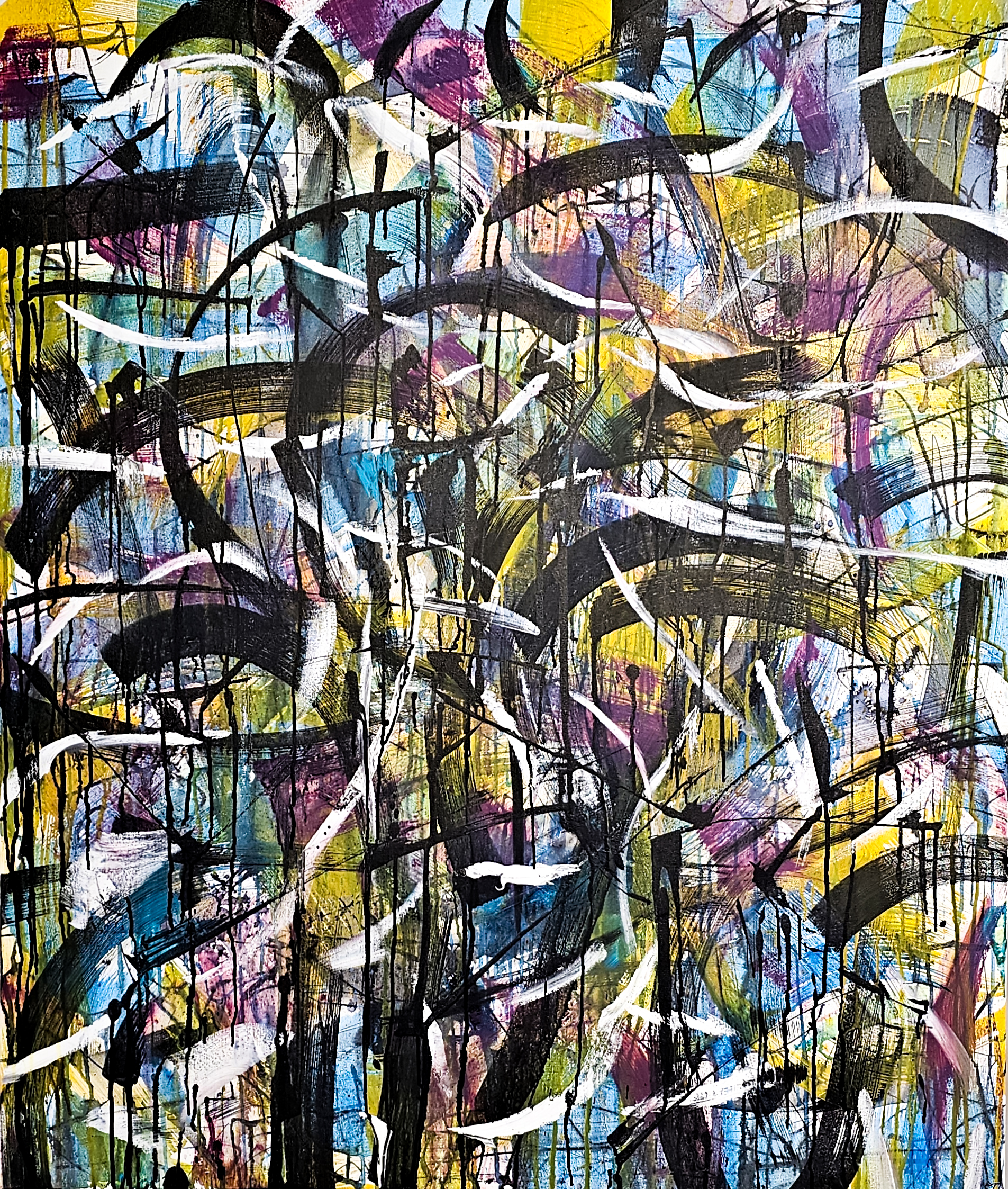
My  large-scale piece,  LIVE GENEROUSLY,  is part of a series of homage paintings that seek to pay tribute to female trailblazers. These women have defied the expectations of their families, society, prevailing narratives and/or authorities to challenge conventional thinking.  The series is a contemplation on the lives of these women.

Live generously painting by Ella Johnston
Live generously painting

The layering of colours and mediums explores the many complexities and contradictions of their lives and the people they knew, as well as the scenes and political landscape that were part of. The pieces also visually reference military fatigues and camouflage, in light of the battles these individuals have fought. 

The bats in the garden over lockdown, Centred in time and We are here now

Ella Johnston Level Best Art Gallery

I explore memory and love in THE BATS IN THE GARDEN OVER LOCKDOWN.  Created in 2023, these pieces evoke a memory of looking out of the window during the pandemic with my partner.  The brush strokes hope to evoke the sense of magic and wonder we had while watching the bats swoop for moths in the dusk. 

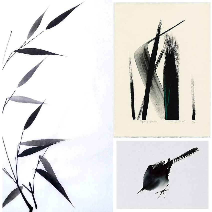
The CENTRED IN TIME  and WE ARE HERE NOW now ink on paper pieces are abstract tributes to nature and the mood evoked by a walk along a river, estuary or beach. Whatever the time of year, on any particular day, the meeting of sky, land and water can have a uniquely beautiful quality to it. 

We are here now, ink on paper Ella Johnston
We are here now, ink on paper

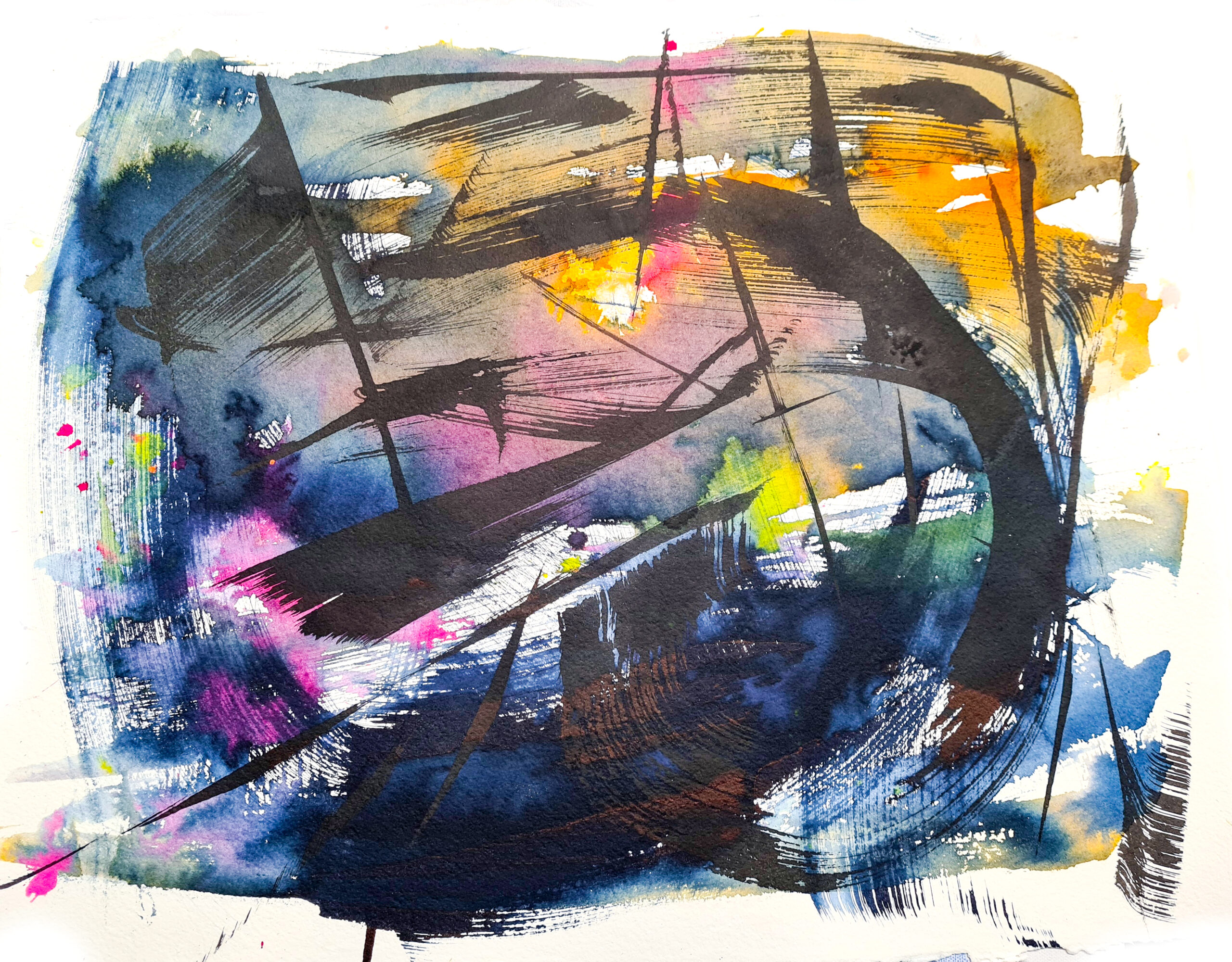
These artworks perform as palimpsests, with layer after layer of ink colour being applied to the paper, saturating the surface and merging into another. With hues of navy, pink and black it aims to conjure a sense of the magical quality of the landscape as the day turns into evening.

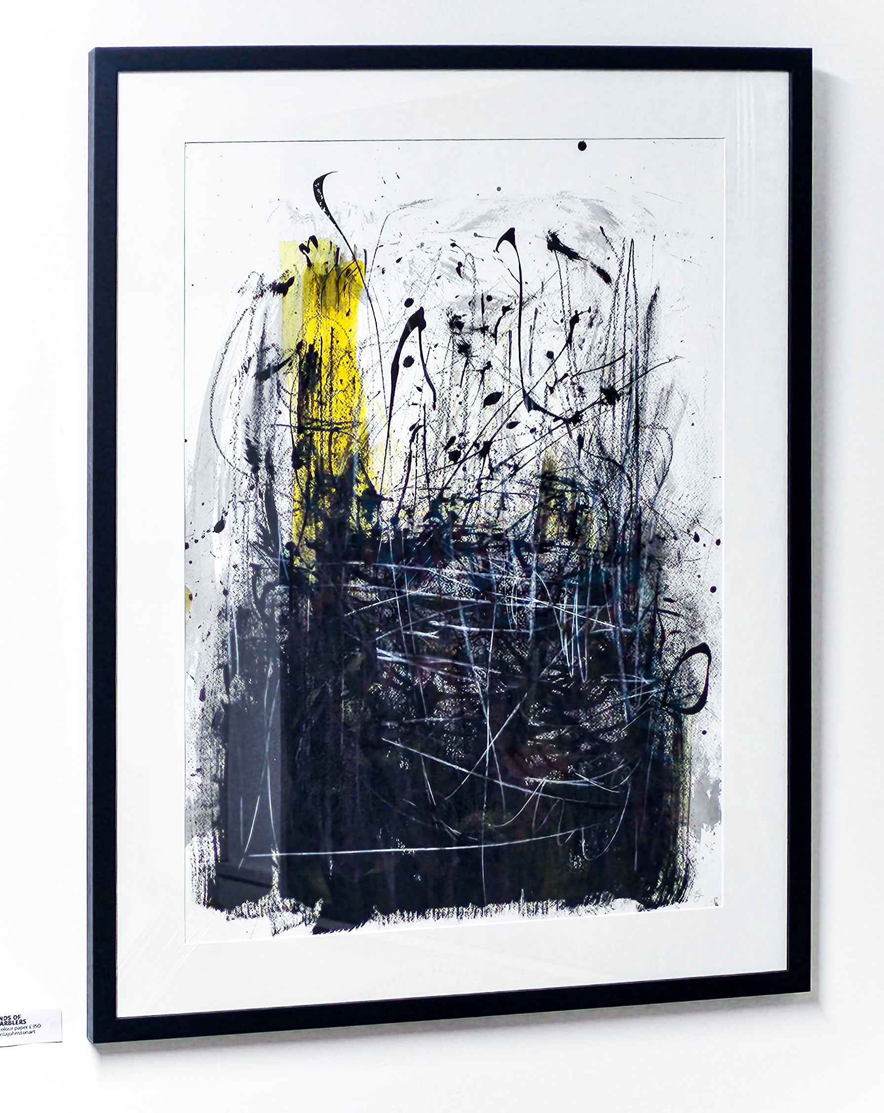
Rave sounds of the reed warblers and  I can hear the music travel

Ella Johnston Level Best Art Gallery jan 2024
I can hear the music travel and We are here now at Level Best Art Gallery 

My RAVE SOUNDS OF THE REED WARBLERS artwork  is a remembered landscape. I created it using feathers found in Wivenhoe woods and teasels gathered from the Ferry Marsh along with tin-can pens and Japanese calligraphy brushes. I wanted to capture the feeling of looking over the Ferry Marsh and being in the space. It is created purely as a memory rather than a depiction.  The hasty strokes and dynamic layering reflects the changes in movement and sound in the environment. 

Rave sounds of the reed warblers, Ella Johnston

I CAN HEAR THE MUSIC TRAVEL is another remembered landscape inspired by memories of the Ferry Marsh. I wanted to reflect the drama of environment on a stormy day. The darkness of the skies, the choppiness of the water, the violence of the wind-blown reeds are all evoked here.

Posted on

New work: Bird prints

A3 Limited Edition Wren Giclee Print (c) Ella Johnston

I’ve recently launched a whole new collection of illustrated bird prints now available on my Etsy and Folksy shops.

A3 Limited Edition Wren Giclee Print (c) Ella JohnstonI really enjoyed drawing this wren – I created it using new uni-pin sepia pigment ink pens on watercolour paper. This delicate avian illustration is then scanned and printed as a fine art print on archival paper ensuring that it will last a lifetime.A3 Limited Edition Peacock Giclee Print (c) Ella JohnstonI originally created the watercolour and ink Peacock artwork for an exhibition. The artwork showcases vivid blue, pea green and violet watercolour washes combined with shimmery golden POSCA pen washes. I then overlaid the painting with pigment ink pen.
A3 Limited Edition Peacock Giclee Print (c) Ella JohnstonMy golden plover drawing was originally created for the book The Migrant Waders, published by Dunlin Press. It was one of my favourite illustrations and I love looking at it, so I had to turn it into a print. Again this is printed on high quality archival paper so it will last a lifetime.
A4 Limited Edition Golden Plover Giclee Print (c) Ella Johnston
A4 Limited Edition Golden Plover Giclee Print (c) Ella JohnstonGolden Plover illustration work in progress (c) Ella Johnston

Posted on

Pick of the Pins: Lucy Tiffney Mural

Pick of the pins Ella Johnston
I’ve been itching to share this pick of my pins this week. Lucy Tiffney’s murals are a constant inspiration but this particular illustration created for Care UK, Oxford really impressed.

I think this example exemplifies Lucy’s illustrative style; simple, structural and striking. It communicates the essence flowing energy and lightness of the plant’s leaves contrasted with the weight of the pot. Her colour choice is always spot-on and her simple composition is one to be admired and taken note of. She has inspired me to explore some large scale work of my own.

See more of Lucy Tiffney’s work on the following channels…

Instagram: @lucytiffney

Website: lucytiffney.com

Posted on

Monthly Moodboard: October, Still Life

October Moodboard Still life

This month’s moodboard is dedicated to the still life.

A couple of weeks ago I went to see the Matisse in The Studio exhibition at the Royal Academy. Ever since then I’ve been obsessed with still life painting and photography.

The exhibition explored the objects in Matisse’s home and how they manifested themselves in his work. Strangely I’ve never really considered doing still lives myself but the exhibition really got me thinking how the pieces we have in our homes hold such a personal place in our hearts.

I genuinely don’t feel particularly materialistic but I admit that I have very deep attachments to certain vases, books and other objet so maybe recording them in my illustrative work would be an interesting process.

It got me thinking about the concept of taste and what objects and arrangements I’d select to depict and the reasons why I’d do this. Also, in the world of Instagram I see so many people doing little tableaux on the channel as a way of representing their brand maybe the still life is the modern day portrait?

Also I’ve included another great painting I’ve seen recently in the moodboard; Gluck’s Lilac and Gelder rose still life. I saw this at the Tate’s Quiet British Art show and I was blown away by its mastery and tenderness. On watching a documentary about the artist, it’s been said that Gluck’s work focused around whoever Gluck was having a relationship with at the time. This was painted around the period where Gluck was having an affair with Constance Spry so there you. Again, it illustrates what a powerful medium for social and personal commentary the still life can be. Watch this space for some watercolour and fine line still lives from me in the future.

Posted on

Monthly Moodboard: September, Simplicity

Monthly moodboard, September Simplicity

Although my art is quite intricate I actually strive for simplicity. The bravery and beauty of making a few gestural lines to shapes to convey a subject for me is an incredible achievement. It’s building up to becoming an obsession of mine, as this September moodboard illustrates.

While my desire for simplicity is a long held one, it was compounded this summer by Dr James Fox’s documentary series The Art of Japanese Life where Fox featured Sesshu’s ‘splashed-ink’ landscape (see below), dating back, unbelievably, to 1495.  Let me say that again, 1495!

I think this is a glorious painting. I see so much energy in it and I find it exquisite in composition and atmosphere. I’m also drawn to the simple black and white colour scheme (I would be though wouldn’t I?).

Sesshu's 'splashed-ink' landscape
Sesshu’s ‘splashed-ink’ landscape

It’s also coincided with me getting some brush pens (which I used to create my new header btw), so I’ve been playing around with them try to make simple, gestural images. I find minimalism and knowing when to stop more difficult than adding clever little details and additional descriptive strokes – it’s a real challenge for me. I’m using the work of Toko Shinoda as further inspiration as well as ancient Japanese brush painting of bamboo, birds and butterflies.

What do you think of this style of painting? Do you like those simple strokes? The black and white? Or do you need a little more colour and detail? I’d love to know.

Posted on

Inspiration: Flavours of Florence

20161009_141541 Wanna know why I wasn’t posting for two weeks? Well, as well as prepping for workshops I was also off finding inspiration in Florence.  I thought I’d give you some little snapshots/flavours of Florence that reignited my creativity.

I first visited Florence when I was an Art History student at the University of Essex. It was actually a compulsory part of the degree course (in those free education, pre-fee days) and it was a real eye opener for me academically and artistically.
20161012_133330The above image is of San Spirito – inside is a triumph of architecture, every time I visit I’m in awe of its almost minimalist elegance. I also love the fact that the church is unadorned on the outside, simply beautiful inside and out.
20161009_141048 20161009_141419 Touristy as it sounds I love the cathederal (Santa Maria del Fiore above) square with the bell tower, the Duomo etc. Although the facade is a bit bling I adore the sparkly marble and the ostentatious pomp of it although I’m sure the purists would disagree. To me the buildings seem to gleam in any weather.
20161014_105750 The place that most inspired me on my initial visit was the Laurentian Library (Biblioteca Medicea Laurenziana) planned and built by Michelangelo. It was my mission this time to show Dr B. The library has been a source of inspiration for artists such as Rothko and film maker Orson Wells. It truly is break taking and iconic. The entrance I believe is ahead of its time, I genuinely think it’s the foundation of minimalism and Michelangelo’s finest work. My visit this year didn’t disappoint, it was more breath-taking than I remember.
20161014_105921 Oh and don’t you love the floor in the library?
20161014_111329 I also saw a new thing in Florence this visit (well a new old thing). The Brancacci Chapel was being restored when I visited originally and for some reason we didn’t make it there on my second visit so this was third time lucky. All I’m saying is I had a little cry when finally faced with it after spending uni lectures and reading so many books on it. Nothing could compare with actually experiencing it and at such close proximity too. 20161012_135822 The Brancacci Chapel is actually painted by three artists, originally Masolino and Masaccio then completed by Filiippino Lippi. This journey through the Renaissance painting was just what I needed to reinvigorate my art practice. Although my work isn’t obviously this kinda style, the whole visit, the architecture, the paintings, the stories behind every commission and fresco has spurred me on to explore some themes further and keep pushing.  20161012_135811

Posted on

Monday Moodboard: Folk patterns

Monday Moodboard Folk pattern

Joyous, colourful and breathtakingly beautiful, my folk art moodboard is perfect for brightening up this grey Monday afternoon. .

Marks, patterns and painting made by ordinary people is a constant inspiration for me. The simple shapes, harmonious composition, strong colour combinations and celebration of birds, flowers and animal life in folk art are timelessly popular in interior design and illustration.  I’ve used them as a spring board for some of the work I created for my Christmas Posca pen workshops and Christmas wrap designs – look out for those next week.

Posted on

Monday Moodboard: Metallics

Monday moodboard: Metallics Ella Johnston ellasplace.co.uk

Every single interiors retail show I visited over the summer this year featured metallics, particularly copper, that’s why it’s this week’s Monday Moodboard.

Fans of simplicity take note. You don’t have to be full-on bling to embrace a bit of metallic joy in your life (although don’t mind a bit of bling sometimes). Metallics can achieve a dramatic, opulent look but you can also use metallics to add warmth and texture to things as I hope I’ve shown here.

Metallic touches can be subtle, chic and classy I promise; underlaid under shabby chic furniture, incorporated into abstract-impressionist inspired painting, a subtle accent onto painted pebbles, gorgeous vintage bakewares even to brighten up a simply-shaped cake – it’s not all about blinding people with glamour and sparkle.

Posted on

Creative ways with watercolour… birds

Watercolour by Ella Johnston

I’m treating you to a sneaky preview of some illustrations I’m working on at the moment. They are not finished by any stretch but I thought you may be interested in seeing them in their ‘raw’ state.

I’ve been trying out some creative ways of adding texture and colour to my avian drawings with watercolour paints for some time now. I feel that this painterly method creates further interest and depth when illustrating the individual bird’s plumage than a line drawing. I also think it imbues a sense of vitality and movement in the composition. It’s also really simple to achieve.

Watercolour by Ella Johnston

My illustrations are made on non-textured watercolour paper – it has a lovely quality that absorbs water and ink really well. I first draw a light sketch of my subject in pencil, loosely highlighting key areas in pencil. Then I apply layer of watercolour washes to the illustration. Each layer is very watered down and I like to build up the colours gradually – this gives me more interesting colour combinations and a pleasing overall texture. Once I’m happy with the colour, I leave this to dry before applying a detailed ink drawing over the top.

Watercolour by Ella Johnston

You’ll be able to see the finished drawings in a book of wading birds published by Dunlin Press next year.

Watercolour by Ella Johnston