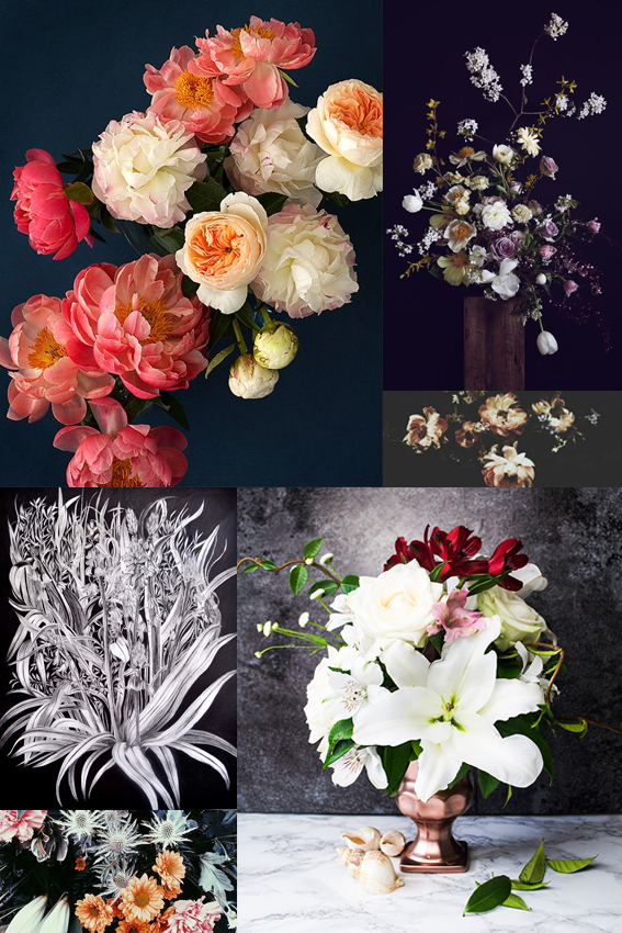
I’m very excited about the up-coming trend for moody botanicals. The contrast of soft peach, pink, white and cream tones on shades of navy, purple and grey is so effective. The overall look feels so romantic and dreamy. While it celebrates beautiful botanics, the style also gives more than a little nod to art history, evoking Rococo and Dutch flower painting themes. This trend will be everywhere later in the year and in 2017. It’s certainly inspired me to take a trip to the Wallace Collection for a little bit of research. I’ve already started to create some pieces with this theme in mind, with varying degrees of success, once I’ve nailed it I’ll let you know.
Tag: contrast
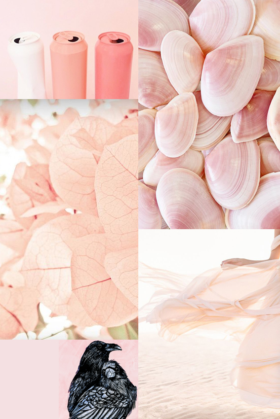
Moodboard Monday: Blush
 As an avid pinner I’ve been struck by just how many images I’ve seen this past year featuring photography, illustration and fashion pieces showcasing a range of blush pink shades.
The hues look great on their own and teamed with light colours. It also works incredibly well when contrasted with darker green or grey shades as well as more vibrant rosy pigments.
It’s been hugely inspiring for me in creating new stationery collections and prints. By replacing my usual white backdrop with soft, gentle blushes it has really warmed up some of my pink flamingo pinks and patterns (I’ll be showing you them soon). I’ve also used it as a background for my more dramatic drawings such as my raven couple piece that you can see on my moodboard.
I’m looking forward to playing with these shades a bit more, not only with my artistic work but also exploring options for adding depth to accent walls as well as seeing how I can incorporate a bit of blush with my home accessories.
