Posted on

Cheap and Easy Decoration Tips: Colourful Amy Butler display

Neon frames: Ami Butler display ellasplace.co.uk

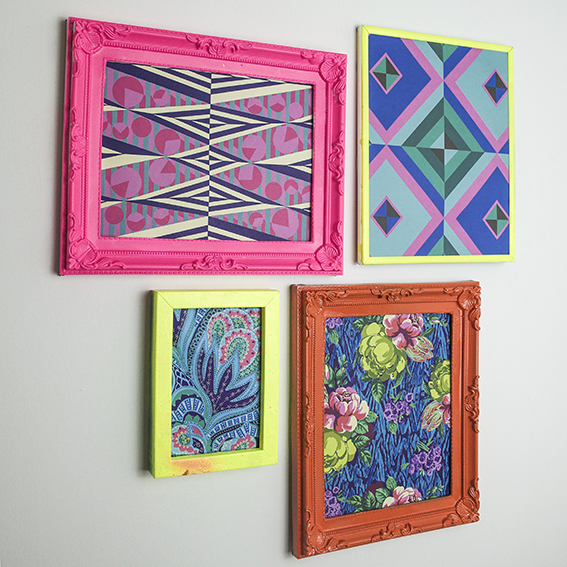
One of my favourite cheap and easy decoration tips is to create a colourful wall display. Here I’ve hung some Amy Butler prints in neon frames.

Bright and eclectic, Amy Butler’s designs are so joyous. Butler gets inspiration from a range of sources, using patterns and colour combinations inspired by her travels around the world.
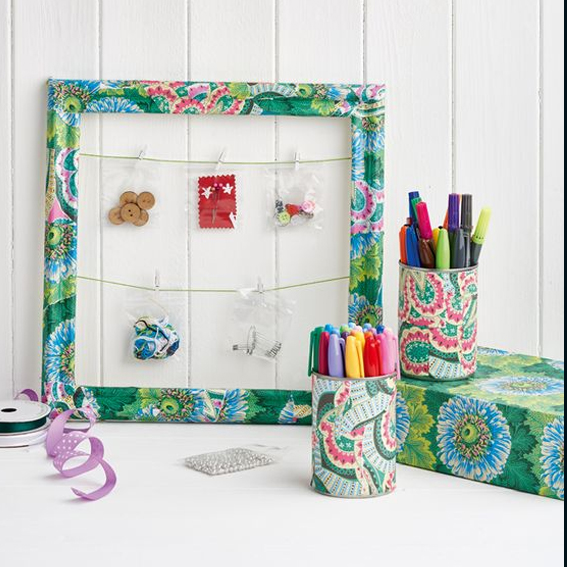
Amy Butler decoupage
Image: Cliqq Photography

I’ve got loads of her fabrics and I was very excited when she released a book of her designs on paper, Amy Butler Decoupage. I’ve used the papers on many of my projects (including this one above for Homemaker Magazine). The book only costs around £11 and you get 80 colourful sheets making it fantastic value. I had a few sheets left and I’ve always felt a bit guilty about ripping them up for decoupage and wanted to show them off properly as a wall display.
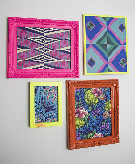
Neon frames: Ami Butler display ellasplace.co.uk Luckily I have a collection of old frames gathered over the years and picked up at car boots (I think it’s another obsession of mine) and luckier still I’ve got a whole box full of spray paint in various colours (including some fab neons) to co-ordinate with the prints.  They really brighten up a dark corner and would look really fun as a grid with matching frames to fill a wall.
 

Posted on

How to Rock Your Collections: Group them

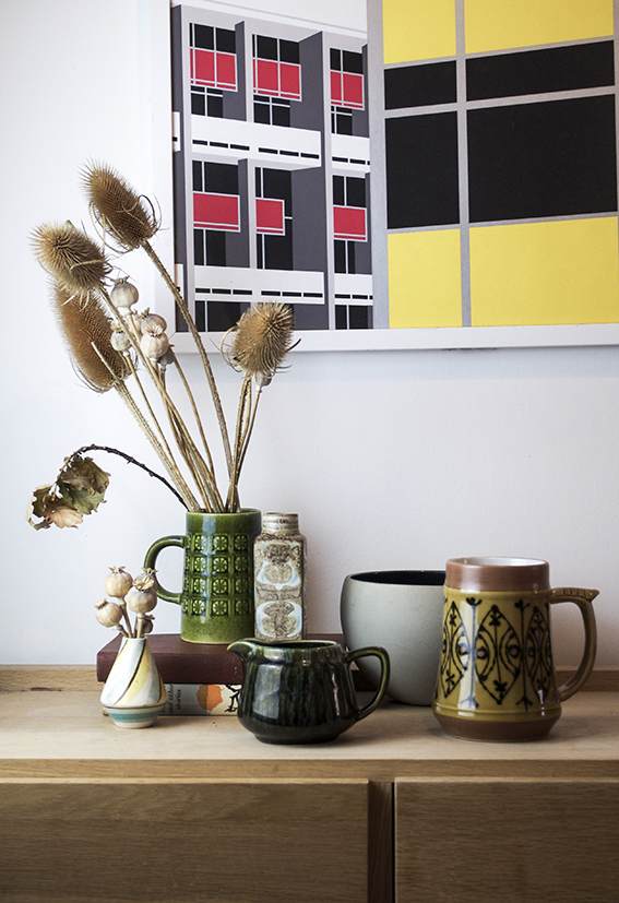
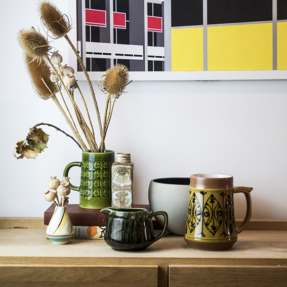
Vintage Pottery Vignette ellasplace.co.uk One of something won’t do for me and I admit it’s a bit of problem.  The thing is, once a nice bit of design catches my eye, be it a print by a particular artist, a ceramic from a certain period or just an object that makes me smile, I can’t fail to be attracted to more examples of that ‘thing’. Which means I have a number of collections.
Vintage Pottery Vignette ellasplace.co.uk I’ve found the best way to manage my little obsessions is to group some of the similarly sized objects together to create little mini still lives.  They are a really effective way to make your pieces look more coherent, emphasise the qualities and idiosyncrasies of those objects and get people talking about them. I first did this with thrift shop buys, teaming them with classic pieces I already had that I was displaying in my hallway.
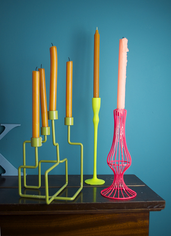
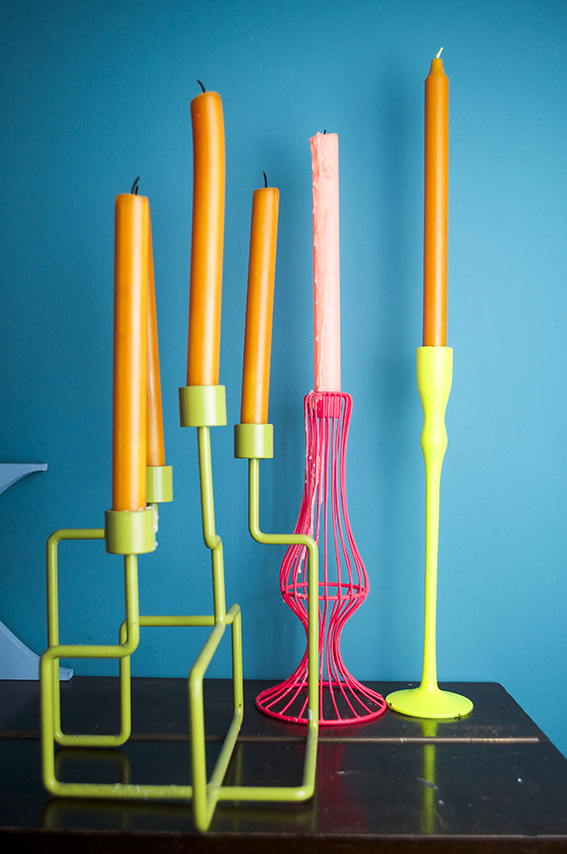
Neon candle vignette ellasplace.co.ukI fell for last year’s neon trend rather hard so I’ve placed my brightly coloured candle sticks on top of the piano in the dining room (well it’s my modern day take on the candelabra). They look great set against my teal-coloured wall (Lido from Mini Moderns if you’re interested). I made sure to buy clashing candles to sit in them for the ultimate vibrant colour pop. These orange ones really pack a punch.
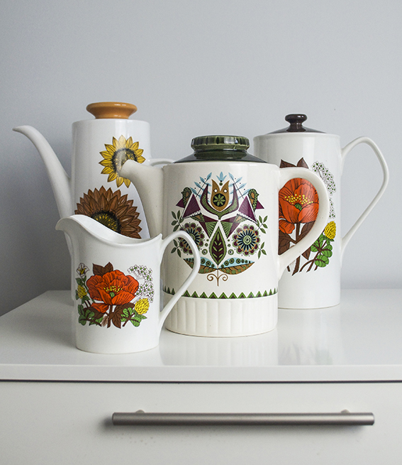
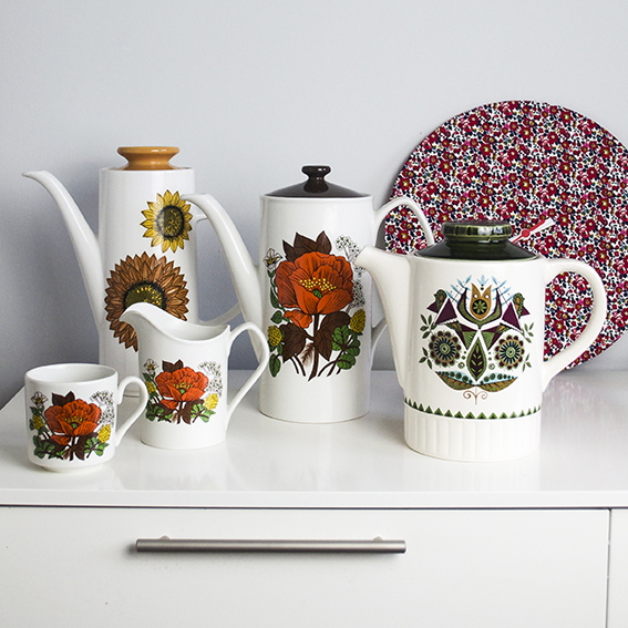
Neon candle vignette ellasplace.co.uk When me and Dr B moved into our Wivenhoe house, my sister Lucy bought us some cute vintage cups and saucers as a house-warming present. A couple of weeks later I was in a local antiques shop and saw a teapot and jug to match – it was destiny, so I needed them to be reunited. Then I spotted another two teapots of a similar ilk and I thought “in for a penny”.
Vintage Teapots Vignette ellasplace.co.uk At first Dr B rolled his eyes at my purchase but once artfully arranged on our white shiny sideboard in our dining room, it gave what can be quite a clinical surface a quirky homespun finish that we were both impressed with.
Vintage Teapots Vignette ellasplace.co.uk So if you’ve got some pieces that are dotted around the place why not bring them together and see how they look.