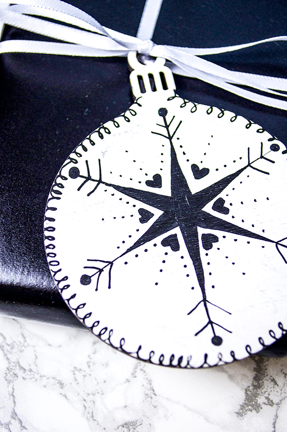
 It’s day two of my week of Christmas wrap ideas. This time I’ve gone for a stylish, yet playful Scandi-style as seen in my Scandi Lodge trend ideas with illustrated mdf bauble shaped tags.
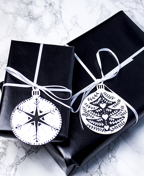 Using my Scandi-style Christmas moodboard and my pinterest pins as inspiration I painted the shapes with white acrylic paint and used black Posca pens to apply the designs.
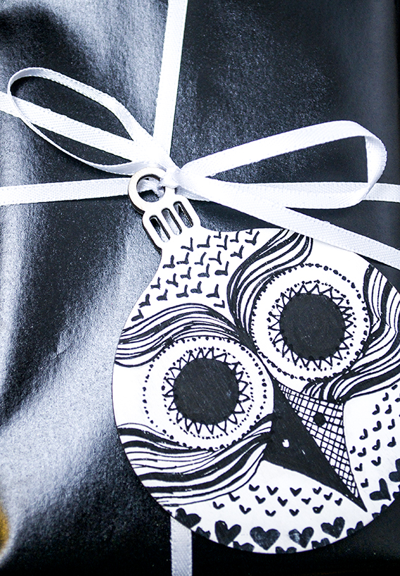
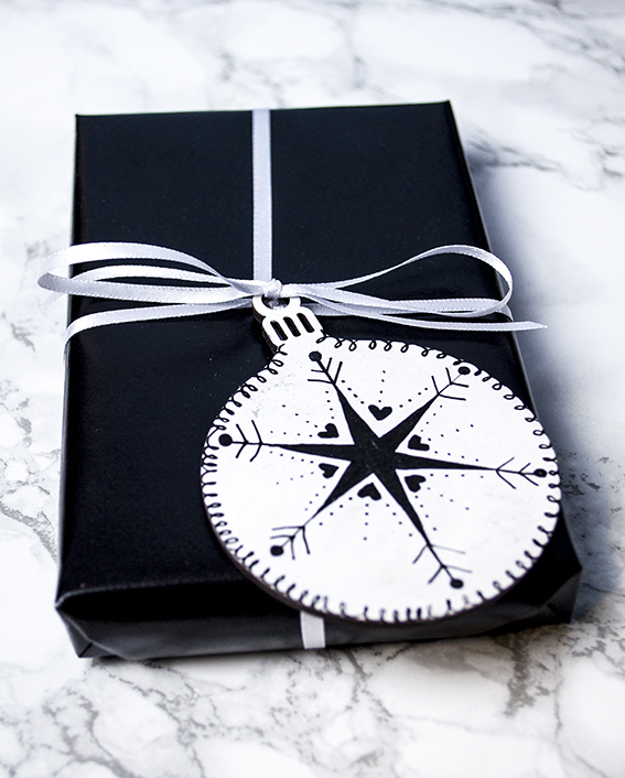 I kept the drawings fairly simple with basic star/snowflake shapes, squiggles, hearts, dots and scallops. Because the illustrated baubles create such an impact I kept the wrap itself very simple using shiny black paper with black or white 5mm and 10mm satin ribbon.
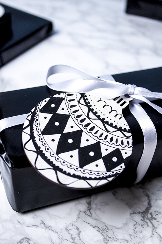
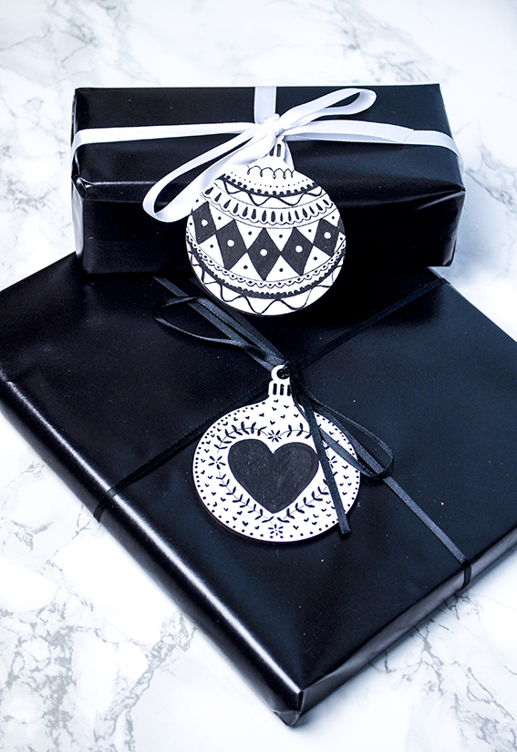 One of the easiest Scandi-style motifs I like to create is my simple laurel stem illustration that you can see above on the heart and the Christmas tree designs. It’s very, very easy to recreate as these step by steps show.
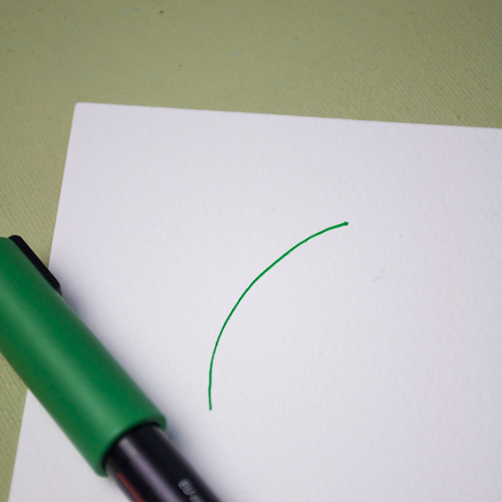 Step 1: Draw a simple line, it can be curved or straight, although I prefer mine to be a little jaunty.
 Step 2: Make little semi-circle shapes along the line as shown.
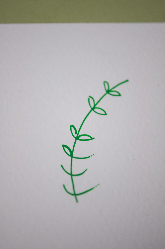 Step 3: Join the tops of the semi-circle to the central line to create leaves.
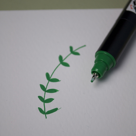 Step 4: Colour in the leaves.
Tag: wrapping
Moodboard: Scandi-style Christmas
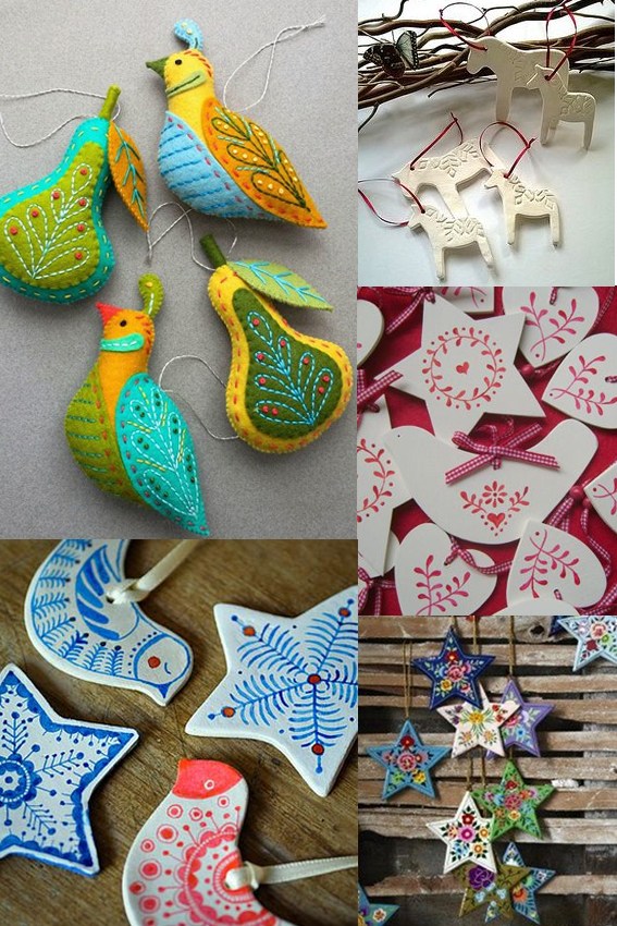 My posts have been sporadic of late because I have been having the busiest time sending out Christmas orders and selling my ways in various Christmas markets. It’s been fun but boy has it been full-on.
Anyway, my festive mood, and indeed this Monday Moodboard, is in total full flow now working on a set of Scandi-style designs and illustrations for Christmas demos for Posca pens and for my Christmas wrapping. I’ll reveal more of this later in the week but in the mean time enjoy some of the patterns and imagery that has been inspiring me.
It’s time… Get set for Christmas!
It’s mid November so I feel it’s a respectable time to start getting set for Christmas. I thought I’d just do a really image-led post featuring some key festive looks that I like for home, gifting and decoration.
Retro shimmer
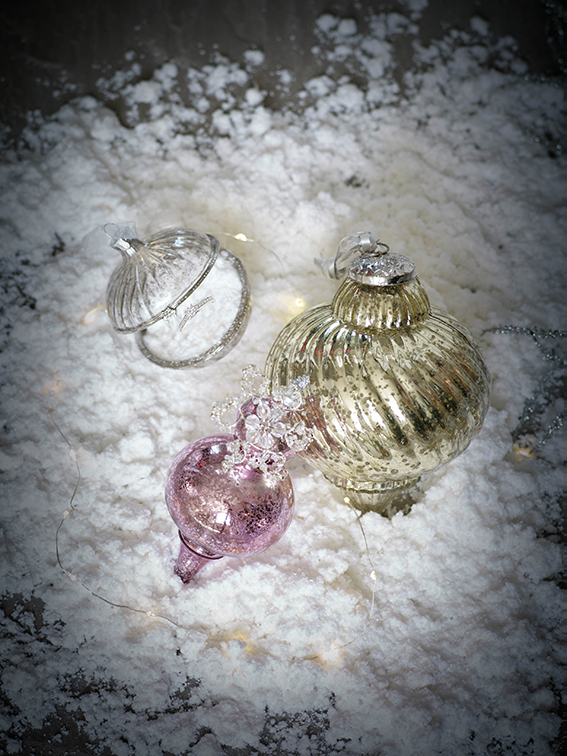
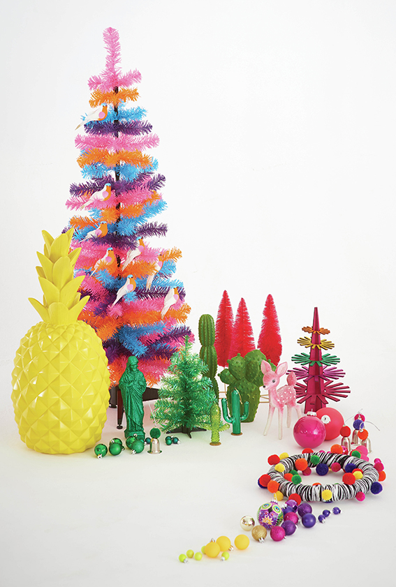
This look brings out the little girl in me. I would imagine the six year old me would have loved a shimmery, glittery tree in pinks, golds, turquoises, silvers and purples. When I was that age, the shinier the better and, while I try to be a grown up, this look still shouts “Christmas” to me.
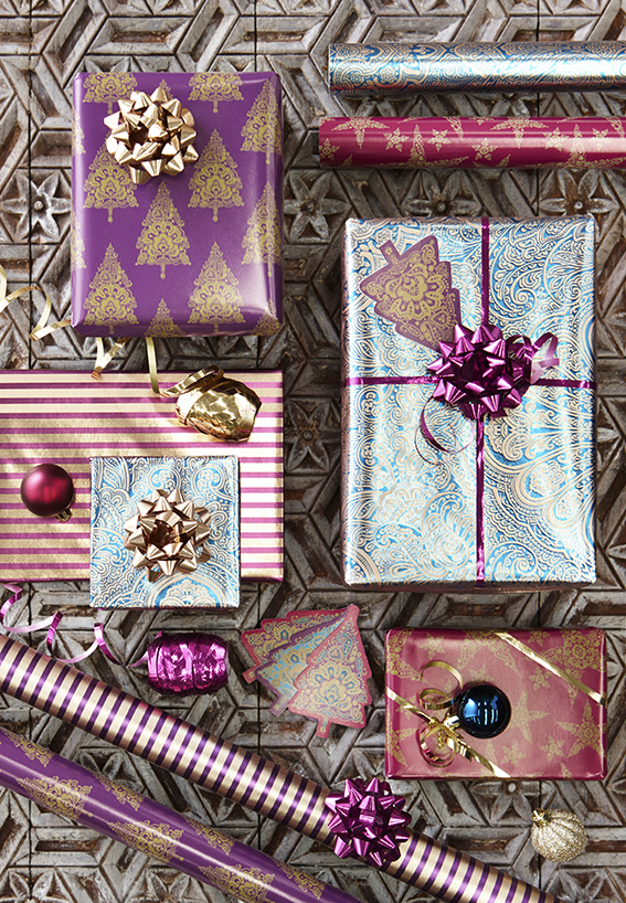
Kiddie Christmas
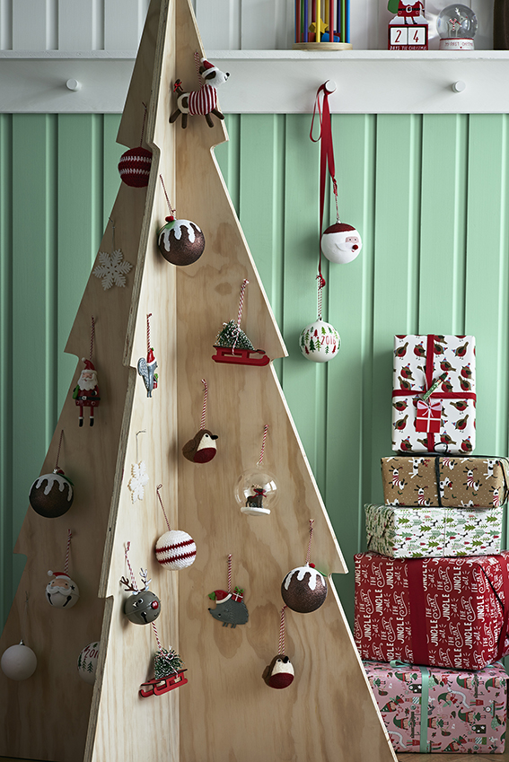
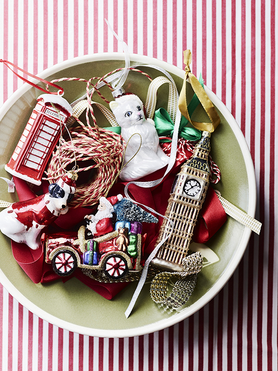
Now it if was up to Dr B, this is what Christmas would look like at our place.
When it comes to wrapping, I go classy with kraft paper and twine or black/white iridescent wrap with contrasting ribbon and tags, Dr B goes all out with robins, trees, snowmen, santas and Christmas puds. His go-to colours are red, green and white because it is “proper”. He likes the fun of this look, the playfulness and, like my retro shimmer look, it reminds him of childhood. I like it too but I’m not sure if it would suit my gaff.
Totes trad
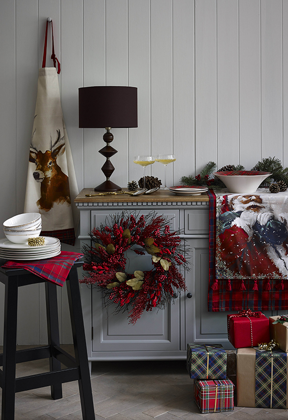
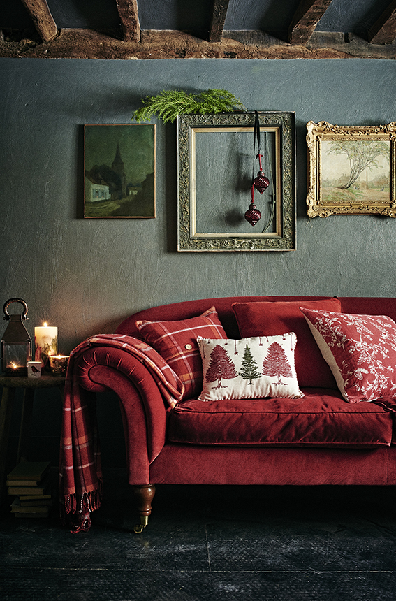
Love this. The sumptuous textures teamed with the plaid, plus the traditional motifs and colour ways combined with twinkly lights and little finishes such as berry and fir wreaths and centre pieces create a warm, cosy feel that immediately references this time of year.
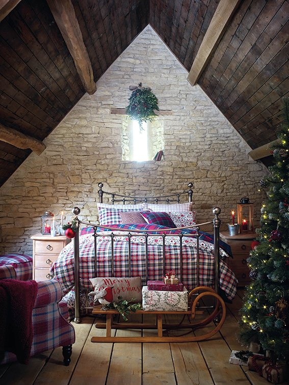
The totes trad look feels both festive and grown up. You kinda feel Christmassy as soon as you see it and just looking at these pictures makes me want to reach for the hot chocolate and my slippers.
Light luxe
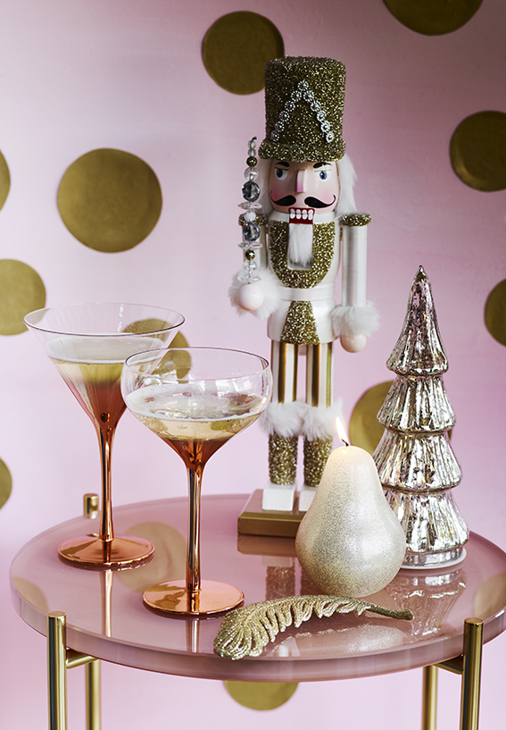
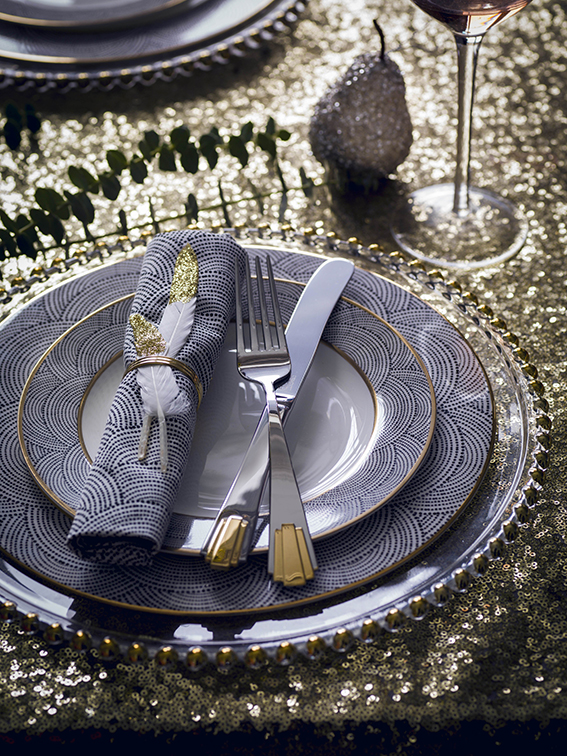
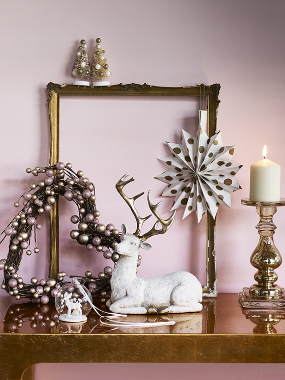
This metallic style is a kind of grown up version of the retro shimmer look.
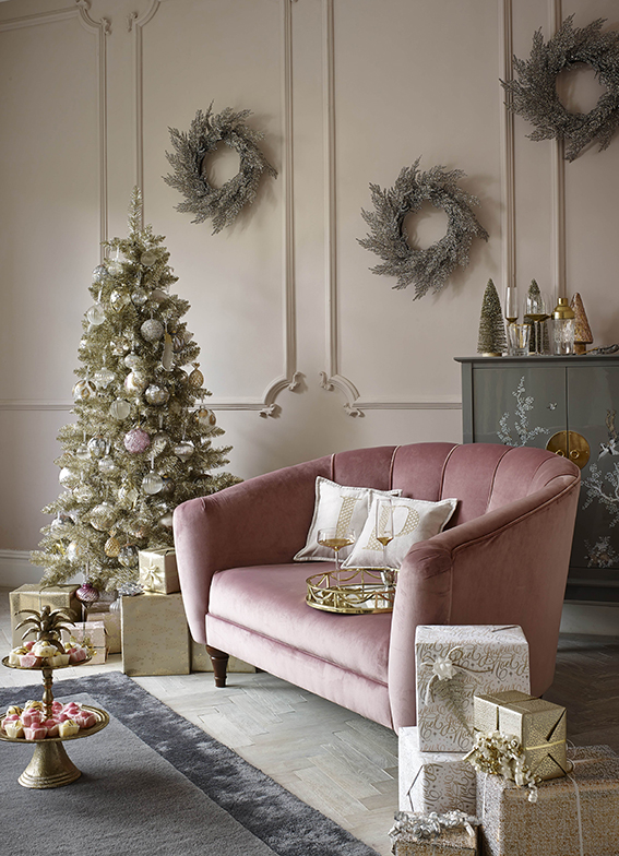
I like the way you can be playful with this look – you can do glitter, you can adorn gifts and decorations with baubles and frosting – but the overall effect is quite chic. I love the art deco references of this and think it really comes together through the coordinating colour way of pinks, navies, silvers and gold/bronze metallics.
Frosted
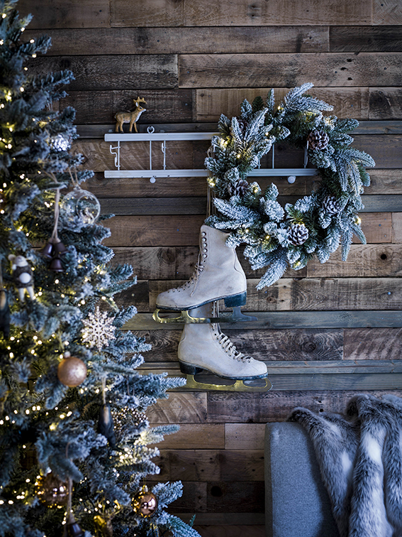
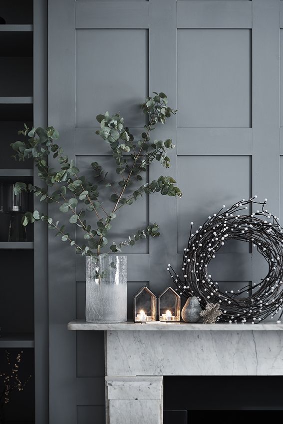
You can do two versions of the frosted Christmas – the one above (trad touches, cosy finishes etc) or the one below (minimal styling, subtle references). Whatever your style the look shares the same cool colour suite teamed with pretty metallic accents and snowflake and wreath motifs.
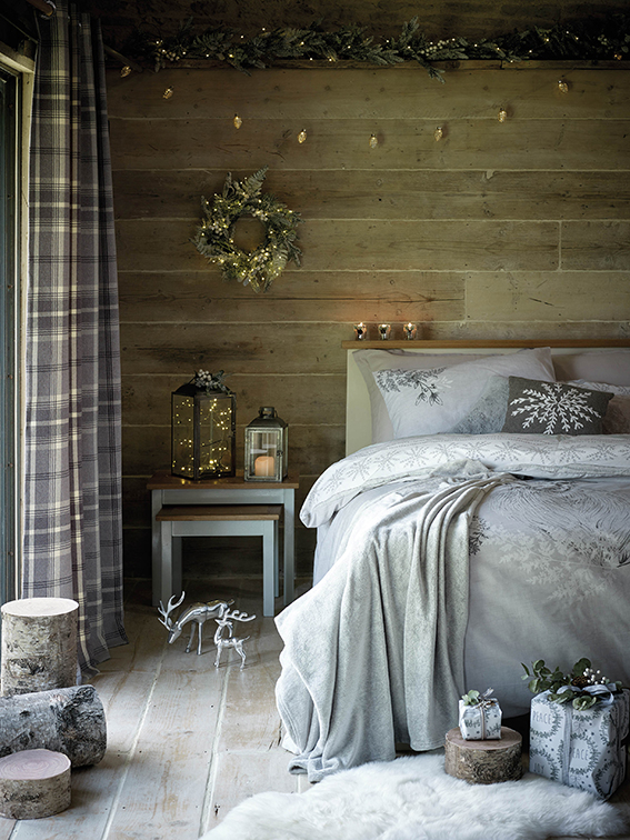
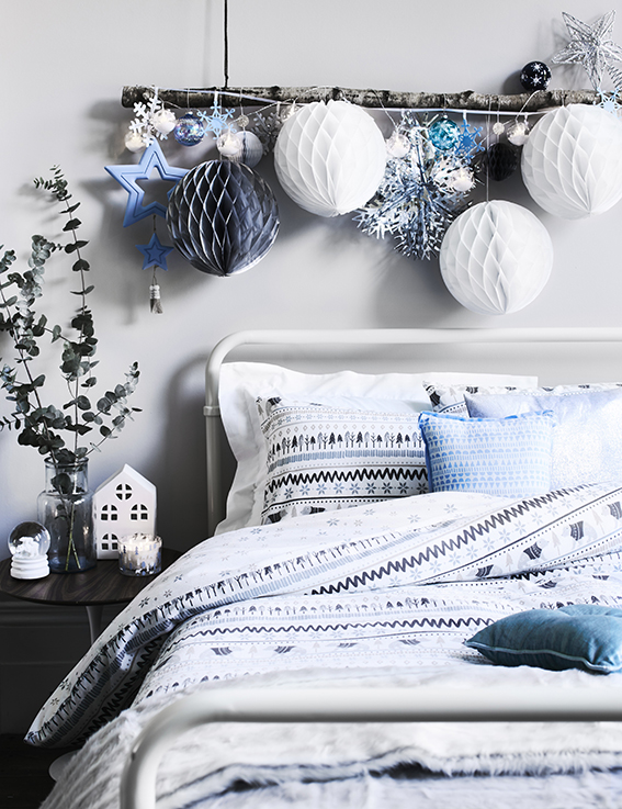
Scandi Lodge
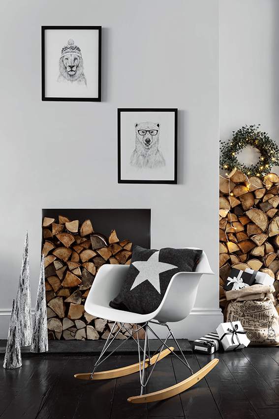
I know everyone has been talking about ‘hygge’ of late and I suppose this look reflects this.
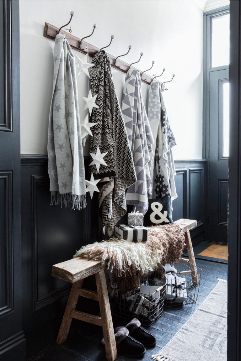
This graphic style is perfect for me but I know that some find this look a little too austere and maybe too stark. However you can soften it up by being more playful with your decorative elements and use of pattern like the examples below…
Latin winter
This is my wildcard but I can’t resist showcasing this range from Paperchase. The colours are warm and vibrant while the motifs are so playful and fun. It’s a great alternative for those who aren’t keen on snowflakes.
