Posted on

The Orphaned Spaces box set
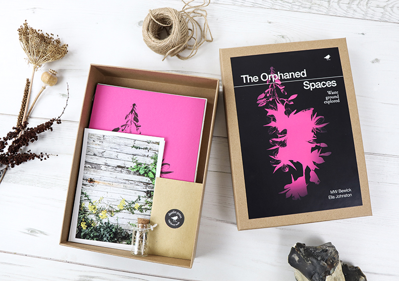
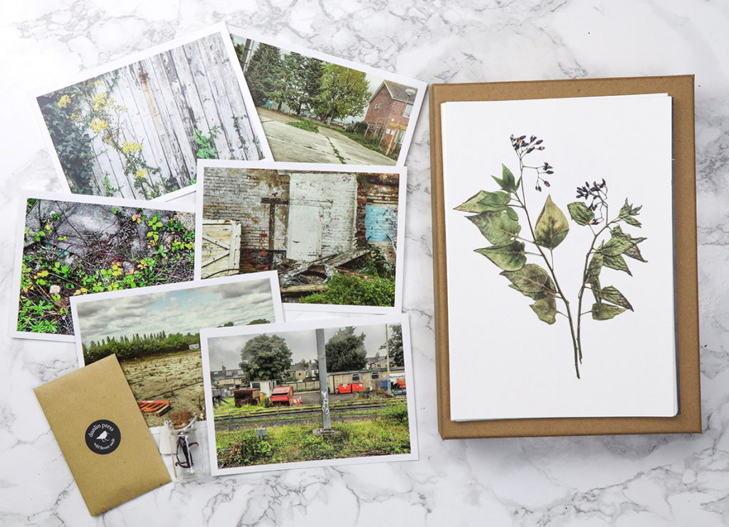
The Orphaned Spaces box set. Featuring postcards, hand-stitched books, seeds, reliquary, archival prints.

Last week I told you about my new illustrated book (with MW Bewick), The Orphaned Spaces published by our indie publishing company Dunlin Press, well here is the box set.
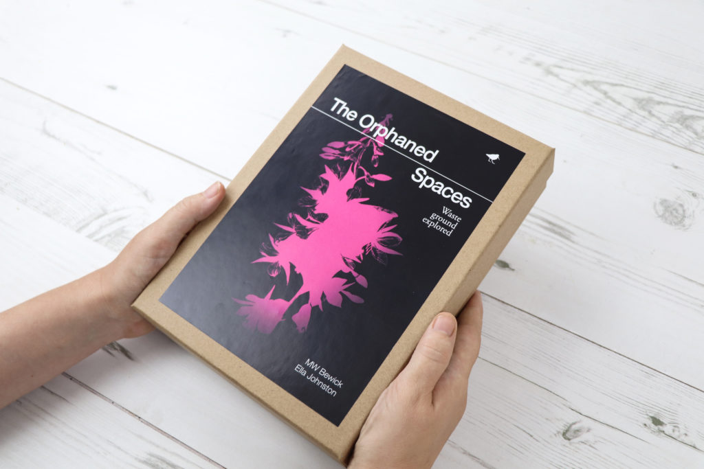
The Orphaned Spaces box set. Featuring postcards, hand-stitched books, seeds, reliquary, archival prints.

The Orphaned Spaces  box set is such an undertaking of work that I had to give it a separate post.

When working on Dunlin Press projects,  we’ve often described each book as ‘time capsules’. We aim for every publication to embody the mood and spirit of a place or region at a particular period of human history – like pressing a pause button or taking a picture. The Orphaned Spaces box set is a physical manifestation of this concept.
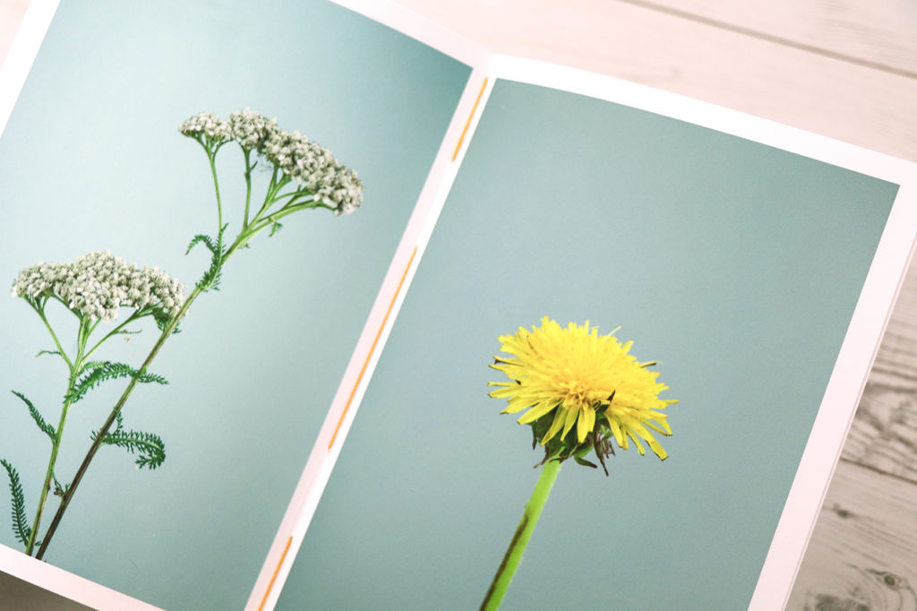
Hand-stitched still lives booklet
Limited edition postcards, reliquary, seeds and archival prints. The Orphaned Spaces Box Set

This highly limited edition, made-to-order box set, deconstructs the book The Orphaned Spaces, breaking it down into hand-stitched booklets, postcards, archival prints and a reliquary.

The box set contains the following elements:

1: Hand-stitched ‘Journal’
Coverstock: G.F SMith, Colorplan, fuchsia pink, 270gsm. Inset pages: G.F SMith, Colorplan, dark grey, 135gsm. Inner pages: ZANDERS ZETA, Unwatermarked Textured Paper, linen 100gsm,
2: Hand-stitched black and white studies booklet
Paper stock: Hahnemühle, Photo Rag, matte smooth, 188gsm
3: Hand-stitched wild flower still lives booklet
Paper stock: Hahnemühle, Photo Rag, matte smooth, 188gsm
4: 10 pressed plants fine art giclée prints
Printed on archival Hahnemühle, Photo Rag, bamboo, 290gsm
5: Six landscape postcards
6: A glass bottle ‘reliquary’
7: Wildflower seeds include a mixture of annual and perennial wildflower species and grasses.
8: Bookmark using G.F SMith, Colorplan, dark grey, 135gsm
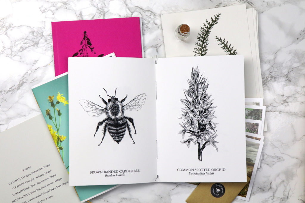
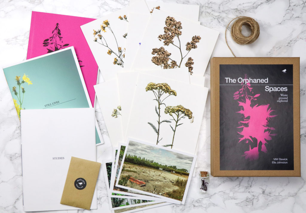
The Orphaned Spaces box set includes three individually hand-stitched books and archival prints plus seeds and reliquary

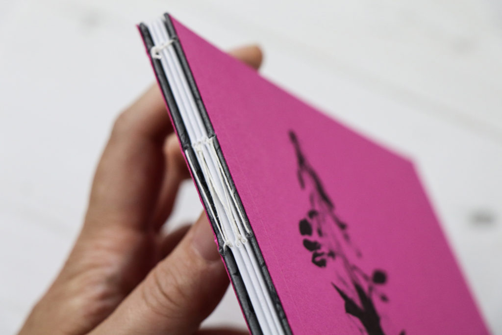
I’ve really made use of the 2010 Central St Martin book-binding summer course I attended during the past eight years. The box set features three hand-stitched booklets all bound by me. I really enjoy book-making so, what would feel like hard work for some feels like a kind of zen meditative process for me.
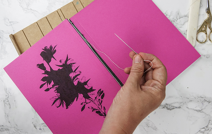
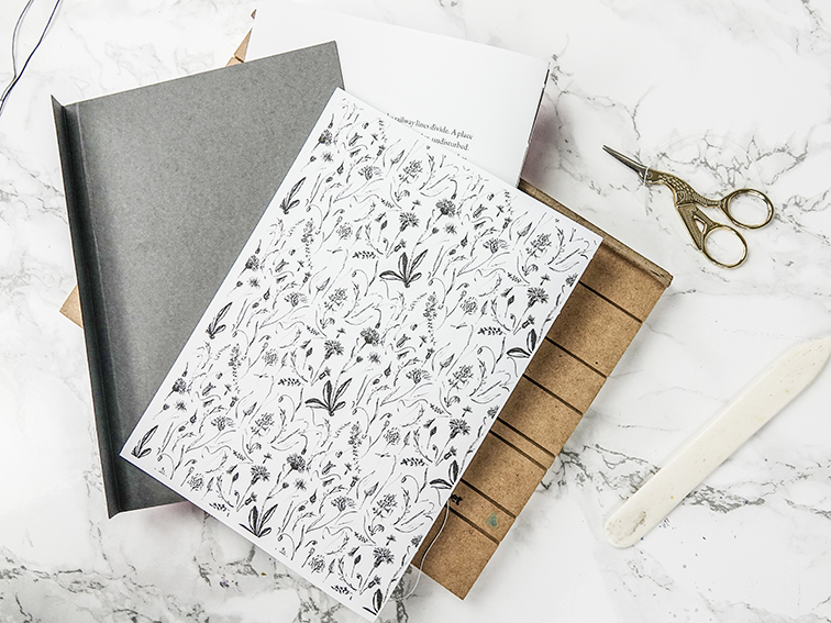
Making the hand-stitched books for The Orphaned Spaces.

You can buy the box set or the book at the Dunlin Press shop.
Posted on

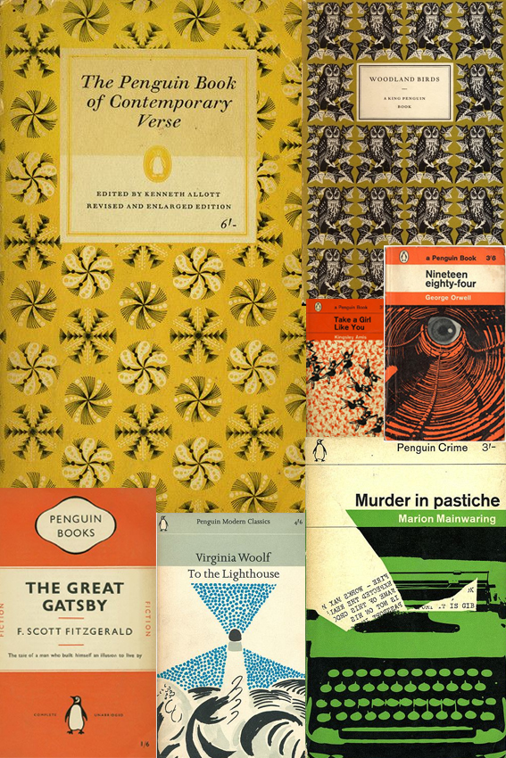
Monday Moodboard: Penguin book design

Penguin Book Design Penguin book design has been an obsession of mine since I was a teenager when I spent an awful lot of time in libraries. Probably too much time if I’m being honest.

In those days I was continually on the hunt for new words, stories and worlds, I used to get lots of books out on spec. I read a lot of duds but I also came across a lot of good stuff too that has stayed with me.

The cover design played a very big part in my decision making process. From the classic orange cover fiction and stylish mid-century illustration to the glorious repeat patterns, it is all the stuff of wonder and as much of an inspiration as the words inside. As a consequence of this I read a lot of books published by Penguin; a great deal of classics and quite a few poetry collections. I’ve now bought a lot of the books that I borrowed and devoured during my teenage years (the ones I enjoyed at least).

As Creative Director of an indie publisher, I design all the books for Dunlin Press. So my youthful interest has become increasingly important now I’m a grown-up. When approaching the layout for each Dunlin Press book I always ask myself, “What would the Penguin designers do?”


Posted on

Monday Moodboard: Midcentury Modern

MCMMoodboard

I’ve many go-tos for inspiration and although you may not think it, mid-century modern design and illustration is one of my favourite sources. That’s why it’s made this week’s Monday Moodboard.

Although my drawing style is heavily influenced by classical botanical illustration, I actually came to it via the route of mid-century modern. How? Well, when you look inside the original mid-century homes, as well as all those gorgeous geo designs,  amazing furniture, playful use of line and fearless colour combinations, there would always be a classic print or two hung on the wall, so I thought “if it’s good enough for them…”

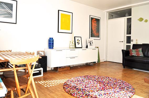
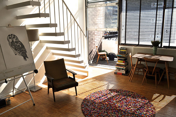
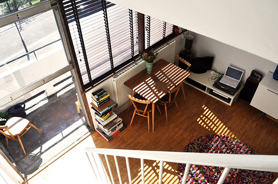
Anyway this is one of my most loved periods for design and illustration I suppose it came from the fact that Dr B and I lived in mid-century apartments for the first 14 years together so we both became interested in this style in terms of design and architecture. For pure nostalgia value here are some pics of our old flat.

mid-century modern flat ellasplace.co.uk mid-century modern flat ellasplace.co.uk mid-century modern flat ellasplace.co.uk

There is so much to find in mid-century modern design, which is why it is such a rich source of inspiration.  I mean just look at the examples on the moodboard. It’s not all about Lucienne Day Calyx fabric (although I blatantly love that design and would have it in every room in the house if I was allowed) or Ercol furniture (although again I adore it and have a lovely 1960s original Ercol dining table and chairs in the kitchen). Design from this period can be ornate and playful and also simple, concise and elegant.

Why this week? I’m currently working on a poetry book for Dunlin Press, an indie publishing house run by me and Dr B. I wanted something that keyed into classic book cover design with a bit of an edge so I’ve been trawling the internet and my design books and the mid-century vibe seems to be the route to explore. I’m not saying our book will look anything like the above but whether you are designing a book cover, thinking about a fabric pattern or imagining a room scheme, in fact whatever creative endeavour you’re undertaking it’s good to have a starting point to kick start your work.