Posted on

Hack: Simple ways to update your plates with ceramic pens

Update your plates (c) Ella Johnston ellasplace.co.uk

As my one of my previous post suggests I am really playing with pattern at the moment, trying to free myself up as an illustrator and exploring ways of drawing to see what ideas ‘land’.

Update your plates (c) Ella Johnston ellasplace.co.uk

I thought I’d try doing things beyond pencil and paper to really put my mind away from the subconscious self-imposed constraints that I may place on my illustration.

Update your plates (c) Ella Johnston ellasplace.co.uk

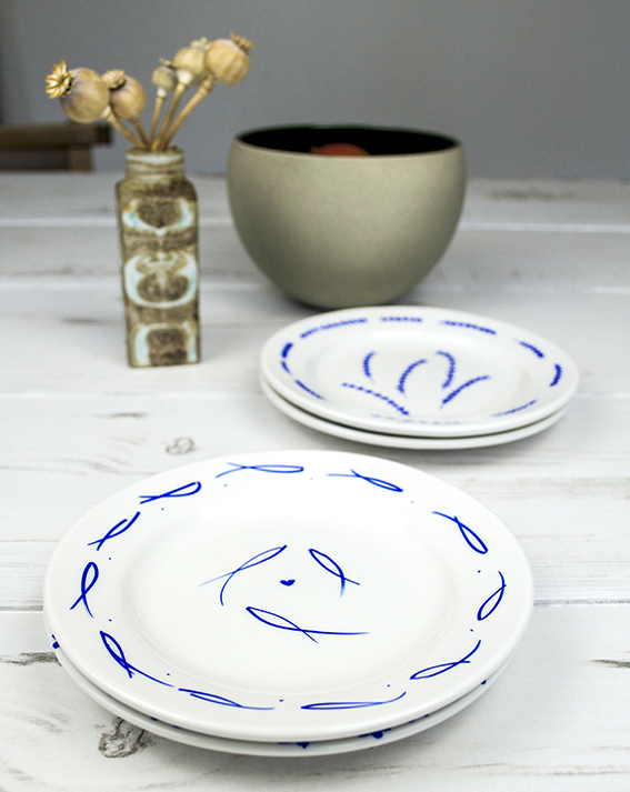
I had these spare plain plates that I’d bought originally for photography props when I was editing Homemaker Mag, I actually never used them because they were too plain and the rim wasn’t delicate enough for any of the shots (it’s amazing what you obsess about on a shoot and what works and what doesn’t).

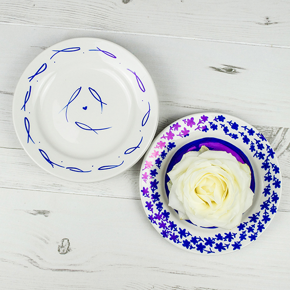
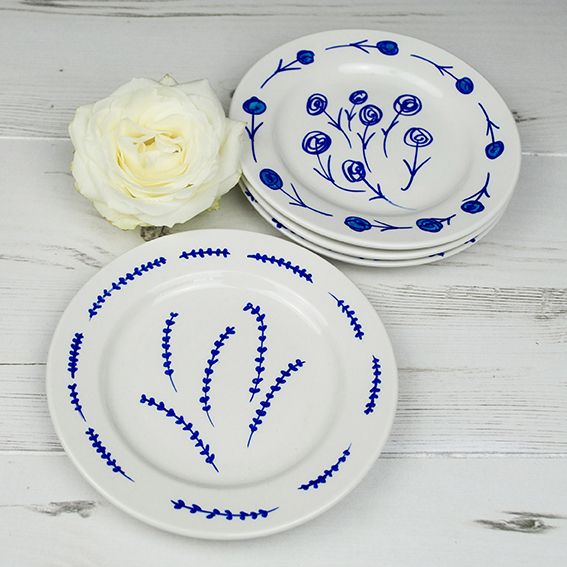
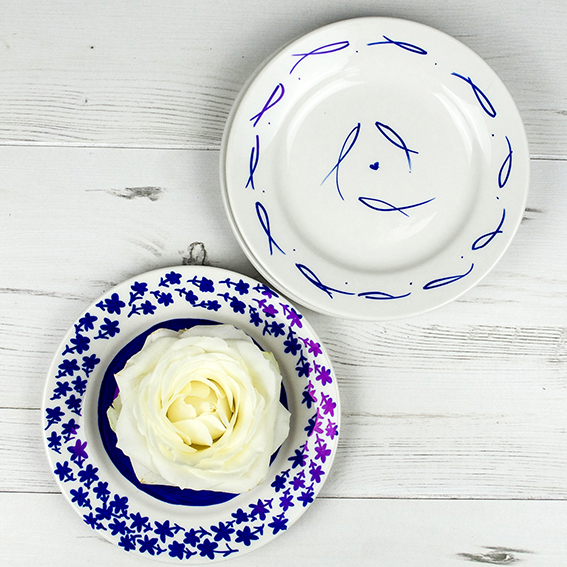
Any-hoo these thick plate rims really allowed themselves for drawing on and I thought at the very least I’d be updating some dull crockery. So out came my cobalt blue ceramic pen and had a little play, here are the results.

Update your plates (c) Ella Johnston ellasplace.co.uk

I gave myself a 20-minute time frame to do them so it was five mins per plate. I did this because I didn’t want to overthink it. I wanted the designs to be spontaneous and completely from the top of my head. So there’s fishes, some Charles Rennie Mackintoshesque roses, wheat germs and blue retro-style flowers.

Update your plates (c) Ella Johnston ellasplace.co.uk

I like the plates and am pleased with the designs. I think I’m going to looking to the wheat germ and fish shapes further. I’ll keep you updated!

Update your plates (c) Ella Johnston ellasplace.co.uk

Posted on

Getting smart with Sharpies: Mexican inspired coasters

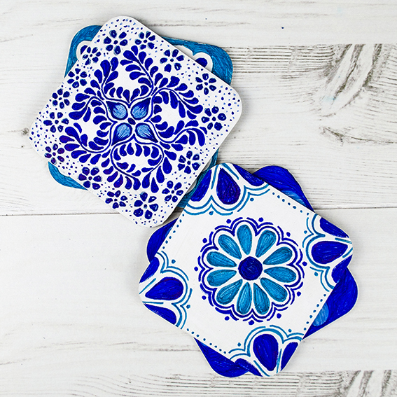
Mexican Coasters (c) Ella Johnston ellasplace.co.uk

I’ve recently got obsessed with all things Mexican. There was a reason for this, myself and the good Dr B always cook something nice on New Year’s Eve and this year we fancied a feast of Mexican style veggie food.

As I was researching various tasty vegetarian recipes* to prepare for us, I kept coming across some beautiful Mexican tile designs. They were absolutely stunning. Not only did I want these tiles in my kitchen and bathroom (when we get round to doing them up) but I was so inspired that I needed these designs in my life straight away.

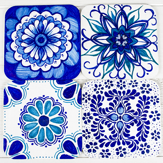
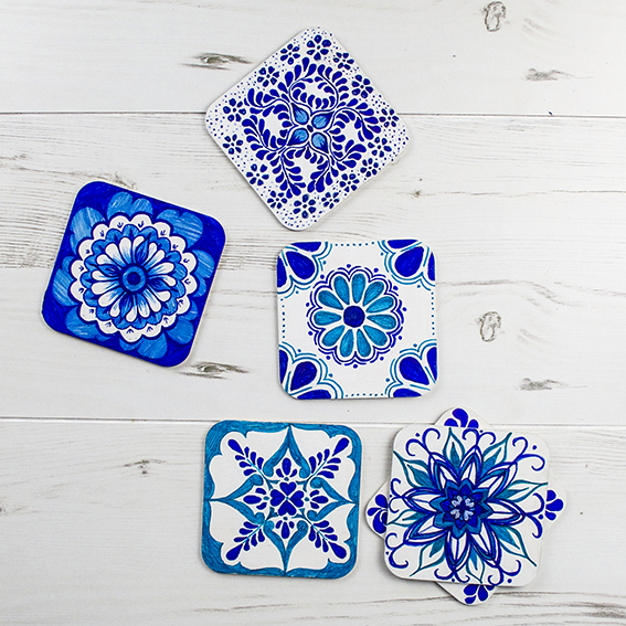
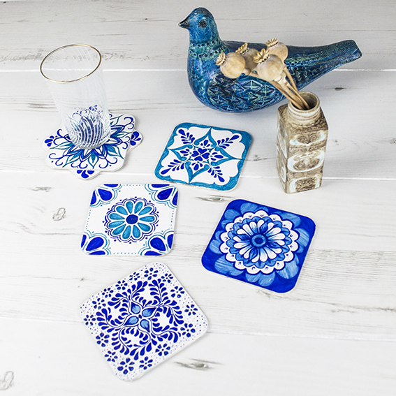
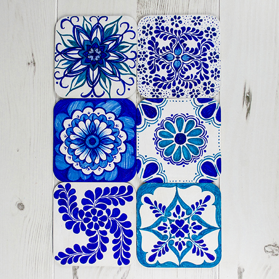
Although many of the tiles came in a gorgeous array of different colour combinations, I was really drawn to the blue and white ones (you know me, I love to keep designs simple when I can help it). So I got out my Sharpie pens, grabbed my spare mdf coasters from my old Shibori coaster project and set to work on whipping up these beauties.

Mexican Coasters (c) Ella Johnston ellasplace.co.uk

Mexican Coasters (c) Ella Johnston ellasplace.co.uk

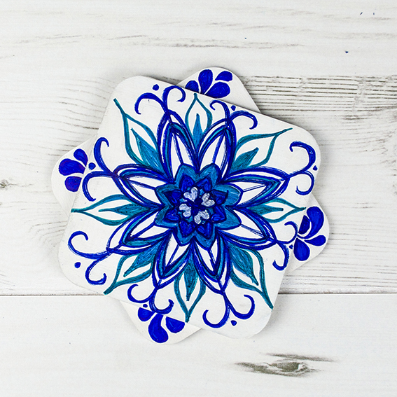
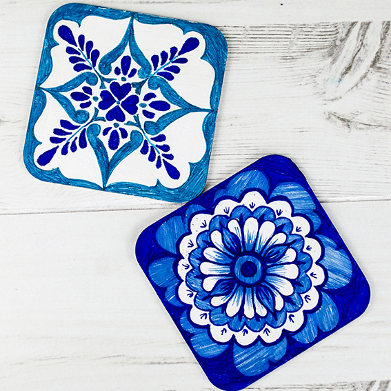
First I gave the mdf squares a lick of white acrylic paint. Once they were dry I drew out my designs freehand on the coasters in pencil. I didn’t want to trace the designs directly as I wanted to add my touches to them to make them my own. I also opted for freehand because, and I know some of my design friends won’t like this, I don’t like it when everything is straight on and symmetrical. I like to keep things wonky every now and again – for me it’s more fun that way.

Mexican Coasters (c) Ella Johnston ellasplace.co.uk

I’m going to give them a little varnish so I can actually use them (I was in such haste to draw the designs on and then get them shot that I clean forgot) but I thought I’d share them with you now as I’m chuffed with them. Can’t wait to get them out now.

The whole exercise has got me thinking of my own pattern designs, can I be more ornate? If I keep my colour scheme simple, can I go to town on the motifs? This project has inspired me to have a bit more of a play and to come up with some new work – watch this space for what I do with this.

Mexican Coasters (c) Ella Johnston ellasplace.co.uk


Mexican Coasters (c) Ella Johnston ellasplace.co.uk

*Spiced roast cauliflower and chickpea tacos with a yoghurt lime dressing and salsa plus nachos with black bean chilli and guacamole with a side order of red cabbage slaw and smoked paprika roast potatoes, if you’re asking. No, we couldn’t eat it all and it lasted through to the next day and beyond. I did take pictures but the light was rubbish and to be honest we were too intent on scoffing rather than blog stuff – sorry!

Posted on

Hack: Handmade Gift Ideas: Sharpie Mugs

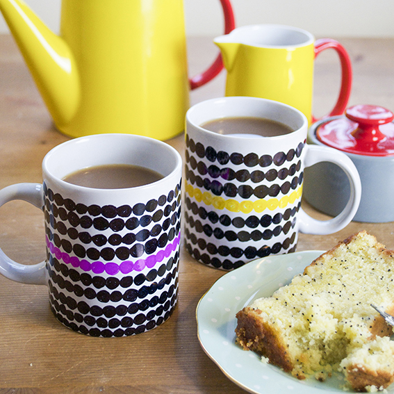
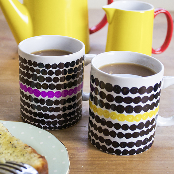
Sharpie hack - cool mug set (c) ellasplace.co.uk

I’ve been coming up with ways to make my gifts a bit more personal by making a few pressies myself. I need to make things fairly quickly without lots of faff (stuff I can do in the evening with the telly on basically). This is where my enormous collection of Sharpie pens come in super handy. I’ve a plain set of ceramic tableware; mugs, saucers and plates plus some spare mdf coasters from my previous Shibori project that I can easily jazz up with these ever practical pens and a little patience.

Sharpie hack - cool mug set (c) ellasplace.co.uk

First I thought I’d do a pair of mugs. I was inspired my Marimekko designs but obviously I adapted it so I wasn’t ripping off a classic. It took me about 30 mins to finish them both and I really like the look of them – contemporary but with a definite handmade edge so as not to be confused with anything shop bought.

Sharpie hack - cool mug set (c) ellasplace.co.uk

Sharpie hack - cool mug set (c) ellasplace.co.uk

Sharpie hack - cool mug set (c) ellasplace.co.uk

Posted on

My Illustrated Christmas Cards


Christmas Stationery Ella Johnston Art and illustration. ellasplace.co.uk

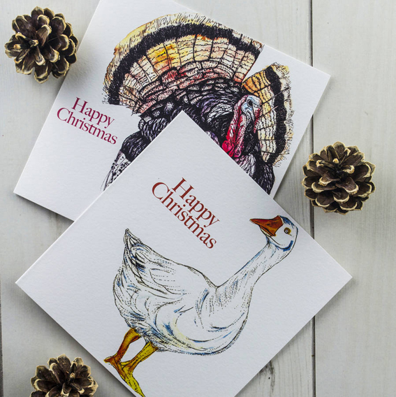
While everyone was sunning themselves this summer I was busy putting together my illustrated Christmas card collections. I’ve got a number of designs available this year ranging from the traditional (we all love a wee robin) to playful (as a veggie I couldn’t help but showcase what most people will be eating at Christmas) to vintage (I’m a huge fan of retro illustration).
Christmas Stationery Ella Johnston Art and illustration. ellasplace.co.uk

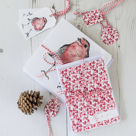
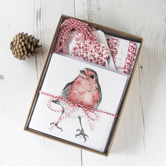
I thought it would be nice to coordinate your Christmas greetings, gifting and thank you notes with my Festive Robin Stationery Box Set.

This year the robin was crowned the nation’s favourite bird in the National Bird Vote – so my festive motif featured on greetings and gift tags is sure to be a real favourite with friends and family and a time-honoured way of ‘tweeting’ your Christmas wishes.

In a Scandi-inspired theme of red and white, the pack also features a simple heart motif print, designed and printed by me. The pack features ten illustrated Robin Christmas greetings, ten thank you notecards and ten Robin gift tags. You can take a look at it here.
Christmas Stationery Ella Johnston Art and illustration. ellasplace.co.uk
I’ve got a pack of 10 illustrated Goose and Turkey Christmas cards (five of each) so you can send a season’s greeting with a cheeky twist. Get your set hereSo what better way to say ‘Season’s Greetings’ than with a lovingly drawn illustration of the creatures that are kindly sacrificing themselves to ensure your Christmas dinner is absolutely perfect; a fattened goose and succulent turkey?

Christmas Stationery Ella Johnston Art and illustration. ellasplace.co.uk

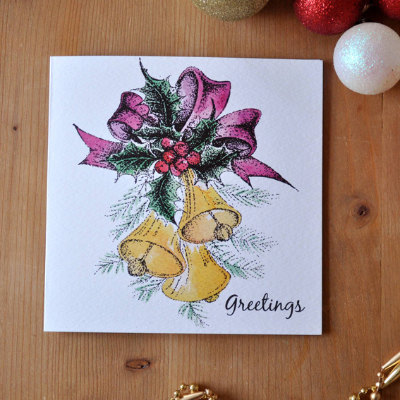
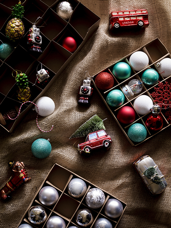
My pack of 10 vintage inspired Christmas cards was inspired by old designs of the 1950s and 60s. There were lots of baubles, bells and kitsch motifs (which I adore). I wanted to see if I could do something similar so I went to the shed and pulled out all my old decorations and got drawing. Check out how you can get yours here

Christmas Stationery Ella Johnston Art and illustration. ellasplace.co.uk

Posted on

Four Fab Christmas Trends

From House of Fraser

Now it’s November I think it’s fair enough to talk about Christmas, isn’t it? Over the coming weeks I’ll be looking at festive ideas so that Ella’s place will be the coolest venue for yuletide food, drink, gifts and decoration inspiration – so watch this space.

As a journalist I’m very lucky to get an early insight into the trends for the upcoming festive season. It’s part of my job to visit trade shows and talk with my colleagues of what’s hot and what’s not for 2015. I’ve really enjoyed putting the festive issues of my magazines together and if you want some immediate crafty projects and ideas – head here and here.

If you’re stuck for what look to go for this Christmas (you’ve still got time to stock up with some yuletide updates for the big day) then this round-up of the year’s top trends should help.

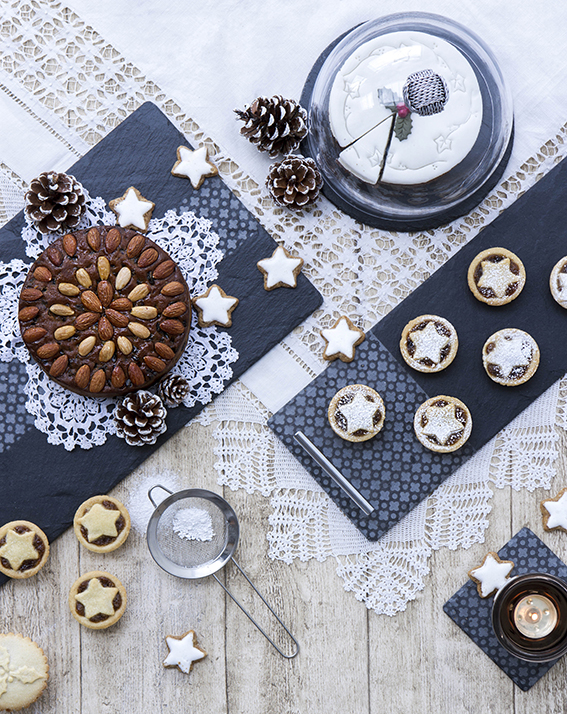
Vintage trad
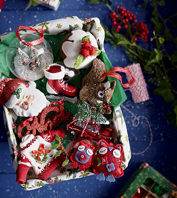
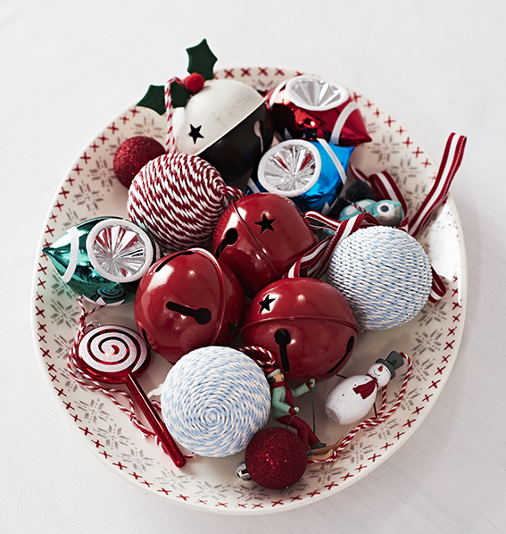
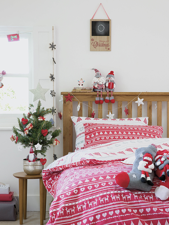
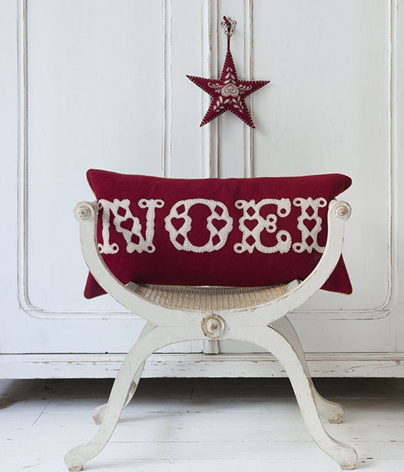
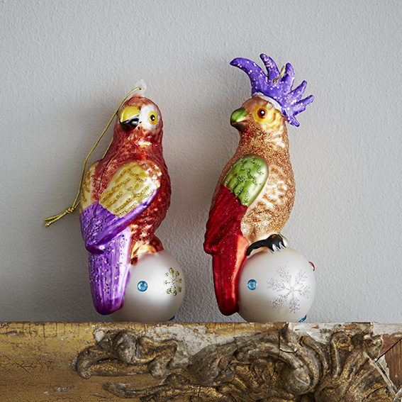
I love a bit of nostalgia at Christmas and the high street has really appealed to our love for yuletides past this year. This look reminds me of when my mum would get the decoration box out and my sister and I would busily get on creating the most stylishly decked-out tree. We were both very particular about the tree and the overall festive scheme. We were also as one on it: we didn’t want classy or cool, we didn’t want restrained, we wanted red, white and fir-tree greens, and we were all about santas, bells, robins, puddings, snowflakes and snowmen. This trend is perfect for this and I know me and my and sis would have been all over this lot when we were kids.

From BHS
From BHS
From Sainsbury's
From Sainsbury’s
From House of Fraser
From Homebase
From Homebase
From Tesco
From Tesco
From Jan Constantine

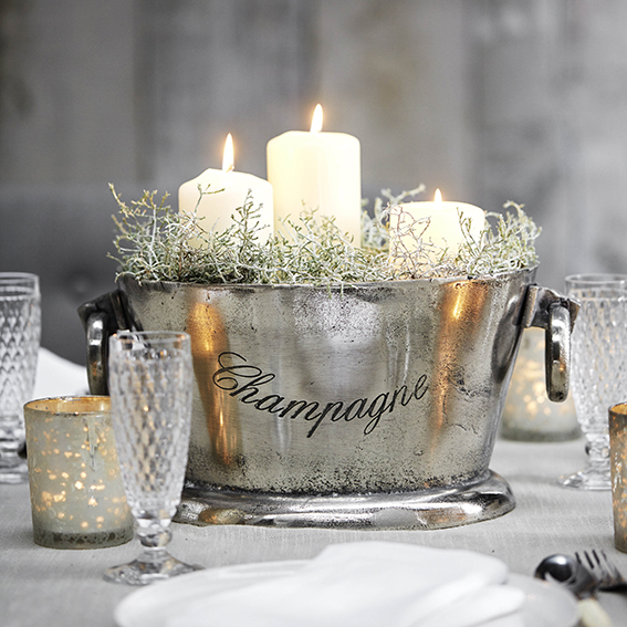
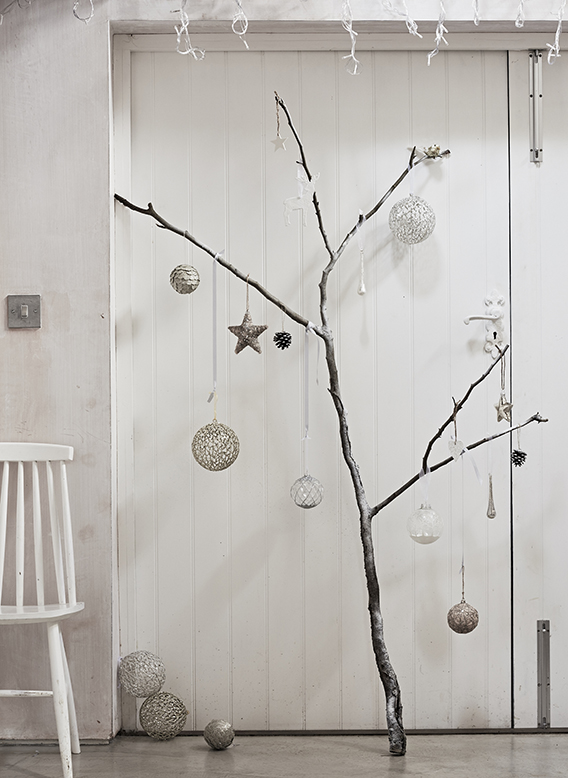
Luxury lodge
If I’m being honest, this trend is really for my fantasy grown-up home. I should explain… When I was a teenager I watched a lot of TV and I always thought that when I reached a ‘certain age’ I’d be living in house with white furniture, bleached and shiny surfaces, sumptuous soft furnishings in a palette of greys and alabaster, pale flowers in the hallway and soothing classical music playing practically all time. I would also wear crisp, expensive shirts. Anyway, while Ella’s place really isn’t like that (those shirts are a pain to iron),  I do love the mix of textures this look combines and the lovely natural touches with the incorporation of foliage and woodland elements – these all work together to create a cool wintery feel without being too clinical or cold. It’s really lovely.

From Amara
From Amara
From BHS
From BHS
From Houseology
From Houseology
From Homebase
From Homebase
From Amara
From Amara
From Sainsbury's
From Sainsbury’s

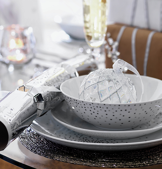
Glam metallics
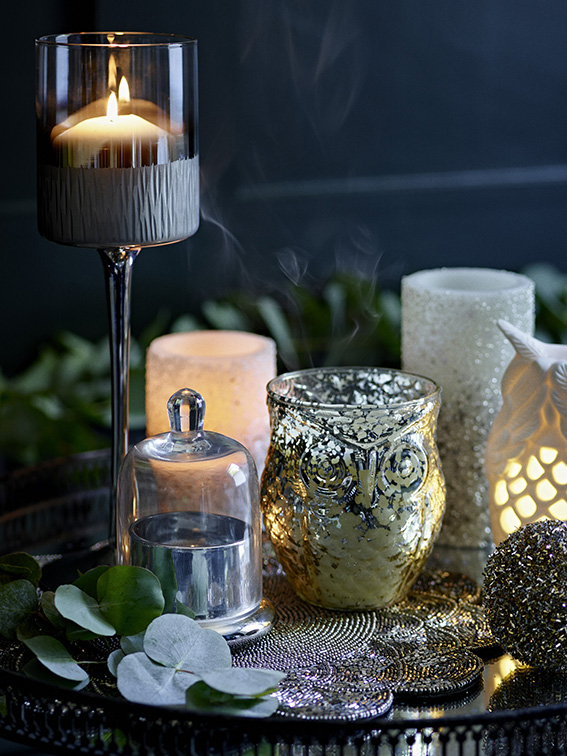
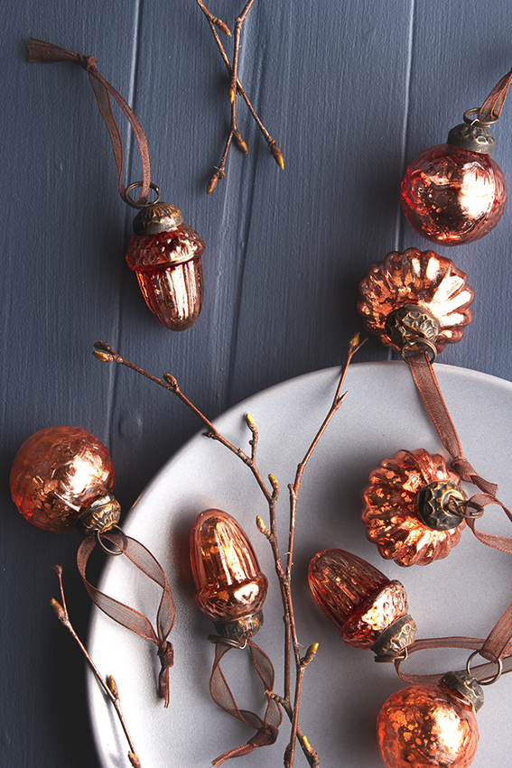
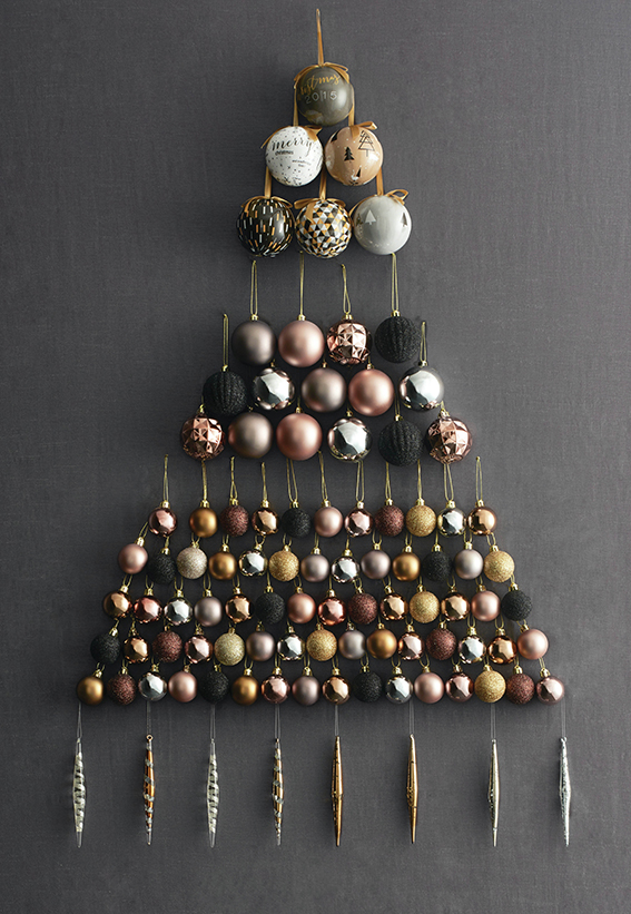
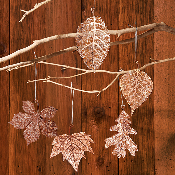
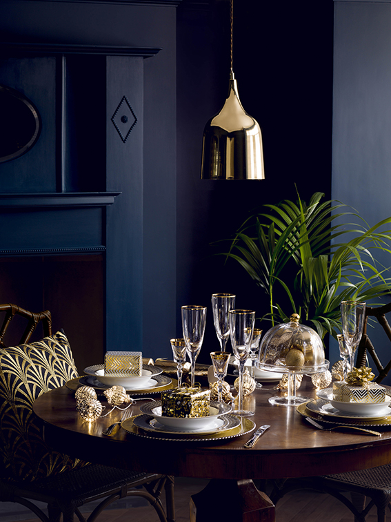
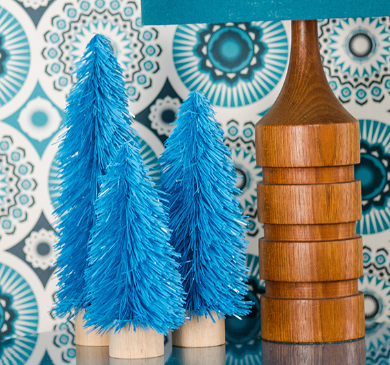
If there’s one key trend for winter 2015/2016 it’s copper and gold. I’ve seen these metallics teamed with navy blue, teal, deep green and almost every shade of grey. I love this look – to me it evokes a sense of old-school glamour and adds an opulent finish to those festive arrangements. It’s also super adaptable; complementing a lot of different interior styles, you can just have small touches, with baubles and little accessories, or you can go all out with lampshades, cushions and crockery for the ultimate foxy looking display that is bang on the money.

From Marks and Spencer
From The Contemporary Home
From Next
From Next
From Lime Lace
From Lime Lace
From Marquis & Dawe
From Marquis & Dawe
From House of Fraser

Elegant brights
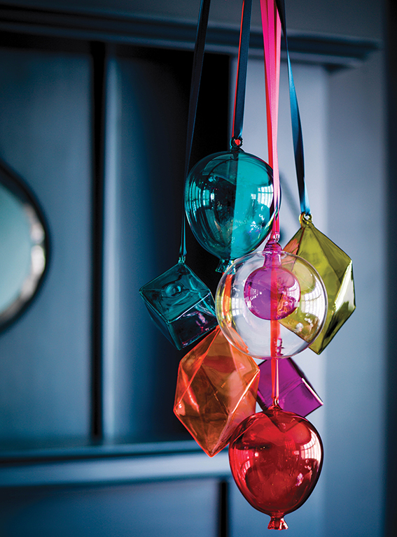
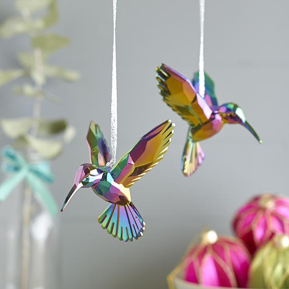
Seeing as it’s Christmas you can indulge your playful side. That’s why it’s great to go for bright colours and quirky designs – after all it is a celebration. The collection shown below illustrates that you don’t have to go for traditional festive motifs or tacky glitz to have a bit of fun with your decorations. In fact you can put together a classy look with nods to contemporary design that will still make people smile and get into the festive spirit.

From Marks and Spencer
From Acorn and Will
From Acorn and Will
From Tescos
From Tesco
From The Contemporary Home
From Rigby and Mac
From Rigby and Mac
From Oliver Bonas
From Oliver Bonas
Posted on

IKEA hack – revamp a step stool

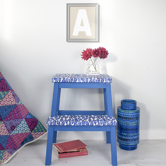
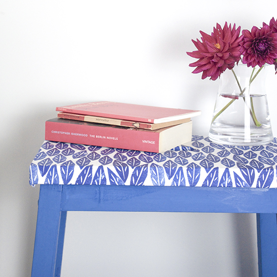
Revamped Ikea Steps photography (c) ellasplace.co.uk

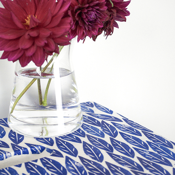
Revamped Ikea Steps photography (c) ellasplace.co.uk

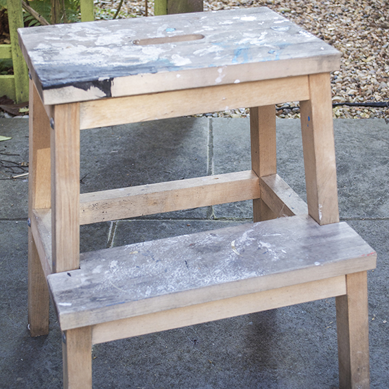
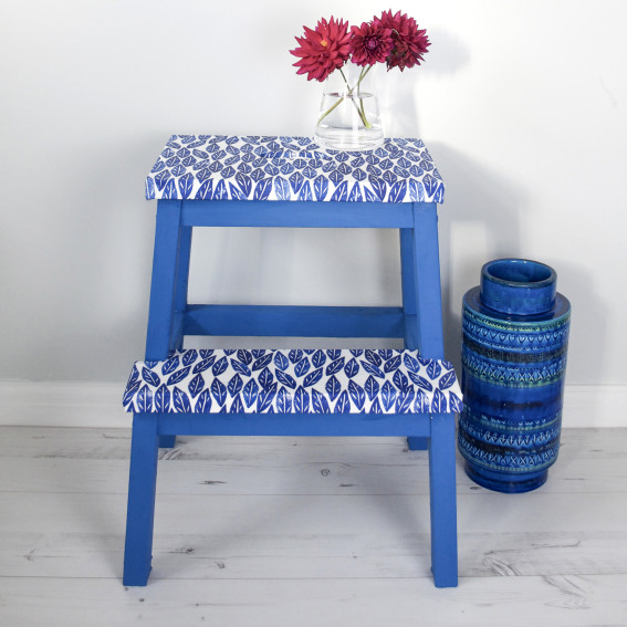
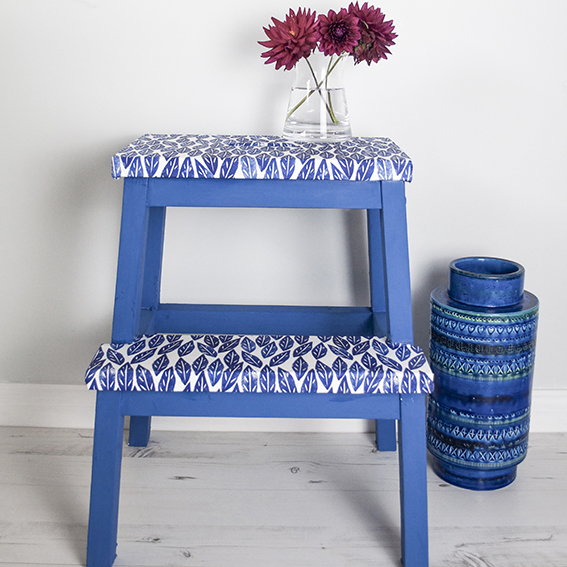
Being only 5ft 4in and a half (the half is very important), the IKEA step stool is my friend. The one above has been particularly well used – especially when we first got it 13 years ago. We lived in a tiny studio flat in London so storage had to be utilised in every space: it went right up to the ceiling. I’ve recently been using the steps in my art studio (another area that makes use of every single square metre of storage), so they’ve got a bit bashed up over the years and were in need of some TLC.

I came across a very sweet revamp project on This Little Street blog, who spruced up a new set of steps with paint and her peel-off wallpaper collection. I thought this idea would work with my Spoonflower fabrics and chalk paint.

Revamped Ikea Steps photography (c) ellasplace.co.uk

Revamped Ikea Steps photography (c) ellasplace.co.uk

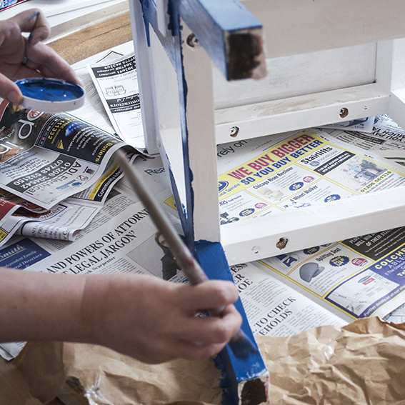
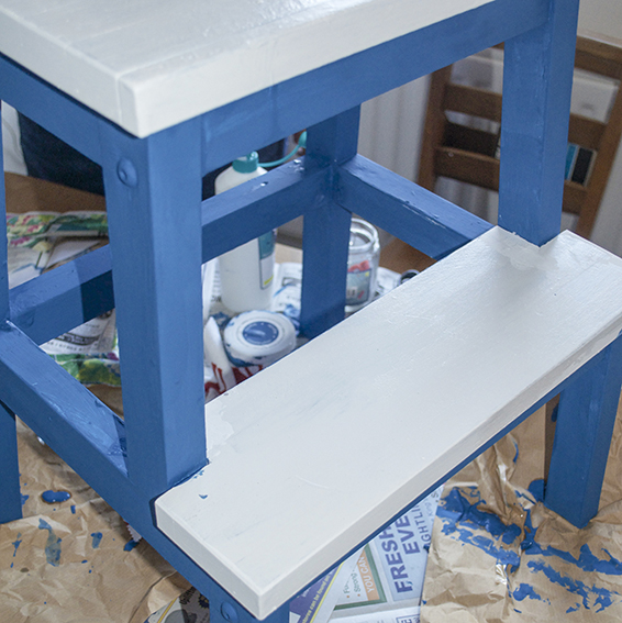
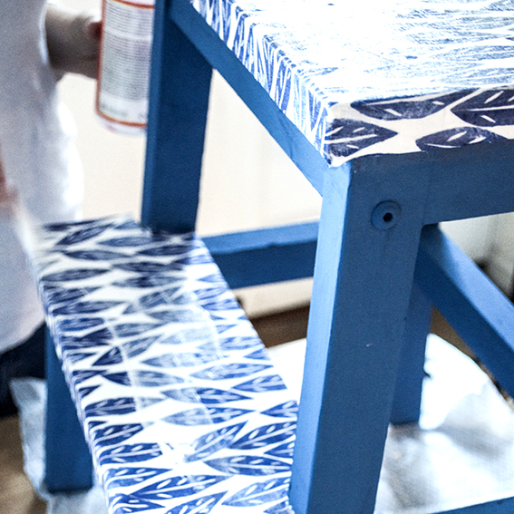
First I had to get these steps into some kind of workable condition. Unlike the Little Street’s upcycle, which used a new set of steps, mine were old, scuffed, split and covered in printing ink and paint. I had to scrape off the paint, sand the surfaces down and treat the steps to some wood primer and a lick of white emulsion.

Revamped Ikea Steps photography (c) ellasplace.co.uk

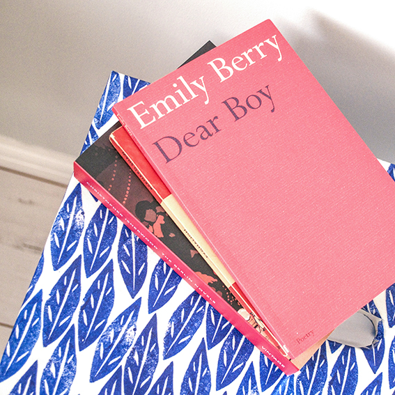
I then painted the frame with Americana Decor® Chalky Finish paint in Legacy, keeping the step and the top white. I then used PVA glue to adhere my blue Scandi leaves material to the white areas and then sealed them in varnish – it means any spills can be wiped off. I’m really pleased with the end result and this once hardworking bit of furniture is now pride of place in our study (where, yes, we have floor-to-ceiling shelves).

Revamped Ikea Steps photography (c) ellasplace.co.uk

Revamped Ikea Steps photography (c) ellasplace.co.uk

Revamped Ikea Steps photography (c) ellasplace.co.ukRevamped Ikea Steps photography (c) ellasplace.co.uk

Revamped Ikea Steps photography (c) ellasplace.co.uk


Posted on

Meet Ella’s Menagerie part 2

Meet my menagerie part 2 (c) ellasplace.co.ukIn September I introduced you to some members of the household; our cool animals and characters that ‘guard’ our rooms, our shelves and our surfaces. Here are some more of our friends, with a little bit of their (imagined) back stories.
Rory (c) Ella Johnston ellasplace.co.uk
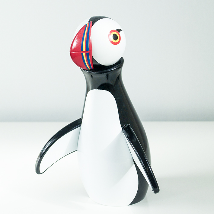
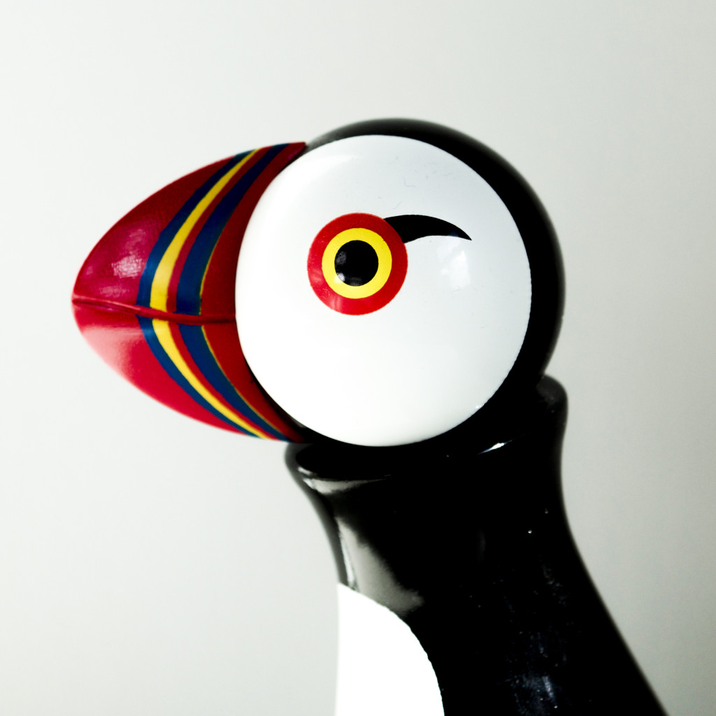
Rory the puffin
This Kay Bojesen Puffin Wooden Figurine is known to us as Rory. I’m telling you this guy is a riot! He flew into our lives last Christmas and my goodness he’s had the whole place in stitches ever since. Lewd, sometimes crude but never, ever rude or offensive, Rory has spent a lot of time in the Orkney Islands hanging out with his fellow puffins,’taking the pish’ out of the seals and enjoying a the odd very fine single malt with the fisherman ‘ma pals’. He has an anecdote for every occasion, is always up for a sing song yet is wonderfully well-versed in literature – particularly ancient folk tales and Icelandic sagas. We’ll often find him with his arm round one of the menagerie giving them a little pep-talk, or simply making them smile. This dude is a legend!
Rory (c) Ella Johnston ellasplace.co.uk

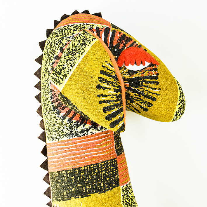
Elma (c) Ella Johnston ellasplace.co.uk

Elma
Stoic, strong, in many ways the rock of the house. Elma has been with us for eight years. We found her where we discovered Ian at Family Tree in Exmouth Market. Loving, caring and fantastic with small children, Elma has been through a great deal in her life as her sad, kind eyes reveal. In her youth she was a pretty wee thing on the late sixties and seventies fashion scene. For a while she very popular with magazine editors, pop stars, photographers and millionaires, but when fashion changed she was rejected by them all. No longer in vogue, she retreated to Ibiza in the eighties. There she lived with her artist lover, who, while very charming, was unfortunately a serial gambler, adulterer and all-round philanderer. She wanted children but knew this was incompatible with his chaotic lifestyle. After 15 years of enduring his infidelities, Elma had had enough and came back to England. She then started working with underprivileged children in inner city London which she describes as the most fulfilling period of her life. Though retired now, Elma still does a lot of volunteering and has expressed an interest in working at the local food bank.
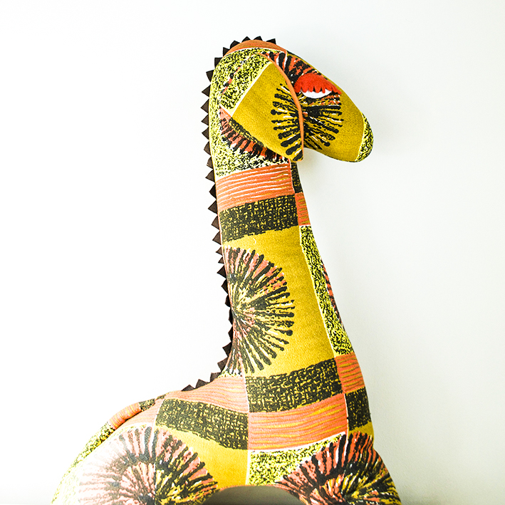
Elma (c) Ella Johnston ellasplace.co.uk

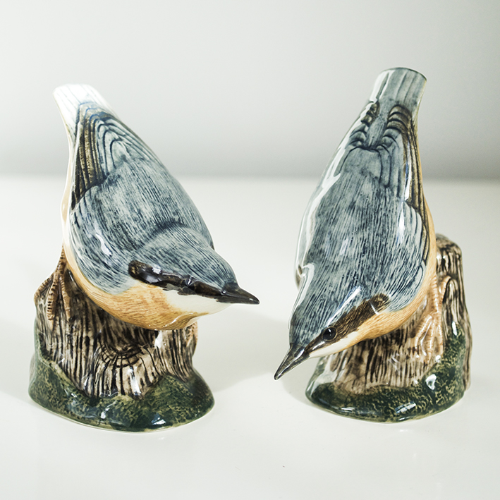
John & Paul (c) Ella Johnston ellasplace.co.ukJohn and Paul
These Quail ceramic Nuthatch pair are not brothers but very, very old school friends who have been inseparable since they were five years old. It took a while for the pair to get settled here. Having been with us for a year we’re beginning to find out a bit more about them (thanks to Rory). They came from a well-known public school that was apparently quite robust in terms of discipline and had some rather strong personalities in their year, as sensitive boys this really didn’t suit them. When they were 18 they went to a London art college together but that didn’t really work out (we’re not sure why) and for a long time they just ‘worked in bars around Europe’ before spending ‘some time in Berlin’ (?). They wanted to come to Wivenhoe to find their hero Martin Newell and make it with their own brand of pop music.
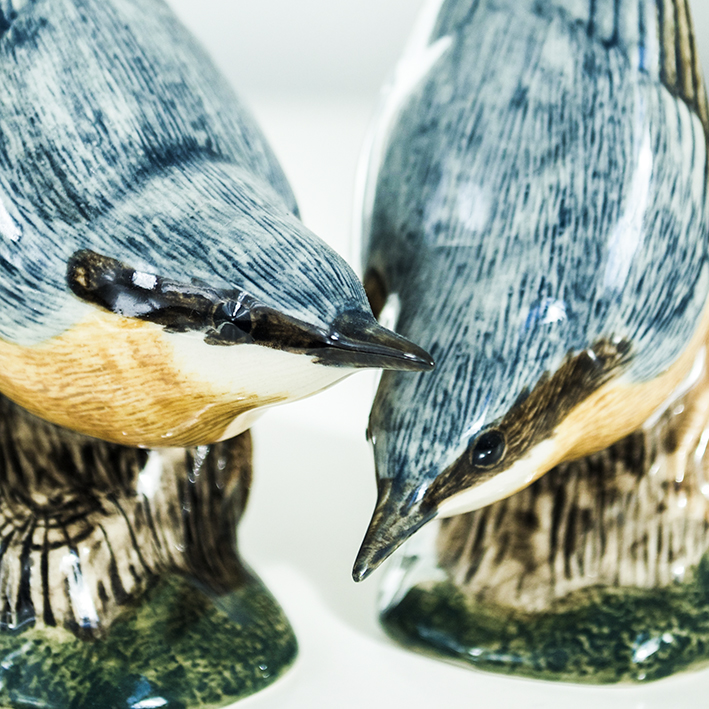
John and Paul (c) Ella Johnston ellasplace.co.uk

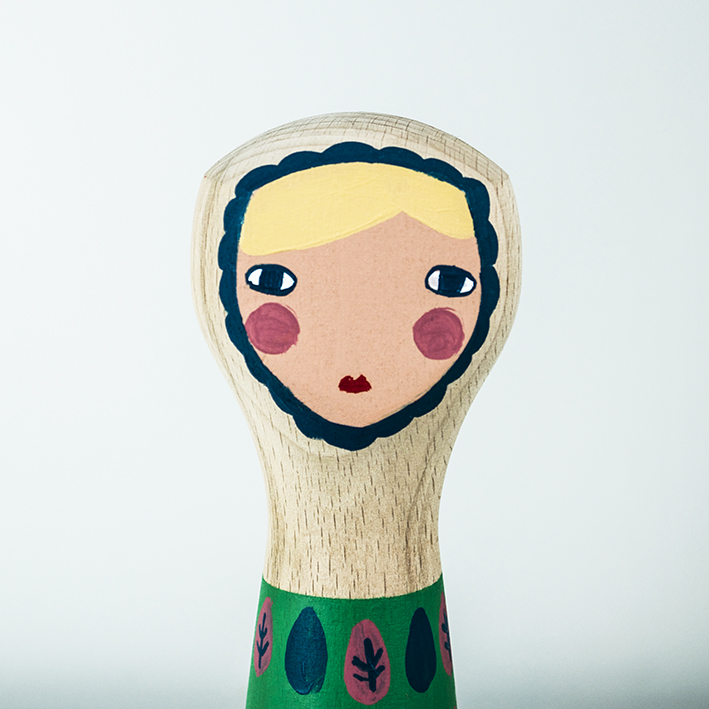
Eliza (c) Ella Johnston ellasplace.co.ukEliza
Lovely Eliza may look innocent, but this hand-painted Donna Wilson wooden doll is anything but. This girl has lived and loved and is all the better for it. A singer and entertainer on the Northern club circuit and latterly a regular fixture on the cruise liner top bills, Eliza has seen it all. Nothing fazes this chick; scared of no-one, she’s hard drinking, got a mouth like a sewer and a heart of pure gold! ‘I’ve kept my looks, cos my looks have kept me’ is just one of her many sayings (well one I can print anyway). A pure sweetheart, Eliza is very sensitive and kind; she’s great mates with Elma and is often heard joining Rory in a impromptu performance of old rebel songs.
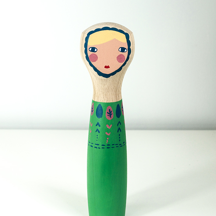
Eliza (c) Ella Johnston ellasplace.co.uk

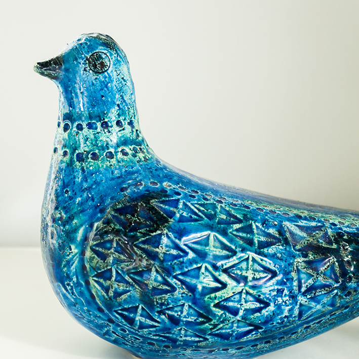
Pierre Luigi (c) Ella Johnston ellasplace.co.uk
Pierre Luigi the pigeon
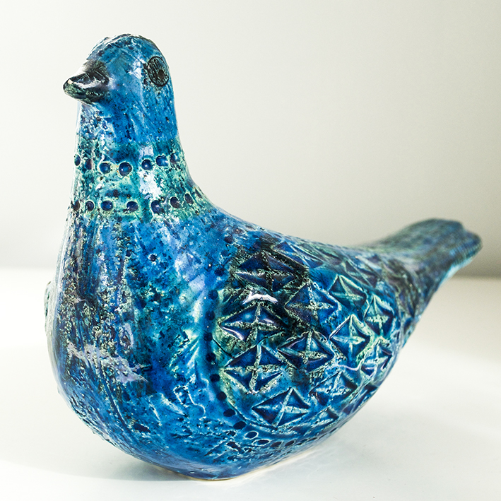
Ah Pierre Luigi, a flamboyant Bitossi Rimini pigeon of the very vintage variety. We found him in Blitz just off London’s Brick Lane because he ‘needed to see what the beautiful kids where doing’ but he was very disappointed. He would be. Pierre Luigi is only used to the best of things, having hung out most of his life with  Italian, French and Spanish sub-aristos in some of the most beautiful chateaus and palaces in the world. He ‘lives for beauty – even when it is ugly’ and is a massive fan of Puccini and Rossini, often blasting out their operas at full volume when in need of inspiration.
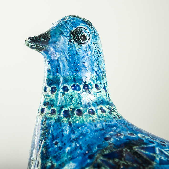
Pierre Luigi (c) Ella Johnston ellasplace.co.uk

Pierre Luigi (c) Ella Johnston ellasplace.co.uk

Alvin (c) Ella Johnston ellasplace.co.ukAlvin the house bird
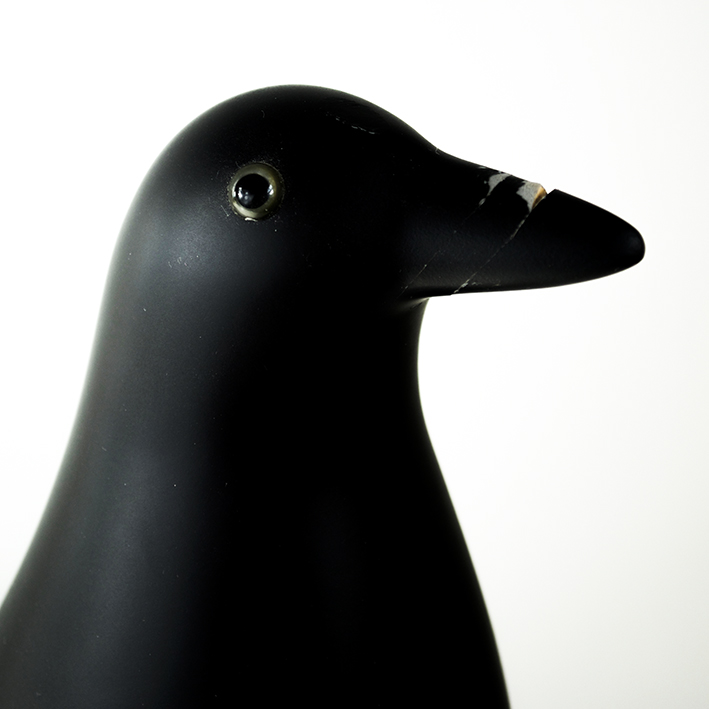
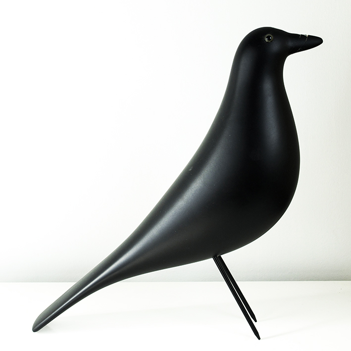
Pierre Luigi adores Alvin the Eames house bird describing him as ‘so sleek, so elegant, so kind, so gentle but with a broody, intense edge’. It’s not actually a bad description. Although we found him at First Site in Colchester, his journey to us has been rocky. A rich boy, he was hot-housed in education and fast-tracked through a string of very high profile corporate gigs but, as is often the way of things, he burned out, reached rock bottom and was left with nothing. He describes this fall as a ‘liberation’ and he now devotes his time to reading political history and theory. He’s just applied for an MA in Human Rights and Cultural Diversity at the University of Essex. I can’t tell you how he broke his beak. Alvin (c) Ella Johnston ellasplace.co.uk
Posted on

5 New Trends for Bedrooms

AW15/16 Bedroom Trends (c) ellasplace.co.ukWe’ve been in our Wivenhoe home for four years now and we still haven’t got round to doing up our bedroom properly. So it is my mission to get it revamped for the end of 2015 – or at least the beginning of 2016 (watch this space). I’ve scoured my look-books and magazine moodboards for inspiration and we (it’s a joint decision afterall) have shortlisted five current bedroom trends that would look fab in our little space. From traditional country classics to bright and contemporary, we’re still debating which style to go for – I personally like them all. I promise we’ll make up our minds soon.
Country Classics
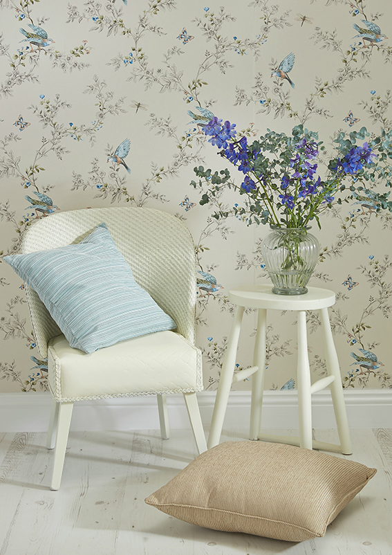
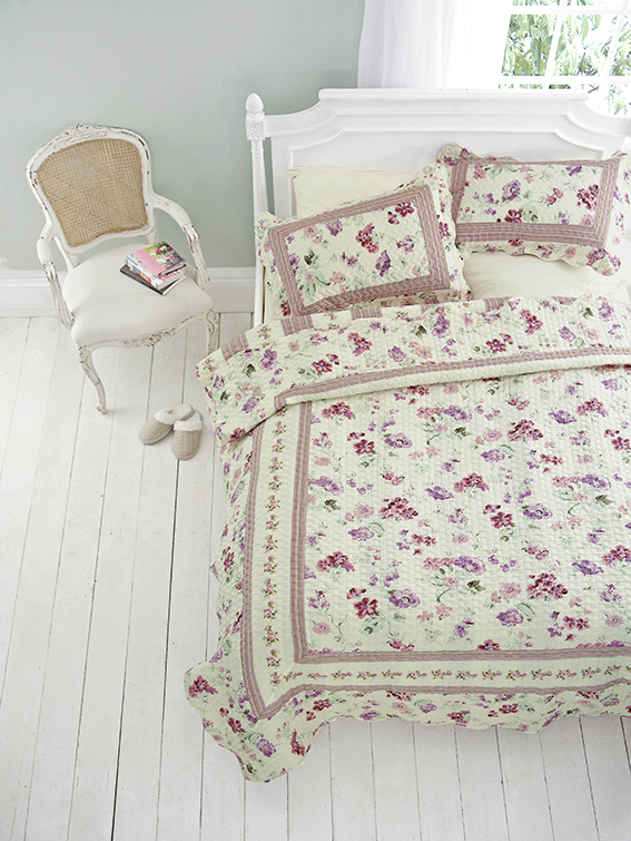
I don’t normally go completely traditional in regards to interior design – I’m favour more of what you might call a mash-up look, or should that be eclectic? However, when it comes to bedrooms,  there’s something I can’t resist about wicker chairs, white wooden accents, artisan looking quilts and pretty florals. It just screams class and loveliness as well as making me feel grown up – I mean take a look at this lot, I’d feel like a French princess every morning if I woke up to this.

From B&Q
From B&Q
From Homebase
From Homebase
From House of Bath
From House of Bath
From Dotcomgiftshop
From Dotcomgiftshop
From Amara
From Amara

Bright and Beautiful
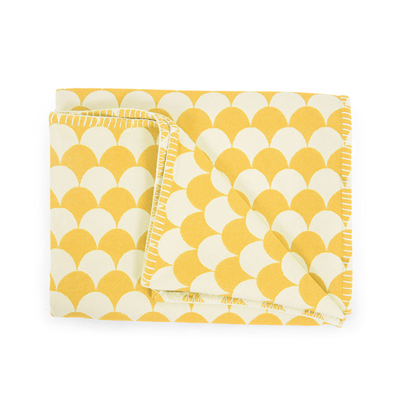
Accent notes in bold colours and vivid patterns are definitely my go-to when I’m usually looking for homewares. So I’m very taken with the trend for retro motifs, geometric weaves and bright painterly effects, plus the current palette of rich buttercup yellows, mint greens and warm berry shades. This look really suits my preference for mixing and matching styles as you can go to town with it or tone it down when teamed with greys and other more sober shades and organic, rustic materials such as wood or leather.

From Wallpaper Direct
From Oliver Bonas
From Oliver Bonas
From HomeSense
From HomeSense
From Heals
From Heal’s
Occa Home
From Bluebellgray

Calming and Relaxing
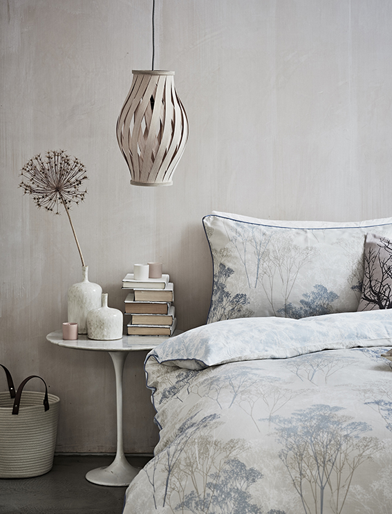
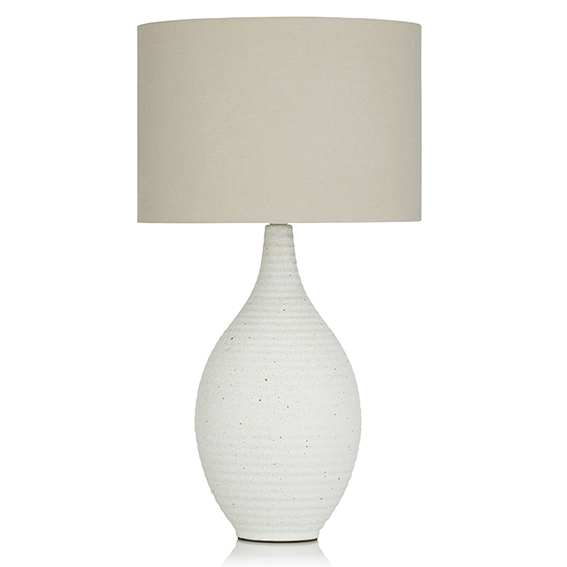
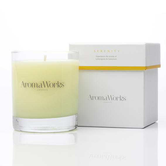
A bedroom is a sanctuary and I’m very attracted to the idea of creating a space that is truly calm and restrained. We’re both so busy and I’d like to make a soothing, restful place for us to really wind down in. I’ve recently seen some lovely collections that fit the bill perfectly, combining soft hues, neutral tones and natural textures with elegant, subtle motifs – just gorgeous. 

From Sainsburys
From Sainsbury’s
From Next
From Next
From Aroma Works
From Aroma Works
From Debenhams
From Debenhams
From Rose & Grey
From Rose & Grey
From Mylands paints
From Mylands Paints

Modern Graphic
As you’ll know from my stamped stationery and fabric collections, I’m often drawn to strong pattern in a contemporary blue/grey colourway. Inspired by Shibori dying and Scandi design, this style seems to combine my love of bold graphics with my desire to create a tranquil space. Worth exploring.

From George at Asda
From Ville & Campagne
From inspaces
From In-Spaces
From Dunelm
From Dunelm

Fun and Quirky
Because the boudoir is a private space (behave!), I think you can afford to be a bit playful too. Even if it’s not massively full on, whatever general look I go for, I’ll be sure to inject a fun quirky element to my bedroom scheme – after all we all know how I love a little animal in every room

From Debenhams
From Debenhams
From the French Bedroom Company
Posted on

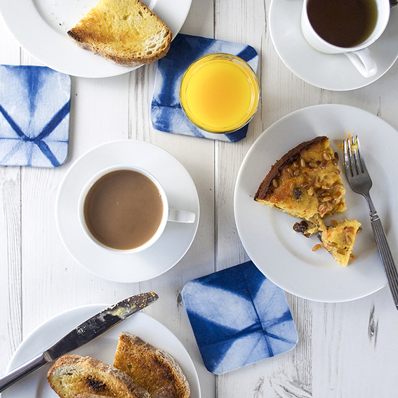
How I made easy fabric coasters in 10 minutes

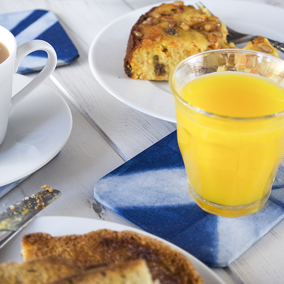
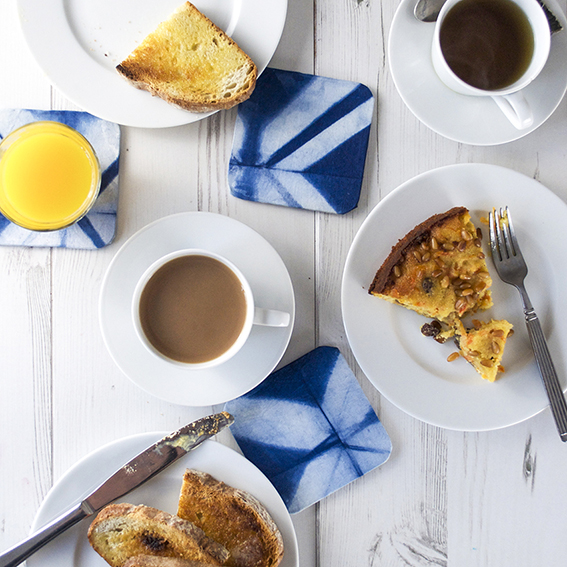
Shibori fabric coasters (c) Ella Johnston ellasplace.co.uk
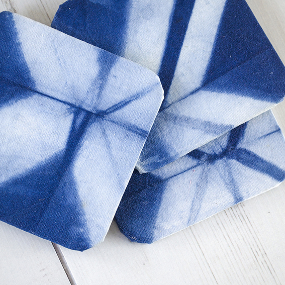
This Shibori fabric coaster project is so easy I kind of feel bad posting it. It took me minutes to make and yet I think they look really stylish. And – seeing as I’m working on Christmas issues of my magazines at the moment – I reckon I may use the techniques employed here to whip up some handmade designer style pressies for my friends.

Shibori fabric coasters (c) Ella Johnston ellasplace.co.uk

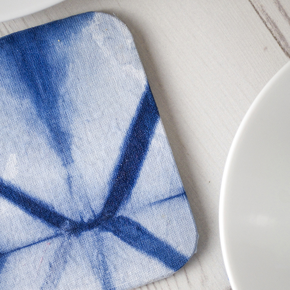
I had a surplus of Shibori-dyed fabric from a recent workshop I attended and I haven’t got round to making cushions with my larger pieces of fabric yet, but I loved my scrap tester pieces that I made and wanted to do something nice with them.

Shibori fabric coasters (c) Ella Johnston ellasplace.co.uk

So I bought a set of blank MDF coasters, cut these scraps to size leaving a 1cm allowance. I then covered the MDF pieces with PVA. I tucked the fabric under and coated the whole lot with a varnish to seal in the fabric and protect the surface. Then once it was all dry I used a strong adhesive to apply a square of felt to the bottom to get rid of any ugly finishes and to provide a good base for the coaster.

Shibori fabric coasters (c) Ella Johnston ellasplace.co.uk

Shibori fabric coasters (c) Ella Johnston ellasplace.co.uk

I’m really pleased with them and use them all the time. A final note: a special shout out has to go for the delicious gluten-free carrot and almond cake (in the pictures, above) from the Wivenhoe Deli and Tea Rooms – I’m a fan and I’m not even gluten intolerant!

Posted on

Dining Trends for Autumn Winter 2015

From Sainsbury's Home
From Sainsbury’s Home

Now we’re in October I’m declaring autumn officially open! I can lock up the barbecue (I make a great veggie one by the way) and look forward to inviting people round for some heartwarming indoor dinners. With this in mind I’m thinking of sprucing up my dining room with a few little key pieces and have been checking out the upcoming trends for autumn/winter 2015 that I thought I’d share with you.

ROYAL AND BERRY-STYLE COLOURS 
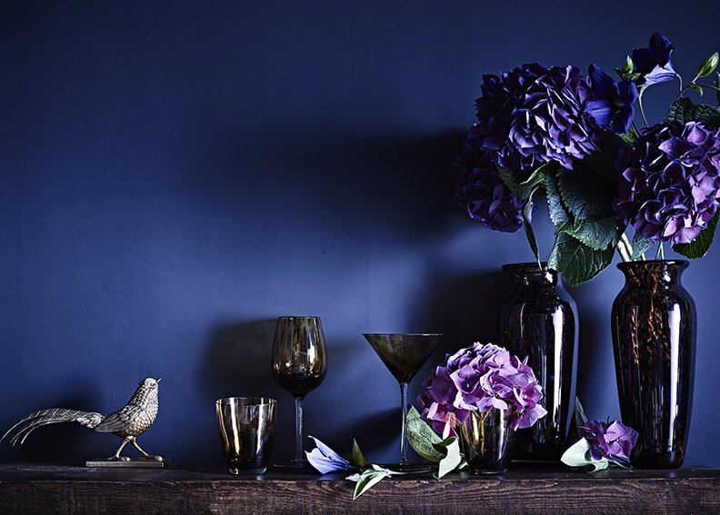
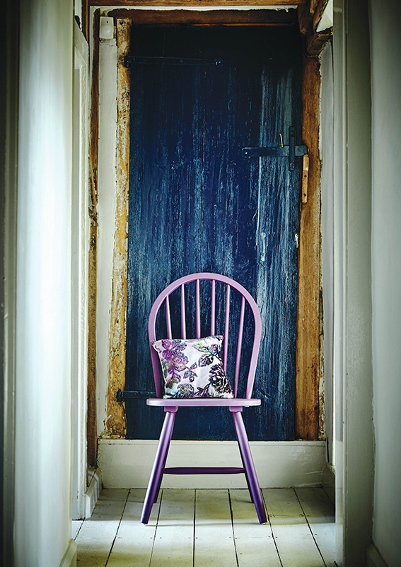
Deep navy blues, vivid purples, soft mulberry and raspberry shades are really popular right now, especially in terms of furniture, table accessories and paints. Much as I love the gothic sub-culture and goths I’m not sure I’m brave enough to go all out on this scheme but I may invest in some richly coloured hydrangeas and the odd cushion.

From Marks and Spencer
From Dunelm
From Dunelm
From LSA
From LSA International

METALLICS – ESPECIALLY COPPER!
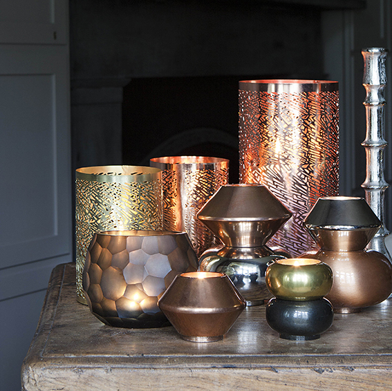
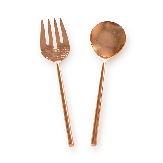
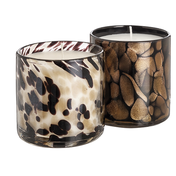
Every single press show I’ve attended this year featured metallics and lots and lots of copper elements. You can go as full-on or as subtle as you like with this trend, grouping lots of lanterns and votives together, or simply choosing glassware with metallic finishes.

From Amara
From Amara
From Tesco
From Tesco
From Oliver Bonas
From Oliver Bonas
From Debenhams
From Debenhams
From Marks and Spencer

PATTERNS ON PLATES AND NAPKINS
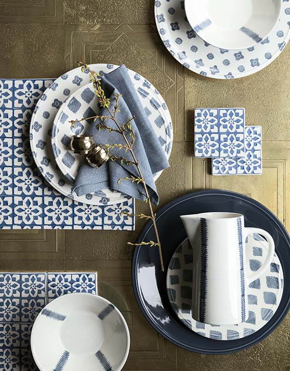
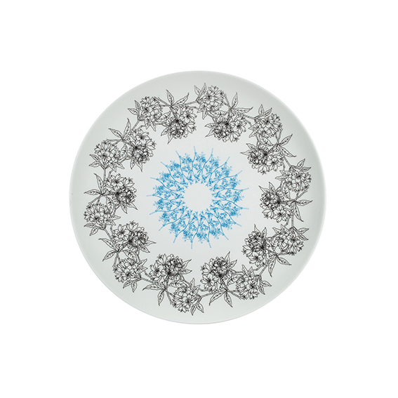
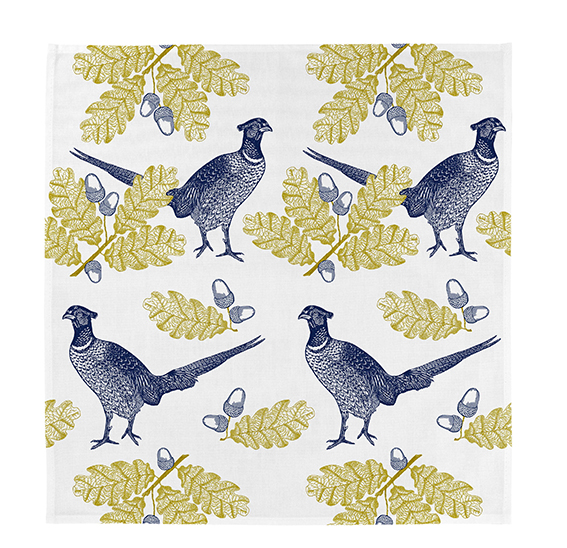
While everything else is all about textures and colours, accessories such as plates and napkins are featuring ornate patterns. As someone who works with pattern and illustration I’m quite excited about this trend as I love little touches of illustration in homewares. And, although I’m a fan of big bold graphics, I do like the fact that more intricate designs are making a play this season.

From House of Fraser
From Amara
From Amara
From Wild & Wolf
From Thornback & Peel