Posted on

Drawing of the week: Flamingo Head

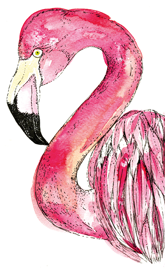
Flamingo (c) Ella Johnston

This week’s drawing of the week is of a bright pink flamingo head.

I must admit it has taken me a little while to warm to the flamingo bird, although really fun to paint and draw (you can really go to town with pink watercolour here), it was a bird that never really got under my skin like a puffin, lapwing or curlew. I suppose I was put off because they have been so popular as a motif in homewares and stationery design.

Perhaps I also thought they were show-offs of the avian world – to me they were just a bit too lairy with their pink plumage. Maybe I was jealous – no one could accuse me of being leggy and it’s rare that I splash out with colour in a sartorial sense (I leave that for my illustration).

Of course I was wrong. I mean these birds are magnificent creatures and when you find our about these birds they really are fascinating. Here are some fun flamingo facts…

Special bills
Flamingos beaks  are specially adapted to separate mud and silt from the food they eat. The bills are uniquely used upside-down. Don’t know what I mean? Take a look here…

In the pink
Their distinctive pigment comes from carotenoids they eat in animal and plant plankton which are broken down into pigments by liver enzymes.

Flam Fam
Flamingos are very social birds. Their colonies can be thousands strong. This protects them from predators and enables them to nest more efficiently.

What a pair
The birds perform synchronised ritual displays in colonies. The members of a group stand together and display to each other by stretching their necks upwards, making calls while head-flagging, then flapping their wings. Flamingos form strong partnerships although in larger colonies flamingos sometimes change mates (well we’re all allowed to change our minds). Both the male and the female play a part in building and defending the nest. Occasional same-sex pairs have been reported, which makes me happy.

Don’t you just love flamingos a bit more now?
 

Posted on

Monday Moodboard: Dots and splodges

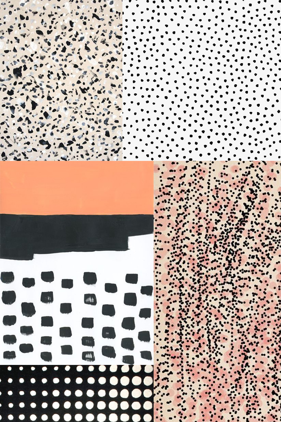
Monday Moodboard Dots and SplodgesAh dots and splodges, my old friends. It’s only right I dedicate a Monday Moodboard to these guys as they are really essential to my creative process.

Whenever I’m in a bit of a rut illustration wise but need to get my drawing head on I make marks with dots and splodges. It helps me explore what patterns to create and allows me to enjoy the medium of whatever I’m working in, be it watercolour, ink or felt pen.

But they’re not just a cool way to play with mark-making; as you can see by the above they are incredibly effective in creating patterns and compositions. I personally can’t resist the combination of black with white, pink and apricot shades.

By the way I need to do a big shout out to Ashley Goldberg as two of her designs are featured here. I LOVE her work to pieces. Check it out here.

Posted on

Drawing of the week: Eucalyptus

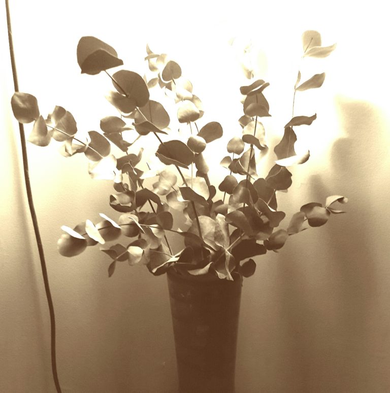
Eucalyptus illustration (c) Ella Johnston

My drawing of the week is a young eucalyptus plant.

I was at a friend’s house last weekend and she had gorgeous bunch of eucalyptus in her lounge. They also looked so elegant placed on their own in the vase, unadorned, unfettered by other blooms. Inspired by these I had to source some of my own sprigs to draw.

It has kick-started me trying out some more botanical illustrations. I’ve already done some further eucalyptus sketches and some more watercolour and ink drawings of ferns.


Posted on

Monday Moodboard: Soft Shades

Monday Moodboard Soft shades

I’m loving this week’s moodboard of sweet, soft shades but you’re probably wondering how I got to it.

I’m on product development mode at the moment and consequently my desk is full of colour swatches, trend reports and tear sheets. Loads of the latter are from last year, which featured these particular shades a lot. I still adore the combinations of greens, blues, creams and pinks – I’m interested to see what new soft shade combinations will be in vogue for spring and summer this year.

Posted on

Easy draw Valentine’s makes


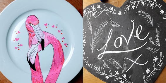
These easy-draw Valentine’s makes are perfect if you like your love tokens handmade. So why not give these illustrations a try in time for the big day on Tuesday?

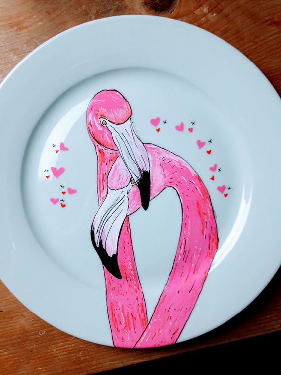
flamingo plate (c) Ella Johnston
I’ve got lots of posca pens from my workshops last year so  grabbed an old white plate and some slate heart-shaped table mats and decided to give them a  love-themed drawing update. And with my templates and how-tos you can do them to…

Download the Flamingo template below and take a look at what I did with my outline drawing on this video above.

Love slate heart craft Ella Johnston
Or if monotone line drawing is more your bag then follow this cute little demo movie. You don’t need slate, you could work this on any dark surface.

Click right to save this template
Posted on

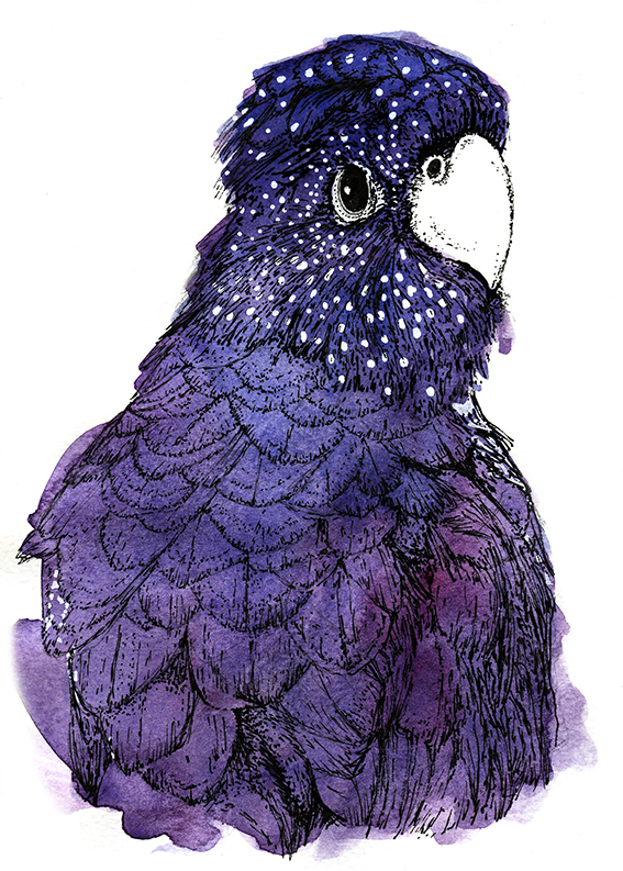
Drawing of the week: cockatoo

Cockatoo illustration (c) Ella Johnston

I really enjoyed doing this drawing of the week, my sanguine looking cockatoo. I’ve drawn it as part of series of bird portrait works to be exhibited later this year.

Now I know this black cockatoo is rather purple in his hue but I wanted to reflect the luxurious, deep and rich nature of his plumage. Very few dark shades are just black, they almost always have a base of purple, green or blue at their core.

As usual I created the illustration in watercolour and fine pin ink pen but this time I used a posca white pen to create the little dots on my boy’s feathers.

Posted on

Home Inspiration: Nina Kullberg

Nina Kullberg

Although my own work is detailed and intricate using fairly muted shades, I’m actually a very big fan of strong graphic pattern and bold colours in my home, especially in my soft furnishings. So when I saw that Nina Kullberg was launching a new set of cushions I had to take a closer look.

I’ve been fond of Nina Kullberg’s work for a while – I’m a little obsessed with her instagram account truth be told. The simplicity of her pattern and her vibrant palette in her cushion collection is just lovely. And, she’s not scared of a muted tone either, just check out her exquisite throws in beige and grey.

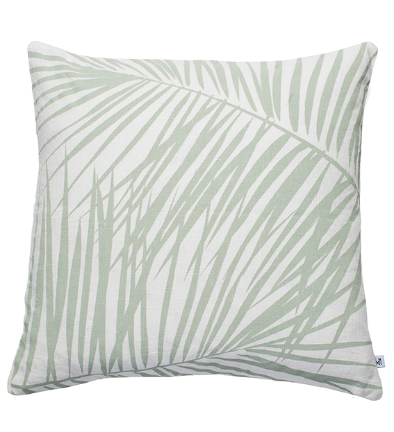
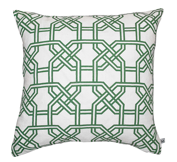
Anyway as all good designers know, it’s vital to respond to trends so the designer has embraced the Pantone Colour of the Year 2017 Greenery in her new collection of cushions. I think these are perfect for spring and summer and would look lovely in a crisp white bedroom or sunny conservatory.

Take a look at Kullberg’s website for more.

Nina Kullberg Palm Springs in Alfalfa £67
Nina Kullberg Athens in English Ivy Green £67
Nina Kullberg London in Hemlock Green
Nina Kullberg London in Alfalfa
Nina Kullberg Paris English Ivy Green
Posted on

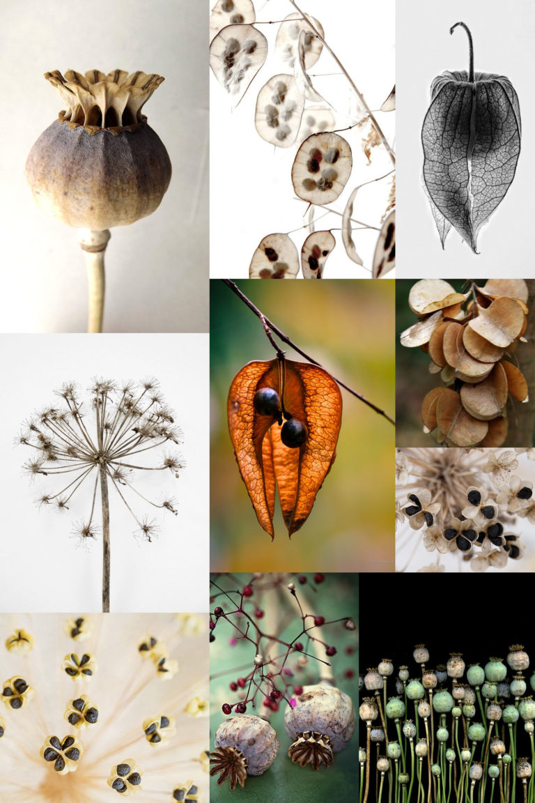
Monday Moodboard: Seed heads

Monday Moodboard Seed headsToday’s Monday Moodboard is a homage to my teenage self. I was obsessed with seed heads when I was doing my A-Levels and after looking at this collection of images I can see why.

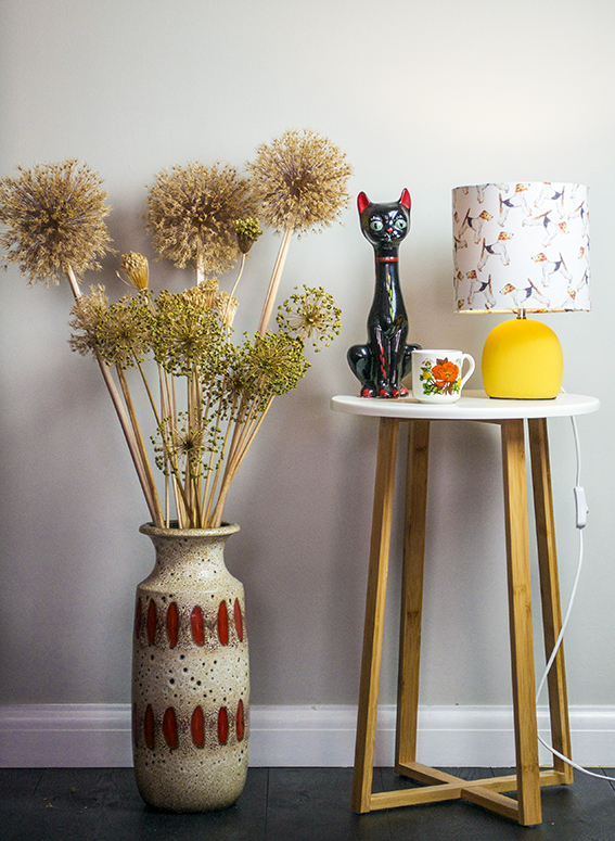
In fact I’m tempted to revisit this as a theme for my illustrations. They are structural, almost architectural in their form and the faded colours would look amazing in watercolour. I’ve got loads of dried allium and poppy heads displayed through out my home (see below) so I may have a little bash drawing at some still lives in ink I think the medium would work with its wild, ragged nature – I’ll keep you posted.
Poppy Heads Ella JohnstonDoglamp and seed heads Ella Johnston

Vintage Pottery Vignette ellasplace.co.uk

Posted on

Drawing of the week: Rooster

Rooster drawing/illustration (c) Ella Johnston

We recently welcomed the new luna (or is it lunar?) year of the rooster so it’s only fitting it’s this week’s drawing of the week.

As much as I like a brown or black bird illustration, the bird I’ve drawn here is a Brown Leghorn rooster, which I have chosen purely for his plumage. When I got out my watercolour paints to illustrate this fella I knew warm orange, purple and emerald hues would be the order of the day. I really wanted to go to town on the colours for this guy as I think the rooster (also known as a cockerel or cock) is such a glorious creature  – I really admire them as they pace around the chicken pen.

As well as being the symbol for my football team, the cockerel is also a scared animal in some cultures, with the rooster being associated with the sun goddess Amaterasu, in fact Zoroastrianism held the rooster as a “symbol of light” and associated the cock with “good against evil” due to its heraldic actions. So all praise for the mighty rooster!

Posted on

Monday Moodboard: Luxe Florals

Monday Moodboard Luxe Florals

Luxe florals are just the right thing for this time of year, which is why today they have made my Monday Moodboard.

The freezing, wet weather and grey skies are atmospheric sure but the damp and cold can be a little draining day after day (last nights evening walk was a very muddy affair). So I’m warming myself with, and getting creative inspiration from, rich purples, velvety blacks, deep maroons and cerise tones as seen in beautiful, frilly flowers. I’ll be working on some sketches of these in the coming weeks with a view to working up pretty patterns and evocative illustrations.