Posted on

Home Inspiration: Nina Kullberg

Nina Kullberg

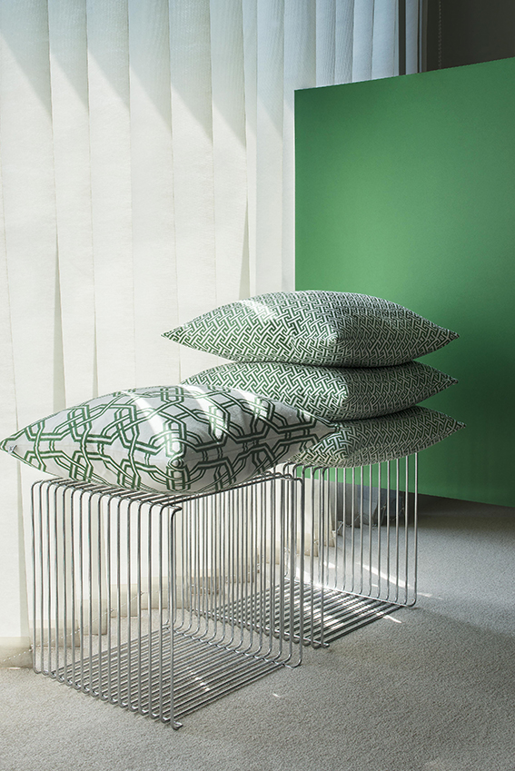
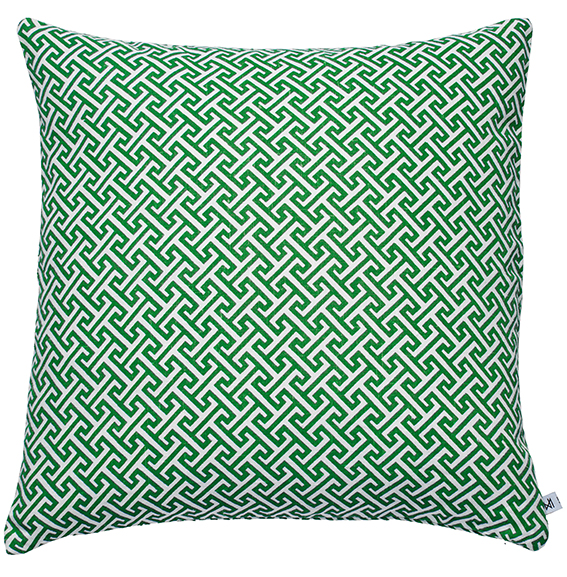
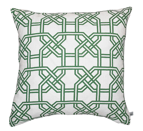
Although my own work is detailed and intricate using fairly muted shades, I’m actually a very big fan of strong graphic pattern and bold colours in my home, especially in my soft furnishings. So when I saw that Nina Kullberg was launching a new set of cushions I had to take a closer look.

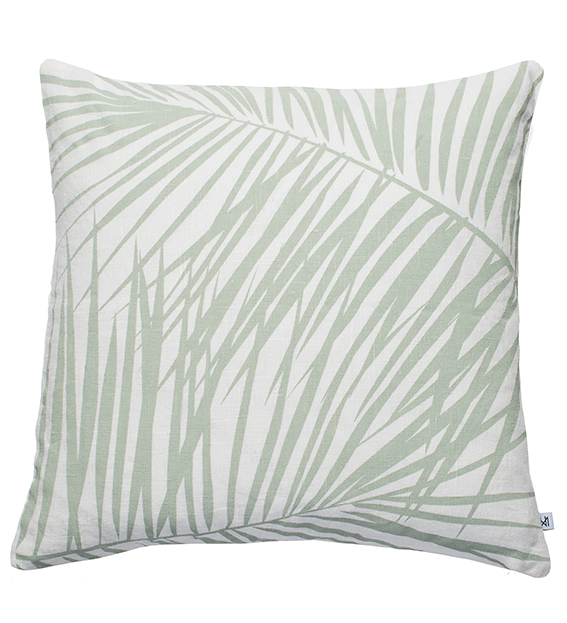
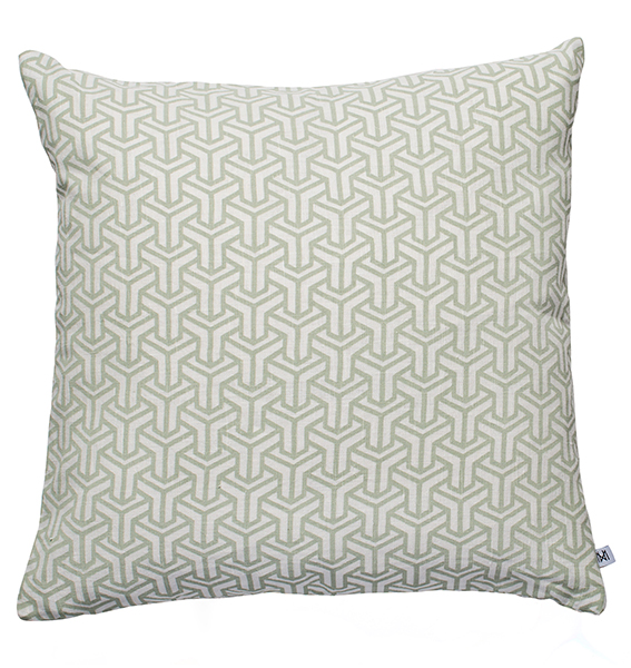
I’ve been fond of Nina Kullberg’s work for a while – I’m a little obsessed with her instagram account truth be told. The simplicity of her pattern and her vibrant palette in her cushion collection is just lovely. And, she’s not scared of a muted tone either, just check out her exquisite throws in beige and grey.

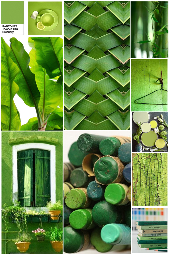
Anyway as all good designers know, it’s vital to respond to trends so the designer has embraced the Pantone Colour of the Year 2017 Greenery in her new collection of cushions. I think these are perfect for spring and summer and would look lovely in a crisp white bedroom or sunny conservatory.

Take a look at Kullberg’s website for more.

Nina Kullberg Palm Springs in Alfalfa £67
Nina Kullberg Athens in English Ivy Green £67
Nina Kullberg London in Hemlock Green
Nina Kullberg London in Alfalfa
Nina Kullberg Paris English Ivy Green
Posted on

Monday Moodboard: Pantone Colour of the Year: Greenery

Greenery Moodboard

Last week Pantone announced its colour of the year for 2017. It’s ‘Greenery’ and it makes me happy.

A few design experts have been a bit disparaging about this colour with the name ‘Kermit’ referenced, well as a person who admires the work of Jim Henson I don’t think that’s so bad.

But seriously I  love a bit of greenery, and I was even singing its praises earlier this year. Bringing the colours of nature into your home is a marvellous thing and the vivid shade of this Pantone  works incredibly well with both subtle pastels and equally vibrant hues.

The colour is described by Pantone as a “fresh, yellowish hue” that “symbolises the reawakening of nature in spring and is a symbol for a new beginning”. Great – just what we need after 2016.

I’ve embraced shades of greenery already in my own new print designs (before the announcement I may add) so I’m incredibly happy that it’s not just me looking to find hope in natural colours and forms.

Leaf prints by Ella JohnstonLeaf prints by Ella JohnstonLeaf prints by Ella Johnston