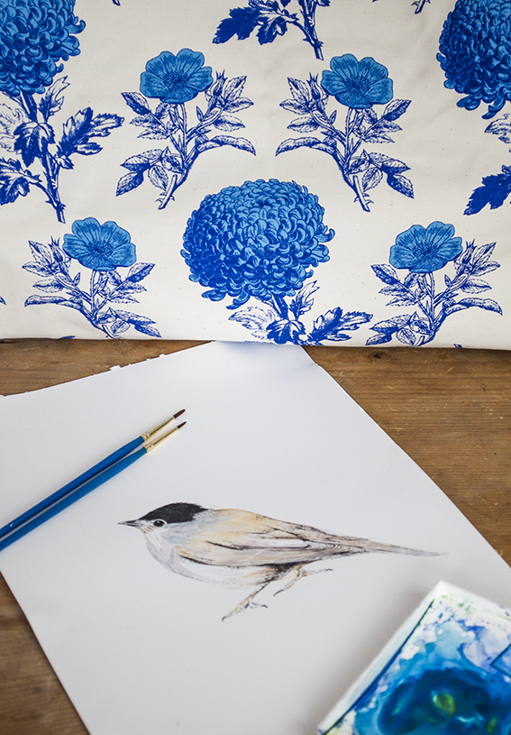
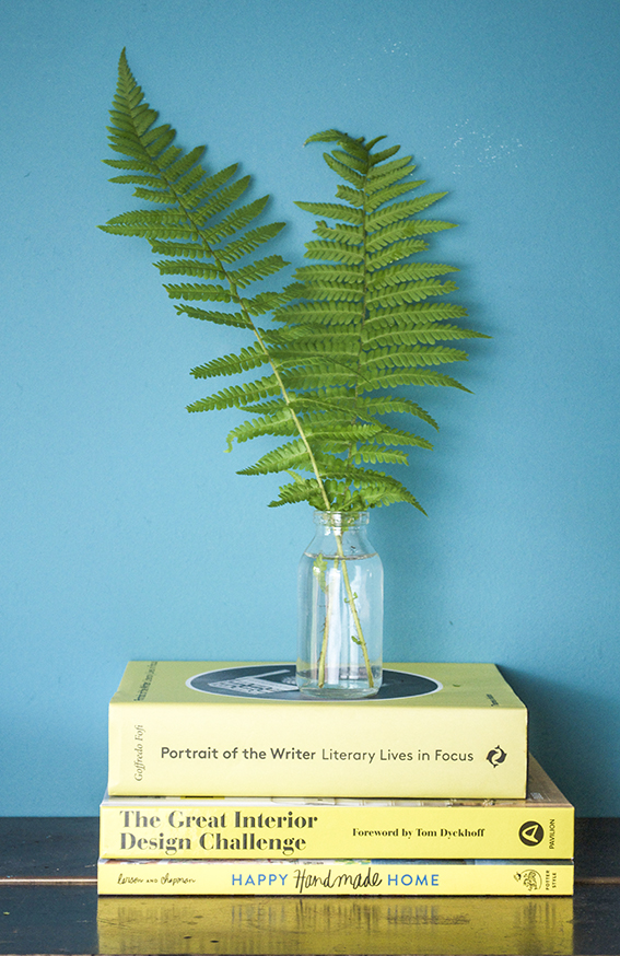
 The garden is a great place to source bits and pieces for a quick, easy and cheap display. Ideal for weddings and parties or, for me, as last minute props when photographing my prints and stationery.
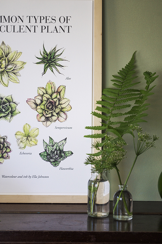 As our ferns are so lush and green at the mo, I’ve been snipping the odd leaf to place in clear containers for the ultimate elegant display. Teaming them with over-it cow parsley also looks very effective as a simple structural tableaux.
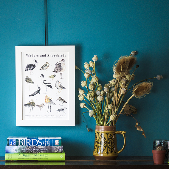
We had an abundance of poppies this year. Now they’re all done I’ve got loads of fab poppy heads to have as year-round loveliness. I’ve combined these with some dried out teasels that my mum gave me last year and placed them in a vintage jug I picked up from a charity for a loose organic feel.
Category: Uncategorized
Quick and Easy Update: Hang Fabric hoops
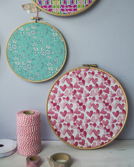
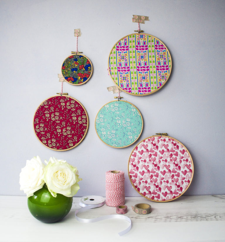 If you’re short of time or money here’s a super quick, easy way of giving your walls an update. Just buy a set of embroidery hoops, stretch some over some scrap fabric (it doesn’t have to be ‘proper’ haberdashery fabric you can use old shirts or dresses) and there you go!
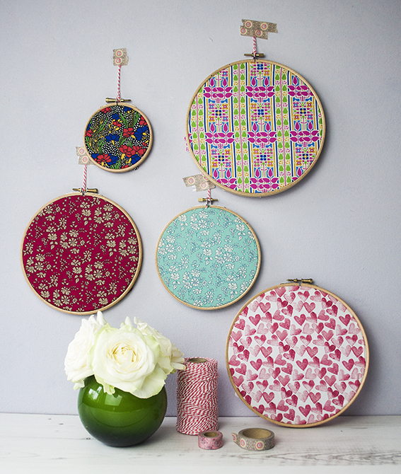 The great thing about this is you can change the display to suit the seasons. And if you’re so inclined, you can also add a little stitching over your fabric with slogans and patterns.
Monday Moodboard: Tiles
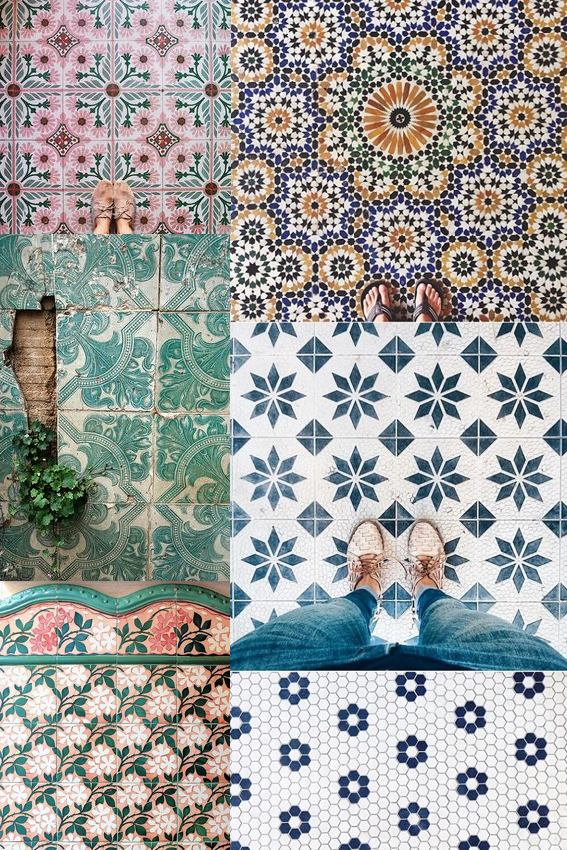 First things first, an apology. I completely forgot about my Monday Moodboard last week. That’s because I got completely absorbed in working on creating tile designs for an upcoming Posca pen project for the company’s display stand. So welcome to my world! This was exactly the kind of thing I was looking at last week. Don’t worry I’ll share my take on tiles in the coming weeks.
I’m currently going through lots of trend reports at the mo and patterned tiles are most definitely in. I’ve always fantasised about a bathroom made up of mismatched tile designs, a lovely med-inspired blue and white kitchen with a ornately patterned tiled splash-back and one of those hallways with an intricate luxurious tiled floor. I best get saving.
Savvy small space solutions: creating a reading corner
As Dr B and I work from home in a small space we’ve had to be quite savvy when looking for storage and creative solutions.
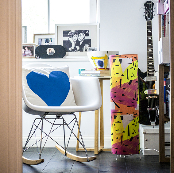 As we both work from home, it’s important to me that work stays in the office rather than seep into every bit of the house. Although it’s a compact space, I was very keen to create a corner where one of us could step away from the desk and do a bit of reading and thinking while staying in the working environment.
As the room is small, I’ve stuck to a simple to a black and white colour-scheme with little pops of colour.
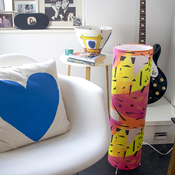 The mini rocking chair is perfect for reading and is a great escape from an upright office seat. It’s also light and easy to move around so you never feel like it’s a big bit of immovable furniture taking up too much space.
The slim little table is from Habitat. It’s simple, stylish and didn’t cost much money but it’s tall enough to rest your coffee or book on, as well as this cool ceramic bowl also from Habitat.
I deliberately chose the table, chair and shelves (which you can see peeking in at the right) with long legs that you could see under, adding to the sense of space.
Multi-function objects are great for small rooms too; that A3 box isn’t just a brilliant way to store all my art stuff (it has improved my life immeasurably), it also makes a great little guitar stand for Dr B’s Epiphone Casino.
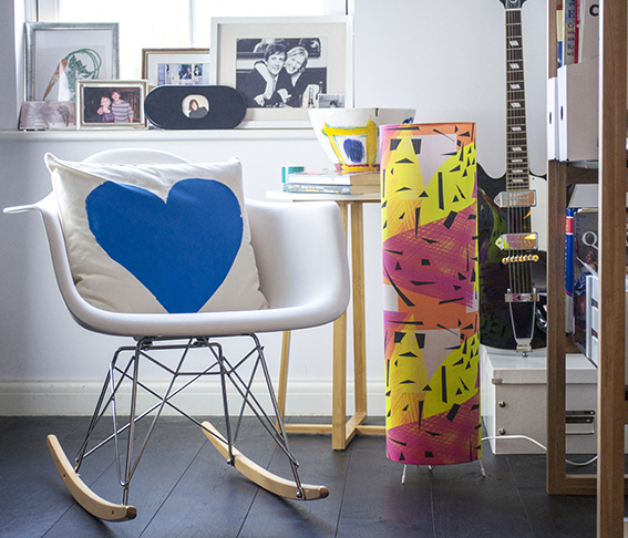 A tall thin, floor lamp is ideal for a smaller room as it makes a real statement and gives out warm light without taking up too much space. I made my own with a Dannells Floor Lamp Making Kit and designed my own Memphis-inspired fabric especially for the lamp.
As with the other kits this was really easy to use and, what’s great about this is you can buy it with the lamp-fitting so there is no faffing. It provides fantastic light and a much needed splash of playful colour in an otherwise very restrained scheme.
Drawing of the week: Leaves

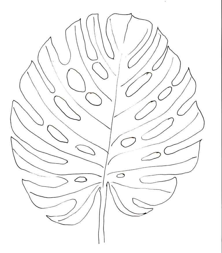
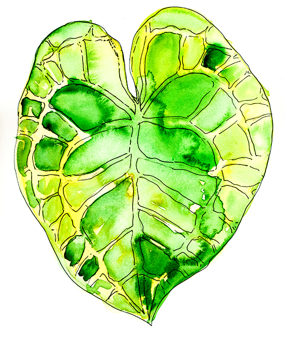
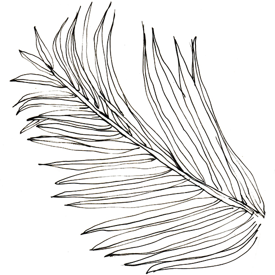
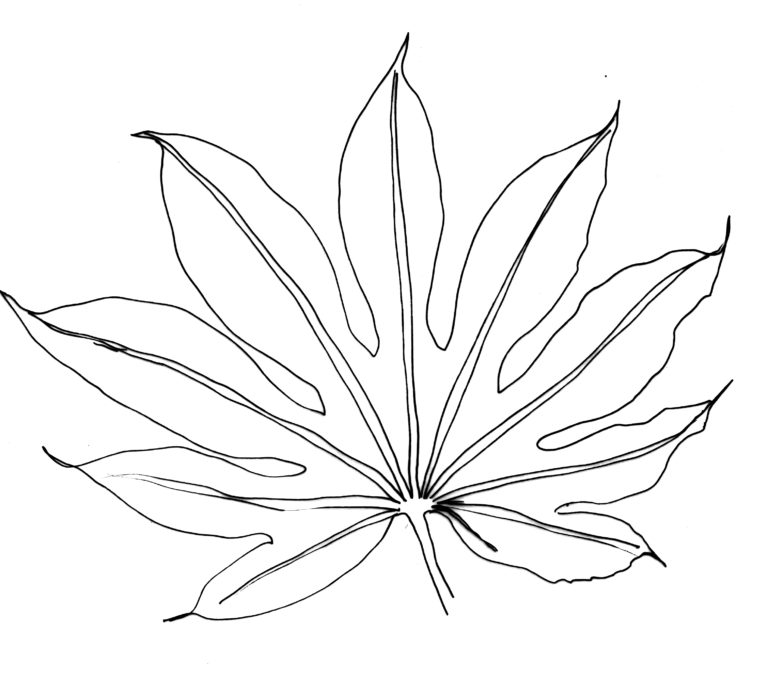
Leaves are my go-to shape for doodling and have been a constant subject for my drawing over the years. The variety, the curves, the veins, the lush texture all provide a rich resource for artists and illustrators.

I recently visited the Botanic Gardens in Cambridge. Among the various planting schemes and a lovely gaggle of ducks (I know that’s the collective noun for geese but you didn’t see these guys), the gardens also boasts an impressive glasshouse where plants from around the world are nurtured and displayed. The rainforest area is fabulous and I was struck by its enormous leaves that cover such large areas.

The nearest things we get to this is our household plants. So I thought I’d get busy with some watercolour illustrations and black and white sketches of Monstera, Aralia, Alocacia and Cycad.

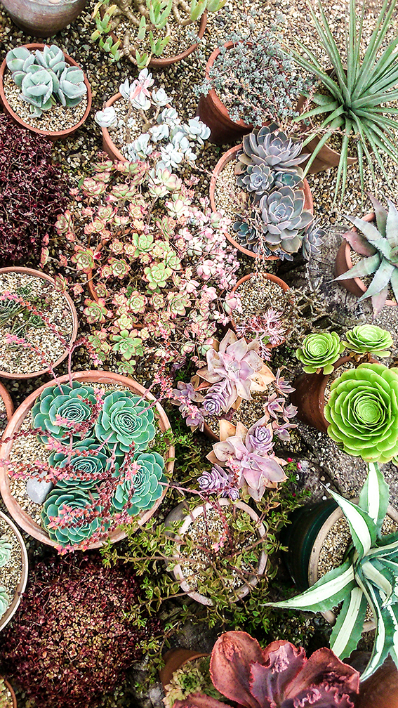
Inspiration: Beth Chatto Garden Succulents
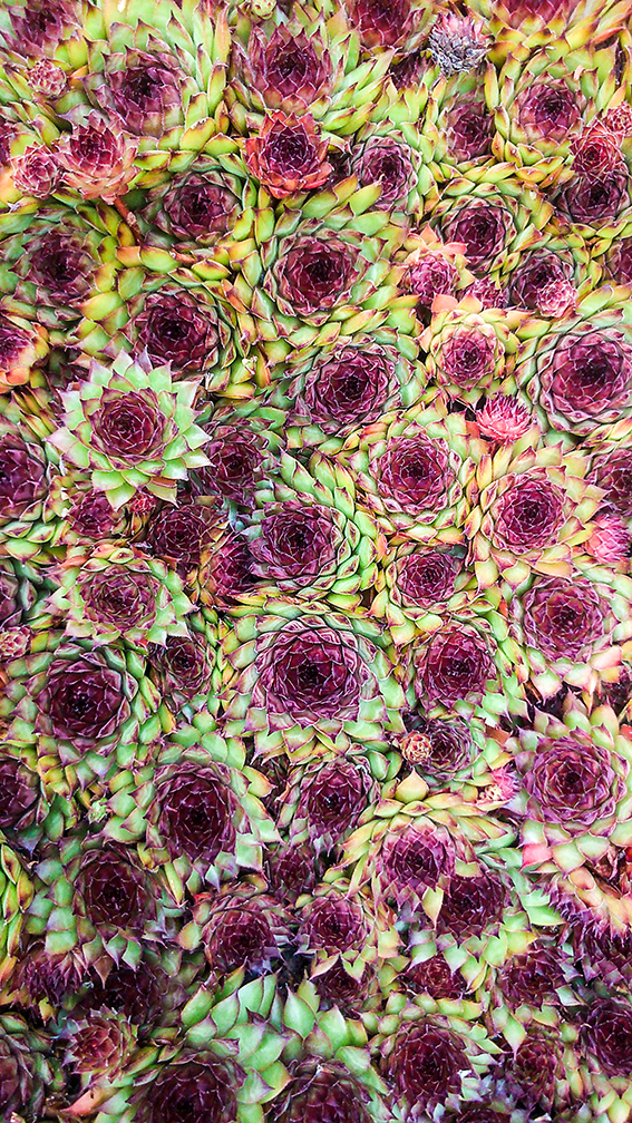
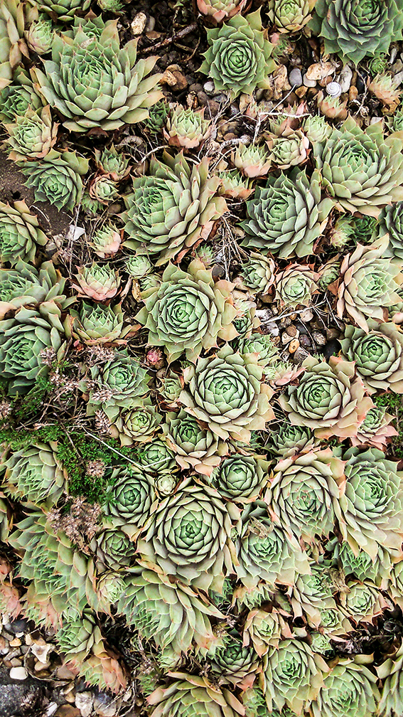
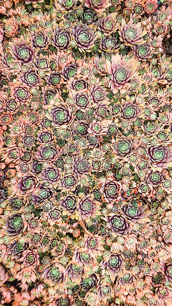
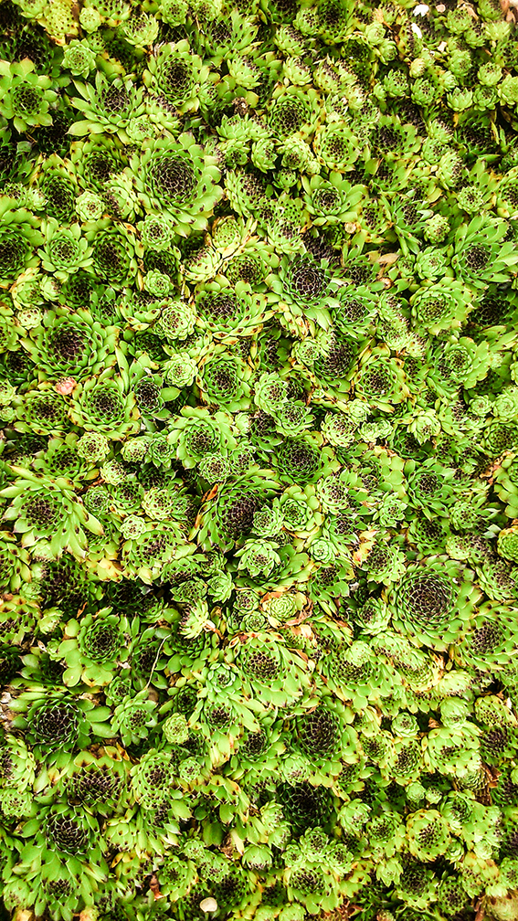
One of the best places to go for visual inspiration is the near-by Beth Chatto gardens. The succulent collection is a particular pull for me, especially as I go about my artistic work. Research is essential to my work and you’ll often find me with my phone or camera in hand, capturing images that interest and inspire me.
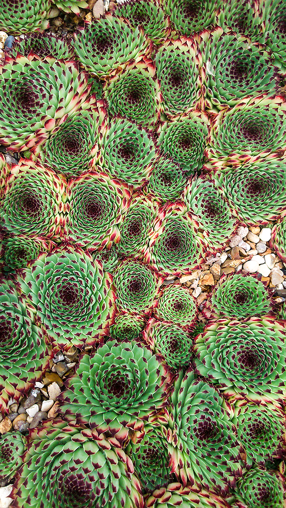 The gardens have is a wide variety of succulents. The way the gardeners display the plants all together is really impressive. The visual impact of these packed-in plants in such a range of naturally attractive colours look like a patten design in themselves.
Check out my succulent print at > my Folksy shop
Find out more about Beth Chatto Gardens > here
Cheap and Easy Decoration Tips: Colourful Amy Butler display
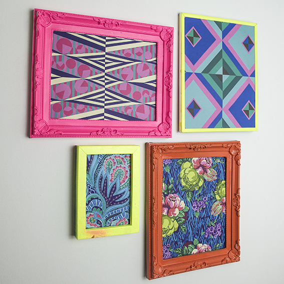
One of my favourite cheap and easy decoration tips is to create a colourful wall display. Here I’ve hung some Amy Butler prints in neon frames.
Bright and eclectic, Amy Butler’s designs are so joyous. Butler gets inspiration from a range of sources, using patterns and colour combinations inspired by her travels around the world.
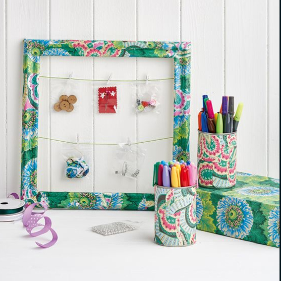
I’ve got loads of her fabrics and I was very excited when she released a book of her designs on paper, Amy Butler Decoupage. I’ve used the papers on many of my projects (including this one above for Homemaker Magazine). The book only costs around £11 and you get 80 colourful sheets making it fantastic value. I had a few sheets left and I’ve always felt a bit guilty about ripping them up for decoupage and wanted to show them off properly as a wall display.
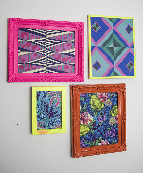 Luckily I have a collection of old frames gathered over the years and picked up at car boots (I think it’s another obsession of mine) and luckier still I’ve got a whole box full of spray paint in various colours (including some fab neons) to co-ordinate with the prints. They really brighten up a dark corner and would look really fun as a grid with matching frames to fill a wall.
Drawing of the week: Blue Jay Bird
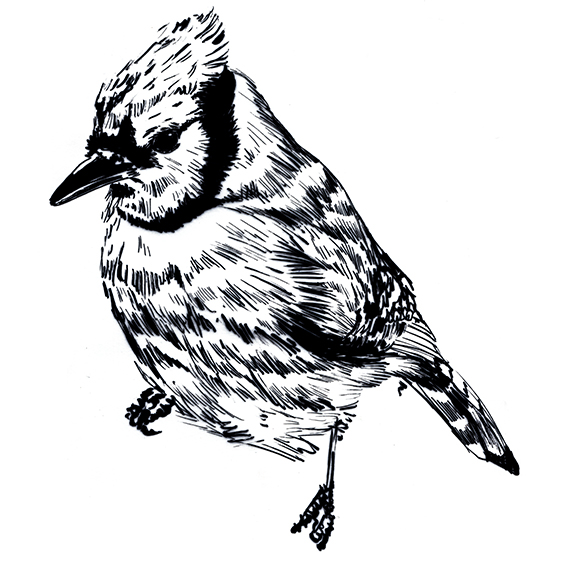
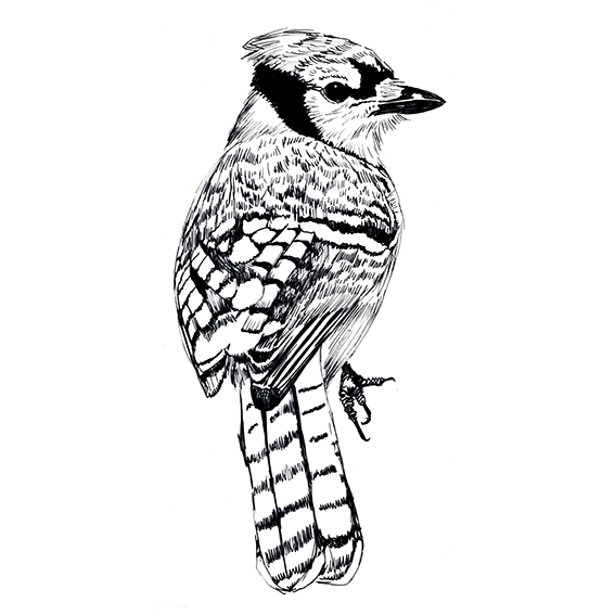
 My drawing of the week, a blue jay bird, is inspired by nature and by a song. We have regular jays in our local woods and I’m always trying to spot them on my walks.
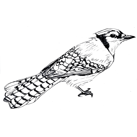
Anyway one revealed himself to me last week, where, weirdly I had the Beatles song Blue Jay Way in my head for the rest of the day. So I fancied doing a watercolour and ink illustration of the regular jay’s North American cousin.
In old African American folklore of the southern United States, the blue jay was held to be a servant of the Devil. I think my one is harbinger of joy.
The blue jay’s colouration is not derived from pigments but is the result of light interference due to the internal structure of the feathers; if a blue feather is crushed, the colour disappears, this is known as structural colouration.
Monday Moodboard: Moody Botanicals Trend
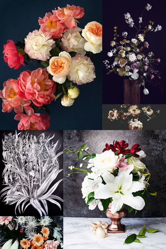
I’m very excited about the up-coming trend for moody botanicals. The contrast of soft peach, pink, white and cream tones on shades of navy, purple and grey is so effective. The overall look feels so romantic and dreamy. While it celebrates beautiful botanics, the style also gives more than a little nod to art history, evoking Rococo and Dutch flower painting themes. This trend will be everywhere later in the year and in 2017. It’s certainly inspired me to take a trip to the Wallace Collection for a little bit of research. I’ve already started to create some pieces with this theme in mind, with varying degrees of success, once I’ve nailed it I’ll let you know.
Bag a Freebie! Win a Gorgeous Thornback & Peel Tote
Are you a freebie fan? Get your hands on a gorgeous Thornback & Peel tote bag. For your chance to win, simply tweet me or leave a message on my Facebook wall with the #TandPTote hashtag telling me what you’d put in yours. I’ll be announcing the winner on 25th June.
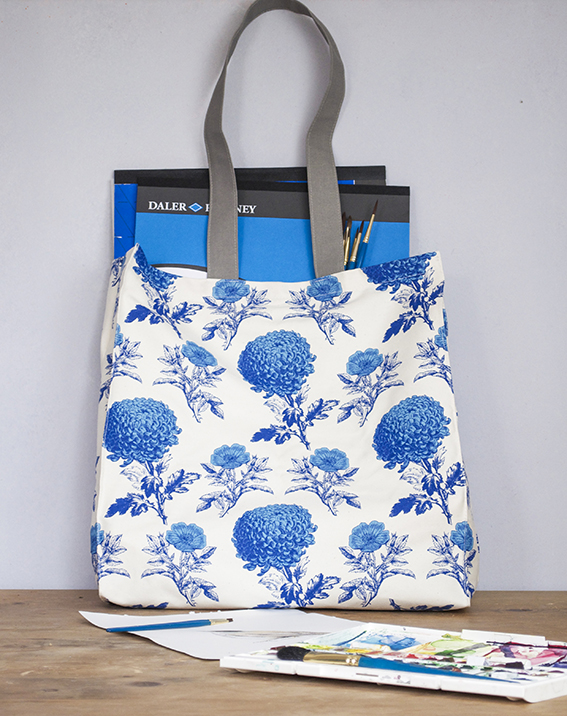
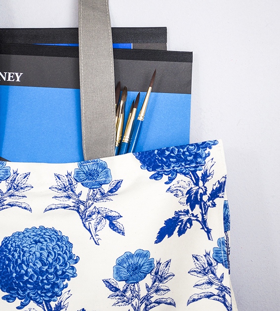
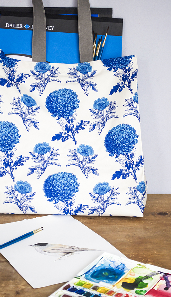
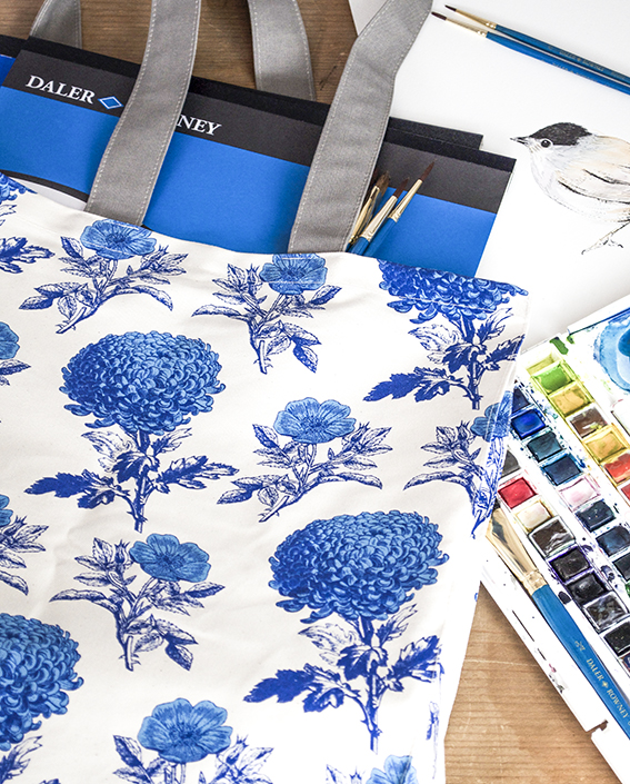
I’m a big fan of Thornback & Peel – the celebration of fine illustration and choice of colour ways makes for elegant pieces without being overly stuffy or fussy. So I was very pleased when the company sent me this Mums & Roses tote, especially as it comes in blue and white; the colour-combo of the summer. For more designs check out the rest of the collection at the Thornback & Peel website > here.
This tote is simply perfect for my alfresco watercolour painting jaunts over the summer.
At this time of year the light is so beautiful where I live, especially in the mornings. I often spend the start of the day with my paper pad and paints at the ready to capture the Essex estuary landscapes and the flora and fauna therein.
I’m filling my tote with my summer painting essentials. The bag is just the right size to fit two A3 pads comfortably with ample room for brushes and paints plus a bottle of mixing water, making it a practical as well as stylish choice.
Whatever you’re doing over the summer, why not stash your seasonal essentials in a stylish tote?
Even if you’re not the lucky winner of my comp, you can get a 15% discount on one of these shoppers until 29th June 2016; just visit the Thornback & Peel website and quote ELLASPLACE at the checkout.
 Enter the comp via my >Twitter or >Facebook
Check out Thornback & Peels totes >here
