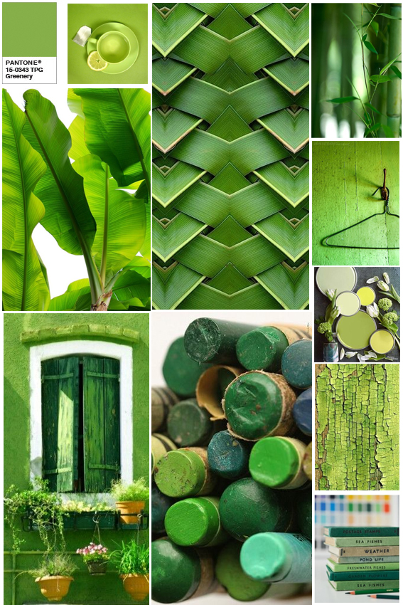
Last week Pantone announced its colour of the year for 2017. It’s ‘Greenery’ and it makes me happy.
A few design experts have been a bit disparaging about this colour with the name ‘Kermit’ referenced, well as a person who admires the work of Jim Henson I don’t think that’s so bad.
But seriously I love a bit of greenery, and I was even singing its praises earlier this year. Bringing the colours of nature into your home is a marvellous thing and the vivid shade of this Pantone works incredibly well with both subtle pastels and equally vibrant hues.
The colour is described by Pantone as a “fresh, yellowish hue” that “symbolises the reawakening of nature in spring and is a symbol for a new beginning”. Great – just what we need after 2016.
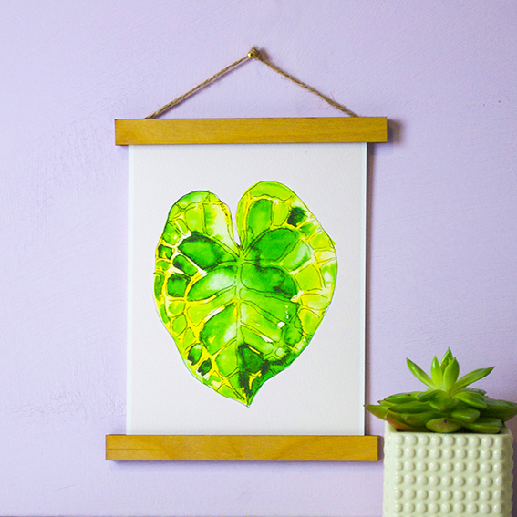
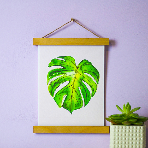
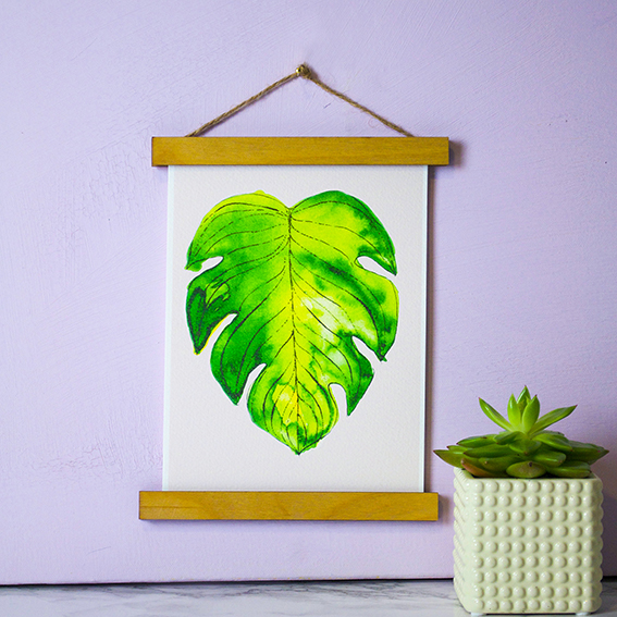
I’ve embraced shades of greenery already in my own new print designs (before the announcement I may add) so I’m incredibly happy that it’s not just me looking to find hope in natural colours and forms.