 It’s rare to meet a true design icon, rarer still to be welcomed into one’s home. So it was a great pleasure to be invited to Sarah Campbell’s colourful and exciting abode.
You may think you don’t know Campbell but believe me you probably do. Working with her sister Susan Collier since the sixties, their vibrant creations have charmed design and illustration junkies like myself over decades, with collaborations with Liberty, Habitat, Jaeger and Conran. In fact when I was researching Sarah I was delighted to discover that I had some of the Liberty designs at home.
After her sister’s death in 2011, Sarah has been working independently and as a lover of her vibrant, painterly style and celebration of shape and colour I couldn’t wait to ask her about her practice and, if I’m being honest, get some tips of making my own work as exciting and effortlessly original as hers.
 Warm welcome
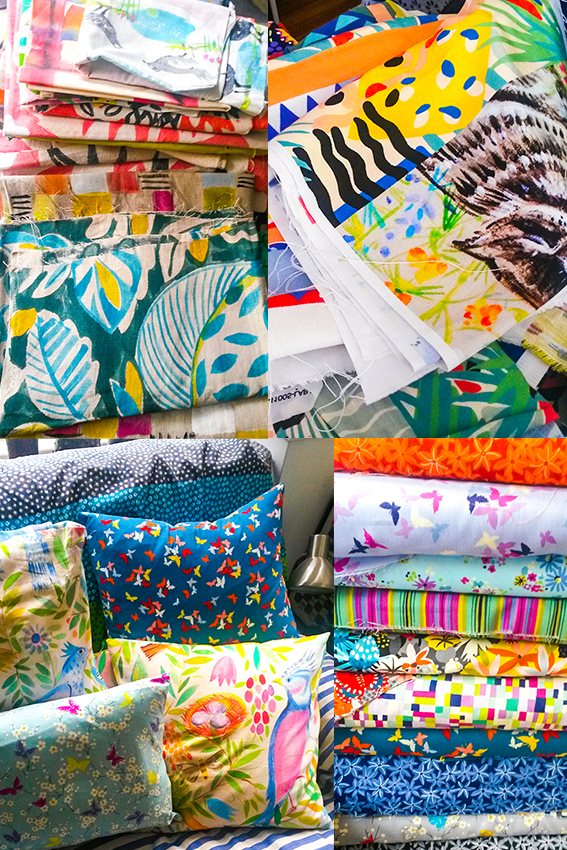
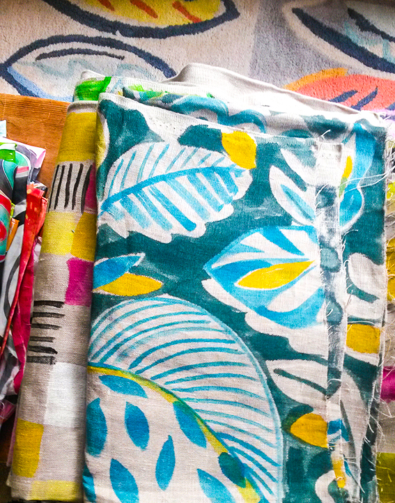
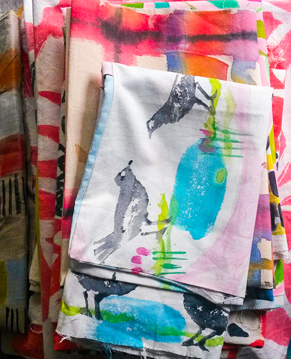
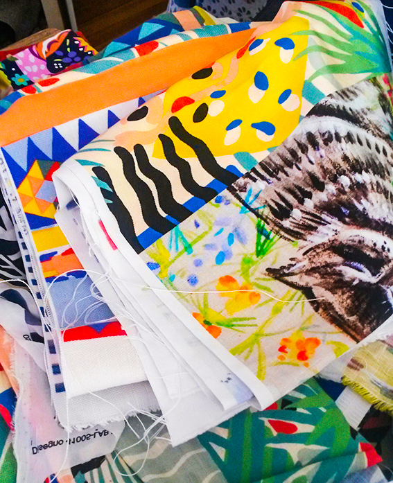
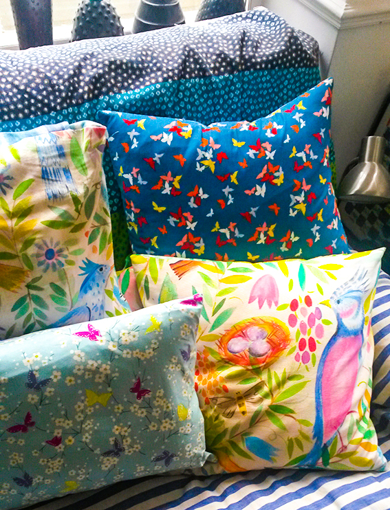
As you walk into Sarah’s fab mid-century modern home, you are immediately struck by colourful designs and a delicious array of textiles. It was heartening to see this – I was pleased it wasn’t a sterile space or simply too cool for school. In fact the exuberance and vibrancy of her illustrative work truly extends to her main room, with vivid soft furnishings and a bright green wall enhancing the foliage outside.
“Colour is the stuff of life,” she says. “When babies are very young we’re told they see colour as the contrast of black and white. But they very soon come to love real colours. It’s very important, colour is a magnet – people are drawn to it. Even in a home that’s all white or cream, I’d be hoping to see a bunch of red flowers or a merry postcard.”
There is an emotional connection too, she adds. “I went to a magnificent newly refurbished house recently where they had painted their kitchen wall a lovely turquoisey green. I couldn’t help but remark upon it. They told me that they’d had the colour in their previous home and just couldn’t live without it. I thought that was wonderful – a great anchor for a new ship if you like. It’s like they know they’re home.”
 As well as the attractive combination of textures, shapes and hues in the house, I was also pleased to be greeted by a Matisse poster in the sitting room. Sarah’s work has always reminded me of this artist (one of my favourites) and I couldn’t help but ask her about this…
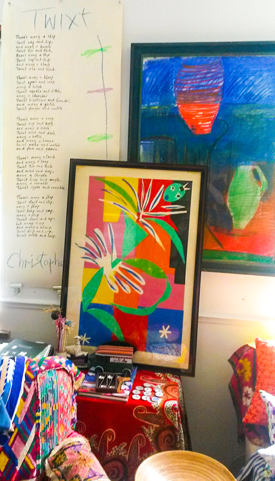 “Well you can’t do better than Matisse as an inspiration. I think of him as a friend. There are lots of aspects of his work I love. He was brought up in a weavers’ town in northern France so he really understands textiles. They way he uses patterns in his paintings reflects his childhood surroundings. When I look at something like his painting The Pink Studio, I imagine him under the weaving machine observing all the different angles of the pattern.”
I think Sarah shares Matisse’s understanding of shape and composition, and while this looks free and playful, it is of course much more complex than that.
“You look at people like Matisse, Picasso, Dufy – they can all draw. You can’t reduce something to its simplest form unless you understand it. Drawing is the key. An artist’s essential line is a wonderful thing – it’s just lovely.”
 Mark making
I see a lightness of touch in Sarah’s work, the approach feels joyful and I get a strong sense of maker’s hand in her products. She credits this to being open to influences and enjoying the process of creating.
“My pieces start with painting on paper so it is a very tactile process. People at my workshops say happily that the work is hard but like playing and I say ‘well you can see why I’m so cheerful.’ Everything has influence. I have a very large storage cabinet in my brain. New work can be inspired by a new type of paper, or a simple set of pens or brushes that make me think in a different way, so I can approach it with an inquisitive attitude.”
“When I do workshops I say, ‘we’re not all going to be old masters but we can all enjoy making marks’. Everyone can get something from this experience. People so often have their creative urges curtailed at one point or another. The words, ‘can’t’ and ‘I’m rubbish’ are often used when it comes to creative endeavours – these words are banned at my workshops. I encourage people to have fun and surprise themselves by their own capacities. ”
 The pleasure of creating
It is this sense of enjoyment and a child-like curiosity that Sarah believes keeps her work fresh and enables her to innovate.
“I have to earn a living, I need to send things out to clients for their approval but the sense of exploration has to be at the heart of work. I consider myself extremely fortunate to have had a lifetime of painting patterns. I still enjoy that exploration.”
 As a commercial artist, I imagine she must have been under pressure to ‘churn out what has worked’, so I ask her if she’s ever tempted to repeat past glories or stick to a particular formula that she knows to be popular.
“I have thought about revisiting some of our classics, and indeed have reprinted some of our most famous designs, like Cote d’Azure, as scarves and cushions and possible yardage – they stand the test of time and I still want them to be seen by a wider audience. The old designs certainly retain validity, no doubt. And, of course I do have my own style and way of working. I know what colour combinations and compositions work and naturally I want to make the best use of my experience. When I look back over the archive I can see there are interests that come and go, and motifs and ideas that reoccur, but I’d be a bit embarrassed to go back to the same thing again and again. The market changes, fashions and interests move on all the time, and production possibilities are developing constantly. The main impetus of work is looking and going forward, not back – after all, that’s the designer’s job.”
She continues… “Although it’s clear that building a brand successfully can be done by relying on a very succinct design look, Susan and I built our identity by creating lots and lots of different patterns for our many varied customers. Possibly commercial life might have been simpler if we’d only developed one or two signature motifs… but we enjoyed thinking of new things, couldn’t help it – and I still do.”
 Trail blazers
In such a crowded and competitive arena, Campbell is still very active; collaborating with West Elm, producing collections with Michael Miller Fabrics plus producing a new range for homewares and ceramics, Viva, with Magpie. So what advice would she give to up and coming designers?
“There is still a huge appetite for colour and pattern. Wherever you come from, I believe drawing and the enjoyment of it is fundamental. Keep listening, keep looking, keep your observation skills honed and keep working at your designs. Don’t dismiss what you think of as the mistakes – they are useful. Keep records and date your work, sketches and all that way you know what you did, what you learnt and achieved during that period.”
As you can tell by that last comment, while Sarah is a warm, friendly, unpretentious person, she’s tough. Of course she is, she has been working in the design industry for more than 50 years and there is a strength and wisdom to her that I found very inspiring.
“I’m most proud of still being here doing it. It’s not easy. My sister and I did, I suppose, break through a number of barriers but there were two of us and we brought our individual talents and qualities to the partnership. It’s great to still be working. I welcome new commissions and mainstream customers. I also love working with individuals on bespoke designs for curtains, furniture, clothes and walls. It continues to be great fun and very rewarding.”
See more of Campbell’s work at sarahcampbelldesigns.com
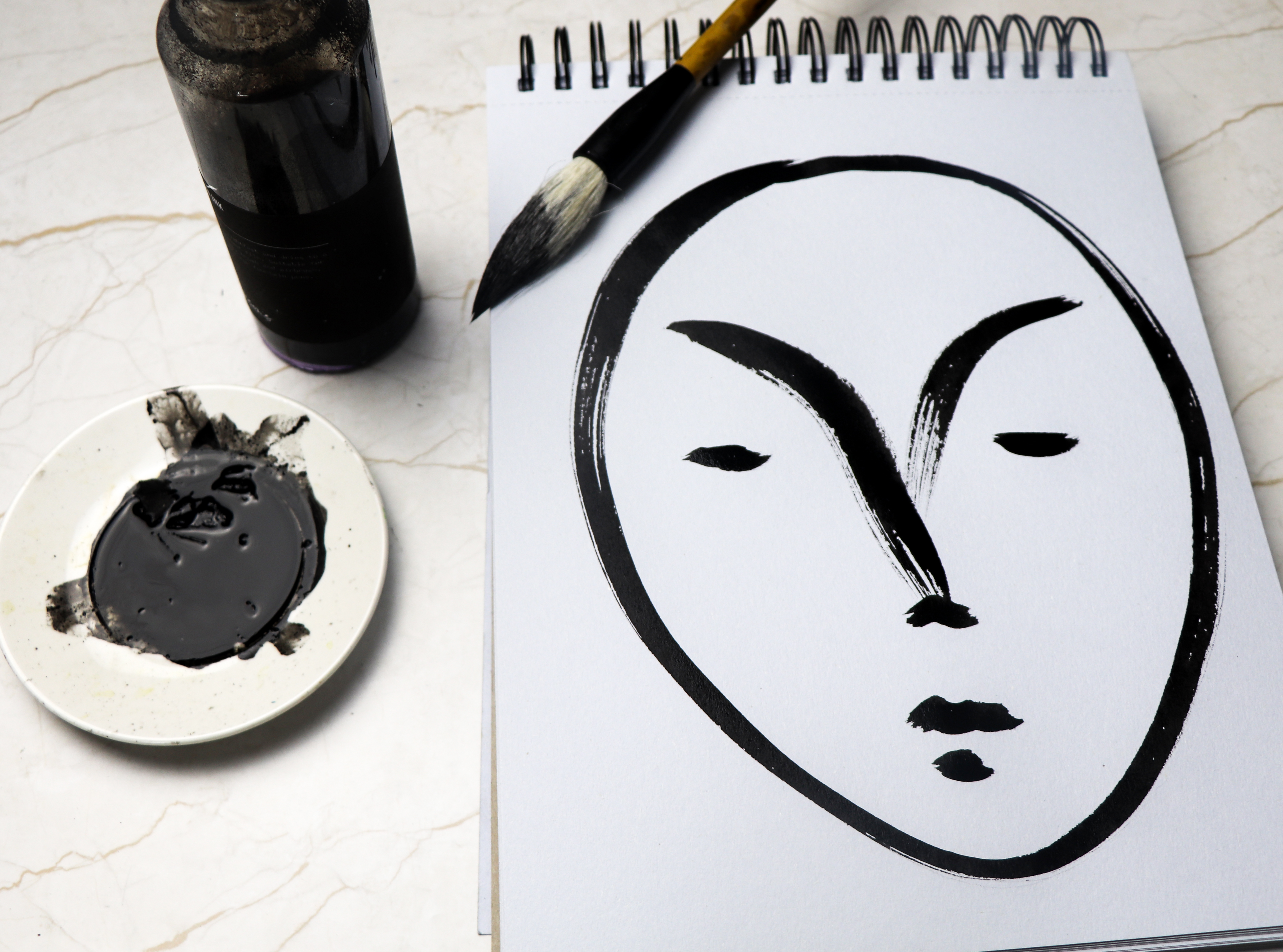
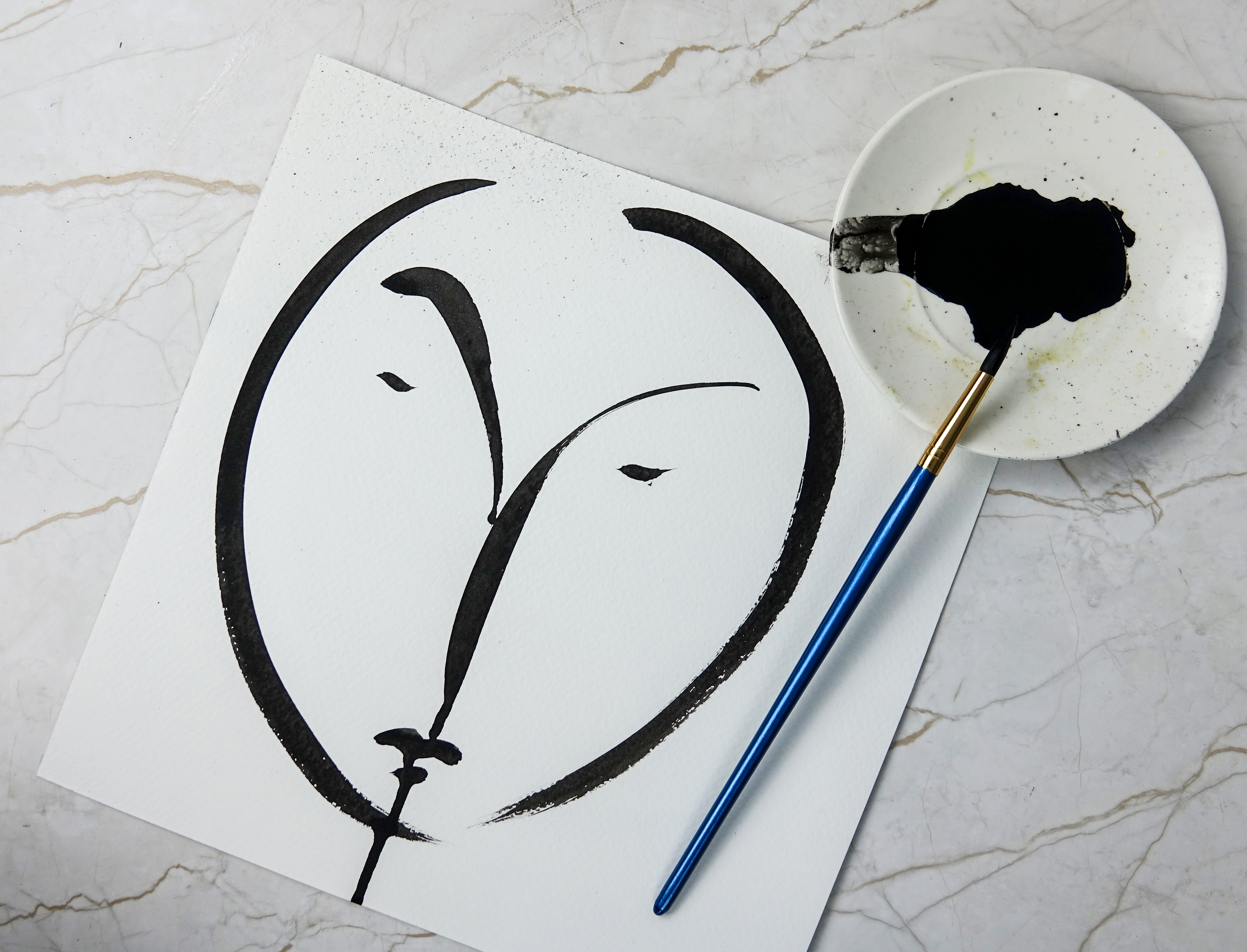 This year I decided to take part in Inktober. In typical Ella style I haven’t followed the #inktober drawing prompts. However I have enjoyed taking part in the art challenge, particularly my black and white brush-drawn faces.
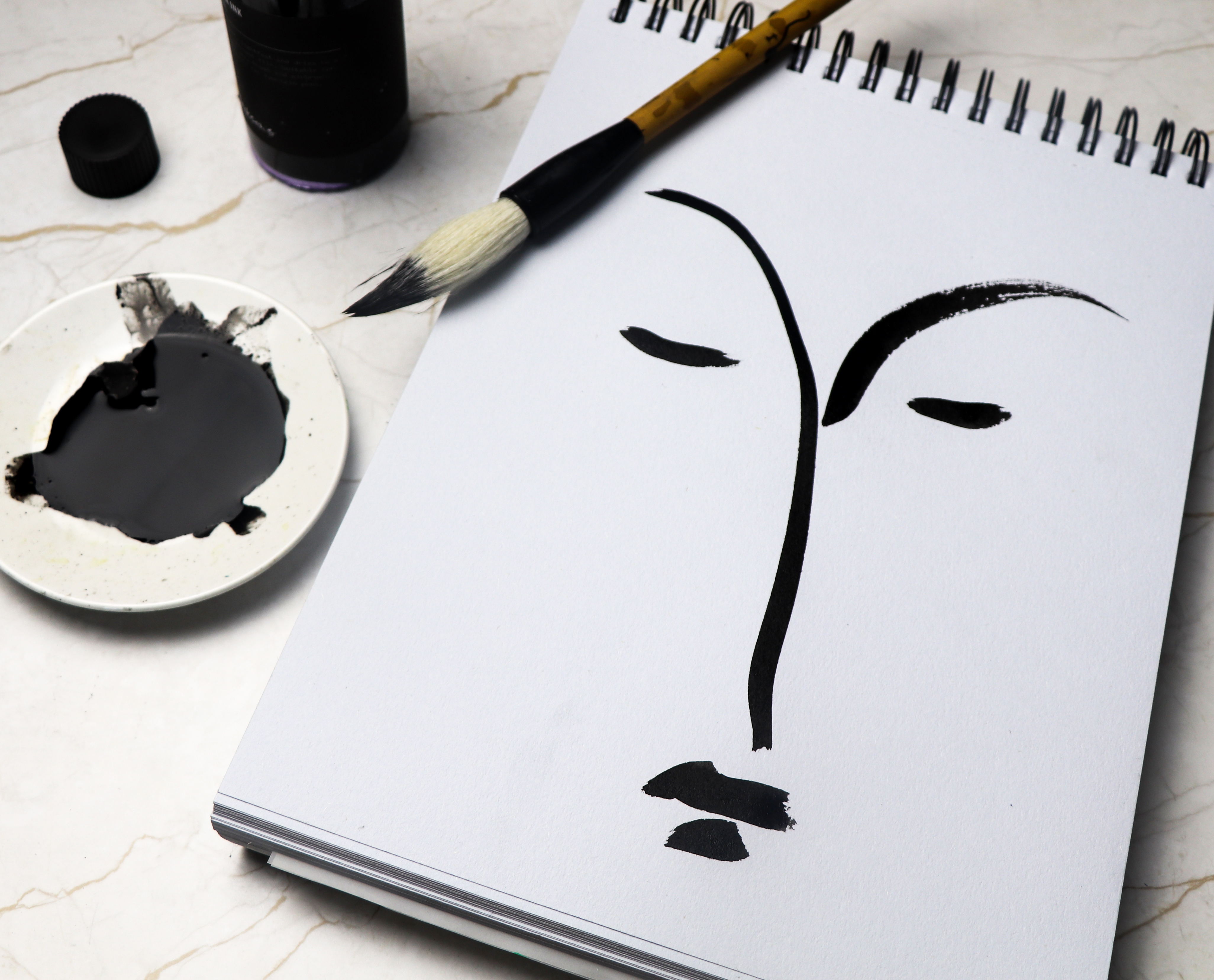
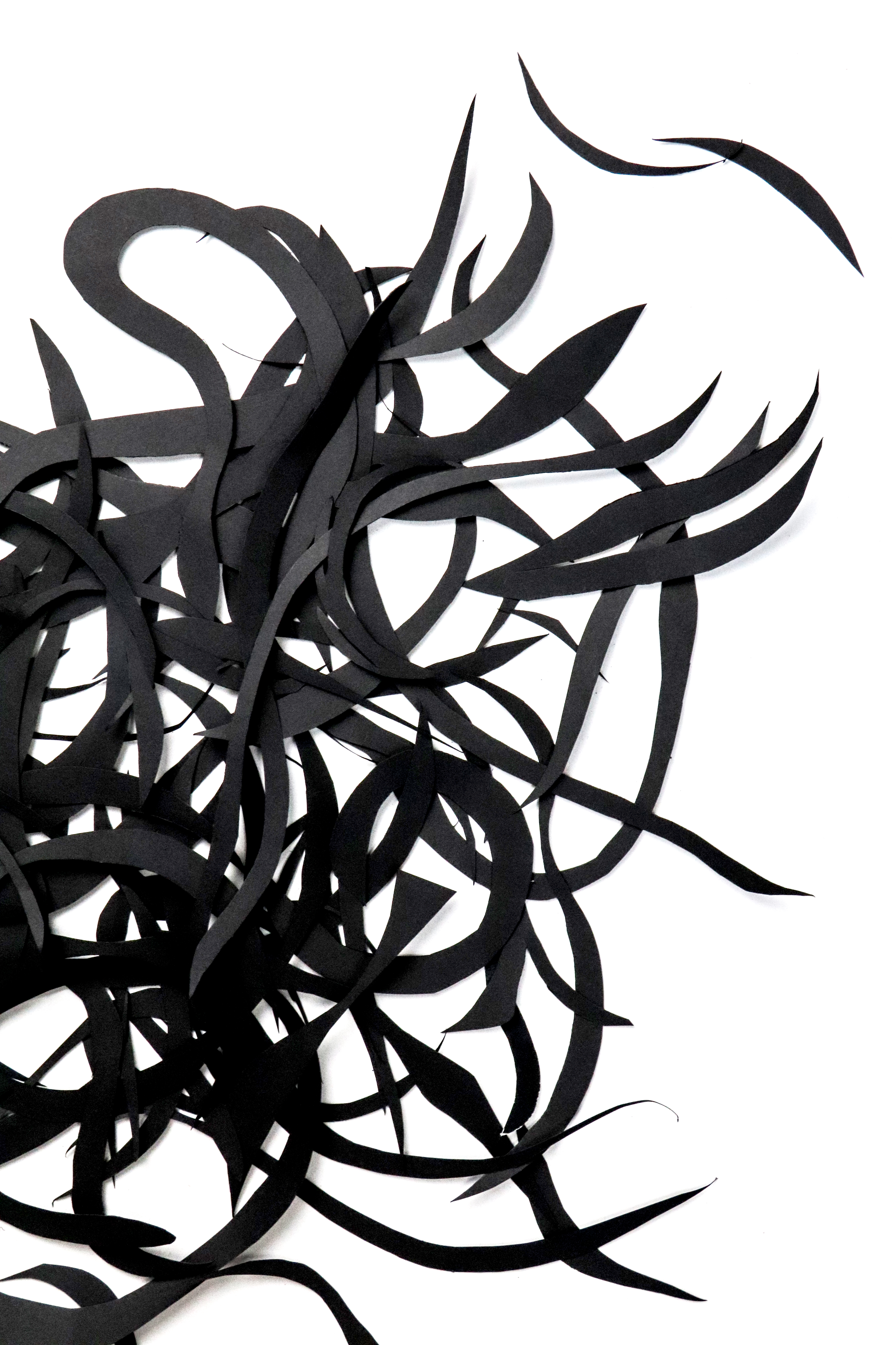
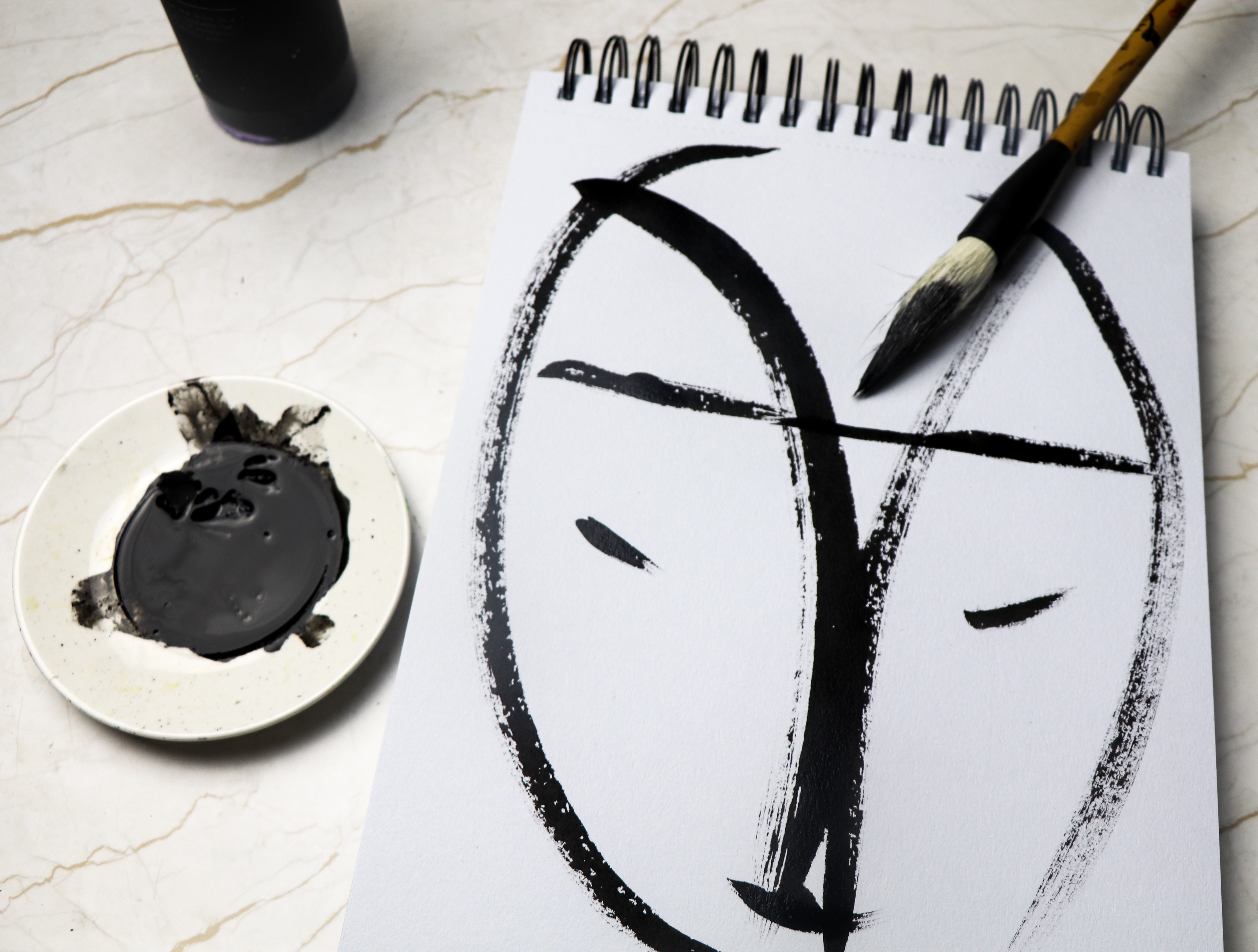 I feel a bit indulgent creating these face drawings. I love using a Japanese calligraphy brush with this free flowing Indian ink. I really enjoy the easy curves and marks this brush makes. However I’m aware I need to develop my own style. It’s a really stage in developing new work.