Posted on

Monday Moodboard: Black and white

Black and white moodboard ellasplace.co.ukTimeless, classy and striking, I love black and white designs. In fact I can’t believe I haven’t featured this on my moodboard sooner.

I hardly ever wear anything other than black and white clothes (occasionally navy or grey but it’s mainly black and white). I also am a massive fan of simple black and white sketches, print and design. The purity, harmony and general all-round elegance is, for me, a total short-cut to cool.

At the moment I’m working on the design for a poetry book. The publication is printed in black and white so I wanted to think of effective shapes and marks that would look strong on the pages without distracting from the words (which are the most important thing). I’ve done lots of research and have settled on something that I’m quite excited about. You can’t see it yet but the book is set to be released later this year so, watch this space.


Posted on

Monday Moodboard Rio 2016

Rio! Monday Moodboard ellasplace.co.uk

The Rio 2016 Olympics kick off this Friday so I thought it would be a fitting subject for my Monday moodboard.

It is such an amazing source of inspiration. I’ve already created a series of work looking at Brazilian birds and florals. I’m also fascinated by Rio’s fabulous tiled beach fronts and decorative, colourful buildings as well as its dramatic landscapes and glorious carnivals. I’m really looking forward to learning more about this wonderful place over the coming weeks.


Posted on

Monday Moodboard: Midcentury Modern

MCMMoodboard

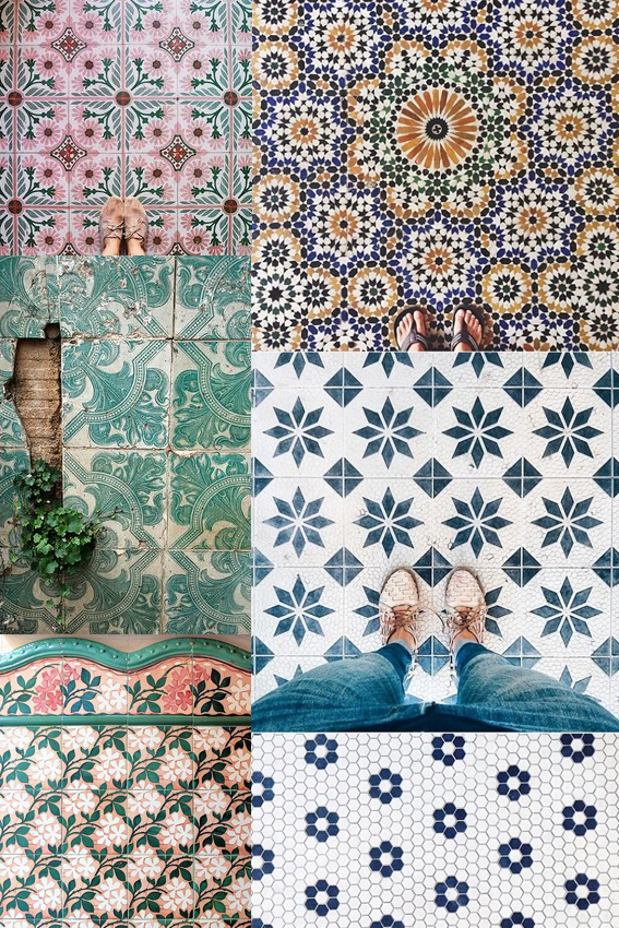
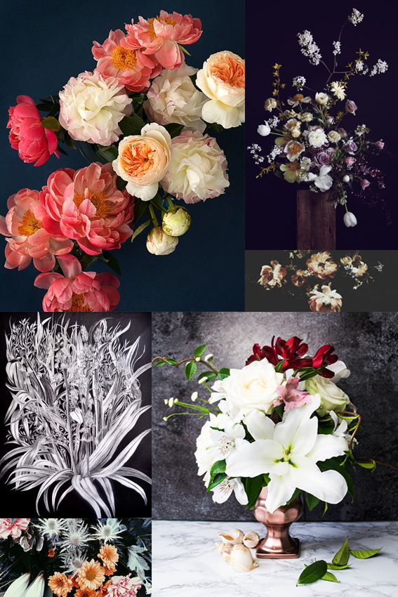
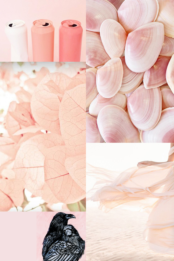
I’ve many go-tos for inspiration and although you may not think it, mid-century modern design and illustration is one of my favourite sources. That’s why it’s made this week’s Monday Moodboard.

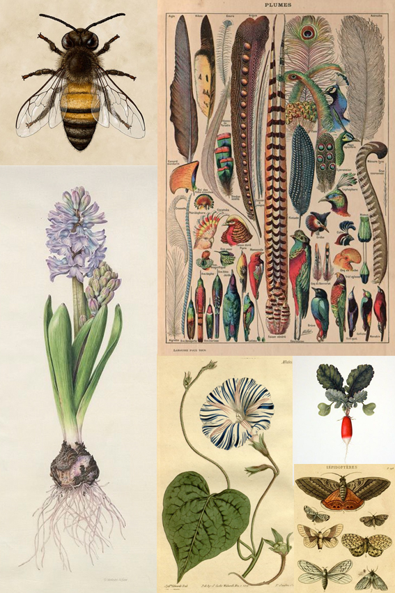
Although my drawing style is heavily influenced by classical botanical illustration, I actually came to it via the route of mid-century modern. How? Well, when you look inside the original mid-century homes, as well as all those gorgeous geo designs,  amazing furniture, playful use of line and fearless colour combinations, there would always be a classic print or two hung on the wall, so I thought “if it’s good enough for them…”

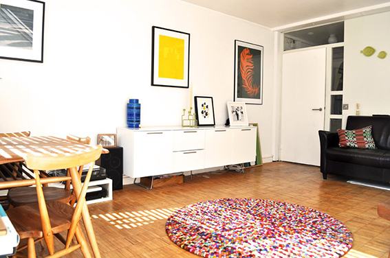
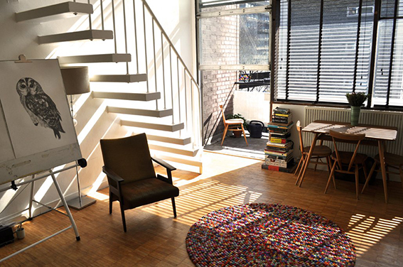
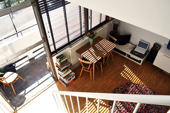
Anyway this is one of my most loved periods for design and illustration I suppose it came from the fact that Dr B and I lived in mid-century apartments for the first 14 years together so we both became interested in this style in terms of design and architecture. For pure nostalgia value here are some pics of our old flat.

mid-century modern flat ellasplace.co.uk mid-century modern flat ellasplace.co.uk mid-century modern flat ellasplace.co.uk

There is so much to find in mid-century modern design, which is why it is such a rich source of inspiration.  I mean just look at the examples on the moodboard. It’s not all about Lucienne Day Calyx fabric (although I blatantly love that design and would have it in every room in the house if I was allowed) or Ercol furniture (although again I adore it and have a lovely 1960s original Ercol dining table and chairs in the kitchen). Design from this period can be ornate and playful and also simple, concise and elegant.

Why this week? I’m currently working on a poetry book for Dunlin Press, an indie publishing house run by me and Dr B. I wanted something that keyed into classic book cover design with a bit of an edge so I’ve been trawling the internet and my design books and the mid-century vibe seems to be the route to explore. I’m not saying our book will look anything like the above but whether you are designing a book cover, thinking about a fabric pattern or imagining a room scheme, in fact whatever creative endeavour you’re undertaking it’s good to have a starting point to kick start your work.
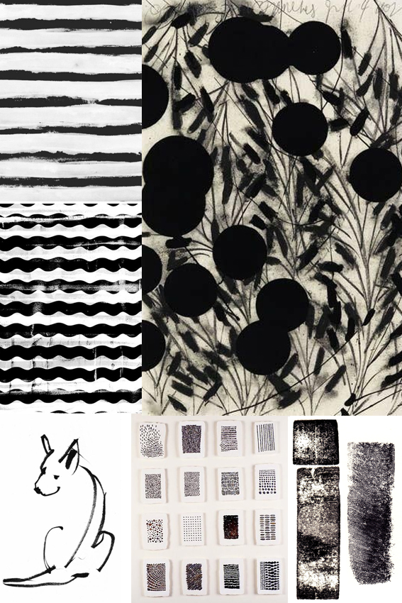
Posted on

Monday Moodboard: Vintage illustrations

Vintage Illustration Moodboard ellasplace.co.ukI’ve spent the past seven days hard at it drawing and my go-to source of inspiration is vintage botanical and nature illustrations.

I’m drawn to the detail in each drawing, the application of colour and the simple, clear composition. I believe these illustrations allow the viewer to really see what’s being depicted without distracting backgrounds or off-putting extraneous elements. I think that’s why they’re classics.

Posted on

Monday Moodboard: Christmas in July

Christmas in July ellasplace.co.ukNo I haven’t gone mad. July means Christmas in magazine and design circles so this moodboard is dedicated to all things festive.

Both this week and the last have/will be spent trawling the Christmas 2016 press shows spotting trends and looking out for key themes. I’ll let you know what I find with my yuletide round up later on in the year.

Posted on

Monday Moodboard: Tiles

Monday Moodboard Tiles First things first, an apology. I completely forgot about my Monday Moodboard last week. That’s because I got completely absorbed in working on creating tile designs for an upcoming Posca pen project for the company’s display stand. So welcome to my world! This was exactly the kind of thing I was looking at last week. Don’t worry I’ll share my take on tiles in the coming weeks.

I’m currently going through lots of trend reports at the mo and patterned tiles are most definitely in. I’ve always fantasised about a bathroom made up of mismatched tile designs, a lovely med-inspired blue and white kitchen with a ornately patterned tiled splash-back and one of those hallways with an intricate luxurious tiled floor. I best get saving.

Posted on

Monday Moodboard: Moody Botanicals Trend

Monday Moodboard Ella's Place

I’m very excited about the up-coming trend for moody botanicals.  The contrast of soft peach, pink, white and cream tones on shades of navy, purple and grey is so effective. The overall look feels so romantic and dreamy. While it celebrates beautiful botanics, the style also gives more than a little nod to art history, evoking Rococo and Dutch flower painting themes. This trend will be everywhere later in the year and in 2017. It’s certainly inspired me to take a trip to the Wallace Collection for a little bit of research. I’ve already started to create some pieces with this theme in mind, with varying degrees of success, once I’ve nailed it I’ll let you know.

Posted on

Moodboard Monday: Blush

Moodboard Monday BlushAs an avid pinner I’ve been struck by just how many images I’ve seen this past year featuring photography, illustration and fashion pieces showcasing a range of blush pink shades.

The hues look great on their own and teamed with light colours. It also works incredibly well when contrasted with darker green or grey shades as well as more vibrant rosy pigments.

It’s been hugely inspiring for me in creating new stationery collections and prints. By replacing my usual white backdrop with soft, gentle blushes it has really warmed up some of my pink flamingo pinks and patterns (I’ll be showing you them soon). I’ve also used it as a background for my more dramatic drawings such as my raven couple piece that you can see on my moodboard.

I’m looking forward to playing with these shades a bit more, not only with my artistic work but also exploring options for adding depth to accent walls as well as seeing how I can incorporate a bit of blush with my home accessories.


Posted on

Moodboard Monday: Green and white

Ellas Place Moodboard Monday

As an artist, illustrator and journalist, observation, research and image gathering are key to the success of my work. So from now on I’m letting you in on my working practice every week with my Monday Moodboards.

I’m always taking pictures of things that catch my eye and (much to Dr B’s chagrin) spend at least a couple of hours a day on Pinterest (probably not very healthy I know) collecting all kinds of images that reflect trends and serve as inspiration for my home and my drawings. Making them into a moodboard distills my thoughts and allows me to think about the vibe I want to create with my own endeavours.

I’ve recently become fascinated by green and white. It is so representative of this time of year. During the past three weeks I’ve been greeted with this glorious colour combination on my daily morning woodland and riverside walks. Lush grass, delicate hawthorn flower and cow parsley abound the environment creating delightful glades and giving everything a soft, elegant appearance. Beautiful.

This simple palette has so much potential in terms of design and it’s versatile too; a simple flower arrangement, artful grouping of fern and minty coloured objet, delicate planting or full-on statement floor and wall tiles, there are so many ways to incorporate this look into your home.  Used wisely it can look stylish in a laid back, understated way. And even if you’re not actually using natural elements or motifs it suggests a natural, organic feel. The clean, fresh scheme and simplicity reflected in my mood board has also given me food for thought when it comes to my illustrations – sometimes maybe less is more?