Posted on

PORT PIECES: Abstract ink works

PORT PIECES: Abstract Ink landscape, Ella Johnston

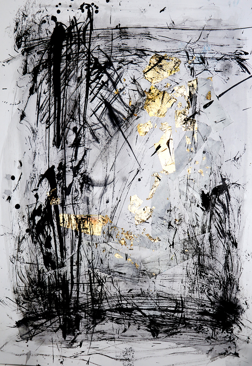
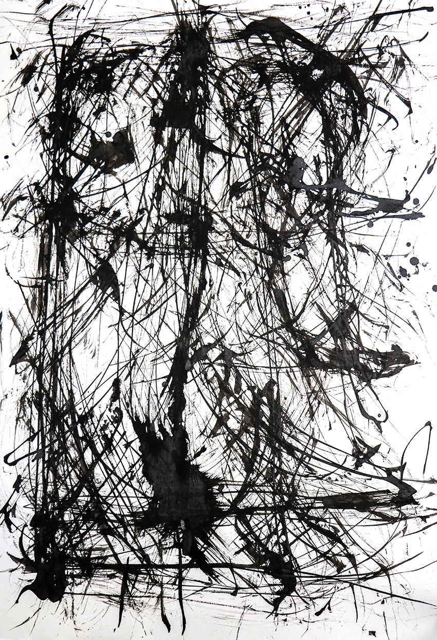
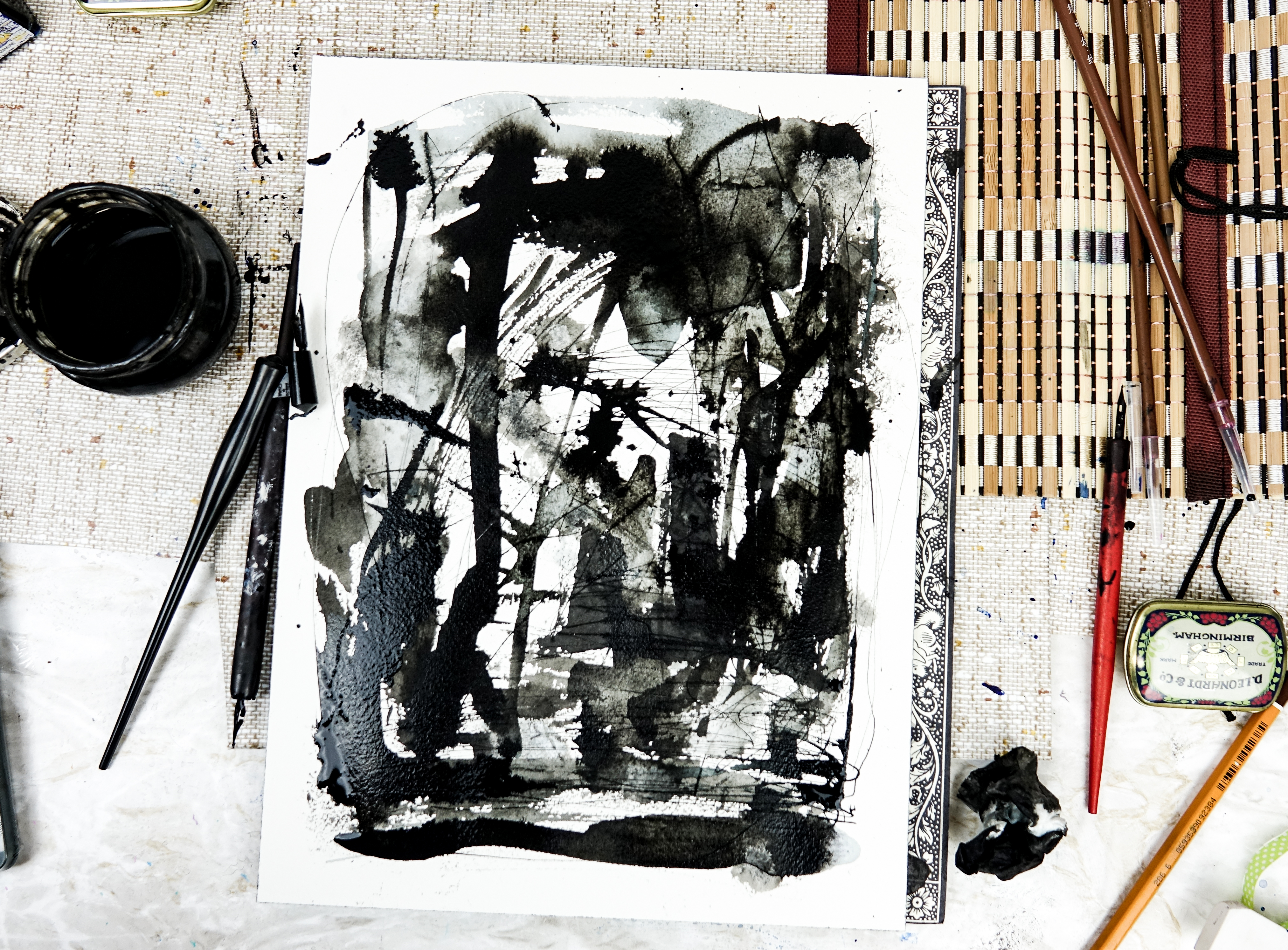
I’ve been recently working on a series of abstract ink works for a new book from Dunlin Press.

The book, PORT, is an anthology looking at the subject of ports. The publication essentially explores places where ‘here’ contacts ‘there’; where known and unknown meet; where perceptions of possible experience are expanded. It features essays, interviews, stories and poetry – I’m very excited to be working on it.

PORT PIECES: Abstract Ink landscape, Indian ink on Arches watercolour paper, Ella Johnston

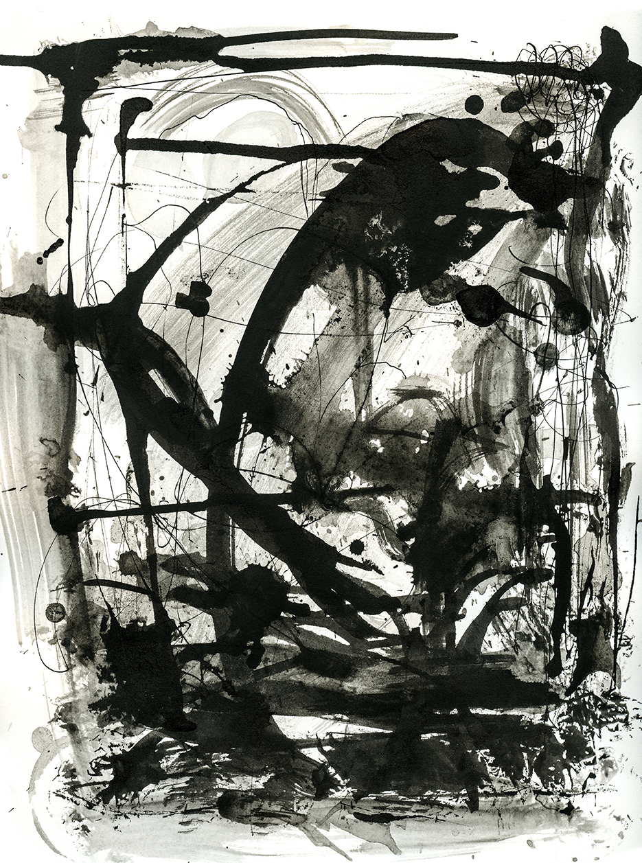
I thought long and hard about this project. I wanted something that reflected the character of such places. Because these locations by their nature are scenes of transition, movement and trade, I needed to convey their shape-shifting essence.

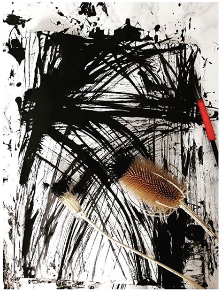
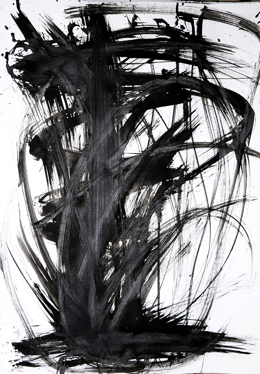
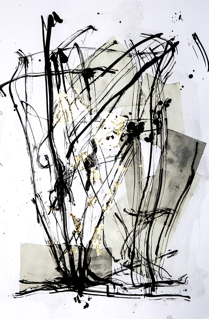
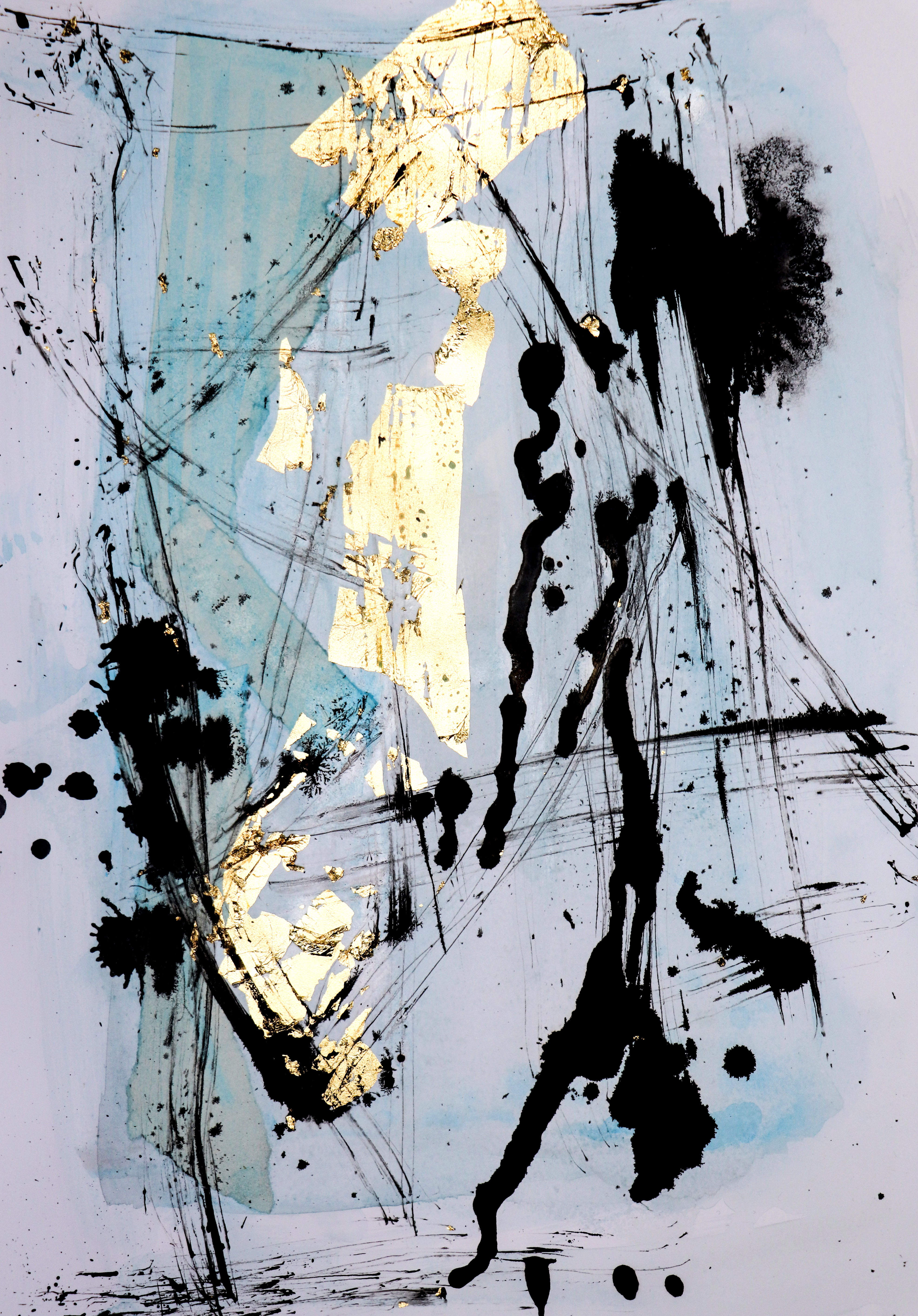
I pondered the medium and colours I was going to use for the pieces. I needed movement, flow and immediacy so I stuck with inks, my current tool of choice.

PORT PIECES: Abstract Ink landscape, Indian ink on Arches watercolour paper, Ella Johnston
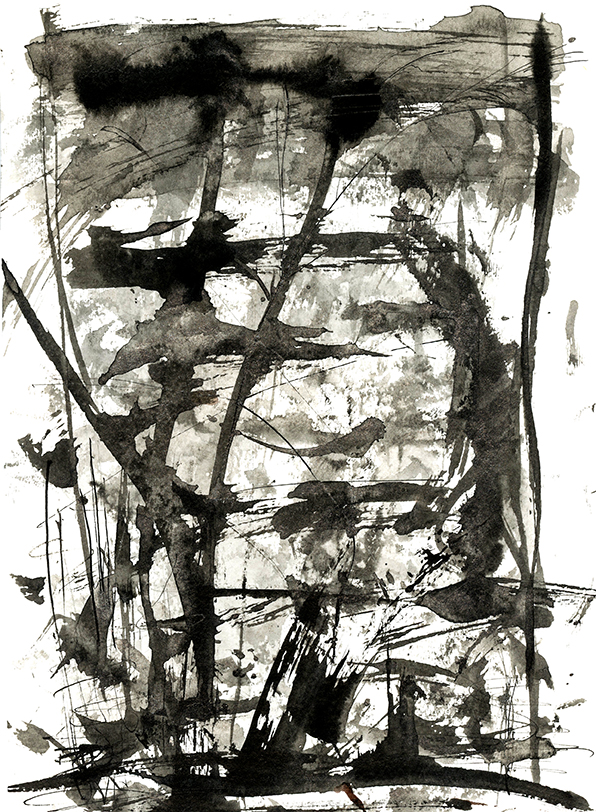
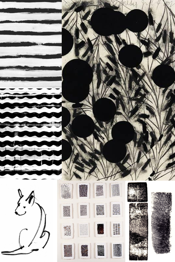
So I approached these compositions as palimpsests; each quick application of ink acting as layers of stories, activities and histories coming together. I played with colour initially but settled on black and white arrangements as I felt they were starker and more visceral.
PORT PIECES: Abstract Ink landscape, Indian ink on sumi rice paper, Ella Johnston
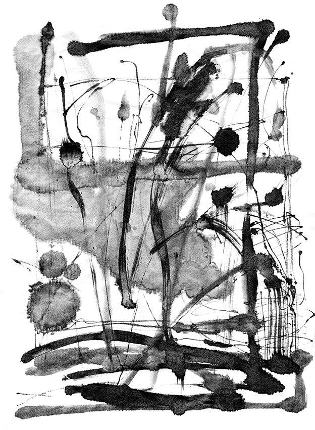
I also experimented with the surfaces I applied my abstract ink works on. My paper selection is an integral part of every original piece. So I mixed it up a bit, using sumi rice paper, Arches smooth hot-pressed and textured cold pressed Arches watercolour paper. Every surface produced very different results as each paper type absorbs the ink washes, marks and strokes completely differently.

PORT PIECES: Abstract Ink landscape, Indian ink on Arches watercolour paper, Ella Johnston

The abstract ink works will be featured as book illustrations, with a selection being printed as limited edition fine art prints and postcards as a companion to the publication. The book is being launched in the autumn and I’ll be sure you keep you updated on its progress here.

Posted on

Experiments in ink!

Ink, mark-making experiments Ella Johnston
In preparation for #inktober I’ve been playing with experiments in ink!

Composition, Indian ink feather and teasel drawing, book paper, silver leaf collage. Ella Johnston

Ages ago I told you about how as an artist and illustrator I strive for simplicity, well this has been a little mantra playing in my head all year so recently I gave into it. I’ve  started working on art work and illustrations using simple black Indian ink and various mark-making tools.

Simplicity is hard.

Composition, Indian ink teasel drawing Ella Johnston
Composition, Indian ink feather and teasel drawing, book paper, gold leaf collage.

These scratchy ink sketches and gold/silver leaf and book paper collages are my first steps along my journey into the simple mark marking. Taking my cue from various Japanese ink artists I’ve experimented with my mark-making tools. I’ve fashioned ‘pens’ and ‘brushes’ from dried out teasels, found feathers, dried seed-heads and bunches of twigs to produce various line effects.

Composition, Indian ink teasel drawing Ella Johnston

I thought I would combine these ink strokes with collage to create movement, contrast and texture. I’m also fascinated by palimpsests (where a manuscript or piece of written-on material has been written over but still bears visible traces of its earlier form) so I wanted to create a sense of that.

Composition, Indian ink feather and teasel drawing, book paper, gold leaf collage.

At the moment, I still need to work on my serenity ( I imagine a few people have remarked on that through the years).

I like combining humble unbleached papers I use for the inner pages of my hand-stitched books (sometimes painted with washes of colour, sometimes not) with gold and silver leaf to create a sense of collision. After these elements are layered up, I naturally want to produce something visceral and energetic over them with the ink marks.

Composition, Indian ink feather and teasel drawing, book paper, gold leaf collage. Ella Johnston Composition, Indian ink feather and teasel drawing, book paper, gold leaf collage. Ella Johnston

Composition, Indian ink feather and teasel drawing, book paper, gold leaf collage. Ella Johnston
Composition, Indian ink dried seed-head, feather and teasel drawing, book paper, gold leaf collage. Ella Johnston

This mark-making method is real fun and, at this stage in my development with getting to know this way of working, I feel a little indulgent. I love the variation in marks the teasel, feather and seed-head tips create – I could go on all day marvelling at all the different line effects they produce.

Composition, Indian ink teasel, feather and seedhead drawing Ella Johnston
Posted on

Monday Moodboard Bloomsbury

As you know by now I develop little obsessions over the course of my research and this Monday Moodboard is dedicated to my latest obsession, The Bloomsbury Group and in particular Charleston House.

The Bloomsbury Group was a collective of friends and relatives who were intellectuals, writers and artists. They had all lived, worked or studied together in the London district of Bloomsbury in the early part of the 20th Century that include figures such as Virginia Woolf and her sister Vanessa Bell, the art critic Clive Bell, painter Roger Fry and John Maynard Keynes. Artists Vanessa Bell and Duncan Grant (with his lover David Garnett) moved to Charleston House in Sussex at the start of the First World War and stayed there for decades, holding gatherings galore.

The house itself is a work of art in itself; Inspired by Italian fresco painting and the Post-Impressionists, the artists decorated the walls, doors and furniture at Charleston. It’s my mission to visit next year and I will make sure I’ll report back.

Posted on

Monday Moodboard: Folk patterns

Monday Moodboard Folk pattern

Joyous, colourful and breathtakingly beautiful, my folk art moodboard is perfect for brightening up this grey Monday afternoon. .

Marks, patterns and painting made by ordinary people is a constant inspiration for me. The simple shapes, harmonious composition, strong colour combinations and celebration of birds, flowers and animal life in folk art are timelessly popular in interior design and illustration.  I’ve used them as a spring board for some of the work I created for my Christmas Posca pen workshops and Christmas wrap designs – look out for those next week.

Posted on

Monday Moodboard: Black and white

Black and white moodboard ellasplace.co.ukTimeless, classy and striking, I love black and white designs. In fact I can’t believe I haven’t featured this on my moodboard sooner.

I hardly ever wear anything other than black and white clothes (occasionally navy or grey but it’s mainly black and white). I also am a massive fan of simple black and white sketches, print and design. The purity, harmony and general all-round elegance is, for me, a total short-cut to cool.

At the moment I’m working on the design for a poetry book. The publication is printed in black and white so I wanted to think of effective shapes and marks that would look strong on the pages without distracting from the words (which are the most important thing). I’ve done lots of research and have settled on something that I’m quite excited about. You can’t see it yet but the book is set to be released later this year so, watch this space.


Posted on

Learning the art of Shibori

DSC_1013

It’s always great to learn new craft techniques – especially when they can be put to good use on home and fashion makes. I recently got to grips with the art of Shibori, an ancient Japanese dying technique, during a workshop at White House Arts in Cambridge.

Japanese printing

I went to the one-day workshop with my mum and my sister and we had a go at two Shibori dying methods; Arashi and Itajime.

Arashi shibori is also known as pole-wrapping shibori. You wrap your cloth around a pole (which looks like a large section of plastic industrial piping), then tightly bind it by wrapping a thin cord up and down the pole. Once the cord is secured, you scrunch the cloth up the pole and sink it into the dye. Arashi is the Japanese word for storm – and that’s a pretty accurate description of the kind of effect you get from this particular type of printing. As you can see above in the first picture in this post and in the photograph here:

DSC_1015

Itajime shibori is what is known as a shaped-resist technique. This means that an object is placed over the folded fabric (for example, a piece of wood) which be used to form a ‘resist’ that stops the dye making contact with the material. Because the fabric is folded (this can be done in many ways) the end result is a gorgeous geometric design that would look great on bedding and other homewares.

DSC_1007
DSC_1009 DSC_1014DSC_1012