 The garden is a great place to source bits and pieces for a quick, easy and cheap display. Ideal for weddings and parties or, for me, as last minute props when photographing my prints and stationery.
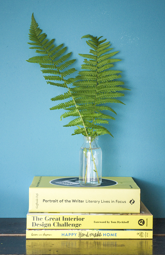
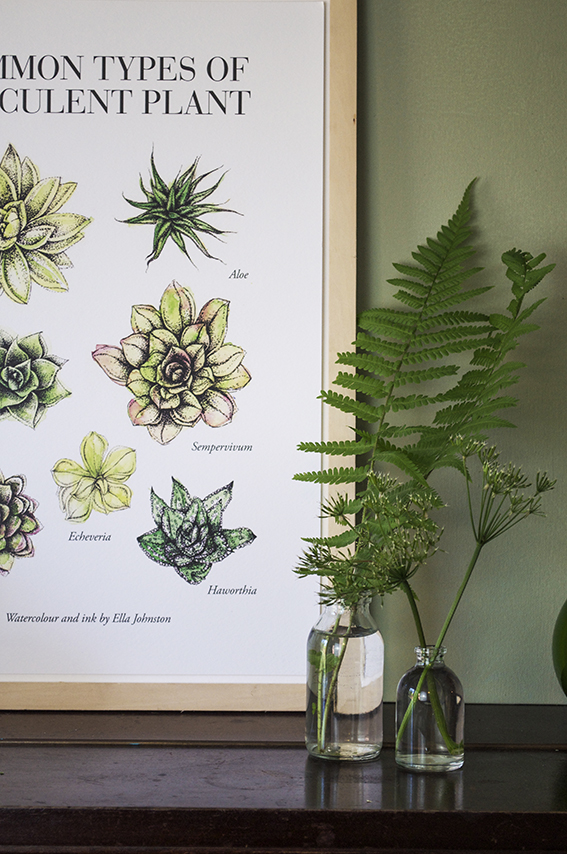 As our ferns are so lush and green at the mo, I’ve been snipping the odd leaf to place in clear containers for the ultimate elegant display. Teaming them with over-it cow parsley also looks very effective as a simple structural tableaux.
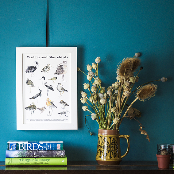
We had an abundance of poppies this year. Now they’re all done I’ve got loads of fab poppy heads to have as year-round loveliness. I’ve combined these with some dried out teasels that my mum gave me last year and placed them in a vintage jug I picked up from a charity for a loose organic feel.
Category: Ella’s Edit
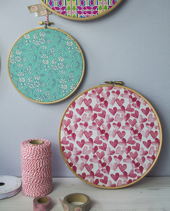
Quick and Easy Update: Hang Fabric hoops
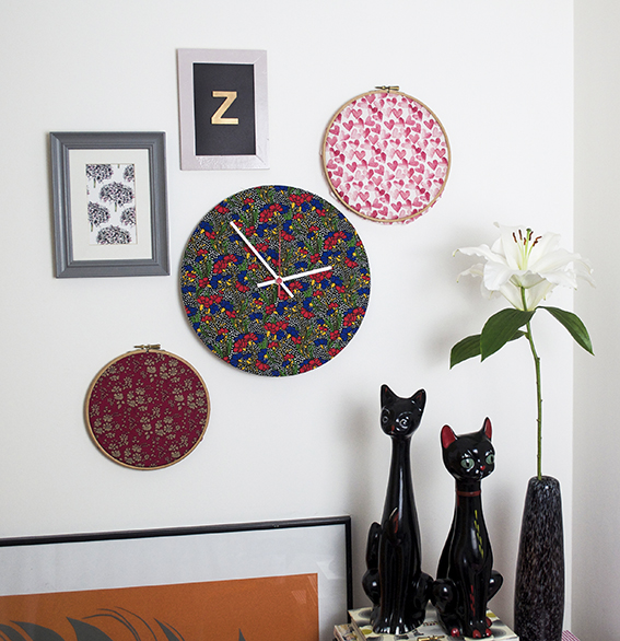
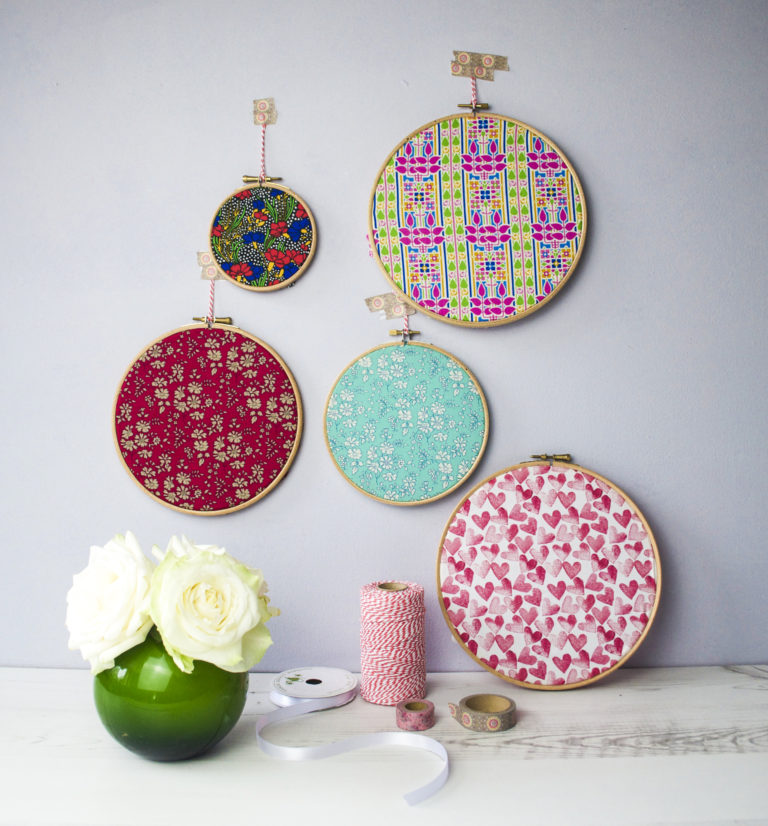 If you’re short of time or money here’s a super quick, easy way of giving your walls an update. Just buy a set of embroidery hoops, stretch some over some scrap fabric (it doesn’t have to be ‘proper’ haberdashery fabric you can use old shirts or dresses) and there you go!
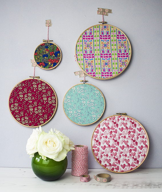 The great thing about this is you can change the display to suit the seasons. And if you’re so inclined, you can also add a little stitching over your fabric with slogans and patterns.
Drawing of the week: Retro flowers
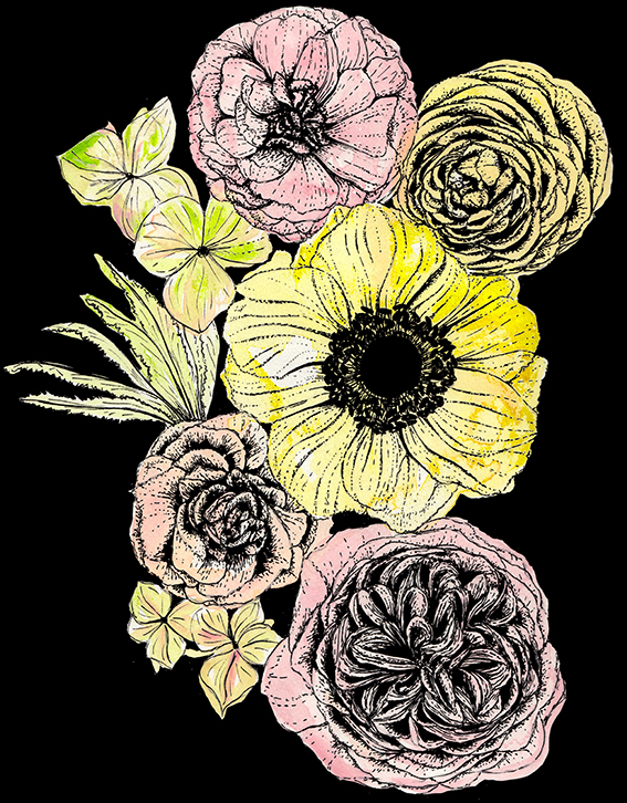
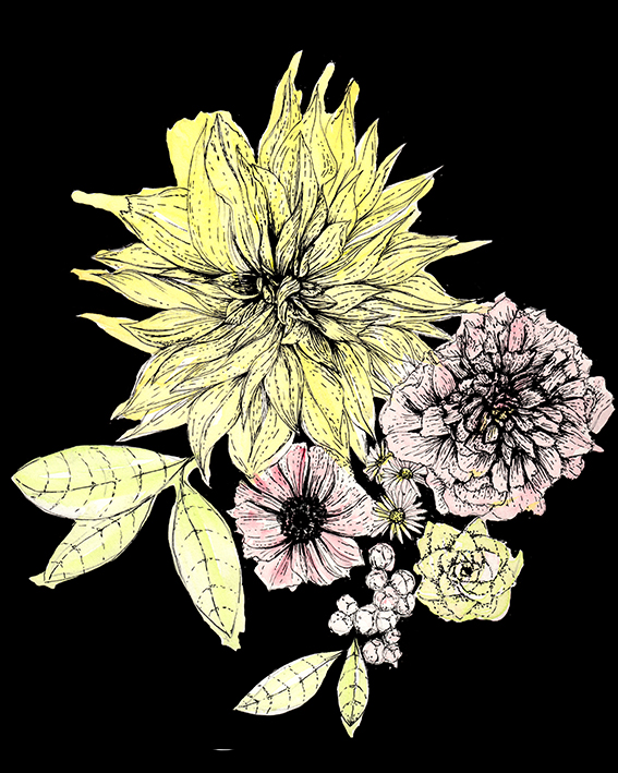
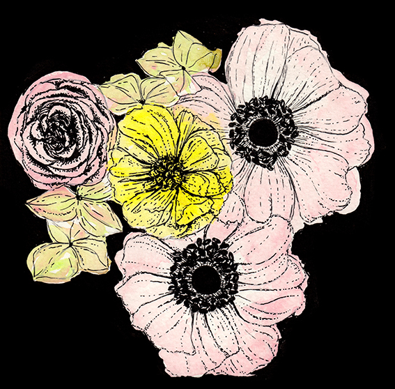
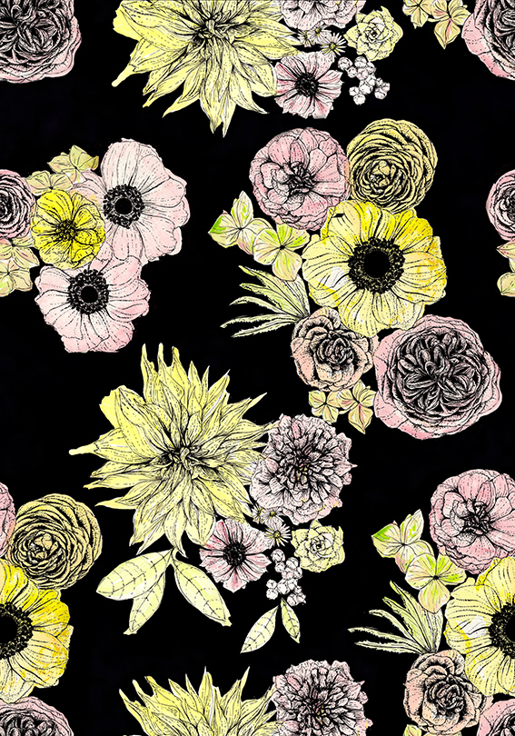
What inspired my retro flower drawings of the week I hear you ask? Well, a couple of weeks ago I was looking at moody botanics and loved the idea of beautiful blooms set against deep dark backgrounds. This also coincided with me becoming obsessed with vintage floral duvet cover designs. And I’m not talking about those pretty ditzy Cath Kidston inspired numbers, no I’m thinking of the type of things I had as a small child in the early 1980s (that were practically 1970s).
So I’d thought I’d combine the two themes and create this set of retro floral illustrations and pattern design. I think these would look great on home project and I’m thinking of using them on some cushions and lampshades for a real cosy feel in the bedroom – a little nod to the bedrooms of my childhood.
The flowers I’ve illustrated here are ranunculus, dahlia, peony, rose, hydrangea, anemone, rose and succulent, I deliberately choose round shapes that fit together nicely in a kind of clockwork fashion.
Monday Moodboard: Tiles
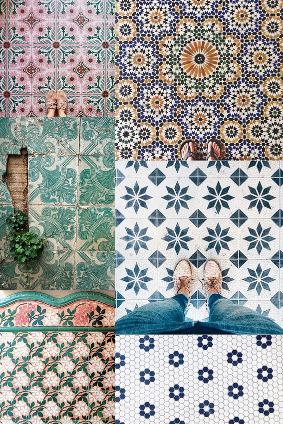 First things first, an apology. I completely forgot about my Monday Moodboard last week. That’s because I got completely absorbed in working on creating tile designs for an upcoming Posca pen project for the company’s display stand. So welcome to my world! This was exactly the kind of thing I was looking at last week. Don’t worry I’ll share my take on tiles in the coming weeks.
I’m currently going through lots of trend reports at the mo and patterned tiles are most definitely in. I’ve always fantasised about a bathroom made up of mismatched tile designs, a lovely med-inspired blue and white kitchen with a ornately patterned tiled splash-back and one of those hallways with an intricate luxurious tiled floor. I best get saving.
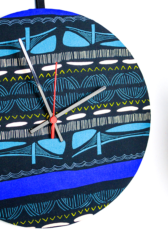
Make a personalised clock in 20 minutes

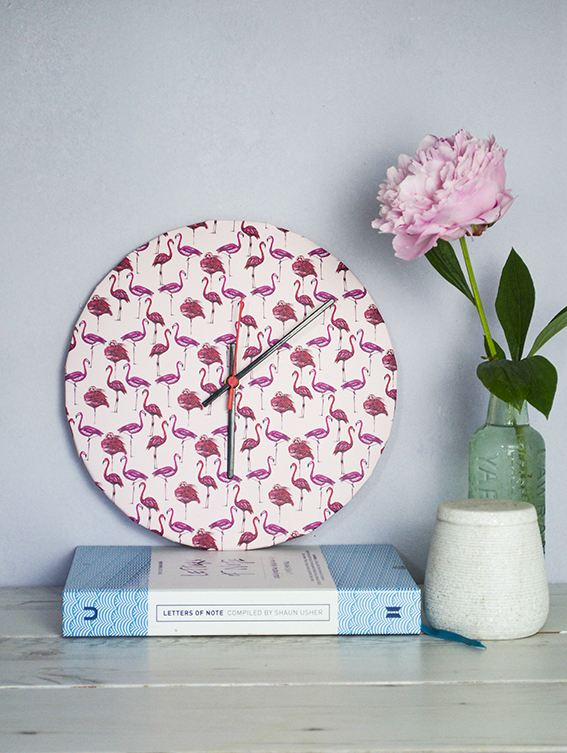
Yes you can make a clock in 20 minutes, personalised to suit your home.
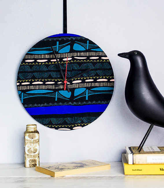 I used a kit from Dannells and teamed it with my flamingo print paper and a fabulous design (Leah Duncan’s Brooklyn Bridge Flare) from Art Gallery Fabrics.
Because the kits have all the bits you simply cut the fabric or paper to fit the sticky backed template, fix it to the hoop and attached the clock mechanism – easy.

Savvy small space solutions: creating a reading corner
As Dr B and I work from home in a small space we’ve had to be quite savvy when looking for storage and creative solutions.
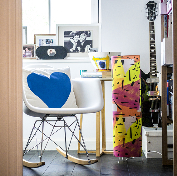 As we both work from home, it’s important to me that work stays in the office rather than seep into every bit of the house. Although it’s a compact space, I was very keen to create a corner where one of us could step away from the desk and do a bit of reading and thinking while staying in the working environment.
As the room is small, I’ve stuck to a simple to a black and white colour-scheme with little pops of colour.
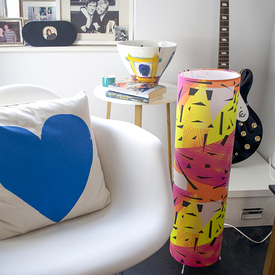 The mini rocking chair is perfect for reading and is a great escape from an upright office seat. It’s also light and easy to move around so you never feel like it’s a big bit of immovable furniture taking up too much space.
The slim little table is from Habitat. It’s simple, stylish and didn’t cost much money but it’s tall enough to rest your coffee or book on, as well as this cool ceramic bowl also from Habitat.
I deliberately chose the table, chair and shelves (which you can see peeking in at the right) with long legs that you could see under, adding to the sense of space.
Multi-function objects are great for small rooms too; that A3 box isn’t just a brilliant way to store all my art stuff (it has improved my life immeasurably), it also makes a great little guitar stand for Dr B’s Epiphone Casino.
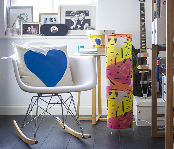 A tall thin, floor lamp is ideal for a smaller room as it makes a real statement and gives out warm light without taking up too much space. I made my own with a Dannells Floor Lamp Making Kit and designed my own Memphis-inspired fabric especially for the lamp.
As with the other kits this was really easy to use and, what’s great about this is you can buy it with the lamp-fitting so there is no faffing. It provides fantastic light and a much needed splash of playful colour in an otherwise very restrained scheme.
Cheap and Easy Decoration Tips: Colourful Amy Butler display
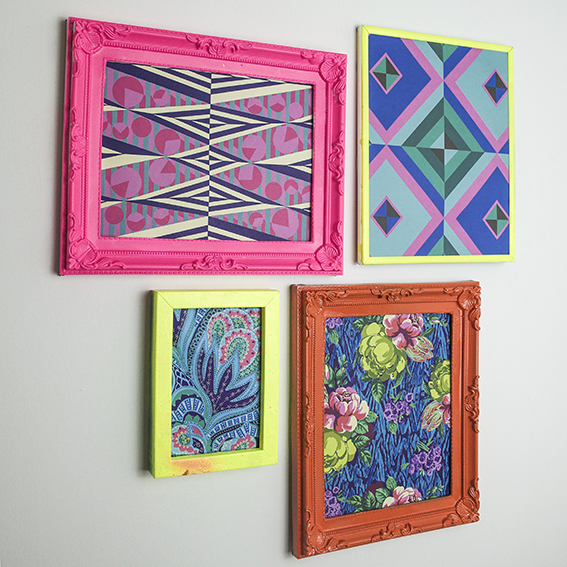
One of my favourite cheap and easy decoration tips is to create a colourful wall display. Here I’ve hung some Amy Butler prints in neon frames.
Bright and eclectic, Amy Butler’s designs are so joyous. Butler gets inspiration from a range of sources, using patterns and colour combinations inspired by her travels around the world.
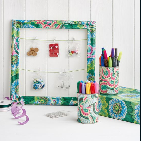
I’ve got loads of her fabrics and I was very excited when she released a book of her designs on paper, Amy Butler Decoupage. I’ve used the papers on many of my projects (including this one above for Homemaker Magazine). The book only costs around £11 and you get 80 colourful sheets making it fantastic value. I had a few sheets left and I’ve always felt a bit guilty about ripping them up for decoupage and wanted to show them off properly as a wall display.
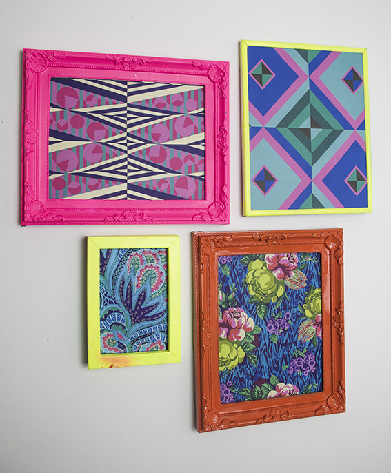 Luckily I have a collection of old frames gathered over the years and picked up at car boots (I think it’s another obsession of mine) and luckier still I’ve got a whole box full of spray paint in various colours (including some fab neons) to co-ordinate with the prints. They really brighten up a dark corner and would look really fun as a grid with matching frames to fill a wall.
Bag a Freebie! Win a Gorgeous Thornback & Peel Tote
Are you a freebie fan? Get your hands on a gorgeous Thornback & Peel tote bag. For your chance to win, simply tweet me or leave a message on my Facebook wall with the #TandPTote hashtag telling me what you’d put in yours. I’ll be announcing the winner on 25th June.
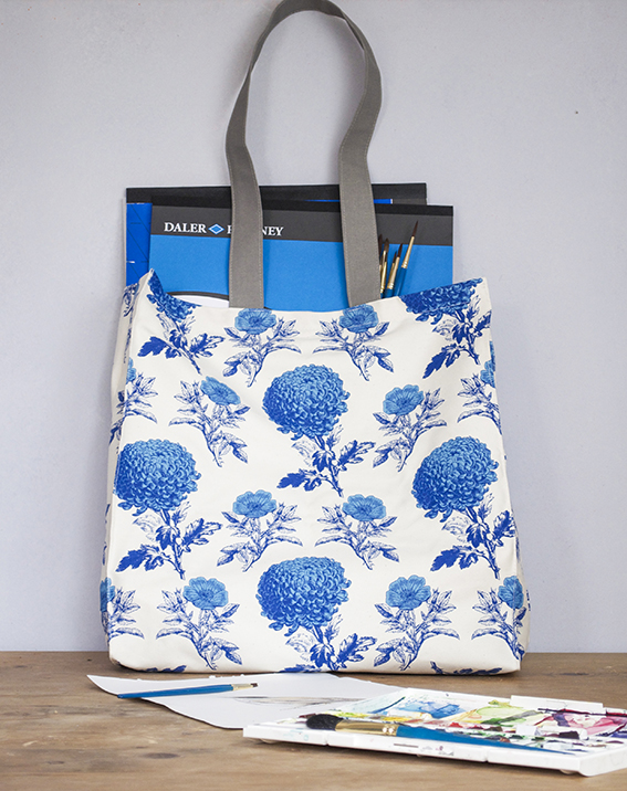
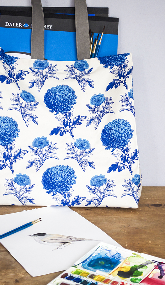
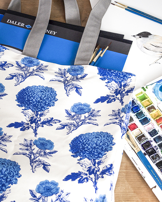
I’m a big fan of Thornback & Peel – the celebration of fine illustration and choice of colour ways makes for elegant pieces without being overly stuffy or fussy. So I was very pleased when the company sent me this Mums & Roses tote, especially as it comes in blue and white; the colour-combo of the summer. For more designs check out the rest of the collection at the Thornback & Peel website > here.
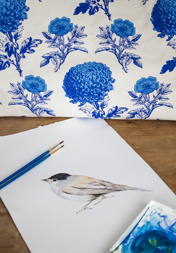
This tote is simply perfect for my alfresco watercolour painting jaunts over the summer.
At this time of year the light is so beautiful where I live, especially in the mornings. I often spend the start of the day with my paper pad and paints at the ready to capture the Essex estuary landscapes and the flora and fauna therein.
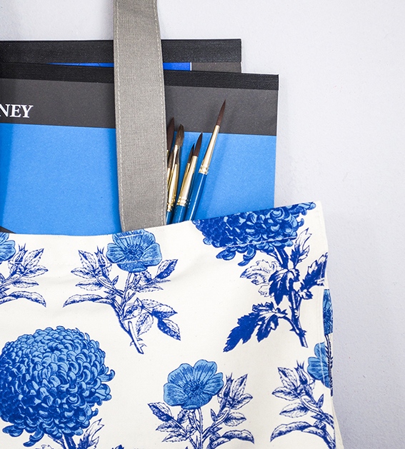
I’m filling my tote with my summer painting essentials. The bag is just the right size to fit two A3 pads comfortably with ample room for brushes and paints plus a bottle of mixing water, making it a practical as well as stylish choice.
Whatever you’re doing over the summer, why not stash your seasonal essentials in a stylish tote?
Even if you’re not the lucky winner of my comp, you can get a 15% discount on one of these shoppers until 29th June 2016; just visit the Thornback & Peel website and quote ELLASPLACE at the checkout.
 Enter the comp via my >Twitter or >Facebook
Check out Thornback & Peels totes >here
Home hack: Four Beautiful Flower Displays
 One of the easiest and cheapest way to give your rooms a splash of quick colour is by adding some flowers to a table or mantelpiece. It’s amazing the instant impact that even the most simple of displays can produce.
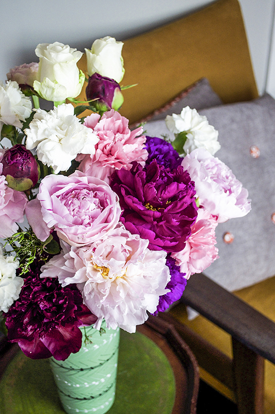 Over the past month I’ve made a record of my displays every week and now I’m sharing them with you. I’ve tried to keep my budget limited with a £40 maximum and £5 min.
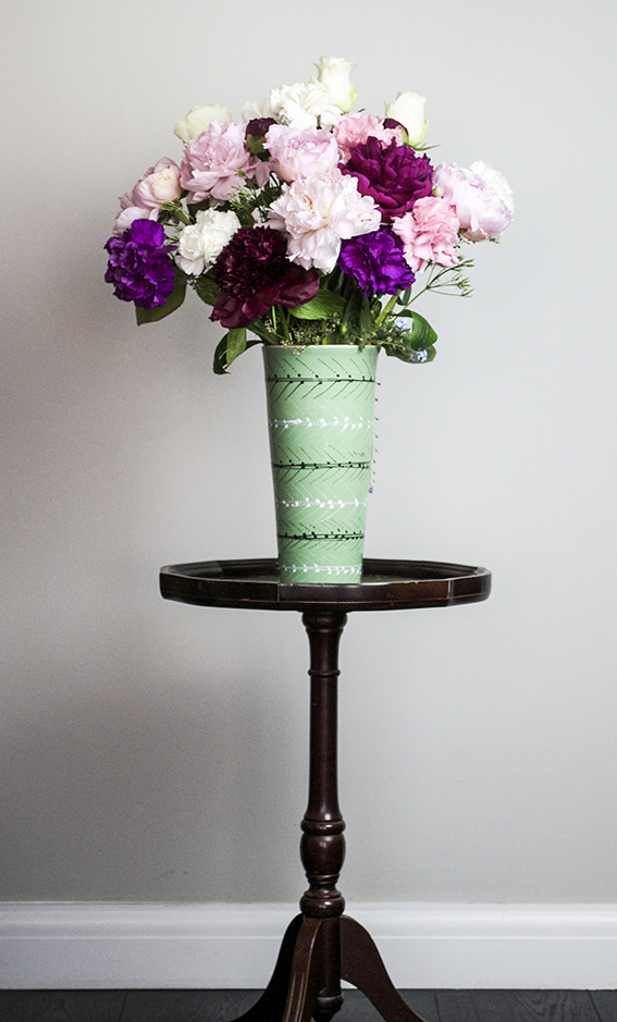
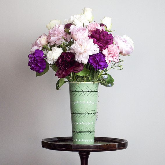
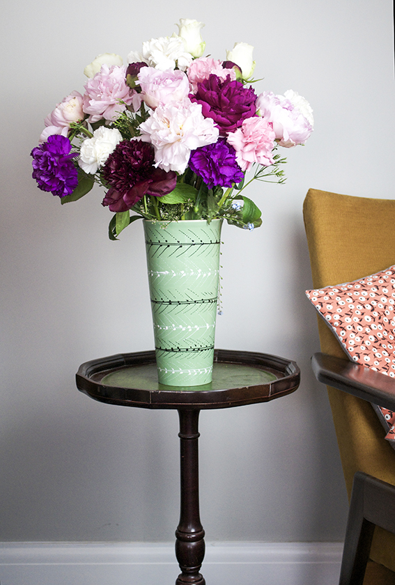
My luxury purple and pink display costs around £40. The mixed peonies in light pink and deep plum were from Value Flora where you can get six stems delivered from £19.99. The vibrant, frilly carnations from my local florist were a snip at 70p each and the roses were £3 for three. I got the wilder bits of foliage from the garden.
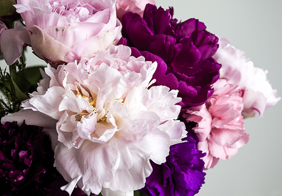 Because these blooms aren’t especially structural I wanted the arrangement to be informal. So I opted for a fairly loose dome. I did this by following the same method I use when making a hand-tied posy.
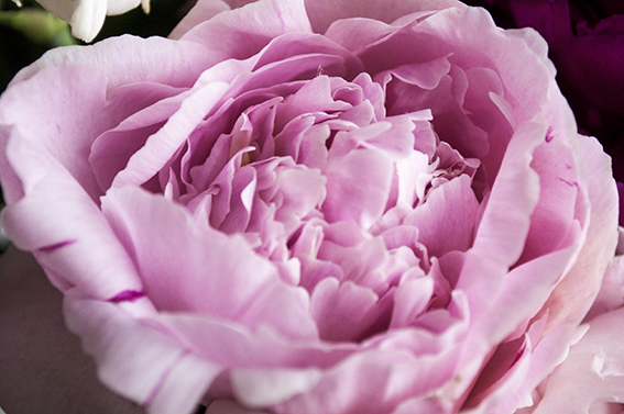 You do this by creating a layering the stems in a spiral formation, starting with one flower in the centre and simply circling blooms around this central one and continuing until you make a dome. Then I give it a bit of a shake before I put into the blooms the vase – I do this to loosen the posy up a bit so it doesn’t look so rigid. I used one of my favourite pieces of pottery to place these blooms in – I just wish I’d made a note of who made it as we’ve had this vase for 10 years and it brings us both joy everyday. The side table was a charity shop bargain; £5 from Cancer Research.
The display below was inspired by the paintings of Jan van Huysum and the recent Dutch Flowers exhibition in the National Gallery. I fancied creating something similarly atmospheric at home. 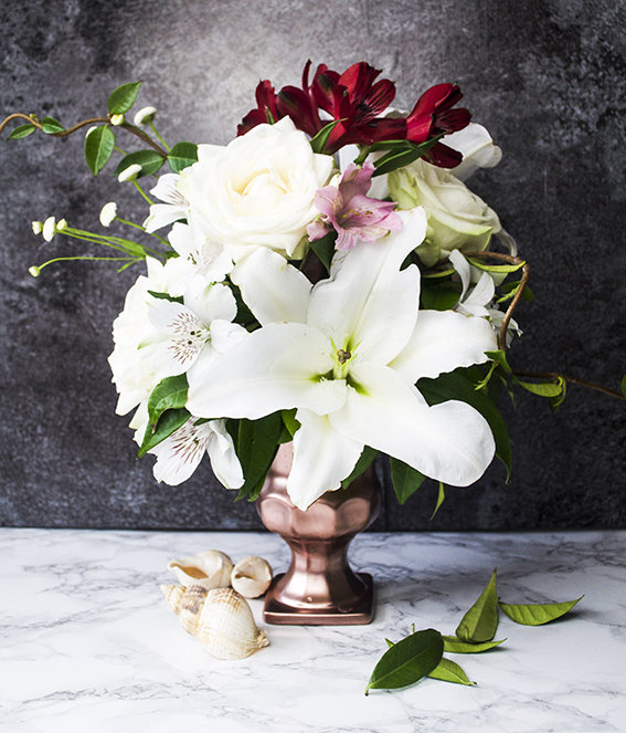
Although this looks quite grand, this rather formal set up is so easy to recreate. I sprayed an old charity shop pub branded vase with bronze paint. Once dry I taped a small block of florists foam soaked in water onto the container. I then arranged the stems into the foam, making sure I walked around the vase and looked onto so that not a bit of the green soaky stuff was exposed. I kept the colours to a minimum for this one, using mainly white, cream and green tones with little splashes of red and pink. I placed the shells by the bottom of the vase to be arch.
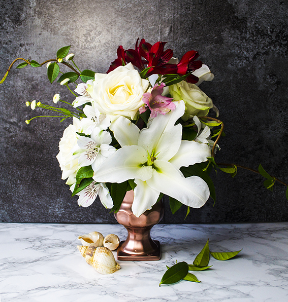
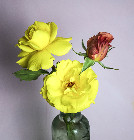
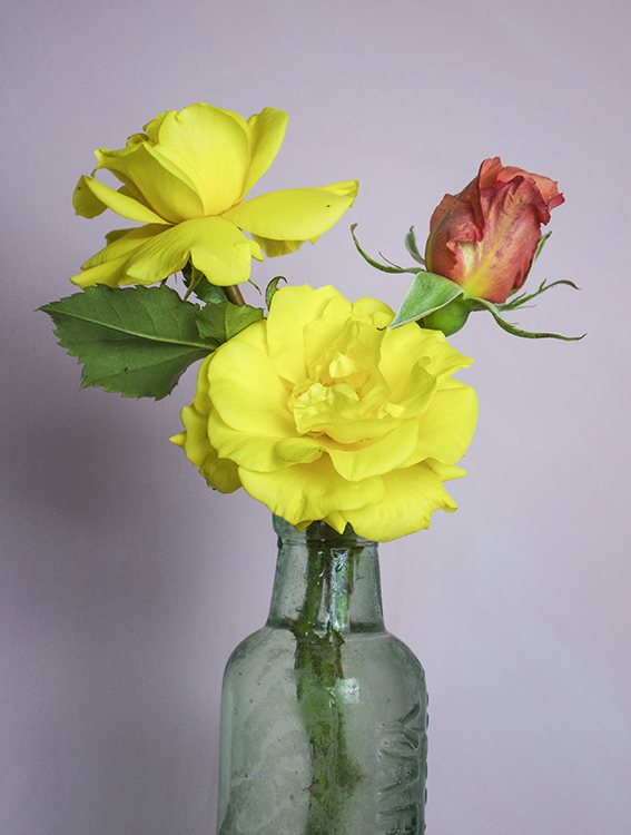
I won’t lie, this one below is actually from my mum as the ‘rents came to see us this weekend. The yellow flowers from her and my dad’s garden smell divine; you get a whiff of a little puff of sherbet as you walk by. They look delightful with such vivid hues and open up into the most perfect shapes.
My mum puts me to shame when it comes to her eye. Three simple, but bright ,stems, one of a contrasting colour, placed at different heights into a vintage old glass bottle that they bought as a job lot at an auction (Mr and Mrs J go to a lot of auctions).
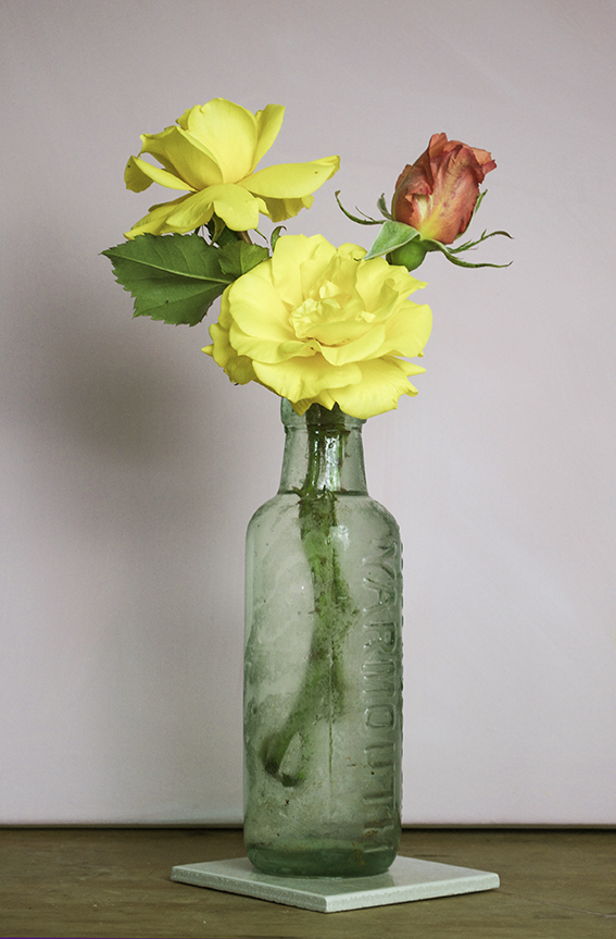 Crucially my mum removed the foliage that was below the water line; not only does this look better but it eliminates the bacteria that would thrive on those leaves. It also keeps the water in the vase cleaner and adds to the shelf life of the blooms.
My final display was for a dinner party and consequently I didn’t want to spend loads of money on flowers as I’d already blown the budget on wine (#sorrynotsorry).
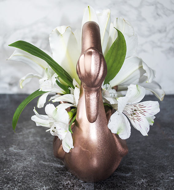 The table flowers to be low (people need to look at each-other over the table). I also wanted them to be fun as we were having a good time.
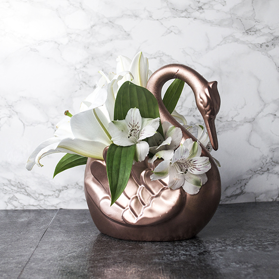
I’ve gathered quite a lot of swan vases from various charity shops over the years. None of them in their original state are particularly artful or beautiful so they’ve all been given the spray paint treatment on more than one occasion. I wanted them to twinkle amongst the candle-light on the table so I’ve painted them in a shiney metallic.
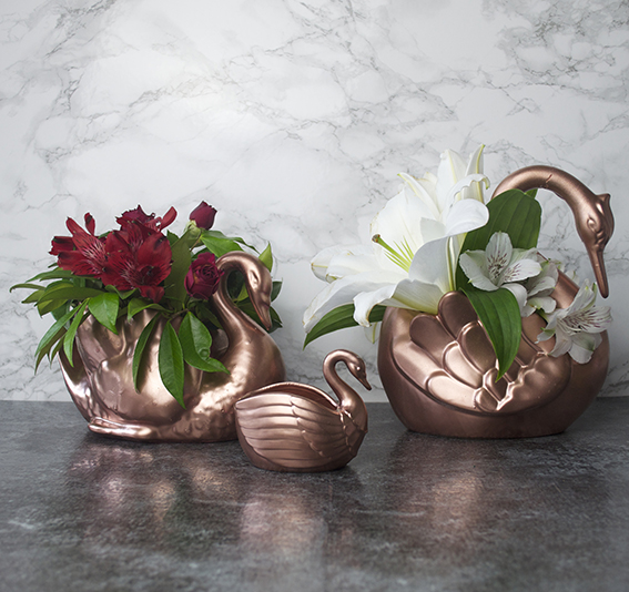 Alstroemeria is ideal for when you want to create a floral statement but you haven’t got loads of money. A stem of alstroemeria has lots of blooms on it so you get a lot for your money and the flowers look very effective when grouped together in one colour. I teamed the red ones with little spray roses and some foliage from the garden, these were placed in water and arranged in the vase. I placed a block of florist foam in the white one, having two large lily heads as my main attraction while filling in the gaps with alstroemeria.
DIY: Liberty Print Clocks
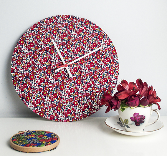 As an obsessive of iconic, classic design and illustration I regard a Liberty print with admiration and awe. But as I don’t live in a particularly girlie gaff, I’m sometimes at a loss as to where to put them in my home. In fact it would be fair to say that Ella’s place is quite gender neutral so, while I like a floral print (I mean, I draw enough flowers and like to display a bloom in practically every room), I restrict more ornate, flowery designs to accents rather than a full on floral fest, which is why I made these handmade clocks.
Creating a bespoke time piece is super simple. As clock fittings are so easy to come across these days (seriously, google it and you’ll be faced with a wealth of cost-effective options) you can make clocks in any shape or size with the minimum of effort all you need is the fitting and a suitable surface to attach it to.
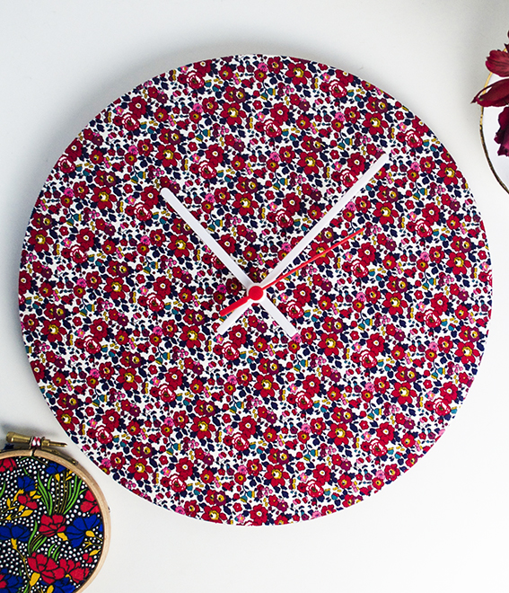 I took a cheat’s choice and used a needcraft clock kit for ease, as everything was pre-cut and measured. All I needed to do was add fabric – a total timesaver. But you can always cover an area of mdf or stiff card with material or paper with a hole made for the clock piece. It really is that simple – easy crafting if there ever was.
 I got the Liberty fabric from Sewbox who has an extensive collection of designs by the brand – Sue from Sewbox is lovely too, I worked with her a lot on Homemaker and she was super helpful.
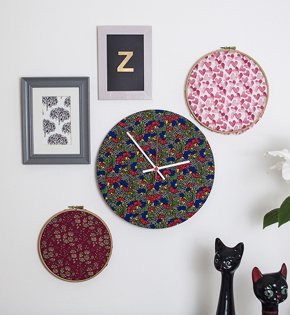 I selected Liberty Betsy Ann in Rossmore Cord for a lighter, classically floral time-piece and Liberty Cranston in Colourway A from its Lifestyle Stile Collection for a deco-style feel (it looks ever so nice with Henry and Matilda my retro cat ceramics). I’ve got the latter hanging in my hallway and the former is looking rather splendid on the white sideboard in the dining room.
