Posted on

Monday Moodboard: Dots and splodges

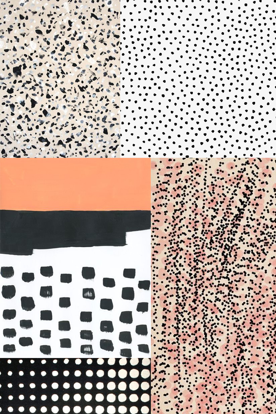
Monday Moodboard Dots and SplodgesAh dots and splodges, my old friends. It’s only right I dedicate a Monday Moodboard to these guys as they are really essential to my creative process.

Whenever I’m in a bit of a rut illustration wise but need to get my drawing head on I make marks with dots and splodges. It helps me explore what patterns to create and allows me to enjoy the medium of whatever I’m working in, be it watercolour, ink or felt pen.

But they’re not just a cool way to play with mark-making; as you can see by the above they are incredibly effective in creating patterns and compositions. I personally can’t resist the combination of black with white, pink and apricot shades.

By the way I need to do a big shout out to Ashley Goldberg as two of her designs are featured here. I LOVE her work to pieces. Check it out here.

Posted on

Monday Moodboard: Henna designs

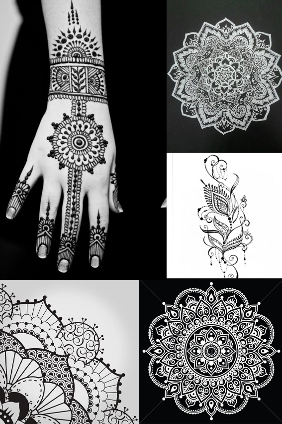
MOnday Moodboard Henna patterns After a busy fortnight with holidays, workshops and Christmas prep, I’m back with some insights from the outside world – a Monday Moodboard dedicated to henna designs and patterns.

I get trend reports and press previews all the time but every now and then a trend comes along that I don’t know about that really excites me. While I obviously know about these beautiful, ancient designs, and have even had these exquisite patterns  painted on myself in the past,  I didn’t know they were capturing peoples’ imaginations right now.

How wrong was I?

Every teenage girl that came to my Posca pen workshops in Manchester and Birmingham wanted to recreate mandala and henna designs.  They were really very adept at creating these patterns and told me that they wanted to place these designs on their clothes and homewares. It’s good to get out there and talk to people – you can always learn something.

Posted on

Drawing of the week: Bear

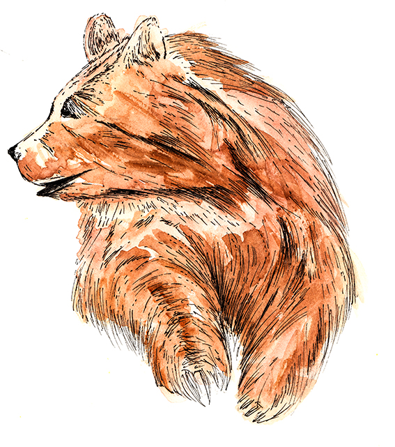
Bear Illustration by Ella Johnston

This week’s drawing is of a bear. I’m exploring zoo animals at the moment and I’ve developed quite a stash of sketches of zoo creatures so I wanted to share this quickly made illustration with you.

As usual this drawing is created with watercolour and fine-nibbed pen. I wanted this to be gestural and light in contrast with the animal’s large, imposing structure.

Posted on

Drawing of the week: mid-century style leaves

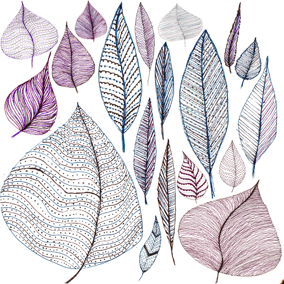
Line leaves Ella Johnston

As I’m very happy to share my experiments as well as my finished pieces this week’s drawing of the week is my collection of mid-century style leaves.

I’ve been working on a set of autumn designs and while I’ve been enjoying working with watercolour and ink, these initial pen sketches shown here were a real joy to play with and reminded me of illustrations and fabric motifs from the 1950s.

Normally I would use these as a starting point for something else however I actually like them as they are, they have real potential for pattern designs.

Posted on

Drawing of the week: Birds of Brazil

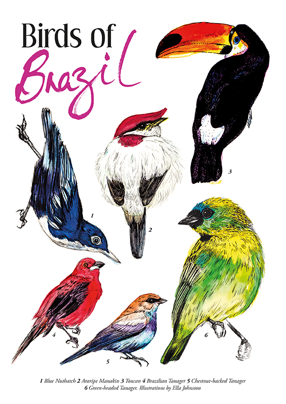
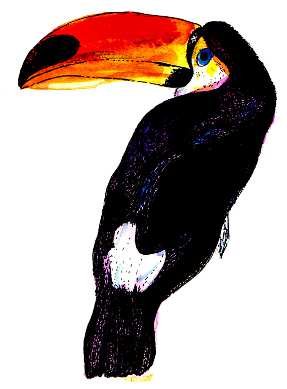
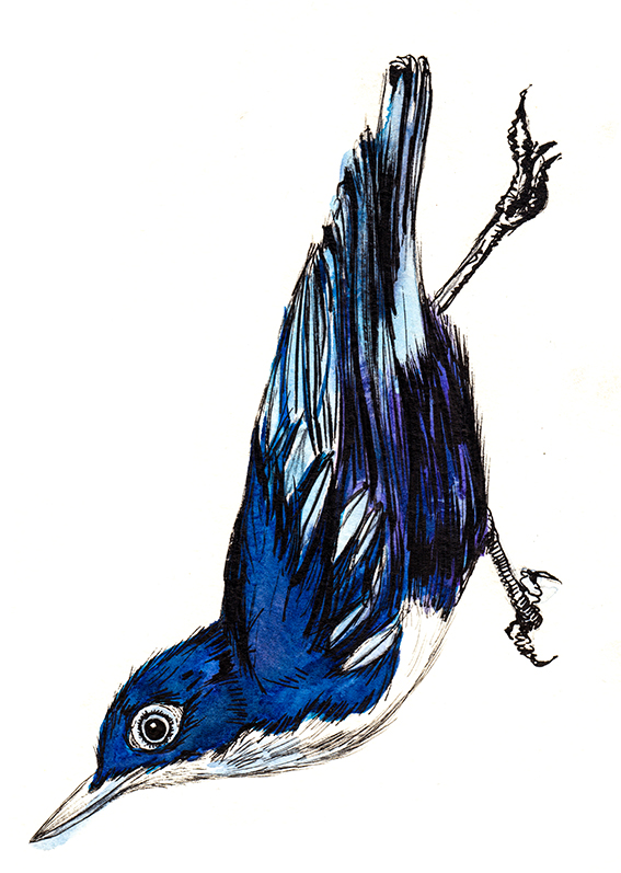
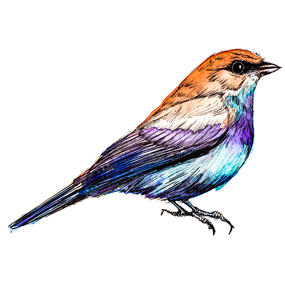
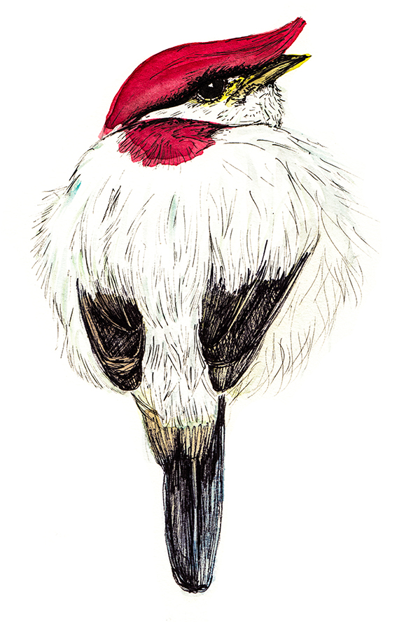
Birds of Brazil Ella Johnston ellasplace.co.ukThis week’s drawing of the week is my Birds from Brazil guide, created as a celebration of the up-coming Rio 2016 Olympics.
Bird of Brazil illustration Ella Johnston
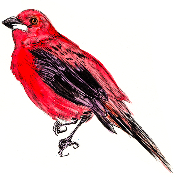
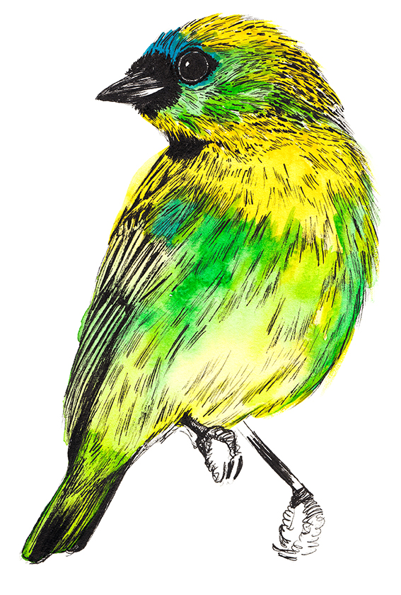
My illustrated guide features six Brazilian bird illustrations; blue nuthatch, anaripe manakin, toucan, Brazilian tanager, chestnut-backed tanager and green-headed tanager.

Bird of Brazil illustration Ella Johnston
All the drawings are created with watercolour and black pen – you know, my trademark illustration style. You can buy the print of these Brazilian beauties at my Not On The High Street shop click here to see it.

Bird of Brazil illustration Ella Johnston
Green Tanager Ella Johnston ellasplace.co.uk

Posted on 1 Comment

Completed Plant of the Fortnight: Thistle

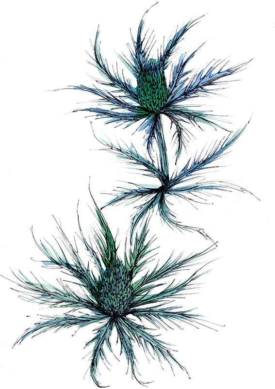
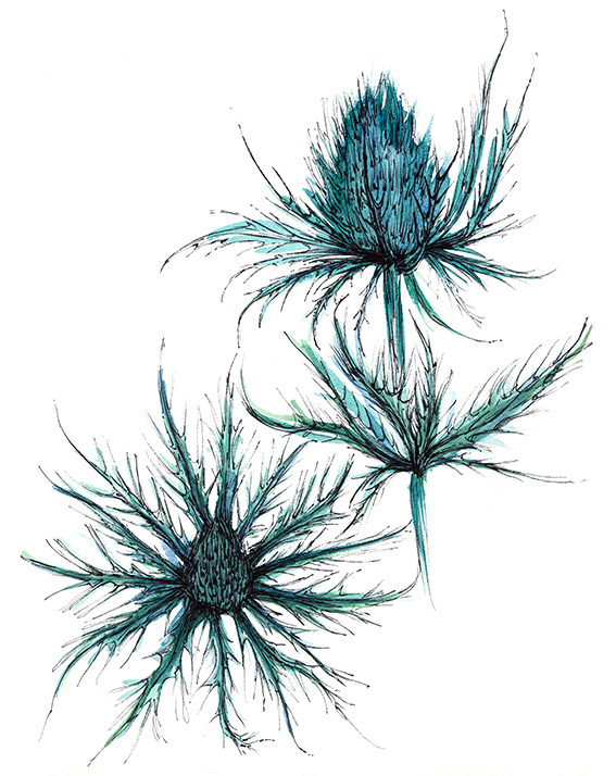
Thistles, Watercolour and Ink, (c) Ella Johnston

After whipping up a set of black and white thistles earlier this week I got carried away and did two final watercolour illustrations and a fabric pattern using this gorgeous flower as my motif.

Thistle, Watercolour and Ink (c) Ella Johnston
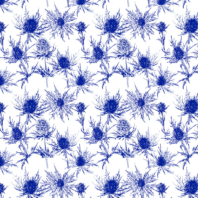
I love a thistle and used them a lot when I style photo shoots – I admire their structural quality and blue, green, two-tone colours. I particularly like drawing them though, you can be really expressive with both the watercolour and the pen work as you can probably tell. They also work incredibly well as an indigo and white pattern – I’ve ordered some fabric in this pattern from my  Spoonflower shop so I can make some nice stylish textile bits and pieces.

Thistle Pattern indigo and white (c) Ella Johnston

Posted on

Plant of the Fortnight: Wood Anemone

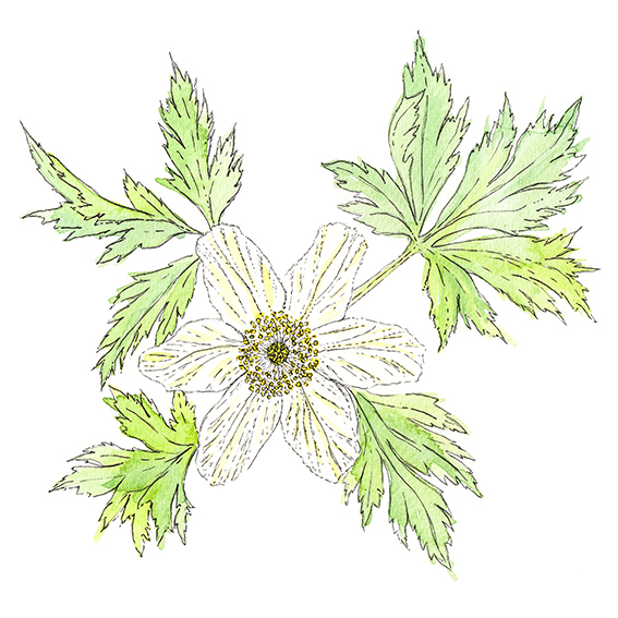
Wood Anemone Illustration (c) Ella Johnston ellasplace.co.uk

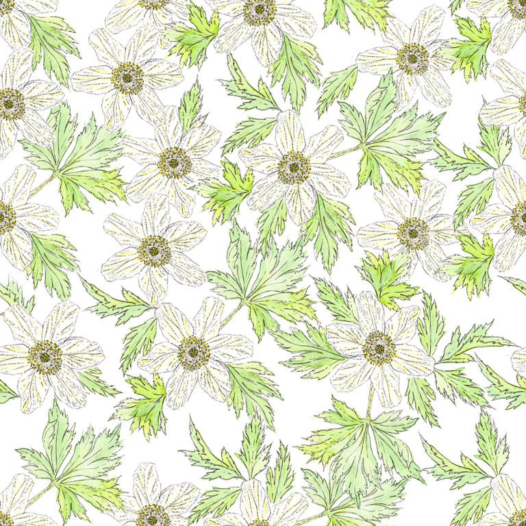
On Monday I shared some sketchy five minute drawings of some wood anemones, here’s my colour version using watercolour and ink. I’ve also worked up a pretty pattern repeat using the flower and foliage as a motif.

These are really lovely delicate flowers, I love their light, paper-like petals and delicate minty coloured leaves. I’m lucky enough to live near woods and every spring it is full with a delightful carpet of green and white. It’s a wonderful gift every year and gives us a tremendous amount of pleasure.

Wood anemone pattern (c) Ella Johnston ellasplace.co.uk

Posted on

How I added a ‘Memphis lite’ element to my home

Memphis style tealights (c) ellasplace.co.uk

Last summer I went to the Pick Me Up show at Somerset House. Every year the show features a fresh line-up of artists and designers who are considered to reflect the best of new illustration, graphic design and related disciplines. It’s a great event for picking up on trends.

Almost every item in the 2015 show was influenced by the Memphis Group, an Italian design and architecture collective founded in Milan by Ettore Sottsass in 1981 that designed Postmodern furniture, fabrics, ceramics, glass and metal objects from 1981 to 1987. Since the show I can’t seem to pick up a magazine or visit an interiors site without reading a reference to this group. This style is big in 2016, so if you’re new to Memphis style take a look at my Pinterest board to familiarise yourself with it.

I must confess that it’s taken me a little while to embrace this particular look – I was a child in the 1980s so anything from that era has to work extra hard to win my favour. However the Memphis look is fresh, playful, fun and actually very easy to incorporate into interiors and crafts projects. It also, even 30 plus years on, looks surprisingly contemporary. You can go all out with it or incorporate little elements of this style to give your home or craft creations a quirky, on-trend edge.

So starting softly, I took Ettore Sottsas’ iconic Letraset design, as seen below, as an inspiration for a quick interiors update.
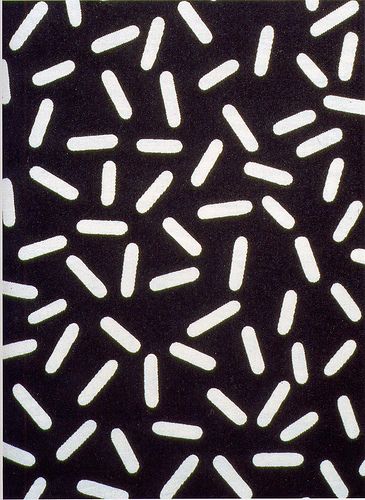
‘Letraset’ textile design by Ettore Sottsas

It’s a wonderfully simple, effective design that works well as a standalone pattern but can look fab  layered over different shades. It’s also great at different sizes.
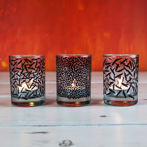
Memphis style tealights (c) ellasplace.co.uk

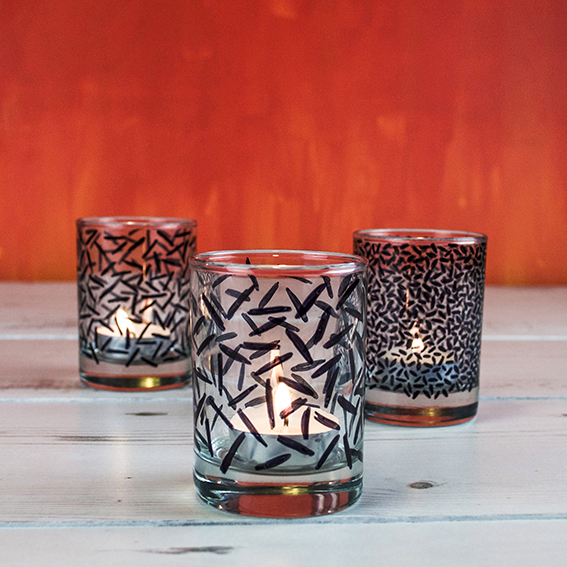
I used this Letraset pattern as a ‘Memphis lite’ starting point to update some funky tea-light holders as a gift for my lounge. I got these little shot glasses from a charity shop and they are perfect lanterns for my tea-lights. However, left plain, I felt they were rather stark.
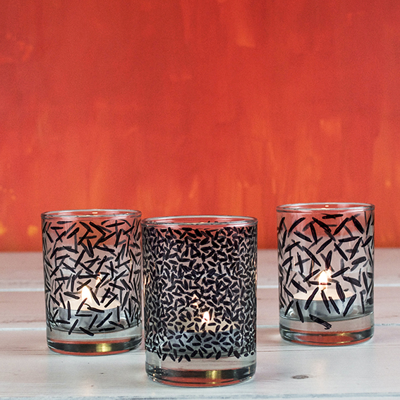
Memphis style tealights (c) ellasplace.co.uk
I used black permanent marker (the Memphis Group use a lot of black) to very loosely apply a similar pattern over the glasses. I wanted to play with the scale of the motifs to make the lanterns more varied and create interest when they were arranged together. I literally did this while I was watching telly one evening, and I’m pleased that this easy make made me think more about the Memphis Group’s work and has spurred me on to check it out further.
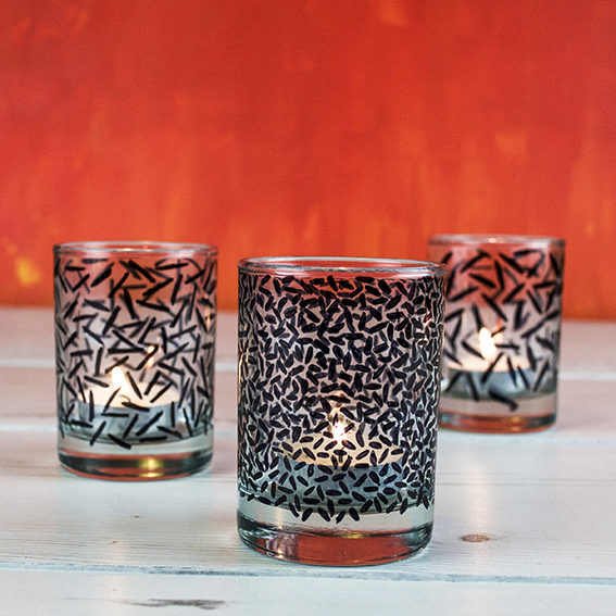
Memphis style tealights (c) ellasplace.co.uk