Posted on

Monday Moodboard: Penguin book design

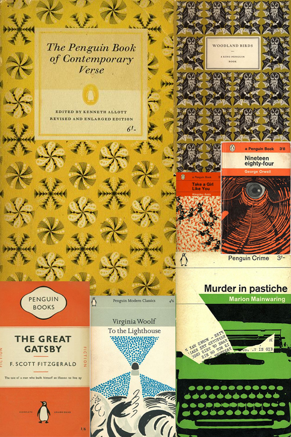
Penguin Book Design Penguin book design has been an obsession of mine since I was a teenager when I spent an awful lot of time in libraries. Probably too much time if I’m being honest.

In those days I was continually on the hunt for new words, stories and worlds, I used to get lots of books out on spec. I read a lot of duds but I also came across a lot of good stuff too that has stayed with me.

The cover design played a very big part in my decision making process. From the classic orange cover fiction and stylish mid-century illustration to the glorious repeat patterns, it is all the stuff of wonder and as much of an inspiration as the words inside. As a consequence of this I read a lot of books published by Penguin; a great deal of classics and quite a few poetry collections. I’ve now bought a lot of the books that I borrowed and devoured during my teenage years (the ones I enjoyed at least).

As Creative Director of an indie publisher, I design all the books for Dunlin Press. So my youthful interest has become increasingly important now I’m a grown-up. When approaching the layout for each Dunlin Press book I always ask myself, “What would the Penguin designers do?”


Posted on

DIY: Ornate cases

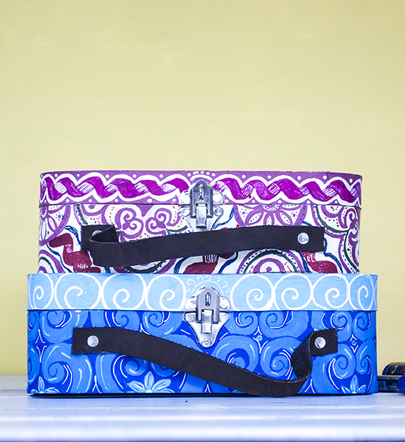
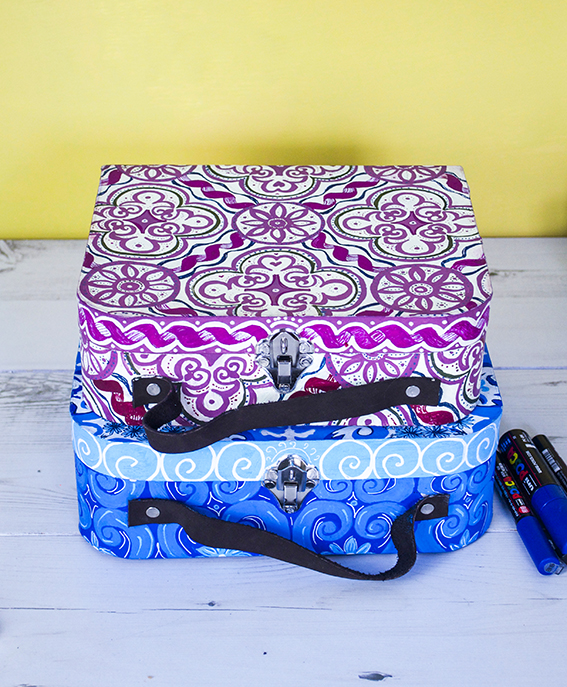
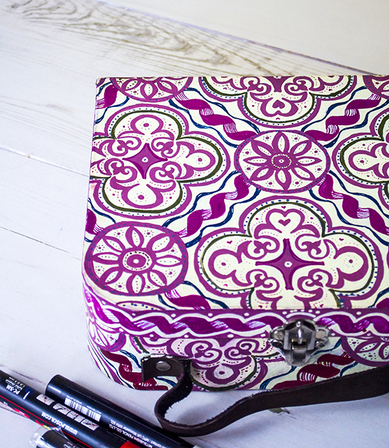
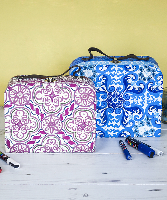
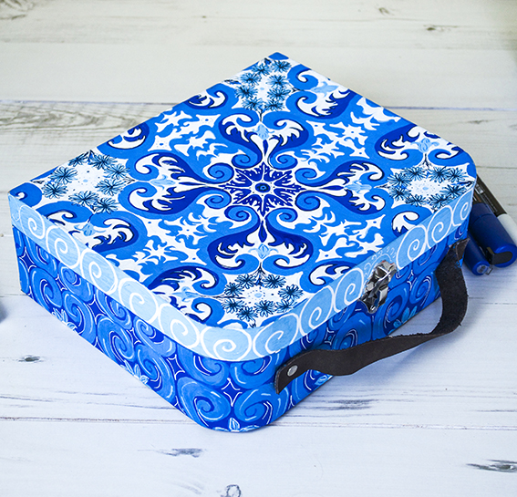
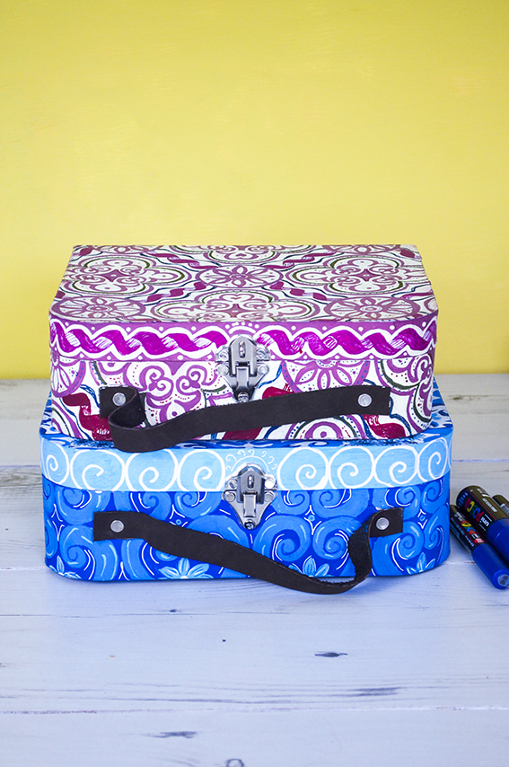
Ornate cases ellasplace.co.uk I’m not gonna lie, these ornate cases took ages to create but they are quite a cool DIY. I have had a brief from the guys at Uni-Ball to create a selection of products updated with the company’s pens. I wanted to make a number of items at various sizes and using the wide range of pens they had on offer.
Ornate cases ellasplace.co.ukI also wanted an excuse to play with an ornate pattern idea I’ve had for a while. Because Uni-Ball’s Posca pens have a wide range of colours and shades I thought they would perfectly lend themselves to a pattern that utilised various shades of the same hue.
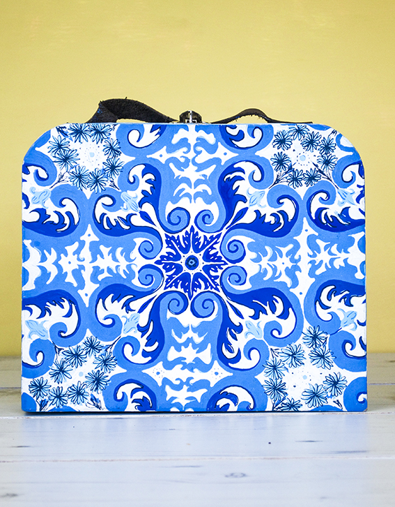
Ornate cases ellasplace.co.ukI have looked through loads of tile designs to come up with the ones I have worked out here.
Ornate cases ellasplace.co.ukThese cases were plain brown mdf boxes. I traced on my design before filling in the light colours then layering with darker shades.
Ornate cases ellasplace.co.uk

Posted on

Drawing of the week: Fox Terrier

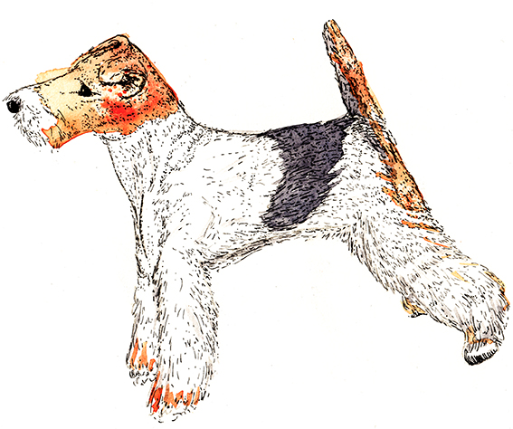
Fox Terrier
My drawing of the week is of a dog – a lovely fox terrier.

I drew this by accident. I was actually going to draw a fox (and I will next week) but I came across this breed of dog while image researching and remembered how much I like them. So I thought I may as well draw this little fella.

A little bit about a fox terrier…
Wire fox terriers (as seen here in my watercolour and ink illustration) are known for their energy and intelligence. They have a low boredom threshold (like me and Dr B)  and require stimulation, exercise (I should do more of that) and attention (we all need that).  They are bred to be independent thinkers (I really like that).

Now, all that remains is for me to try and persuade Dr B that we need one as a pet in our lives.


Posted on

7 Strong AW16 Home Looks

AW16 Looks ellasplace.co.uk
Summer is nearly done (yes, sorry to let you know about that one) and I’m looking forward to refreshing JB towers with some new looks for AW16.

I’m very excited about this season – there are so many looks I love that can be enjoyed and adapted to suit your style. There are seven really strong themes that would work well in any kind of interior, large or small, grand or modest.

Colour pop fun

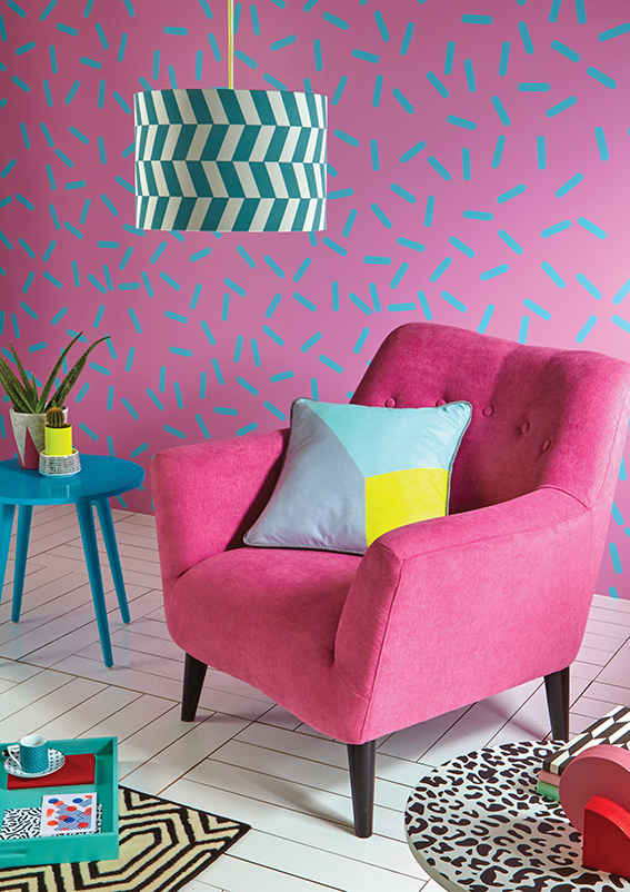
Colour pop fun AW16 ellasplace.co.uk
From Very

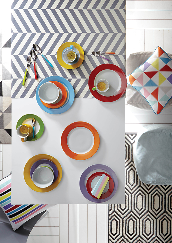
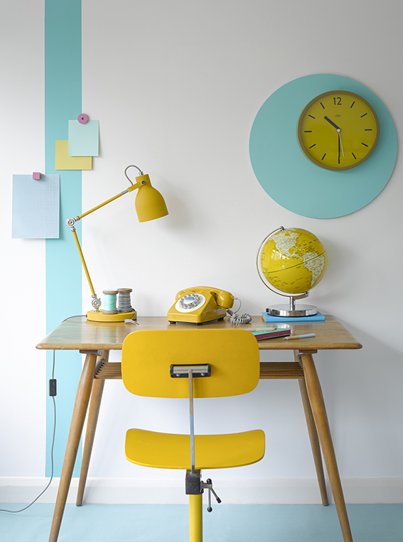
I can’t resist a pop in colour in my rooms. You can go bold with a Memphis-inspired scheme like the one from Very above or you can simply add colour accents to a more restrained room with accessories. How about some bright crockery or a statement lamp or piece of brightly coloured furniture.

Colour pop fun AW16 ellasplace.co.uk
From Very
From Cuckooland
From Cuckooland

Lush and plush

Lush and plush AW16 ellasplace.co.uk
From House of Fraser

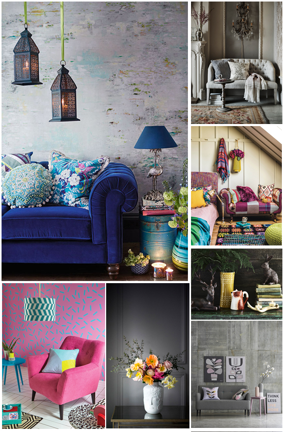
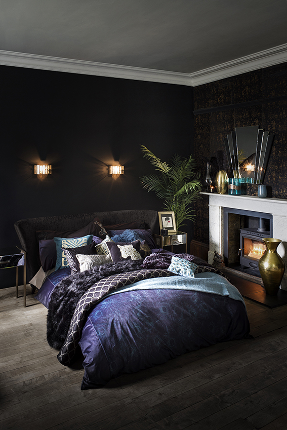
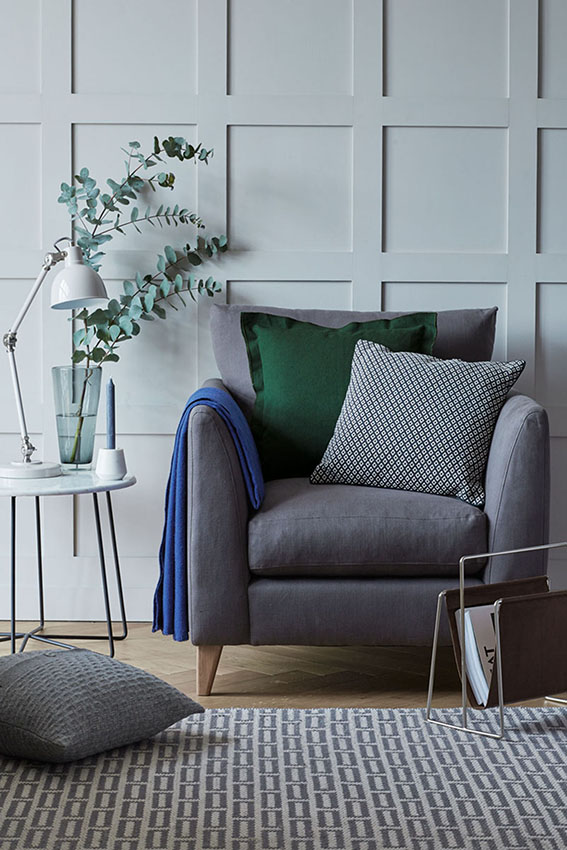
We all love a bit of luxe; gorgeous fabrics and textures that are tactile, soft and warm that make us feel warm and snuggly while still retaining a sense of style and opulence. Key colours are navy, purple and turquoise and beautiful metallic touches. Oh, and don’t forget a bit of greenery!

Lush and Plush AW16 ellasplace.co.uk
From Debenhams

Understated luxury

Understated luxury AW16 ellasplace.co.uk
From Sainsbury’s

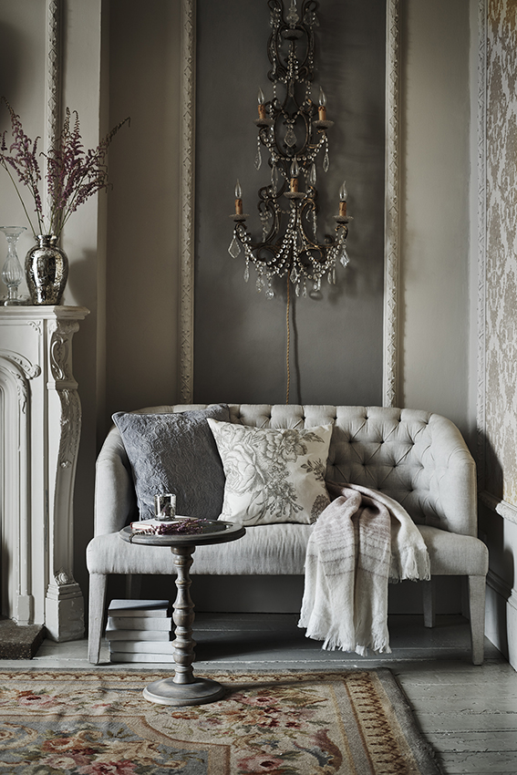
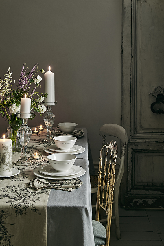
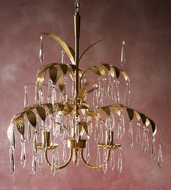
This look reminds of years ago when, in another life I think, as production editor on Restaurant Magazine I went on my first press trip. It was to the Martel Chateaux in Bordeaux and it was really quite something. Woven carpets and tapestries, distressed wooden panels and floors. Studded sofas, elegant candelabra and pretty chandeliers – the whole place was just divine and now is rather easy to evoke with a few high street buys.

Understated luxury AW16 ellasplace.co.uk
From Sainsburys’
From Marks & Spencer

Quirky classics

Quirky classic ellasplace.co.uk
From Marks and Spencer

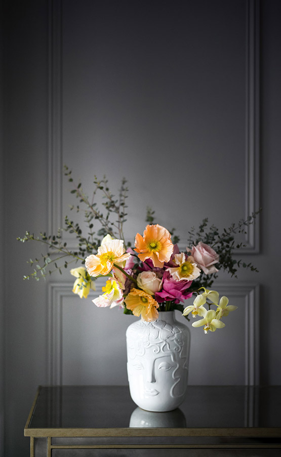
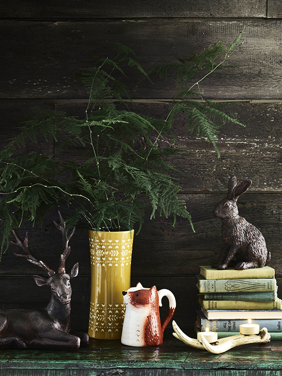
If you’ve had a look at my menagerie pages you’ll know I love a home with a sense of humour and a touch of the unexpected. So I’m pleased to see accessories from so many leading retailers that make you smile this year.  I’m particularly taken with this vase from Marks and Spencer.

From George at ASDA
From George at ASDA

Cool and clean

Simple elegance AW16 ellasplace.co.uk
From Dunelm

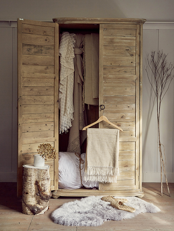
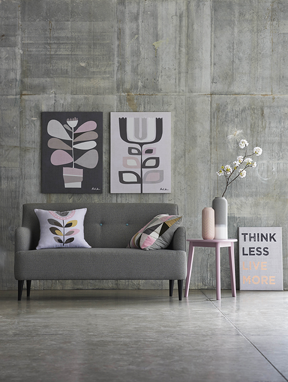
A calm colour scheme and  well chosen, minimal accessorising can be a really rather wonderful thing. Its certainly something I like in a bedroom and this was definitely my approach when I lived in a small flat. There are so many collections available in terms of furniture and accessories that you can co-ordinate to get this grown-up look.

Simple elegance AW16 ellasplace.co.uk
From Next
From Debenhams
From Debenhams

Cosy eclectic

Cosy eclectic AW16 ellasplace.co.uk
From Homesense

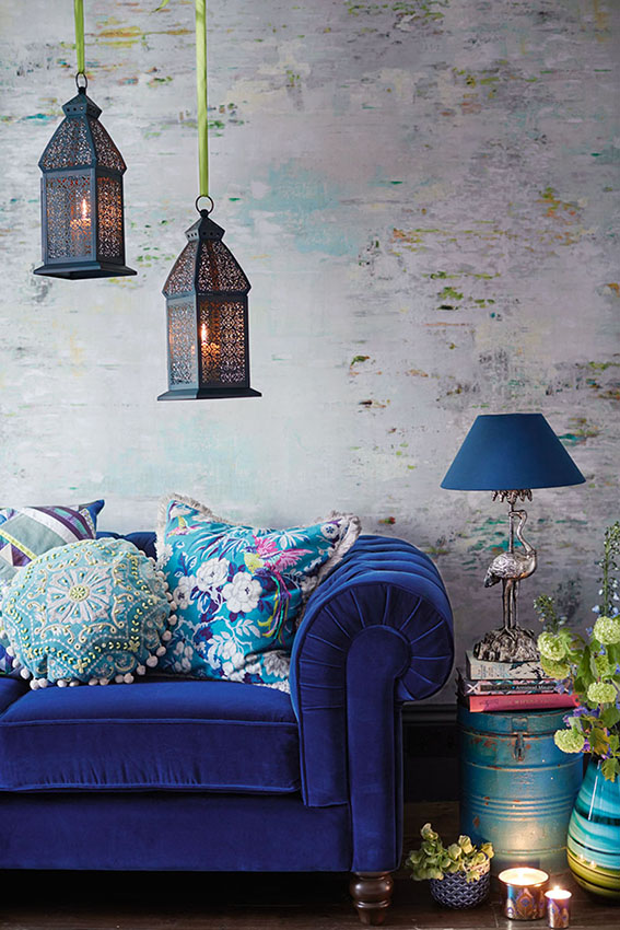
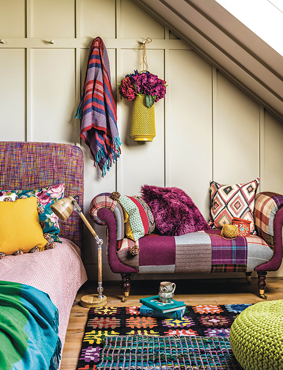
As a former editor of craft mags I’m always drawn to a mismatched style that showcases knitting, crochet, patchwork, weaving and a nice bit of trimming. Check out this room scene from Homesense – it’s colourful and cosy sure but it also has such a cohesive style, it’s just so inviting.

Woodland wonders

Woodland wonders AW16 ellasplace.co.uk
From George at Asda

No autumn round up would be complete without this season’s take on nordic and woodland. I think these ceramics and ornaments from George are really cool; contemporary and fun.

Posted on

Monday Moodboard: Black and white

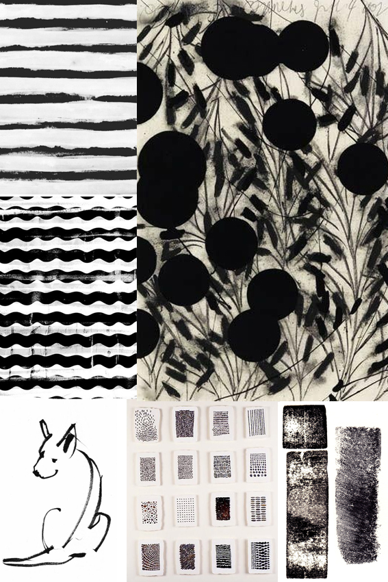
Black and white moodboard ellasplace.co.ukTimeless, classy and striking, I love black and white designs. In fact I can’t believe I haven’t featured this on my moodboard sooner.

I hardly ever wear anything other than black and white clothes (occasionally navy or grey but it’s mainly black and white). I also am a massive fan of simple black and white sketches, print and design. The purity, harmony and general all-round elegance is, for me, a total short-cut to cool.

At the moment I’m working on the design for a poetry book. The publication is printed in black and white so I wanted to think of effective shapes and marks that would look strong on the pages without distracting from the words (which are the most important thing). I’ve done lots of research and have settled on something that I’m quite excited about. You can’t see it yet but the book is set to be released later this year so, watch this space.


Posted on

Drawing of the week: Hare

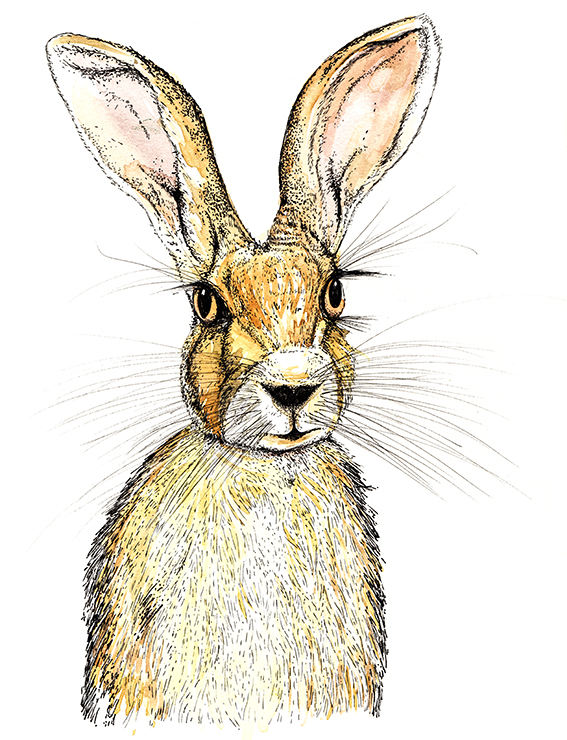
Hare illustration (c) Ella Johnston ellasplace.co.ukHere’s my drawing of the week – a lovely wild hare.

I mentioned last week that I’m branching out with my drawing and illustration, challenging myself to do new things so… Here. Hare. Here*.

As usual this earnest looking little fella was created using watercolour and fine-nibbed felt tip pen. I really enjoyed doing his whiskers and eyebrows – a fun bit of mark-making if ever there was.

* With apologies to Bruce Robinson.


Posted on

DIY: Easy Fancy Votives

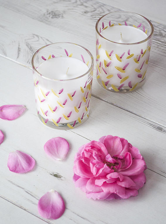
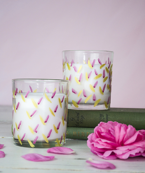
Pimped up votives posca pens ellasplace.co.uk

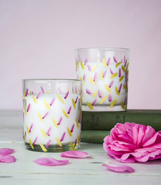
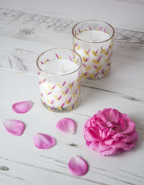
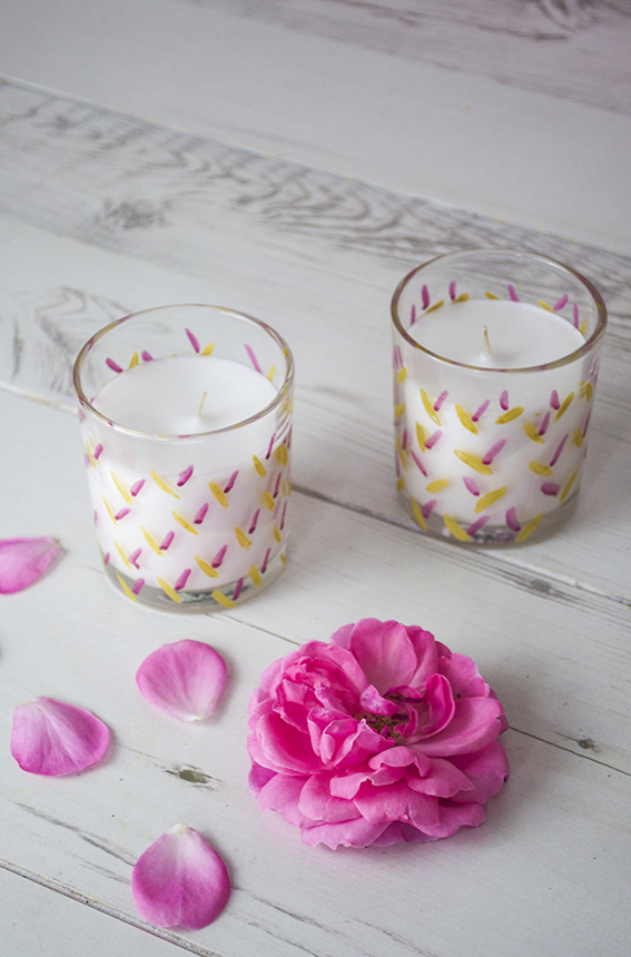
This is a really easy DIY – a pretty pen project to make fancy votives that give cheap filled candles a designer feel.

Pimped up votives posca pens ellasplace.co.ukAs you know I love a scented candle and I do occasionally splash the cash on some expensive ones. However, because I go through quite a few of them, I do get some cheaper ones to light on a Friday and Sunday night when I’m relaxing with Dr B or when I have a cheeky Saturday afternoon bath.
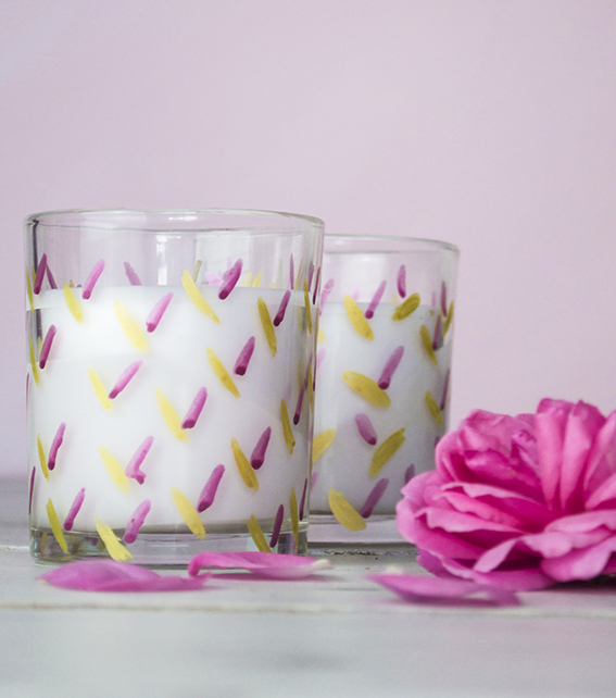
Pimped up votives posca pens ellasplace.co.uk Plain filled candles can look a little drab and I like to give them a nice look. As I’m currently doing some work for Posca pens I’ve got loads of various colours lying around – I’ve chosen beautiful gold and berry coloured pens and gave them a simple leaf pattern.
Pimped up votives posca pens ellasplace.co.uk I wanted to create something really quick and easy as the last thing I wanted to do was spend ages doing an intricate pattern. So these  are just scribbled little lozenges drawn on an angle.
Pimped up votives posca pens ellasplace.co.uk In the spirit of all things green I recycle my glasses once the candle has been burned. Once I finish with them I will use them as vases. The lovely thing about this project is I can pop these glasses in the oven at 145C to seal in the design and I have some lovely gold and berry containers. Pimped up votives posca pens ellasplace.co.uk

Posted on

Monday Moodboard Rio 2016

Rio! Monday Moodboard ellasplace.co.uk

The Rio 2016 Olympics kick off this Friday so I thought it would be a fitting subject for my Monday moodboard.

It is such an amazing source of inspiration. I’ve already created a series of work looking at Brazilian birds and florals. I’m also fascinated by Rio’s fabulous tiled beach fronts and decorative, colourful buildings as well as its dramatic landscapes and glorious carnivals. I’m really looking forward to learning more about this wonderful place over the coming weeks.


Posted on

Friday fun! Botanical love; more spoils from the garden

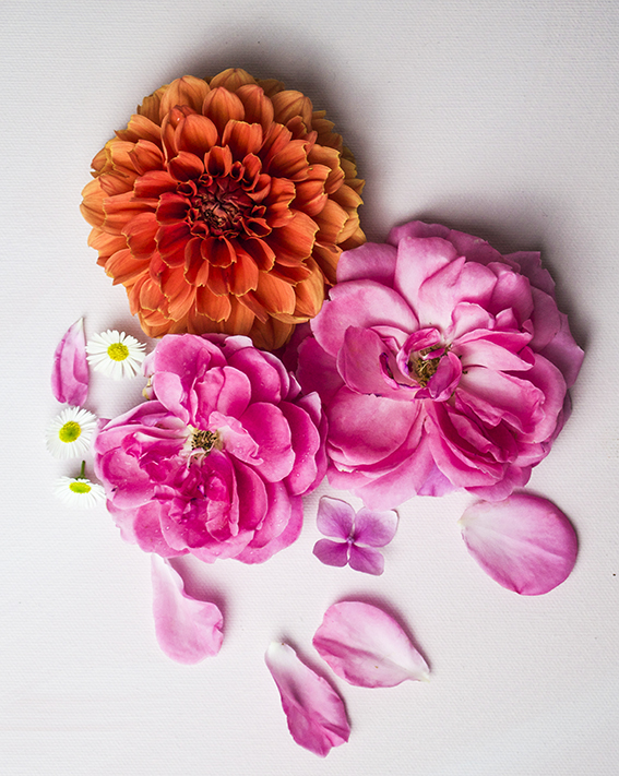
Garden flowers ellasplace.co.uk

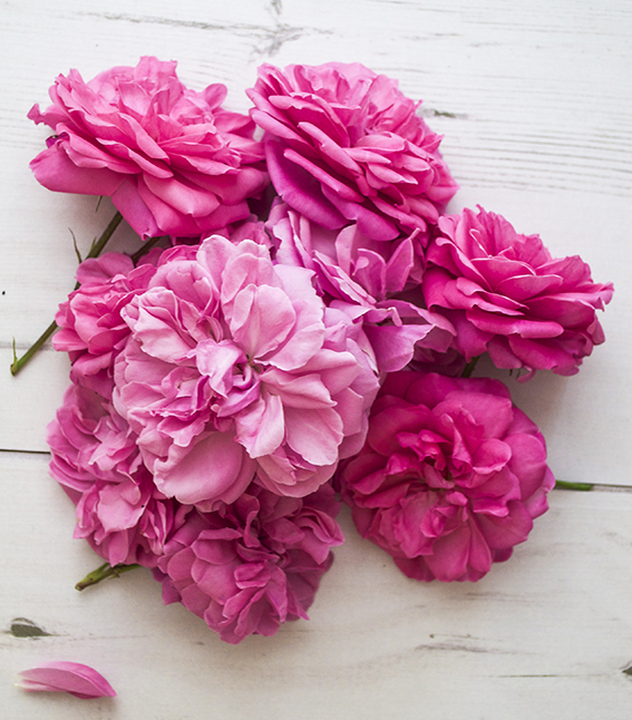
More indulgent love for botanicals from me. My garden just keeps giving. Roses. ellasplace.co.uk

What a beautiful, beautiful summer it’s been so I’ve been reaping more spoils from the garden.
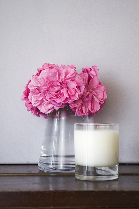
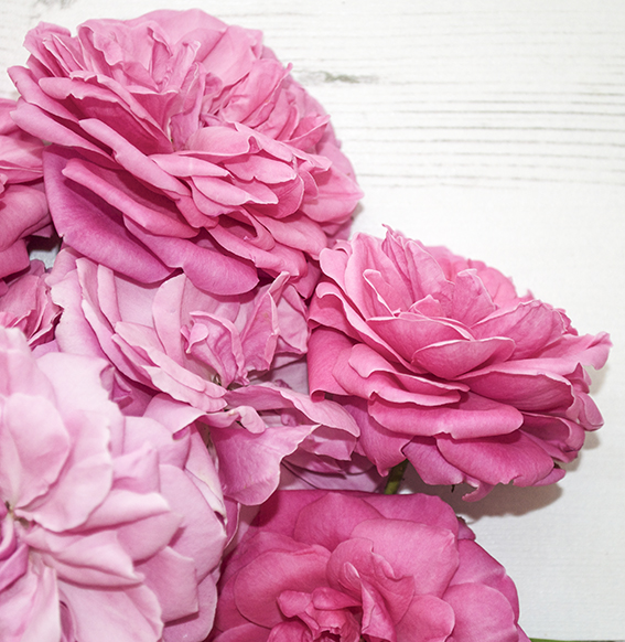
Roses. ellasplace.co.uk We have beautiful bright pink roses which need constant pruning – they just keep blooming. This is great for us as we have an abundant supply of vibrant blooms to grace our rooms with.
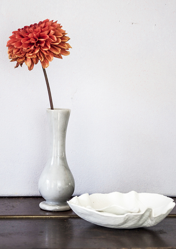
Roses. ellasplace.co.uk Luckily we’re also in dahlia season so everyday I’m checking which heads I can chop to bring indoors and display in our home.
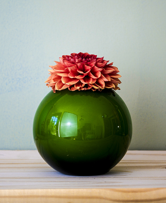
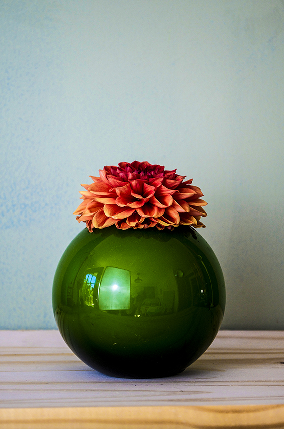
Dahlia. ellasplace.co.uk I love a big fat dahlia bloom – you can display a single stem and enjoy its wonderful structure and architecture. So I’ve placed one of my orange flowers in this lovely marble effect  vase I found at a charity shop and the other in my favourite green fishbowl vase (sorry about the reflections, I’ve still got so much to learn about photography and picture editing)
Dahlia. ellasplace.co.uk

dahalia 1

Posted on

Drawing of the week: A rainbow unicorn!

Unicorn Print Ella Johnston. Available on Not On The High Street.

I know. Me? A rainbow unicorn? Drawing of the week? Yes, yes and yes.

The unicorn is a very special drawing for me as it meant doing something out of my comfort zone and taking a bold step.

Last month I visited the Not On The High Street partner day – it’s a great event for all the sellers on the site to come together learn from each other while also getting insights and advice from the NOTHS team. One of the services they offered was a clinic looking at my shop and evaluating all my products. To be honest this was a big deal for me – after creating the illustration, designing the products, shooting them, writing the products and marketing them, sometimes criticism, however useful, constructive and helpful, can be hard to take. But I have resolved this year to take the advice, learn from any criticism and act on it and most of all not to take things personally. So I made use of this years clinic for my shop.

Actually I received very little criticism. I was on trend, my products and photography were really good and I got the word ‘beautiful’ a lot (always good). I just needed to work on my SEO and put some of my products into a more lifestyle setting. After all that stealing myself it was one of the most positive experiences I’ve ever had.
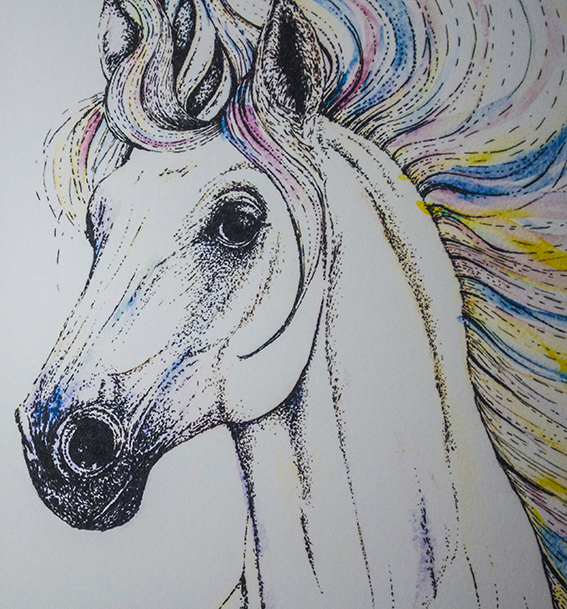
Unicorn Print Ella Johnston. Available on Not On The High Street. God, this is getting to be a long story, sorry.

Anyway I asked the women running the clinic if there was anything I could do to improve my offering, anything my style could be suited too, anything new I could try. “A unicorn” they said, “Create a range with a unicorn.”

Okay.

But I don’t do girly stuff. I don’t do fanciful stuff.

Why don’t I?

Why don’t I try something I’ve not explored before?

So I set about answering this brief. I wanted to do it with enthusiasm, integrity, honesty and love, like I do with all of my illustrations. After lots of visual research, I got really excited about this new challenge and set myself seven days to create the illo then get it onto a print and get it into the shop.

I picked up my watercolour paints and fine nib black pens and went to work. Dr B was quite surprised, he envisaged a mythical, goth type creation instead he got a handsome steed with a rainbow mane – a girly unicorn!
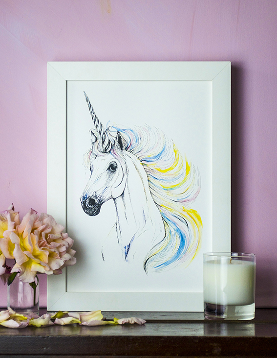
Unicorn Print Ella Johnston. Available on Not On The High Street. So here is the unicorn print. I’m immensely proud of it as it represents more than a drawing but is a symbol of my journey as an illustrator and as a person, leaping into the unknown and trying something new. I’m hanging this bad boy in my office now to show me why it’s so important to keep striving. You can buy my print on Not On The High Street. 
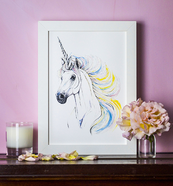
Unicorn Print Ella Johnston. Available on Not On The High Street.