Posted on

Christmas wrap ideas part 1: Totes trad red and green

whitewrapping_2 Over the next four days I got some top easy gift wrap ideas for giving your Christmas pressies that extra pizzazz.
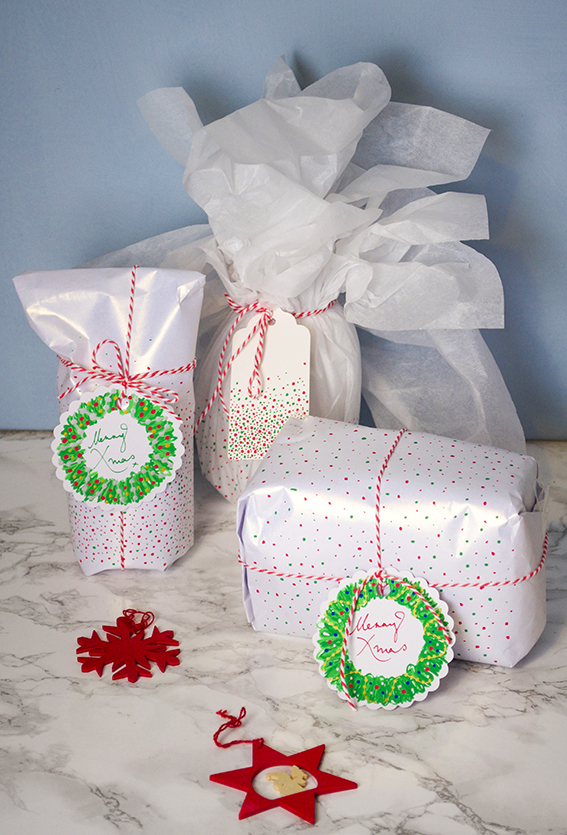
whitewrapping_3Idea number one is inspired by the totes trad red and white festive theme as outlined in this Christmas trends post. As I might of mentioned, this red, white and green colour scheme is one very much favoured by Dr B. So I always do something every year that’s a little concession to his yuletide preferences (although in fairness he’d have penguins and robins and Santas everywhere if it were up to him).
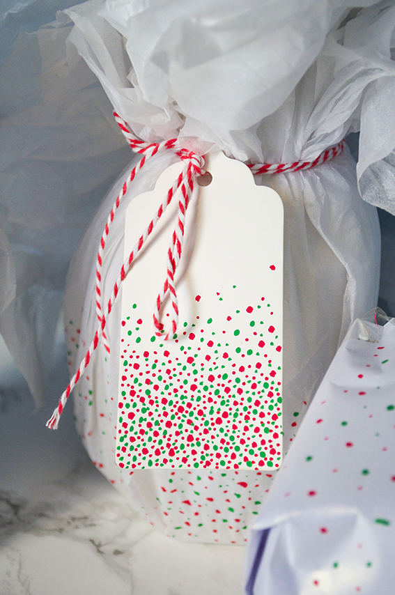
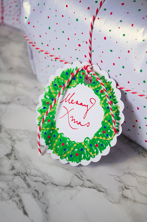
whitewrapping_4This is my concession to tradition. I have loads of gift tags and Posca pens left over from the craft shows I did this autumn so I thought I’d get busy with some quick and easy wrap revamps.  I used two different nib sizes (5M and 1MR) to create different sized dots on the wrapping paper and some of the tags. I then finished it off with a trad twine bow.  I also completed some of the gifts with a bespoke wreath tag. It’s dead easy to do, so much so I’ve got a little step by step for you below for you to try.
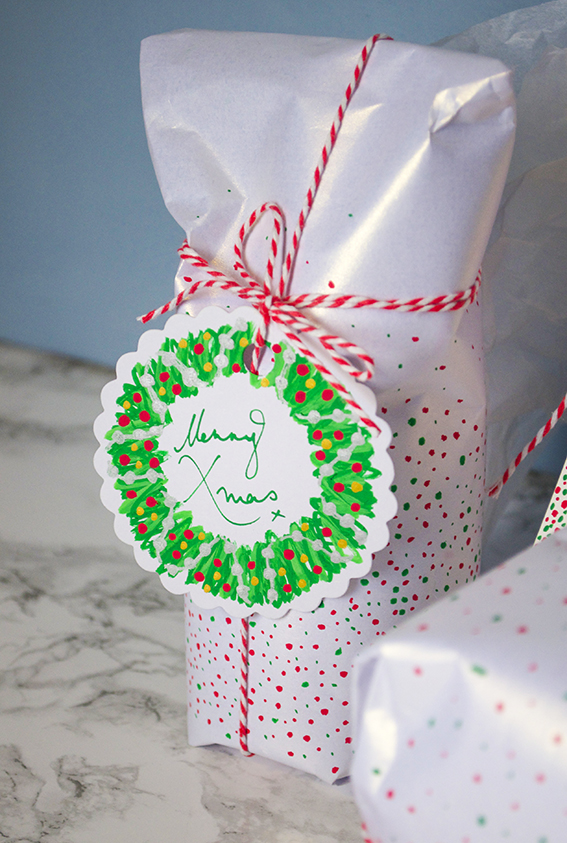
whitewrapping_1 You don’t have to be a fantastic drawer to create this wreath, I’ve shown loads of people how to do it; if you can make a mark you can make this wreath. You’ll need a circular tag and Posca pens in dark and light green, gold (or silver), red and blue.
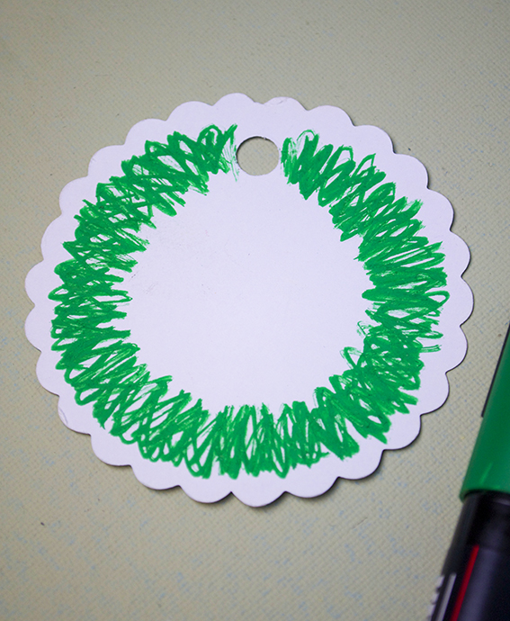
Ella Johnston Christmas Wreath gift tag tutorial Step 1: Make a dark green circle using a rough layered zig-zags.
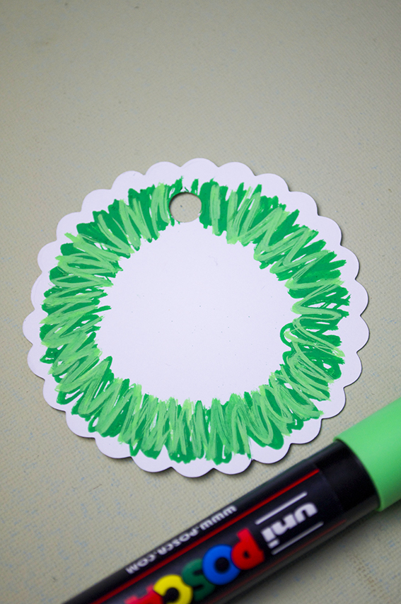
Ella Johnston Christmas Wreath gift tag tutorial Step 2: Overlay the dark green with a lighter shade.
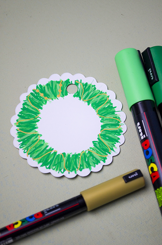
Ella Johnston Christmas Wreath gift tag tutorial Step 3: Once your wreath is dry (the pens are paint based so you can use them as such) use the gold pen to draw lines around the ring as above, like it is wrapped around the wreath. Once you have covered the wreath with gold lines draw circles along the lines to make a string of beads.
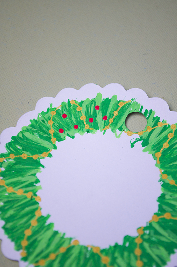
Ella Johnston Christmas Wreath gift tag tutorial Step 4: Add coloured baubles in-between the gold bead garland.
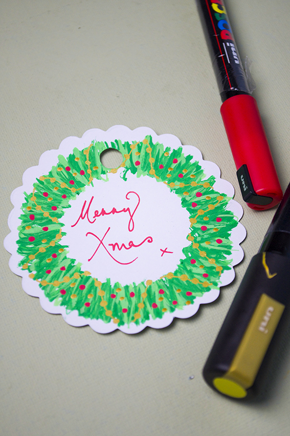
Ella Johnston Christmas Wreath gift tag tutorial
Step 5: Write a little festive phrase in the middle.
Posted on

Drawing of the week: Zebra

zebralowres_20

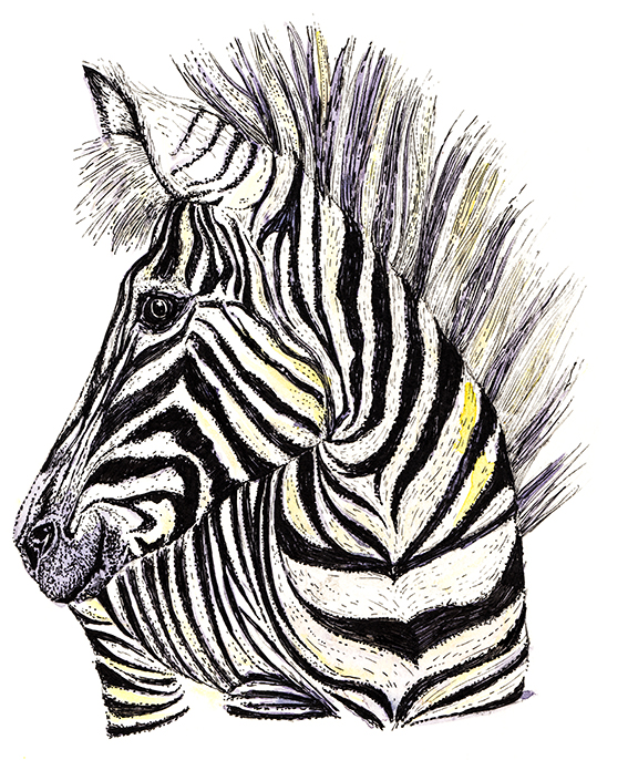
This time for my drawing of the week I’ve done a very earnest little Zebra. Even in the middle of doing loads of Christmassy type stuff I still made time to work on my zoo animals series.

Although I love black and white drawings I can never resist subverting a traditional black and white subject with a bit of colour, so as well as using my black pens on this illustration I’ve adding some purple and yellow watercolour notes.

Posted on

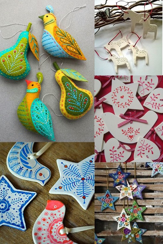
Moodboard: Scandi-style Christmas

Scandi Christmas MoodboardMy posts have been sporadic of late because I have been having the busiest time sending out Christmas orders and selling my ways in various Christmas markets. It’s been fun but boy has it been full-on.

Anyway, my festive mood, and indeed this Monday Moodboard,  is in total full flow now working on a set of Scandi-style designs and illustrations for Christmas demos for Posca pens and for my Christmas wrapping. I’ll reveal more of this later in the week but in the mean time enjoy some of the patterns and imagery that has been inspiring me.

Posted on

Inspiration: Flavours of Florence

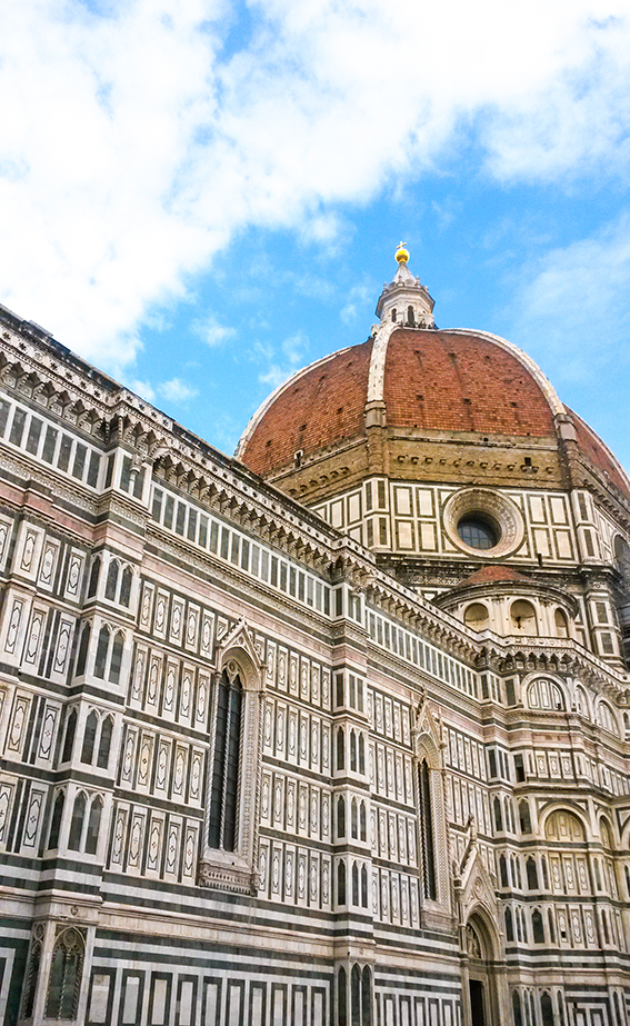
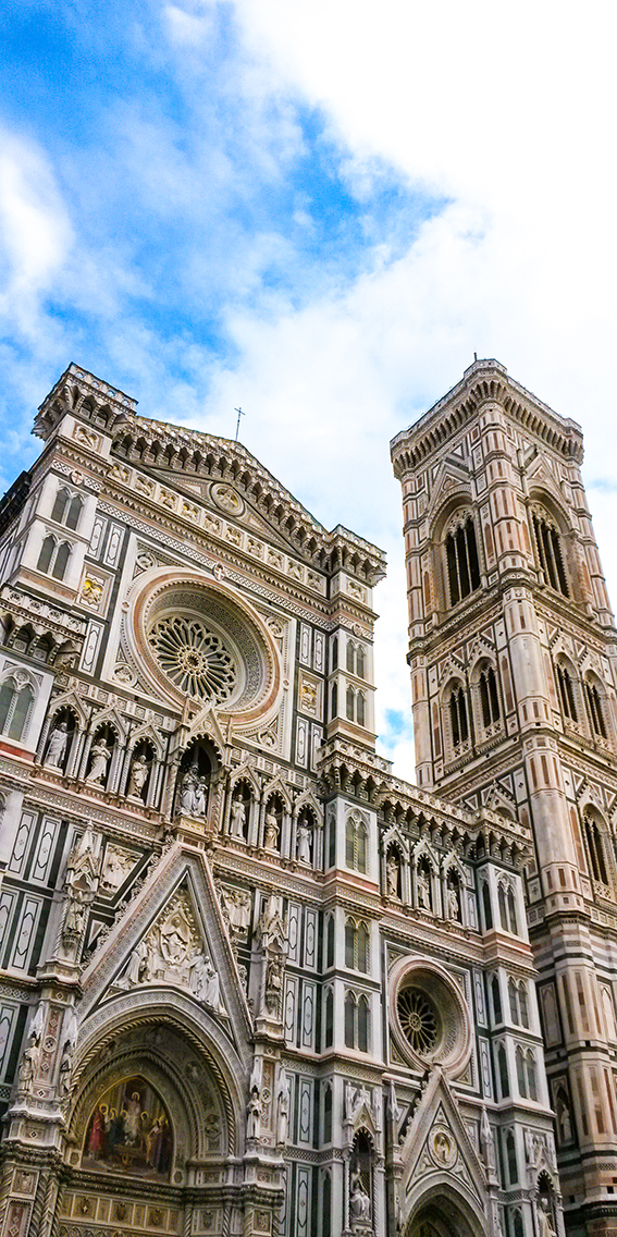
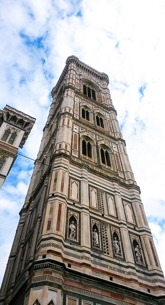
20161009_141541 Wanna know why I wasn’t posting for two weeks? Well, as well as prepping for workshops I was also off finding inspiration in Florence.  I thought I’d give you some little snapshots/flavours of Florence that reignited my creativity.

I first visited Florence when I was an Art History student at the University of Essex. It was actually a compulsory part of the degree course (in those free education, pre-fee days) and it was a real eye opener for me academically and artistically.
20161012_133330The above image is of San Spirito – inside is a triumph of architecture, every time I visit I’m in awe of its almost minimalist elegance. I also love the fact that the church is unadorned on the outside, simply beautiful inside and out.
20161009_141048 20161009_141419 Touristy as it sounds I love the cathederal (Santa Maria del Fiore above) square with the bell tower, the Duomo etc. Although the facade is a bit bling I adore the sparkly marble and the ostentatious pomp of it although I’m sure the purists would disagree. To me the buildings seem to gleam in any weather.
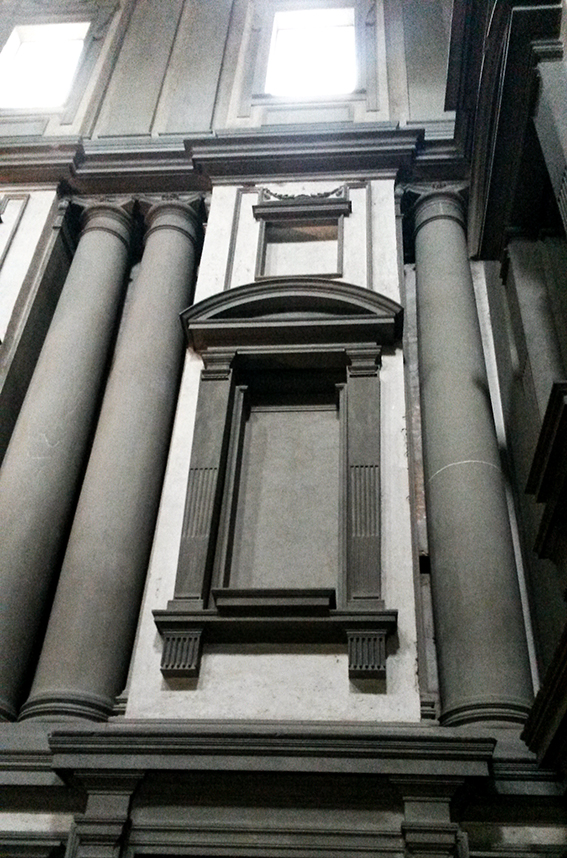
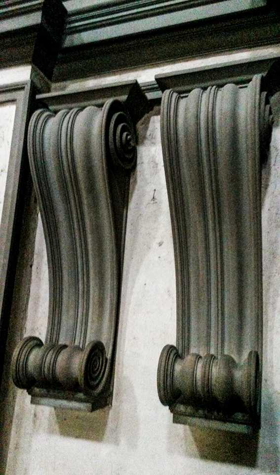
20161014_105750 The place that most inspired me on my initial visit was the Laurentian Library (Biblioteca Medicea Laurenziana) planned and built by Michelangelo. It was my mission this time to show Dr B. The library has been a source of inspiration for artists such as Rothko and film maker Orson Wells. It truly is break taking and iconic. The entrance I believe is ahead of its time, I genuinely think it’s the foundation of minimalism and Michelangelo’s finest work. My visit this year didn’t disappoint, it was more breath-taking than I remember.
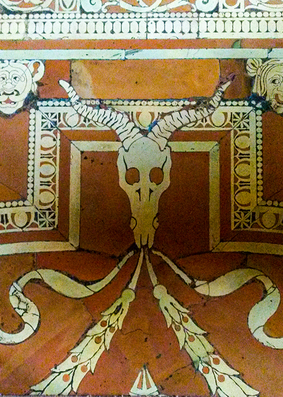
20161014_105921 Oh and don’t you love the floor in the library?
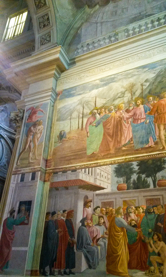
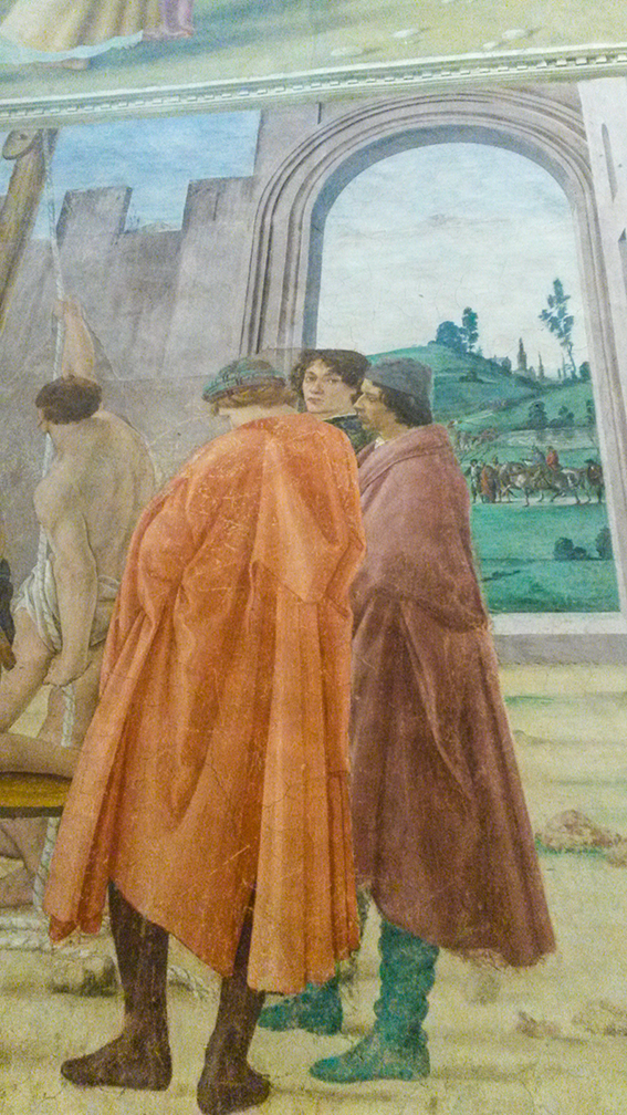
20161014_111329 I also saw a new thing in Florence this visit (well a new old thing). The Brancacci Chapel was being restored when I visited originally and for some reason we didn’t make it there on my second visit so this was third time lucky. All I’m saying is I had a little cry when finally faced with it after spending uni lectures and reading so many books on it. Nothing could compare with actually experiencing it and at such close proximity too. 20161012_135822 The Brancacci Chapel is actually painted by three artists, originally Masolino and Masaccio then completed by Filiippino Lippi. This journey through the Renaissance painting was just what I needed to reinvigorate my art practice. Although my work isn’t obviously this kinda style, the whole visit, the architecture, the paintings, the stories behind every commission and fresco has spurred me on to explore some themes further and keep pushing.  20161012_135811

Posted on

Drawing of the week: Pelican

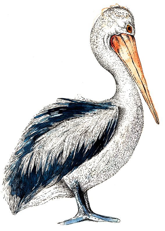
Pelican drawing by Ella JohnstonMy drawing of the week this week is of a pelican.

As a prolific drawer of birds, I’ve always wanted to draw a pelican. I like the long beak/bill (with that funky pouch) and squat body; they appear to me as both elegant and bulky at the same time.

This illustration was created with blue and orange shades of watercolour and black uni-ball pin pens. He looks quite stern here but I’m sure this guy is quite friendly when you get to know him.

Posted on

Monday Moodboard: Folk patterns

Monday Moodboard Folk pattern

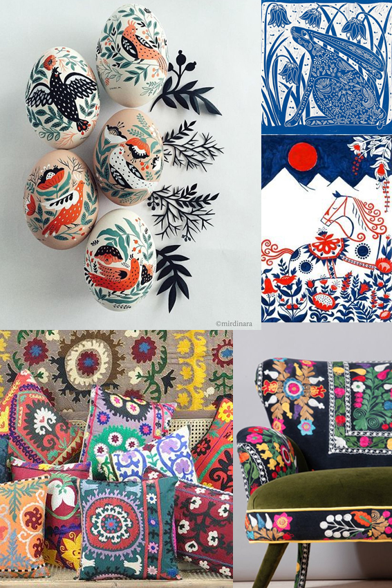
Joyous, colourful and breathtakingly beautiful, my folk art moodboard is perfect for brightening up this grey Monday afternoon. .

Marks, patterns and painting made by ordinary people is a constant inspiration for me. The simple shapes, harmonious composition, strong colour combinations and celebration of birds, flowers and animal life in folk art are timelessly popular in interior design and illustration.  I’ve used them as a spring board for some of the work I created for my Christmas Posca pen workshops and Christmas wrap designs – look out for those next week.

Posted on

It’s time… Get set for Christmas!

From George Home
Decorations From George Home

It’s mid November so I feel it’s a respectable time to start getting set for Christmas. I thought I’d just do a really image-led post featuring some key festive looks that I like for home, gifting and decoration.

Retro shimmer

Decorations from Dunelm

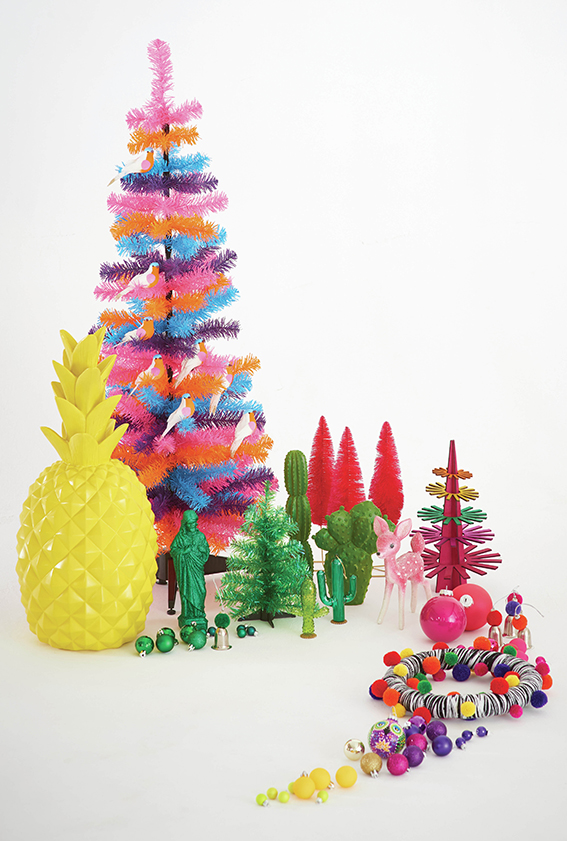
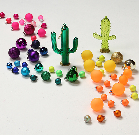
This look brings out the little girl in me. I would imagine the six year old me would have loved a shimmery, glittery tree in pinks, golds, turquoises, silvers and purples. When I was that age, the shinier the better and, while I try to be a grown up, this look still shouts “Christmas” to me.

From Next
From Next

Kiddie Christmas

From Sainsbury's
From Sainsbury’s

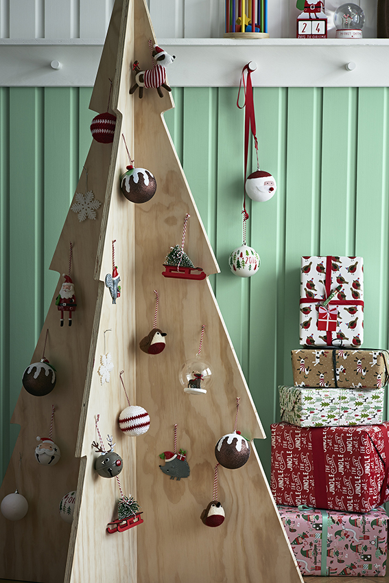
Now it if was up to Dr B, this is what Christmas would look like at our place.

When it comes to wrapping, I  go classy with kraft paper and twine or black/white iridescent wrap with contrasting ribbon and tags, Dr B goes all out with robins, trees, snowmen, santas and Christmas puds. His go-to colours are red, green and white because it is “proper”. He likes the fun of this look, the playfulness and, like my retro shimmer look, it reminds him of childhood. I like it too but I’m not sure if it would suit my gaff.

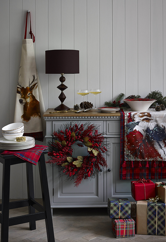
Totes trad

From Marks & Spencer

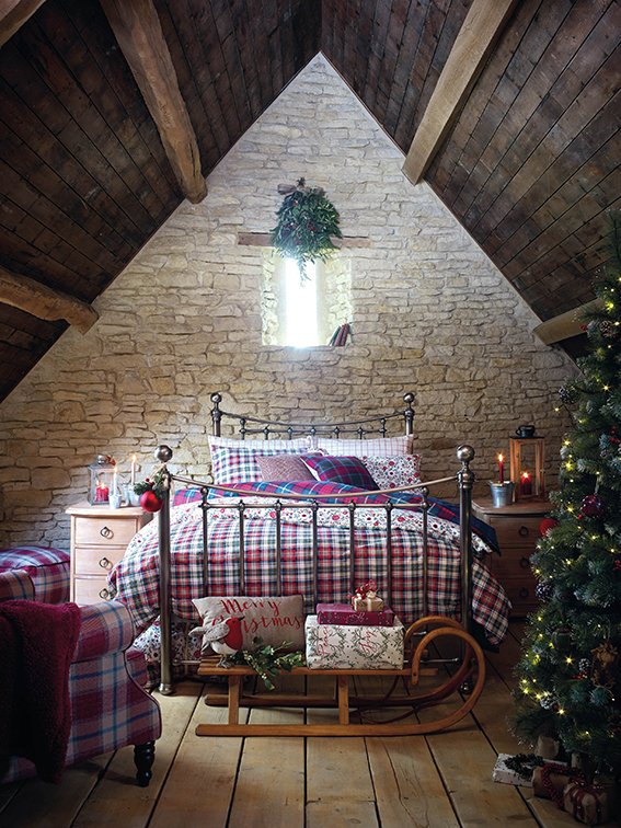
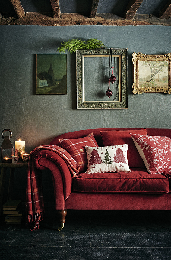
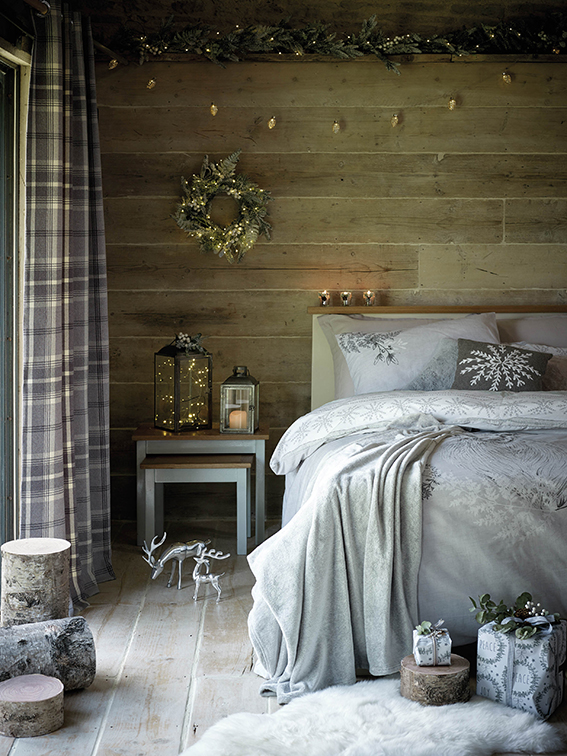
Love this. The sumptuous textures teamed with the plaid, plus the traditional motifs and colour ways combined with twinkly lights and little finishes such as berry and fir wreaths and centre pieces create a warm, cosy feel that immediately references this time of year.

From Dunelm
From Dunelm

The totes trad look feels both festive and grown up. You kinda feel Christmassy as soon as you see it and just looking at these pictures makes me want to reach for the hot chocolate and my slippers.

From Sainsbury's
From Sainsbury’s

Light luxe

From George Home
From George Home

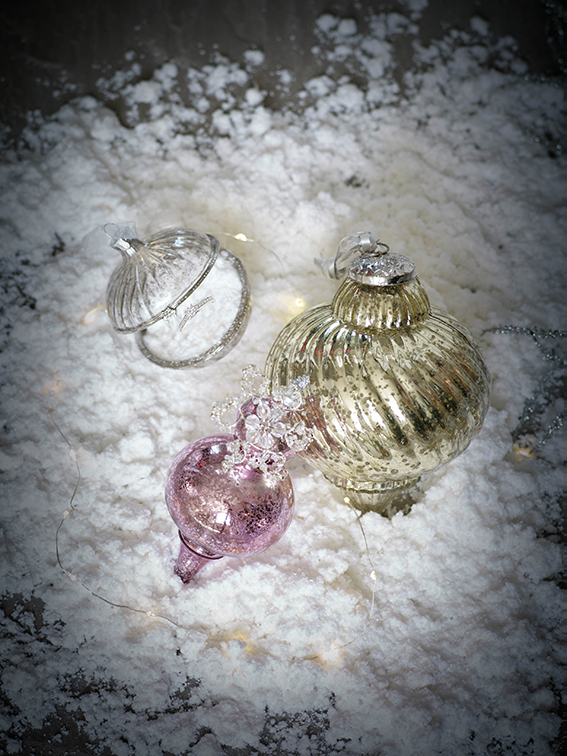
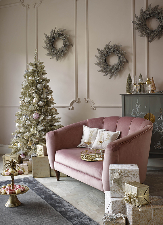
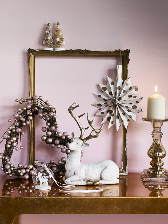
This metallic style is a kind of grown up version of the retro shimmer look.

From Marks & Spencer

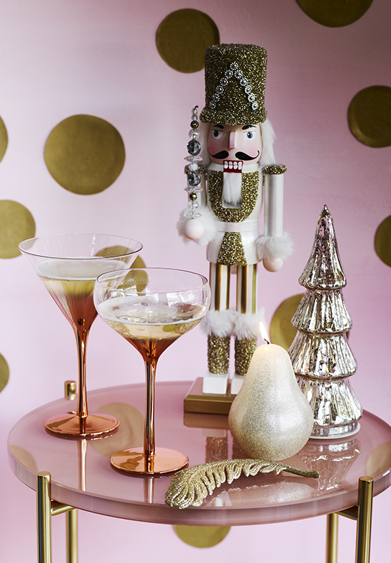
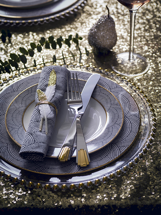
I like the way you can be playful with this look – you can do glitter, you can adorn gifts and decorations with baubles and frosting – but the overall effect is quite chic. I love the art deco references of this and think it really comes together through the coordinating colour way of pinks, navies, silvers and gold/bronze metallics.

From House of Fraser
HyperFocal: 0
From George Home

Frosted 

From House of Fraser

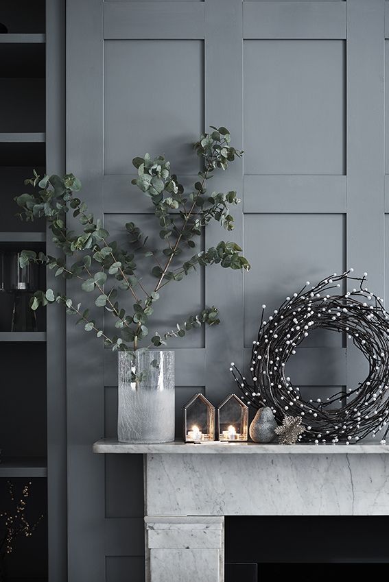
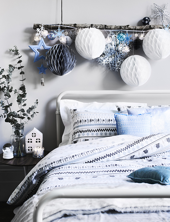
You can do two versions of the frosted Christmas – the one above (trad touches, cosy finishes etc) or the one below (minimal styling, subtle references). Whatever your style the look shares the same cool colour suite teamed with pretty metallic accents and snowflake and wreath motifs.

From Sainsbury's
From Sainsbury’s

Scandi Lodge

From Amara
From Amara

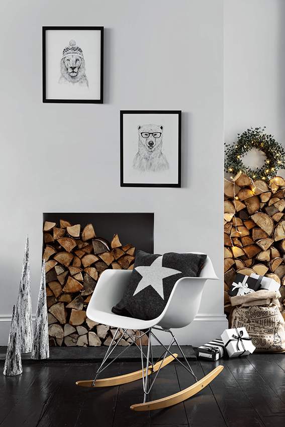
I know everyone has been talking about ‘hygge’ of late and I suppose this look reflects this.

From Amara
From Amara

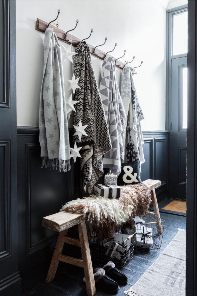
This graphic style is perfect for me but I know that some find this look a little too austere and maybe too stark. However you can soften it up by being more playful with your decorative elements and use of pattern like the examples below…

From Dunelm
From Dunelm
From George Home
From George Home

Latin winter

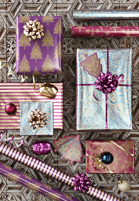
From Paperchase
From Paperchase

This is my wildcard but I can’t resist showcasing this range from Paperchase. The colours are warm and vibrant while the motifs are so playful and fun. It’s a great alternative for those who aren’t keen on snowflakes.

From Paperchase
From Paperchase
Posted on

Drawing of the week: Elephant

Elephant Illustration by Ella JohnstonThis week’s drawing of the week is of an elephant.

There are no trends, no ‘work’ here (even though I have been talking about drawing zoo animals). I made this picture for my husband.

It was our 14 ‘ivory’ wedding anniversary. We’re not buying each other ivory because that’s wrong, so we needed an alternative. We (completely independently)  used our imaginations with this watercolour and ink illustration and Dr B wrote me a poem entitled ‘Elephant’.  We think they are our best pressies to each other in all our marriage.

Posted on

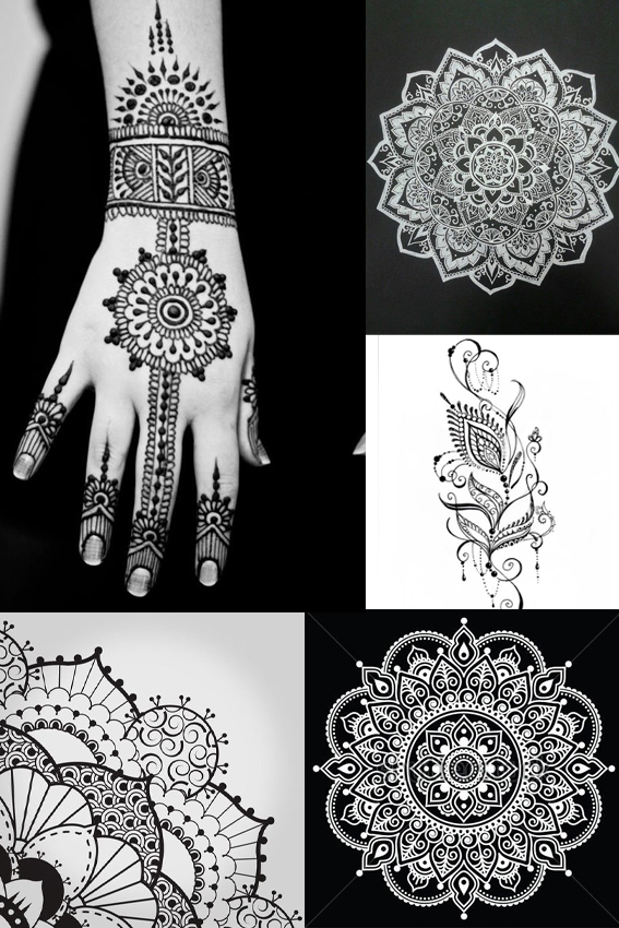
Monday Moodboard: Henna designs

MOnday Moodboard Henna patterns After a busy fortnight with holidays, workshops and Christmas prep, I’m back with some insights from the outside world – a Monday Moodboard dedicated to henna designs and patterns.

I get trend reports and press previews all the time but every now and then a trend comes along that I don’t know about that really excites me. While I obviously know about these beautiful, ancient designs, and have even had these exquisite patterns  painted on myself in the past,  I didn’t know they were capturing peoples’ imaginations right now.

How wrong was I?

Every teenage girl that came to my Posca pen workshops in Manchester and Birmingham wanted to recreate mandala and henna designs.  They were really very adept at creating these patterns and told me that they wanted to place these designs on their clothes and homewares. It’s good to get out there and talk to people – you can always learn something.

Posted on

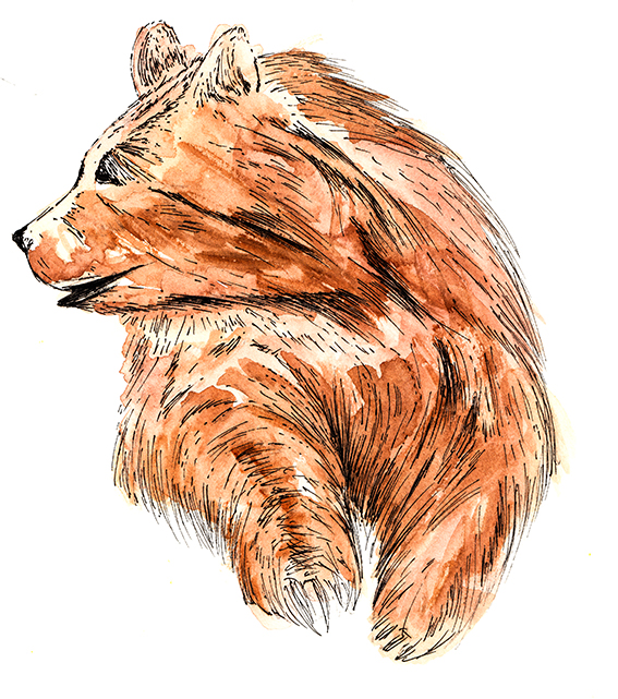
Drawing of the week: Bear

Bear Illustration by Ella Johnston

This week’s drawing is of a bear. I’m exploring zoo animals at the moment and I’ve developed quite a stash of sketches of zoo creatures so I wanted to share this quickly made illustration with you.

As usual this drawing is created with watercolour and fine-nibbed pen. I wanted this to be gestural and light in contrast with the animal’s large, imposing structure.