Posted on

Experiments in ink!

Ink, mark-making experiments Ella Johnston
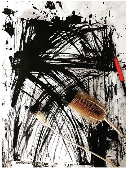
In preparation for #inktober I’ve been playing with experiments in ink!
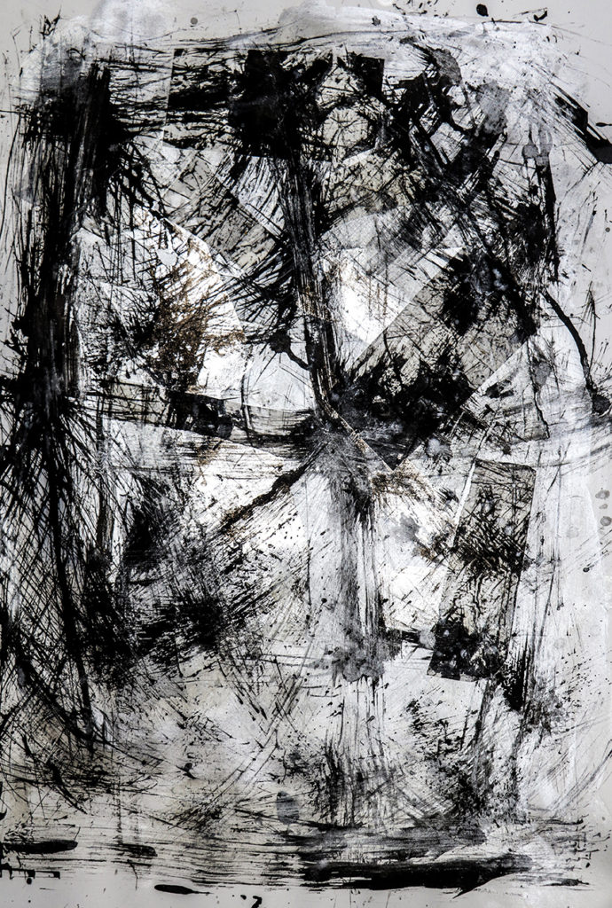
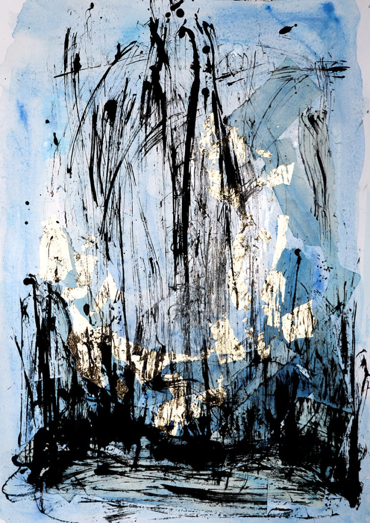
Composition, Indian ink feather and teasel drawing, book paper, silver leaf collage. Ella Johnston

Ages ago I told you about how as an artist and illustrator I strive for simplicity, well this has been a little mantra playing in my head all year so recently I gave into it. I’ve  started working on art work and illustrations using simple black Indian ink and various mark-making tools.

Simplicity is hard.
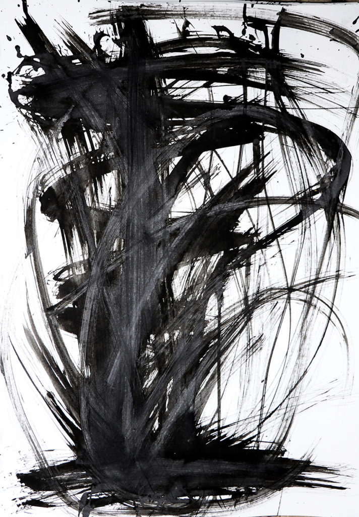
Composition, Indian ink teasel drawing Ella Johnston
Composition, Indian ink feather and teasel drawing, book paper, gold leaf collage.

These scratchy ink sketches and gold/silver leaf and book paper collages are my first steps along my journey into the simple mark marking. Taking my cue from various Japanese ink artists I’ve experimented with my mark-making tools. I’ve fashioned ‘pens’ and ‘brushes’ from dried out teasels, found feathers, dried seed-heads and bunches of twigs to produce various line effects.
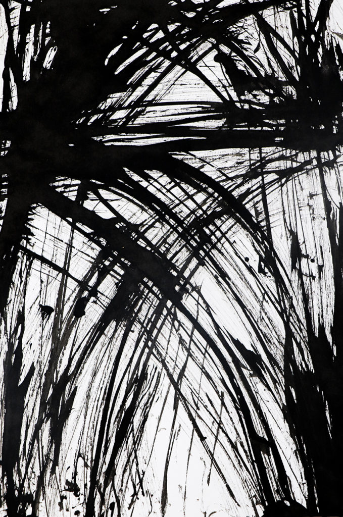
Composition, Indian ink teasel drawing Ella Johnston

I thought I would combine these ink strokes with collage to create movement, contrast and texture. I’m also fascinated by palimpsests (where a manuscript or piece of written-on material has been written over but still bears visible traces of its earlier form) so I wanted to create a sense of that.
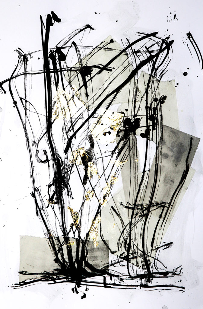
Composition, Indian ink feather and teasel drawing, book paper, gold leaf collage.

At the moment, I still need to work on my serenity ( I imagine a few people have remarked on that through the years).

I like combining humble unbleached papers I use for the inner pages of my hand-stitched books (sometimes painted with washes of colour, sometimes not) with gold and silver leaf to create a sense of collision. After these elements are layered up, I naturally want to produce something visceral and energetic over them with the ink marks.
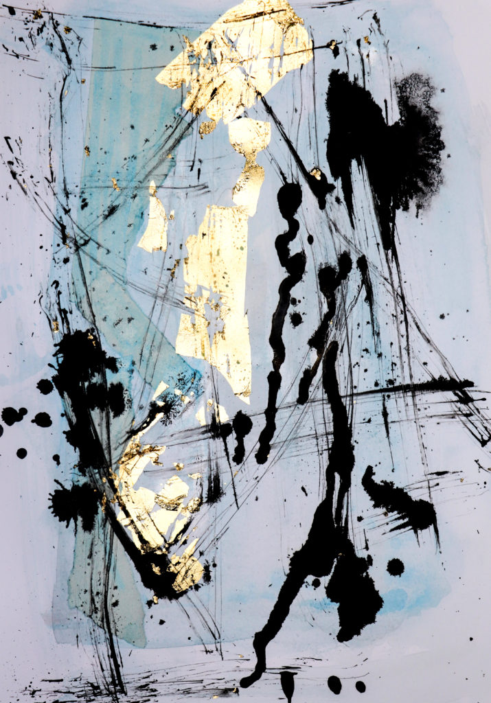
Composition, Indian ink feather and teasel drawing, book paper, gold leaf collage. Ella Johnston Composition, Indian ink feather and teasel drawing, book paper, gold leaf collage. Ella Johnston
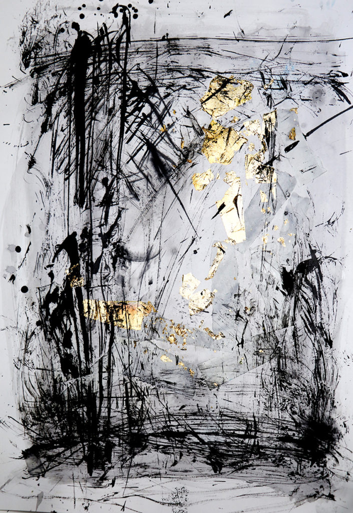
Composition, Indian ink feather and teasel drawing, book paper, gold leaf collage. Ella Johnston
Composition, Indian ink dried seed-head, feather and teasel drawing, book paper, gold leaf collage. Ella Johnston

This mark-making method is real fun and, at this stage in my development with getting to know this way of working, I feel a little indulgent. I love the variation in marks the teasel, feather and seed-head tips create – I could go on all day marvelling at all the different line effects they produce.
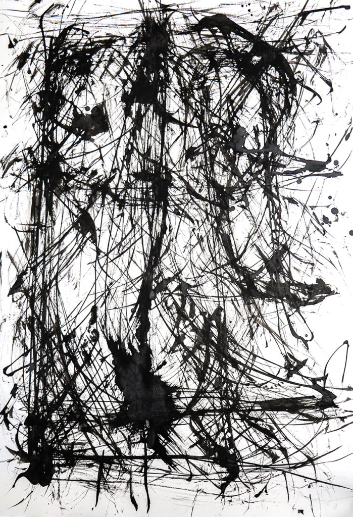
Composition, Indian ink teasel, feather and seedhead drawing Ella Johnston
Posted on

Monthly Moodboard: October, Still Life

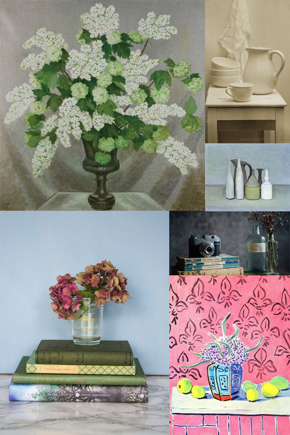
October Moodboard Still life

This month’s moodboard is dedicated to the still life.

A couple of weeks ago I went to see the Matisse in The Studio exhibition at the Royal Academy. Ever since then I’ve been obsessed with still life painting and photography.

The exhibition explored the objects in Matisse’s home and how they manifested themselves in his work. Strangely I’ve never really considered doing still lives myself but the exhibition really got me thinking how the pieces we have in our homes hold such a personal place in our hearts.

I genuinely don’t feel particularly materialistic but I admit that I have very deep attachments to certain vases, books and other objet so maybe recording them in my illustrative work would be an interesting process.

It got me thinking about the concept of taste and what objects and arrangements I’d select to depict and the reasons why I’d do this. Also, in the world of Instagram I see so many people doing little tableaux on the channel as a way of representing their brand maybe the still life is the modern day portrait?

Also I’ve included another great painting I’ve seen recently in the moodboard; Gluck’s Lilac and Gelder rose still life. I saw this at the Tate’s Quiet British Art show and I was blown away by its mastery and tenderness. On watching a documentary about the artist, it’s been said that Gluck’s work focused around whoever Gluck was having a relationship with at the time. This was painted around the period where Gluck was having an affair with Constance Spry so there you. Again, it illustrates what a powerful medium for social and personal commentary the still life can be. Watch this space for some watercolour and fine line still lives from me in the future.

Posted on

Monthly Moodboard: September, Simplicity

Monthly moodboard, September Simplicity

Although my art is quite intricate I actually strive for simplicity. The bravery and beauty of making a few gestural lines to shapes to convey a subject for me is an incredible achievement. It’s building up to becoming an obsession of mine, as this September moodboard illustrates.

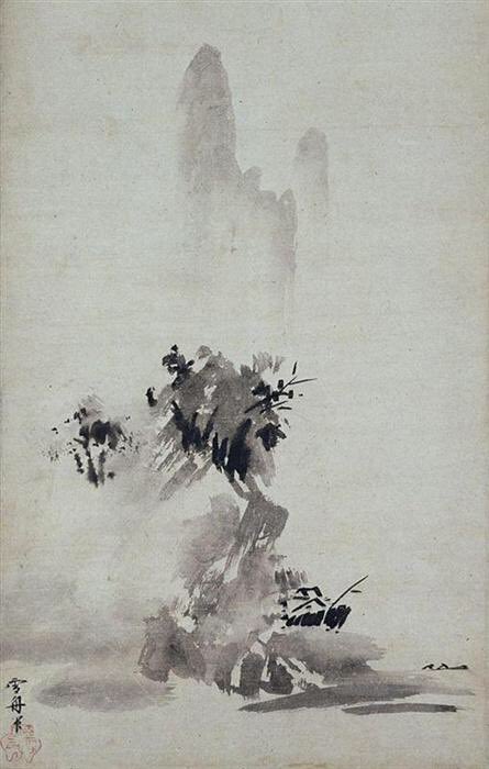
While my desire for simplicity is a long held one, it was compounded this summer by Dr James Fox’s documentary series The Art of Japanese Life where Fox featured Sesshu’s ‘splashed-ink’ landscape (see below), dating back, unbelievably, to 1495.  Let me say that again, 1495!

I think this is a glorious painting. I see so much energy in it and I find it exquisite in composition and atmosphere. I’m also drawn to the simple black and white colour scheme (I would be though wouldn’t I?).

Sesshu's 'splashed-ink' landscape
Sesshu’s ‘splashed-ink’ landscape

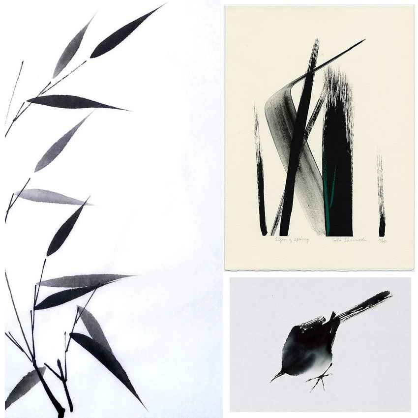
It’s also coincided with me getting some brush pens (which I used to create my new header btw), so I’ve been playing around with them try to make simple, gestural images. I find minimalism and knowing when to stop more difficult than adding clever little details and additional descriptive strokes – it’s a real challenge for me. I’m using the work of Toko Shinoda as further inspiration as well as ancient Japanese brush painting of bamboo, birds and butterflies.

What do you think of this style of painting? Do you like those simple strokes? The black and white? Or do you need a little more colour and detail? I’d love to know.

Posted on

Monday Moodboard #mondaymotivation – House plants

Monday Moodboard Houseplants ellasplace.co.uk

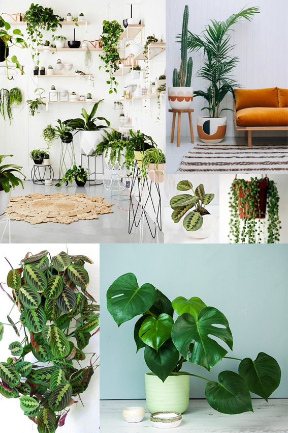
What better way to brighten up this dull Monday than with a plethora of house plants for this week’s moodboard?

Last week I noticed that the first 17 pictures (I know I counted them) from the people I follow on instagram were of house plants. These images particularly showed off the gorgeous greenery against cream, light grey or blush pink walls. Why not? Lush green leaves are a thing of beauty both indoors and out so I’m all for the botanical house plant trend and for bringing nature’s beauty into every aspect of our lives – even our bathrooms.

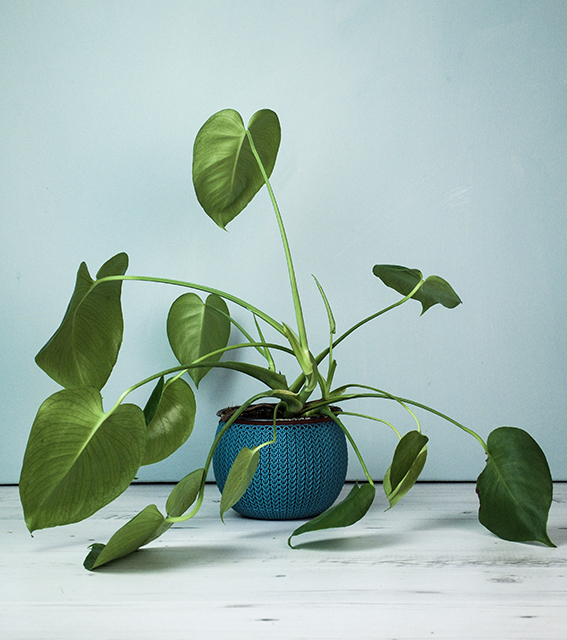
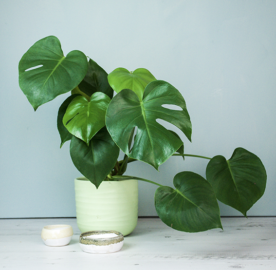
I’m even cultivating some monstera plants of my own with varying degrees of success; here’s my efforts so far…

Monstera plant (c) ellajohnston

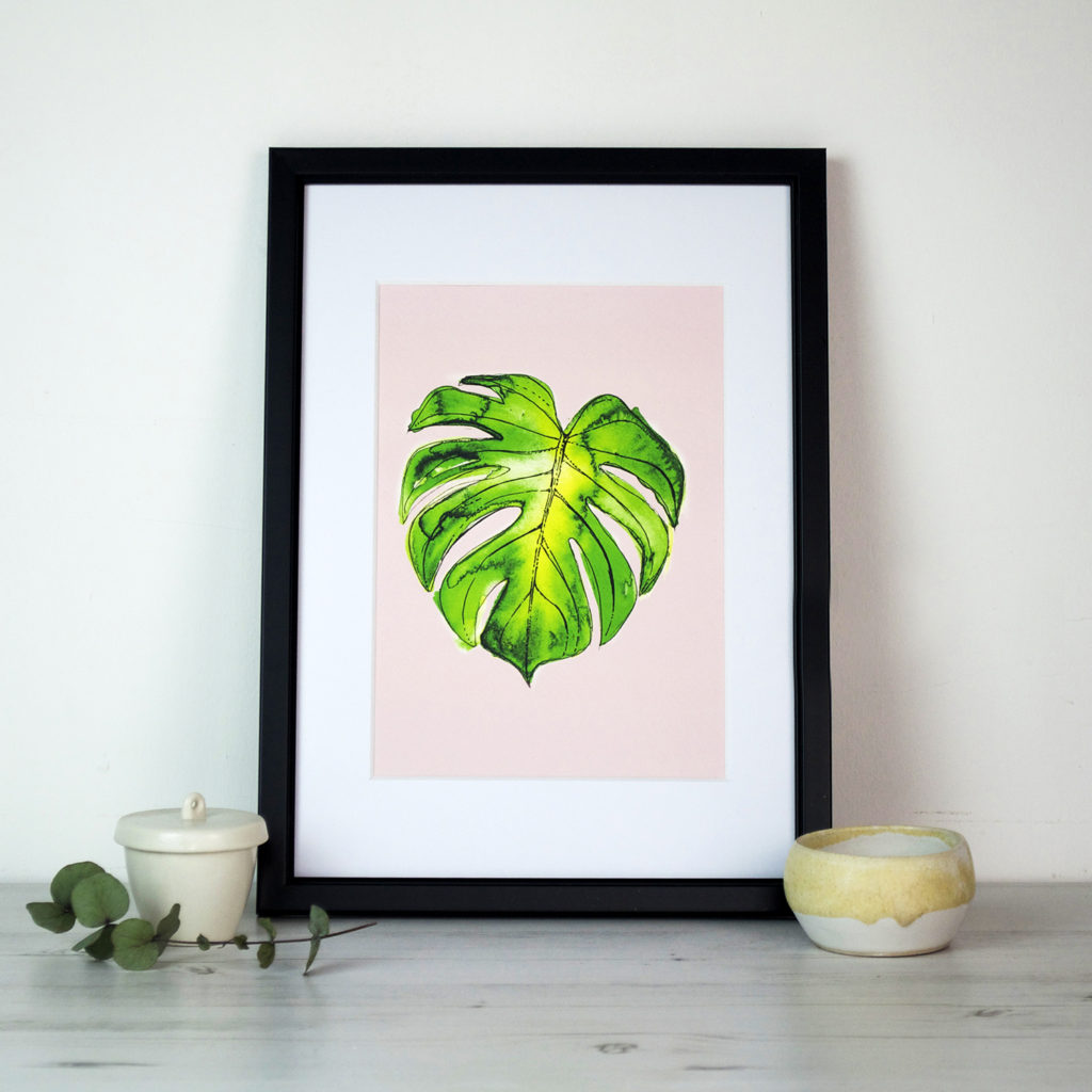
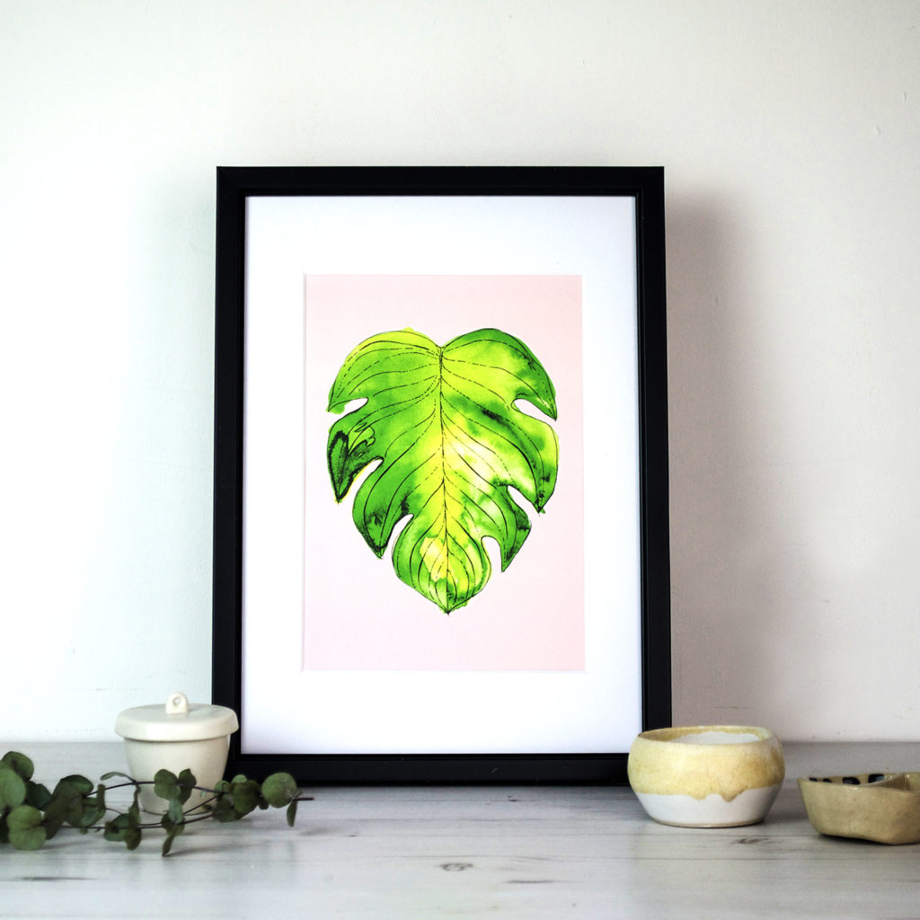
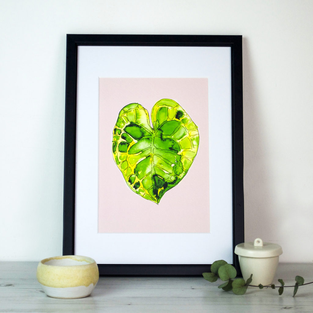
Monstera plant ellasplace.co.ukTrue to form I’m turning this current obsession into illustration too with Monstera watercolours on a blush pink background  selling as prints on Not On The High Street, Etsy and Folksy.
Leaf print Ella Johnston Not On The High StreetMonstera Leaf Print Folksy Ella Johnston

Monsterea leaf print Ella Johnston

Posted on

Monday Moodboard: Birds

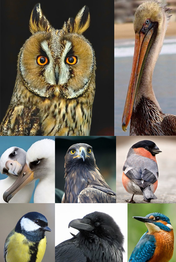
Monday Moodboard Birds

Well it was only a matter of time before I treated you a Monday Moodboard of birds.

As you know an awful lot of my drawing practice centres around birds. So much of my time is spent trawling and taking images of birds to study and illustrate. This is absolutely no hardship for me. I could honestly spend all my time looking at my feathered friends.

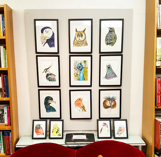
Recently I have been  focussing on heads and shoulders to create bird portraits for my show at the Over The Sofa Gallery at Wivenhoe Bookshop. It’s a small space and I wanted to do it as a site specific piece, the show is called Family Portraits so it has a kind of homely feel. It consists of nine A6 watercolour and ink drawings and four A6 pieces.

The show is on until April 30.

Birds at Wivenhoe Books

Wanna know what each bird is? Well here they are…
Top row from left: Puffin, Long Eared Owl, Starling
Middle row from left: Lapwing, Peacock, Pigeon
Bottom row from left: Cormorant, Robin, Crested Grebe
On shelf: Black Redstart, Budgie, Goldfinch, Dartford Warbler.

Posted on

Monday Moodboard: Cherry Blossom

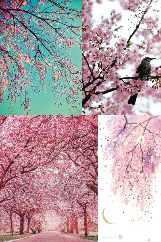
Monday moodboard: Cherry Blossom Ellasplace.co.uk

Today’s Monday Moodboard is dedicated to cherry blossom for no other reason than I love it and gives me a sense of a little bit of magic at this time of year.

When you are busy and going about your business you can forget to look up, but it’s so important to do so as so much wonder can reveal itself, especially at springtime. Whether you are in the country or the city chances are you’ll see a tree that’s frothy with flowers. It is such a joy, particularly for me when it contrasts with a dark grey or stunning blue sky (you know me, always looking for colour combo inspiration).


Posted on

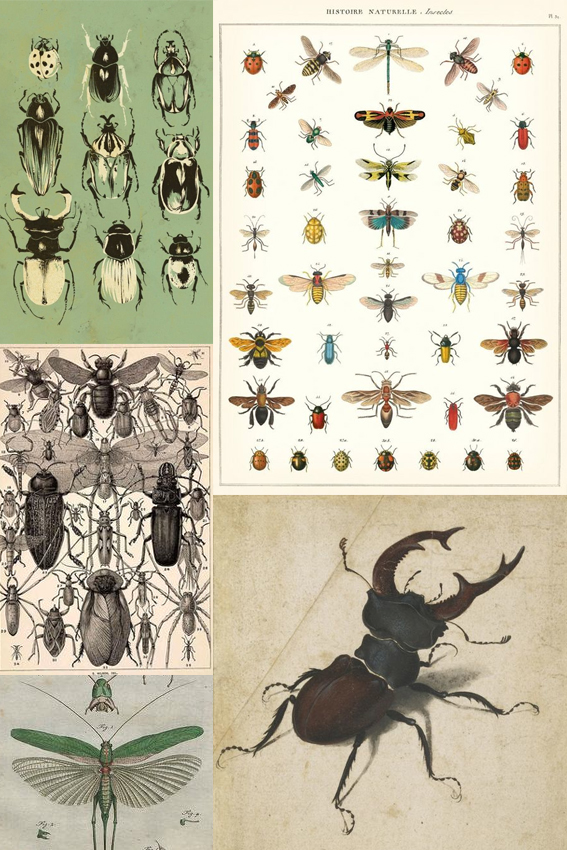
Monday Moodboard: Insects

Monday Moodboard: Insects

This Monday’s Moodboard introduces you to my new obsession… Insects!

Just as with the shells last week, this moodboard shows you that my drawing interests are moving towards more organic, smaller forms, exploring their structure and beauty.

As you can see I’m not the first artist to be inspired by these creatures. These vintage anatomical illustrations will inspire my own work and I hope to capture the iconic shapes of these little critters as well as their intricate detail.


Posted on

Monday Moodboard: Sea shells

Seashells Monday Moodboard

In a follow on from last week this Monday’s Moodboard is of sea shells.

I promise I’m not obsessed with seaside themes at the mo! I am however obsessed with the structure of natural, organic forms.

This theme has been on the back-burner for me for a while now and I think finally this year will be the year when I tackle this nautical theme that has been so loved by photographers and such an enduring subject in vintage illustrations.

Right, let me get those watercolours out.

Posted on

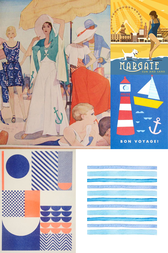
Monday Moodboard: Seaside beach vibes

Monday Moodboard Beach vibes

Yeah, it’s Tuesday but I did this Monday Moodboard yesterday, then took an important commission and had a ton of work to do! This beach, seaside vibe theme is kinda apt as I think I need a holiday!

I was actually putting this board together as a good illustration of how you can take a theme and communicate it using your own style. I adore the deco-esque riveria vintage travel posters illustrations at the top left and right of the board but I really appreciate the simplicity of form that the two lower pieces provide using blues, peaches and whites.

To me this board not only conveys that breezy lightness and crispness of a perfect seaside holiday but it also shows the power of using creative drawing techniques to create convincing visual language.

Posted on

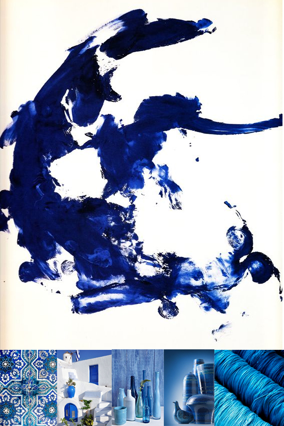
Monday Moodboard: Blue

Monday Moodboard Blue

After a frustrating weekend  (still trying to master videoing myself and tidying my ever messy photo studio) I needed something to give me joy so this week’s Monday Moodboard is all about BLUE! Yes, while my politics are anything but, blue makes me happy.

Of course, the colour is calming which is why I have it in our bedroom but that’s not the whole story. And far from finding it cold, which I’m told some do, I believe that if you find the right shade, blue can be intoxicatingly rich, and even cosy.

The image on top is from the artist Yves Klein’s Blue Epoch period. This exquisite ultramarine shade is known as International Klein Blue (IKB); a deep hue first mixed by the French artist. This blue is said to have its roots in art history using lapis lazuli as an influence. The finest and most expensive of pigments,  lapis has been used since antiquity due to its intense colour; it was used in the funeral mask of Tutankhamun and by Renaissance and Baroque artists for the clothing of the central figures of their paintings, especially the Virgin Mary.