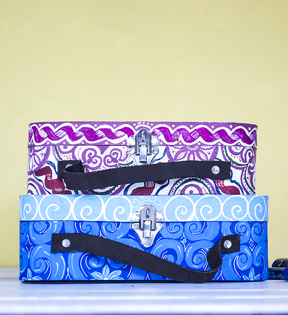
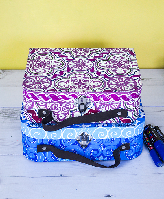
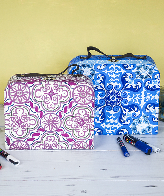
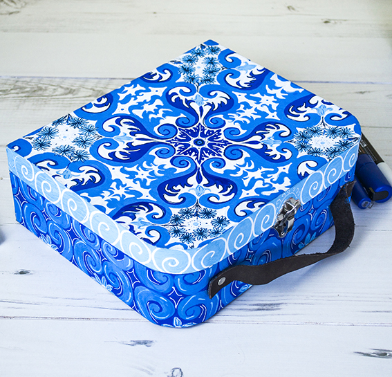
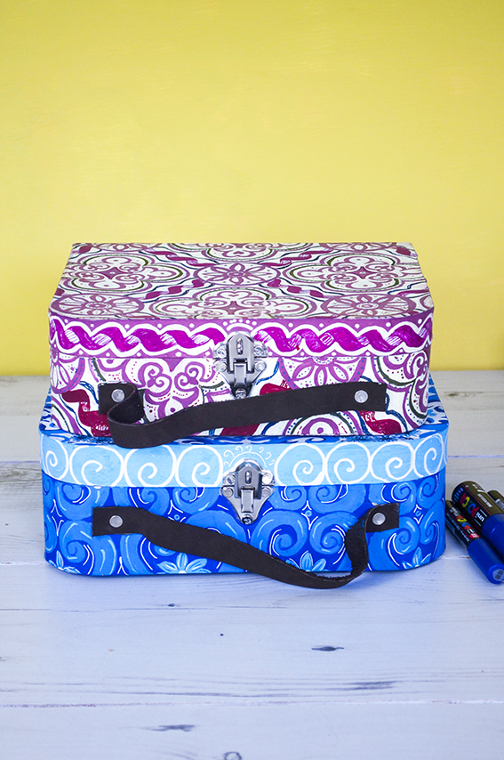
 I’m not gonna lie, these ornate cases took ages to create but they are quite a cool DIY. I have had a brief from the guys at Uni-Ball to create a selection of products updated with the company’s pens. I wanted to make a number of items at various sizes and using the wide range of pens they had on offer.
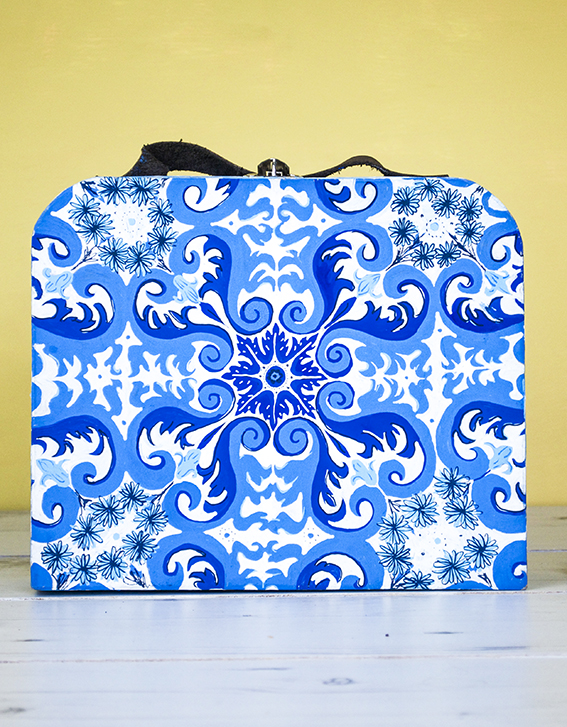 I also wanted an excuse to play with an ornate pattern idea I’ve had for a while. Because Uni-Ball’s Posca pens have a wide range of colours and shades I thought they would perfectly lend themselves to a pattern that utilised various shades of the same hue.
 I have looked through loads of tile designs to come up with the ones I have worked out here.
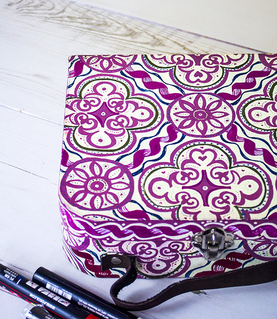 These cases were plain brown mdf boxes. I traced on my design before filling in the light colours then layering with darker shades.
Category: My Illustration
Drawing of the week: Fox Terrier
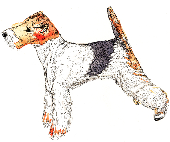
My drawing of the week is of a dog – a lovely fox terrier.
I drew this by accident. I was actually going to draw a fox (and I will next week) but I came across this breed of dog while image researching and remembered how much I like them. So I thought I may as well draw this little fella.
A little bit about a fox terrier…
Wire fox terriers (as seen here in my watercolour and ink illustration) are known for their energy and intelligence. They have a low boredom threshold (like me and Dr B) and require stimulation, exercise (I should do more of that) and attention (we all need that). They are bred to be independent thinkers (I really like that).
Now, all that remains is for me to try and persuade Dr B that we need one as a pet in our lives.
Monday Moodboard: Black and white
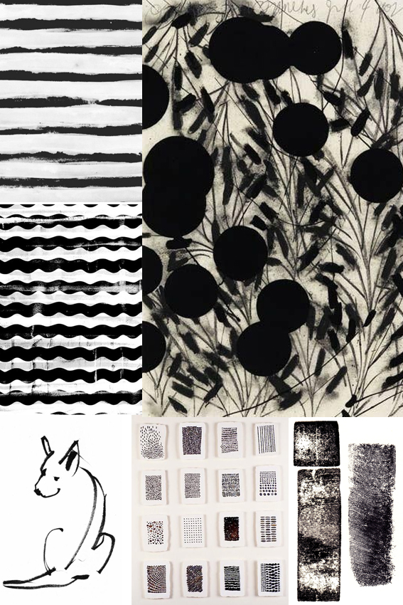 Timeless, classy and striking, I love black and white designs. In fact I can’t believe I haven’t featured this on my moodboard sooner.
I hardly ever wear anything other than black and white clothes (occasionally navy or grey but it’s mainly black and white). I also am a massive fan of simple black and white sketches, print and design. The purity, harmony and general all-round elegance is, for me, a total short-cut to cool.
At the moment I’m working on the design for a poetry book. The publication is printed in black and white so I wanted to think of effective shapes and marks that would look strong on the pages without distracting from the words (which are the most important thing). I’ve done lots of research and have settled on something that I’m quite excited about. You can’t see it yet but the book is set to be released later this year so, watch this space.
Drawing of the week: Hare
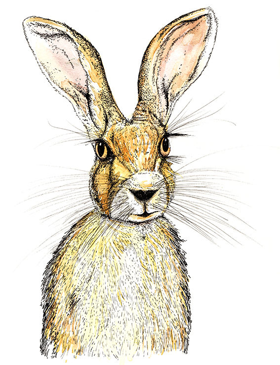 Here’s my drawing of the week – a lovely wild hare.
I mentioned last week that I’m branching out with my drawing and illustration, challenging myself to do new things so… Here. Hare. Here*.
As usual this earnest looking little fella was created using watercolour and fine-nibbed felt tip pen. I really enjoyed doing his whiskers and eyebrows – a fun bit of mark-making if ever there was.
* With apologies to Bruce Robinson.
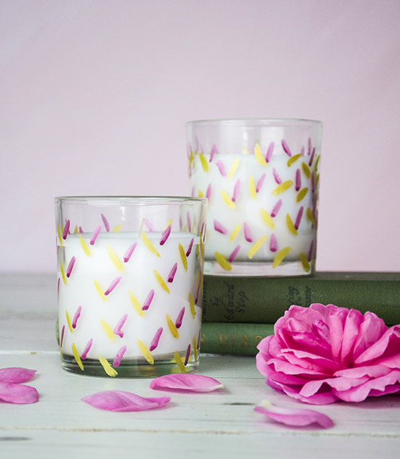
DIY: Easy Fancy Votives
This is a really easy DIY – a pretty pen project to make fancy votives that give cheap filled candles a designer feel.
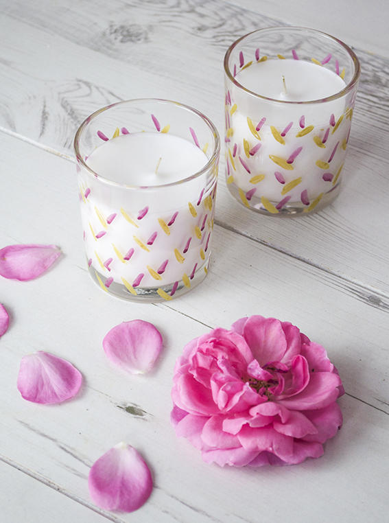 As you know I love a scented candle and I do occasionally splash the cash on some expensive ones. However, because I go through quite a few of them, I do get some cheaper ones to light on a Friday and Sunday night when I’m relaxing with Dr B or when I have a cheeky Saturday afternoon bath.
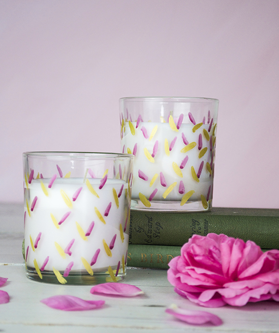
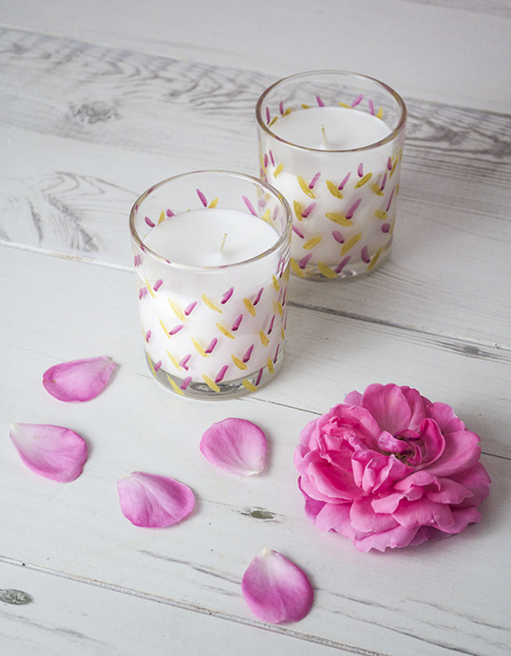 Plain filled candles can look a little drab and I like to give them a nice look. As I’m currently doing some work for Posca pens I’ve got loads of various colours lying around – I’ve chosen beautiful gold and berry coloured pens and gave them a simple leaf pattern.
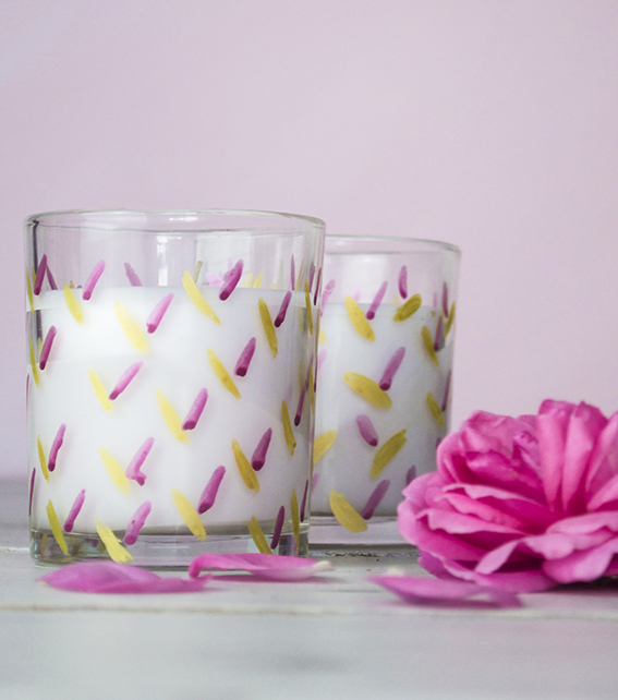 I wanted to create something really quick and easy as the last thing I wanted to do was spend ages doing an intricate pattern. So these are just scribbled little lozenges drawn on an angle.
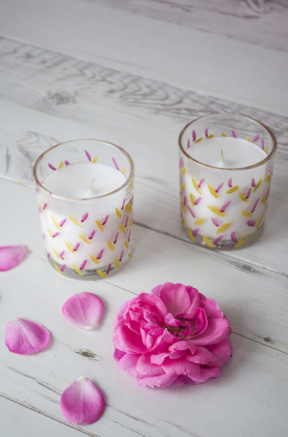 In the spirit of all things green I recycle my glasses once the candle has been burned. Once I finish with them I will use them as vases. The lovely thing about this project is I can pop these glasses in the oven at 145C to seal in the design and I have some lovely gold and berry containers.
Monday Moodboard: Midcentury Modern
I’ve many go-tos for inspiration and although you may not think it, mid-century modern design and illustration is one of my favourite sources. That’s why it’s made this week’s Monday Moodboard.
Although my drawing style is heavily influenced by classical botanical illustration, I actually came to it via the route of mid-century modern. How? Well, when you look inside the original mid-century homes, as well as all those gorgeous geo designs, amazing furniture, playful use of line and fearless colour combinations, there would always be a classic print or two hung on the wall, so I thought “if it’s good enough for them…”
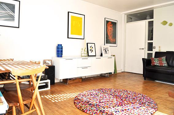
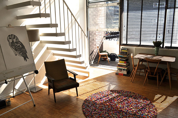
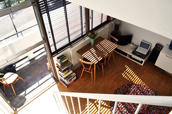
Anyway this is one of my most loved periods for design and illustration I suppose it came from the fact that Dr B and I lived in mid-century apartments for the first 14 years together so we both became interested in this style in terms of design and architecture. For pure nostalgia value here are some pics of our old flat.
There is so much to find in mid-century modern design, which is why it is such a rich source of inspiration. I mean just look at the examples on the moodboard. It’s not all about Lucienne Day Calyx fabric (although I blatantly love that design and would have it in every room in the house if I was allowed) or Ercol furniture (although again I adore it and have a lovely 1960s original Ercol dining table and chairs in the kitchen). Design from this period can be ornate and playful and also simple, concise and elegant.
Why this week? I’m currently working on a poetry book for Dunlin Press, an indie publishing house run by me and Dr B. I wanted something that keyed into classic book cover design with a bit of an edge so I’ve been trawling the internet and my design books and the mid-century vibe seems to be the route to explore. I’m not saying our book will look anything like the above but whether you are designing a book cover, thinking about a fabric pattern or imagining a room scheme, in fact whatever creative endeavour you’re undertaking it’s good to have a starting point to kick start your work.
Monday Moodboard: Vintage illustrations
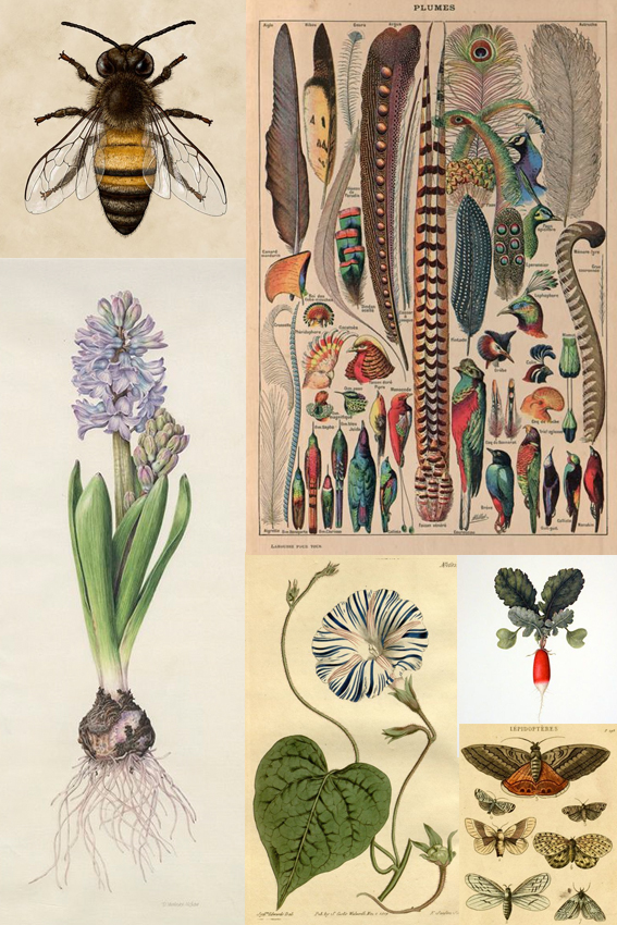 I’ve spent the past seven days hard at it drawing and my go-to source of inspiration is vintage botanical and nature illustrations.
I’m drawn to the detail in each drawing, the application of colour and the simple, clear composition. I believe these illustrations allow the viewer to really see what’s being depicted without distracting backgrounds or off-putting extraneous elements. I think that’s why they’re classics.
Drawing of the week: Birds of Brazil
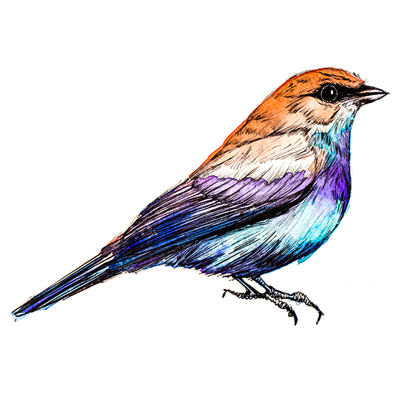
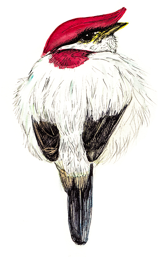
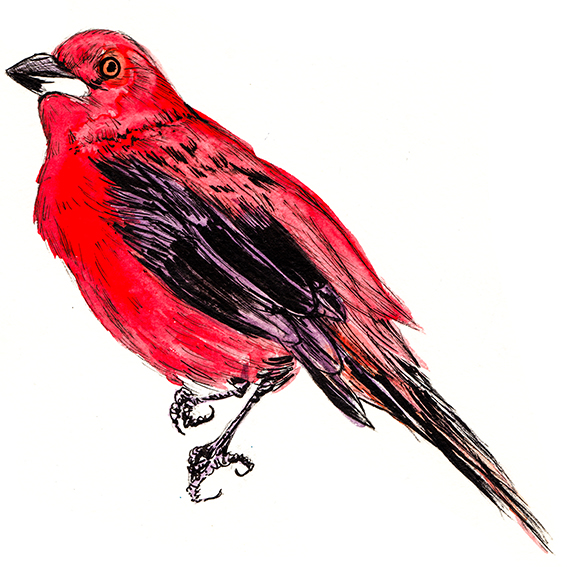
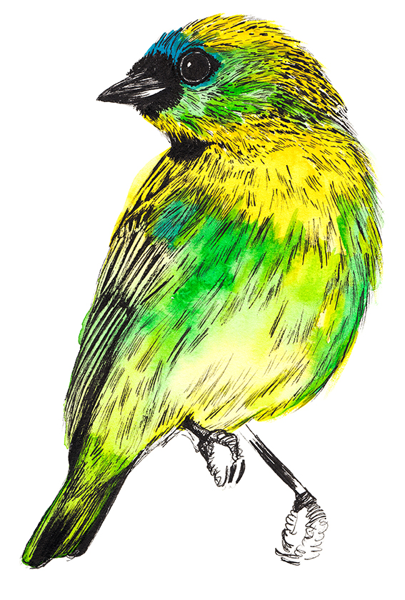
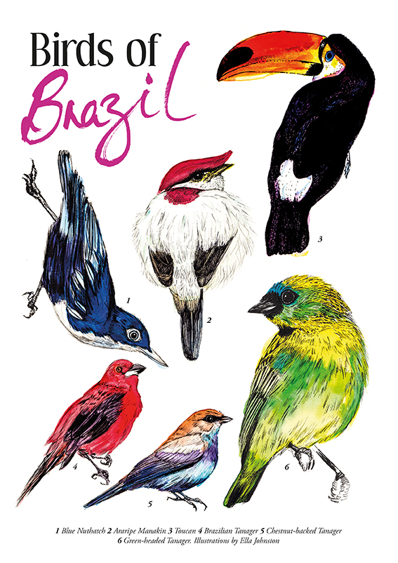 This week’s drawing of the week is my Birds from Brazil guide, created as a celebration of the up-coming Rio 2016 Olympics.
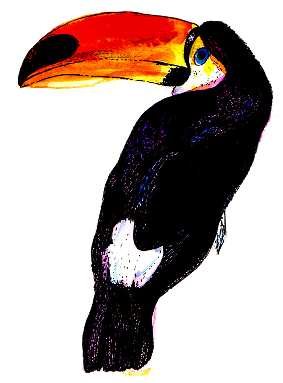
My illustrated guide features six Brazilian bird illustrations; blue nuthatch, anaripe manakin, toucan, Brazilian tanager, chestnut-backed tanager and green-headed tanager.
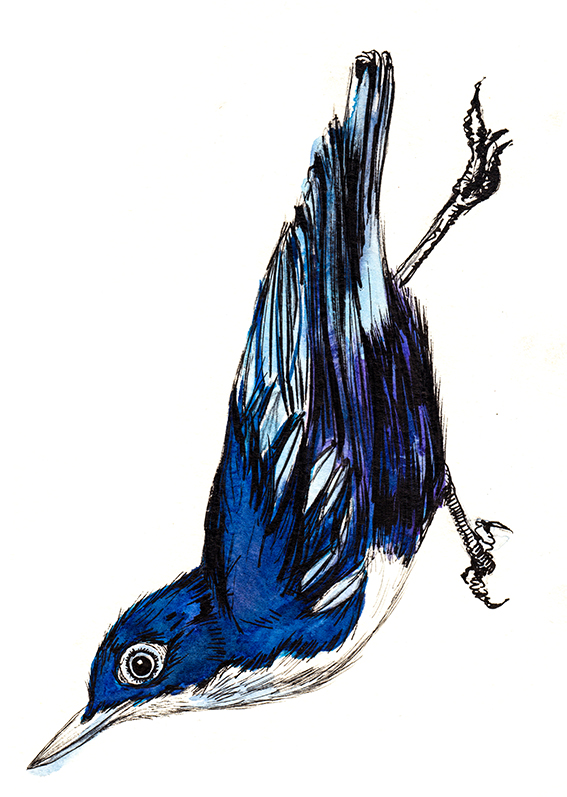
All the drawings are created with watercolour and black pen – you know, my trademark illustration style. You can buy the print of these Brazilian beauties at my Not On The High Street shop click here to see it.
Easy, Cheap Display Ideas: Spoils from my Garden
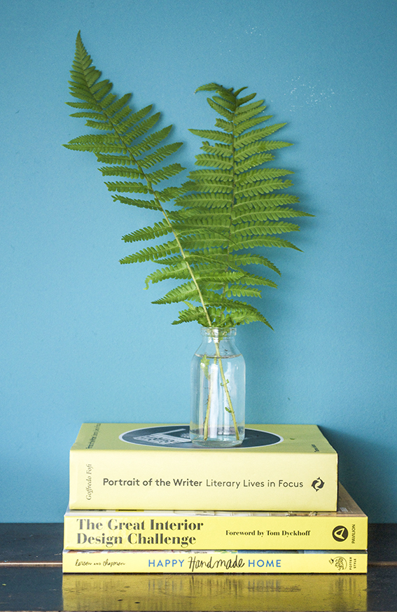 The garden is a great place to source bits and pieces for a quick, easy and cheap display. Ideal for weddings and parties or, for me, as last minute props when photographing my prints and stationery.
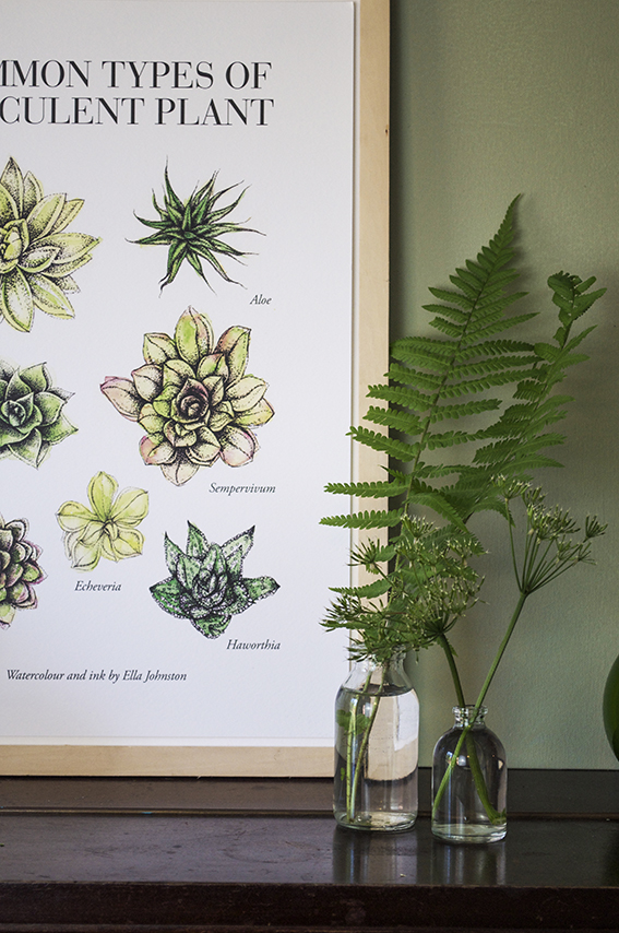 As our ferns are so lush and green at the mo, I’ve been snipping the odd leaf to place in clear containers for the ultimate elegant display. Teaming them with over-it cow parsley also looks very effective as a simple structural tableaux.
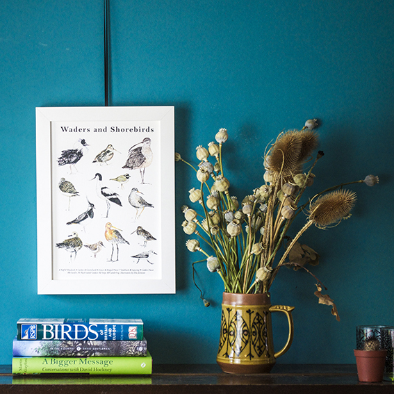
We had an abundance of poppies this year. Now they’re all done I’ve got loads of fab poppy heads to have as year-round loveliness. I’ve combined these with some dried out teasels that my mum gave me last year and placed them in a vintage jug I picked up from a charity for a loose organic feel.
Drawing of the week: Retro flowers
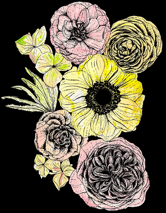
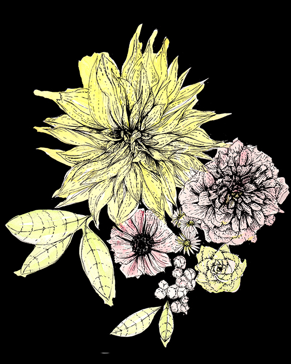
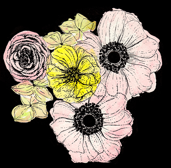
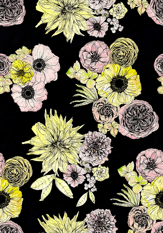
What inspired my retro flower drawings of the week I hear you ask? Well, a couple of weeks ago I was looking at moody botanics and loved the idea of beautiful blooms set against deep dark backgrounds. This also coincided with me becoming obsessed with vintage floral duvet cover designs. And I’m not talking about those pretty ditzy Cath Kidston inspired numbers, no I’m thinking of the type of things I had as a small child in the early 1980s (that were practically 1970s).
So I’d thought I’d combine the two themes and create this set of retro floral illustrations and pattern design. I think these would look great on home project and I’m thinking of using them on some cushions and lampshades for a real cosy feel in the bedroom – a little nod to the bedrooms of my childhood.
The flowers I’ve illustrated here are ranunculus, dahlia, peony, rose, hydrangea, anemone, rose and succulent, I deliberately choose round shapes that fit together nicely in a kind of clockwork fashion.
