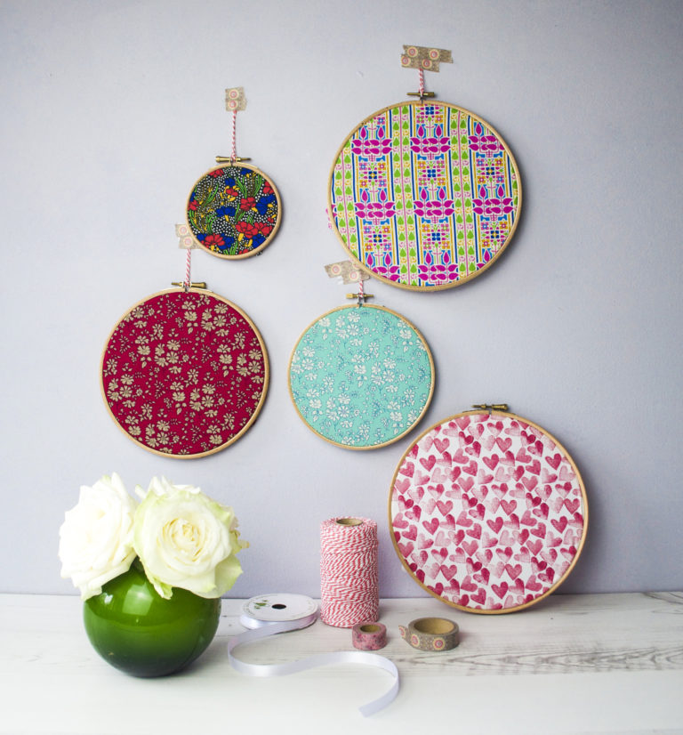
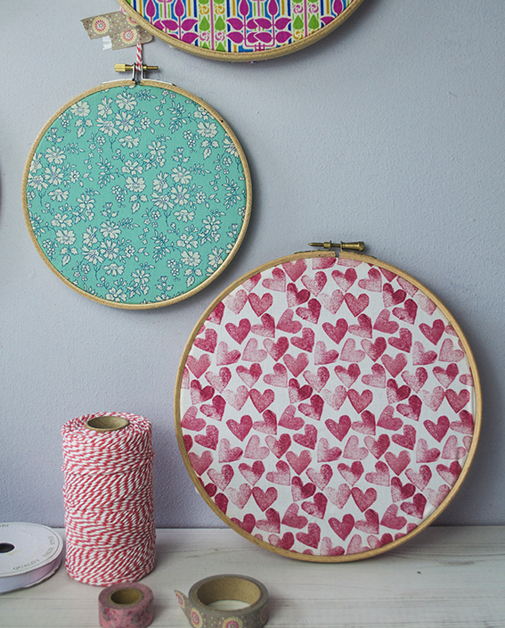
 If you’re short of time or money here’s a super quick, easy way of giving your walls an update. Just buy a set of embroidery hoops, stretch some over some scrap fabric (it doesn’t have to be ‘proper’ haberdashery fabric you can use old shirts or dresses) and there you go!
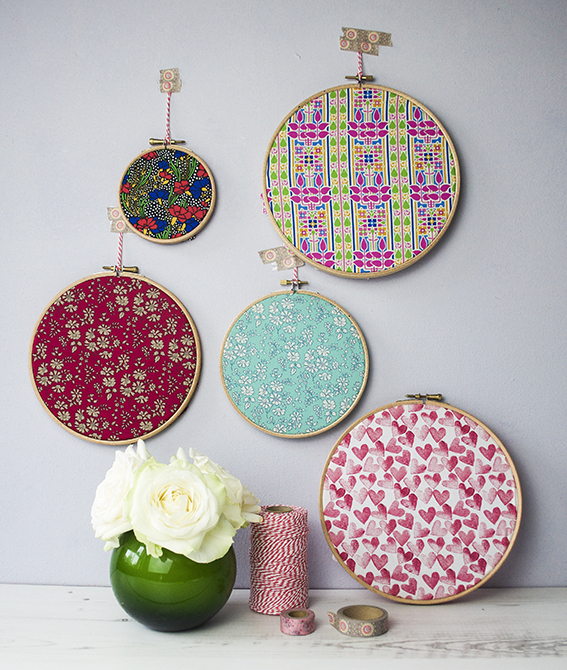 The great thing about this is you can change the display to suit the seasons. And if you’re so inclined, you can also add a little stitching over your fabric with slogans and patterns.
Tag: update
Quick Hack: Customise a lamp
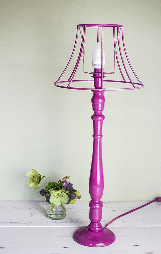
OMG, this is a ridiculously easy up-cycle. It simply involves a lamp-stand, an ornate lampshade frame and a can of spray paint.
I originally did this project for Homemaker Magazine using on-trend metallic paint with a cool matte finish but I wanted something really bright and fun light for my otherwise smart, sleek study/office. I raided my spray paint stash and got this gorgeous cerise/purple shade in gloss from Valspar. Just what I wanted.
Remember to spray in a ventilated area – I do it in my garden. To get an even tone place your object on a box you can swivel around so you’re not missing bits. I hung the shade from inside the top of a deep box so I could get to all the little nooks and crannies. I’m dead please with this update, soon it will take pride of place on the new study shelves.
DIY: Update a wooden box
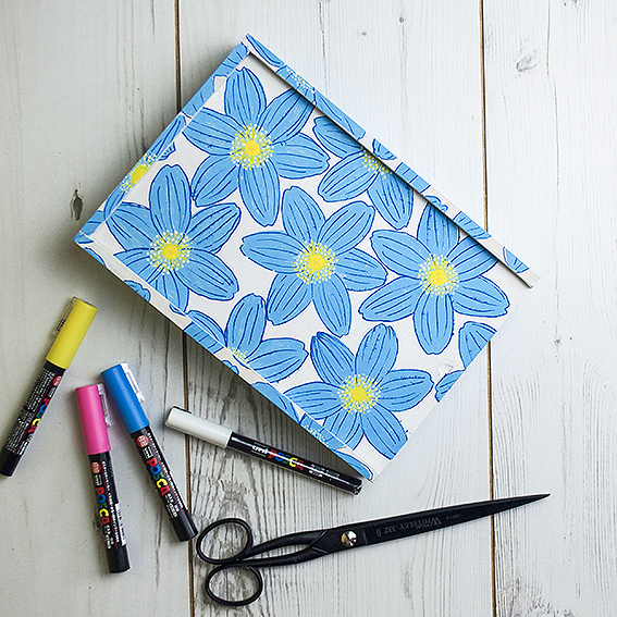
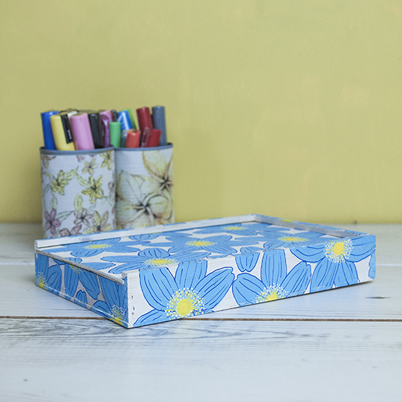
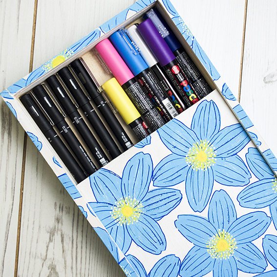
I’ve had this little wooden box for years. It was plain and unloved for ages. I kept pencils in it and every time I retrieved them I thought “I should really do something with this” and then I’d leave it.
Then a couple of weeks ago I was asked if I wanted to do some projects with Uni-ball the makers of Posca pens. Before I started on the projects I thought it best to re-familiarise myself with them and have a little practice. The pens work on a range of surfaces, so after I used them on a set of notebooks I thought I’d give them a try by drawing on that plain old wooden box.
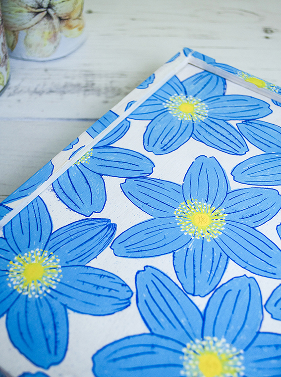
First I painted the box to give it an even white background. Then I used my wood anemone sketch as a basis for my hand-drawn box design. I wanted to make it look quite retro so influenced by sixties and seventies floral patterns I gave the flowers a bright blue colour.
What I like about these pens is that you can layer them without them bleeding and apply lighter shades over darker ones which means I could add depth to the flowers with lovely yellow centres and white pollen.You can set the design by simply spraying some varnish over it.
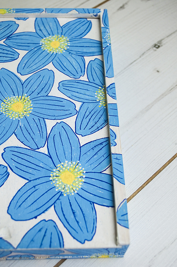
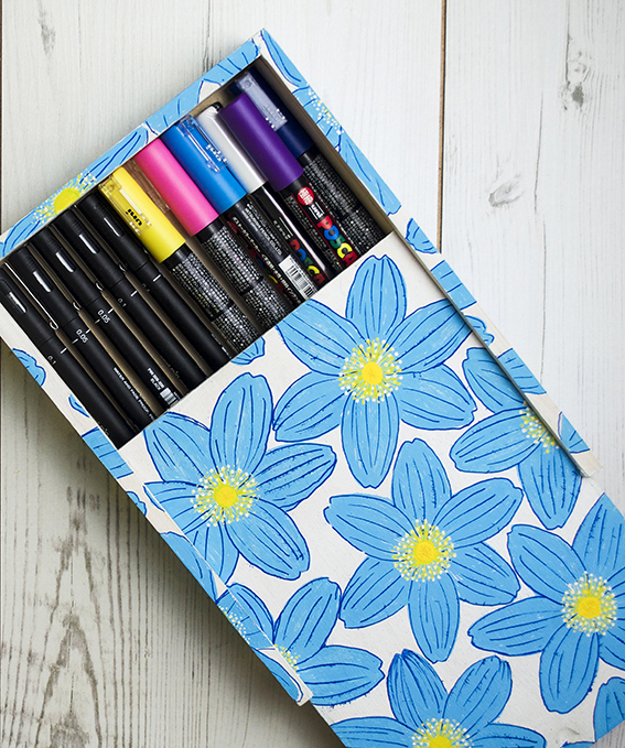
You can set the design on the box by
Hack: make your own storage buckets
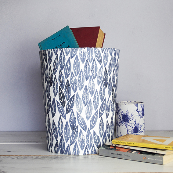
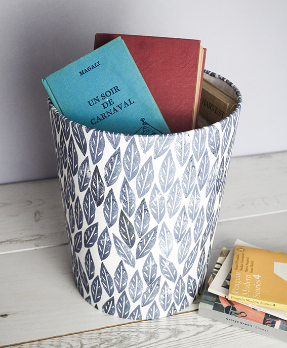
Okay I’ll come clean, I’m using these as storage buckets but they are actually waste paper bins.
I originally bought two Needcraft bin making kits for our upgraded study (pics coming soon) and our ‘continual work in progress’ bedroom. The kit is really easy to use with simple step by step pictorial instructions, I’m not a particularly neat sewer so I like a no-sew quick fix when I can.
The thing is when I made the bins and I didn’t have the heart to put rubbish in them.
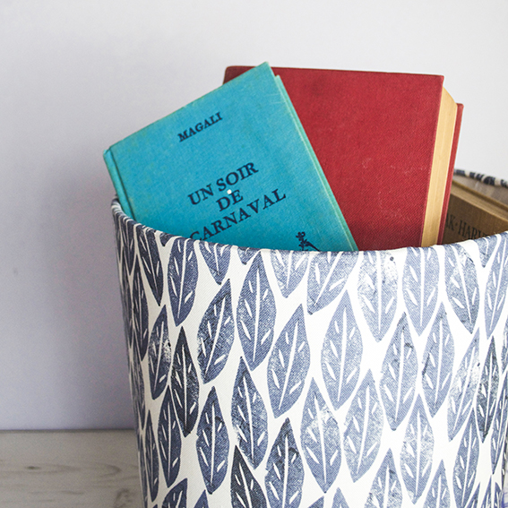
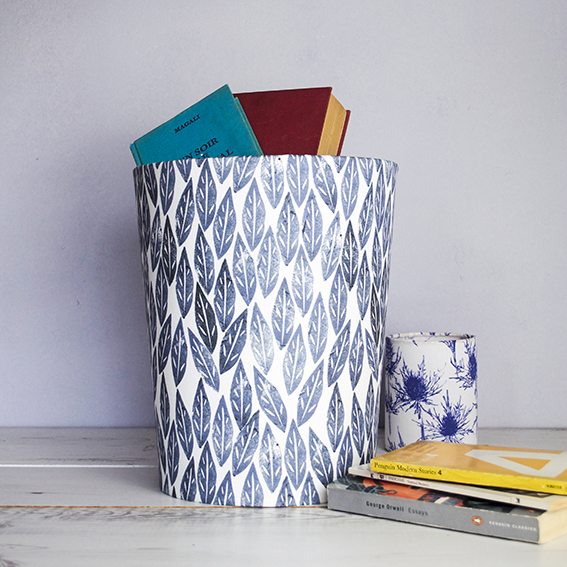
As I’m aiming for a relaxing cool blue vibe in my bedroom and I covered the first ‘bin’ in my storm-grey Scandi leaves fabric from my Spoonflower shop.
I was really happy with the end result, so much so that I really couldn’t face filling it with make-up removing cleansing wipes, laddered tights and other bedroom rubbish stuff. It looked too pretty!
So, inspired by a rather nifty idea from Black Parrots Studio’s Sarah Mitchenall on her first round of The Great Interior Design Challenge my bin turned into a book bucket, which has proved to be very handy, as the one thing our house has got is an abundance of books. So this now lives at the bottom of our bed for all our reading needs.
Now the study REALLY needed a bin so I set about making the next one in my tropical trio design, also available at my Spoonflower shop.
Because the instructions are so easy to follow you can make these bins in minutes with either fabric or paper. I’ve had this tropical design for a while and, although I loved it, I was at a loss as to what to do with it. However the fabric’s subtle hues and graphic design suits our workspace perfectly.
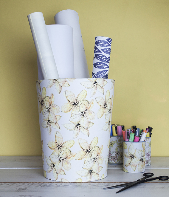
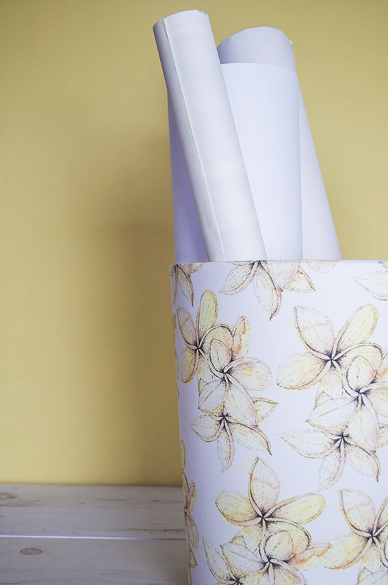
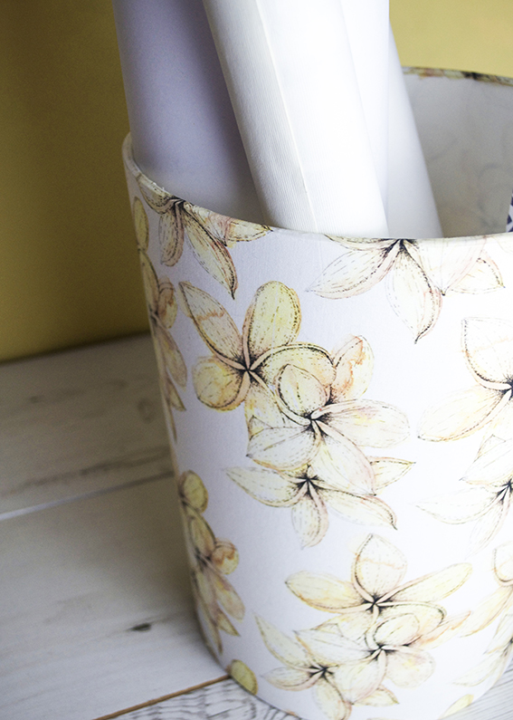
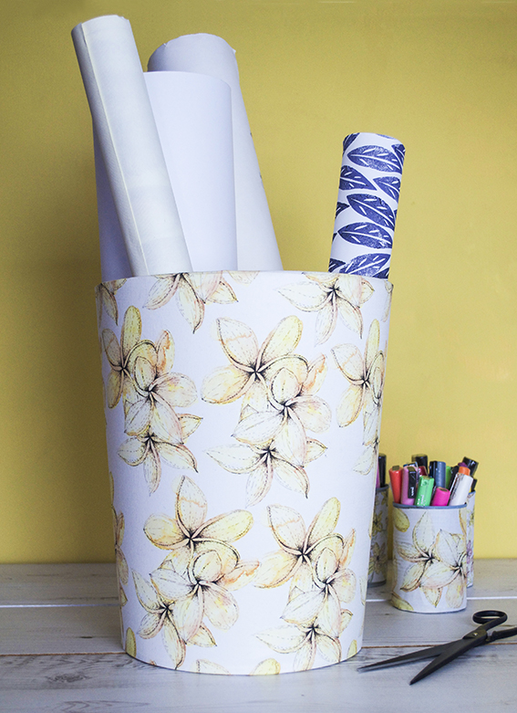
And you see that was the problem – too nice. Once I finished that one I could not face using it as a place to throw receipts and scrap paper for recycling. I do however have lots of gift wrap, large format paper, bookbinding cloth and posters I need to keep in one place so my tropical bloom bucket is being used for precisely that.
Hack: Pimp up a notebook with Posca pens
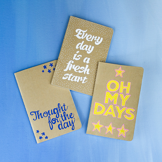
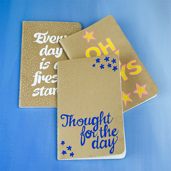
There are few things more majestical to me than a fresh new notebook and a journal where I can pimp up the front is even better.
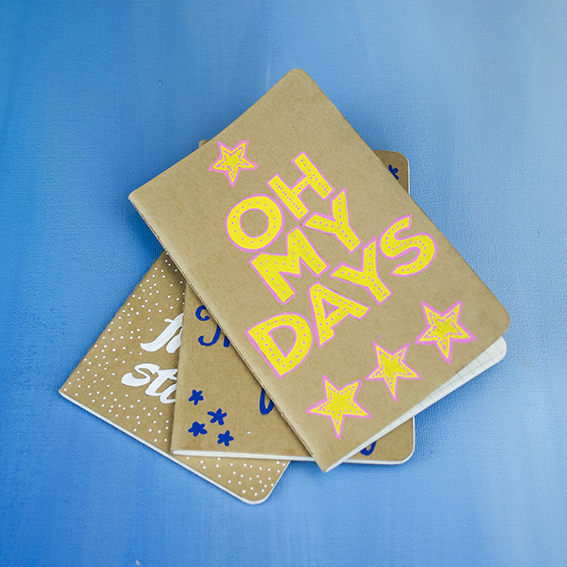
That’s why I love this little set of Moleskine mini cahiers – a trio of mini journals in kraft card all ready to be personalised and pimped up by yours truly.
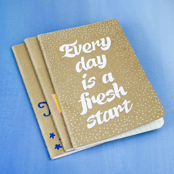
I updated these three with posca pens. I love these pens. They provide beautiful colour coverage and have a fab paint-like quality that you can control, meaning you get great detail without fussing with a brush. You can see that with the white in particular (I know a white pen that works!).
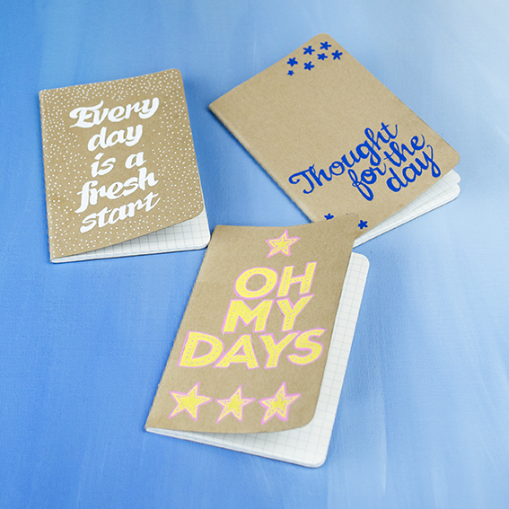
Hand-rendered type is very popular in at the mo – for a font-loving, handwriting addict like myself it’s always been cool, much more character and fun. A little slogan works well on notebook and I decorated this trio with phrases taking ‘days’ as my theme. I must admit my favourite is OH MY DAYS as I always think of my sister Lucy when I hear or see it. I might send her this notebook actually if I’m feeling nice.
If you’re not mega confident in free-hand rendering type then simply print off a slogan in your favourite font and trace it onto the book to colour over.
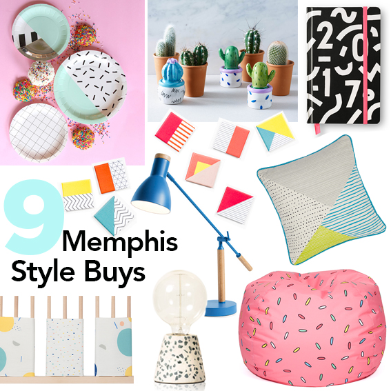
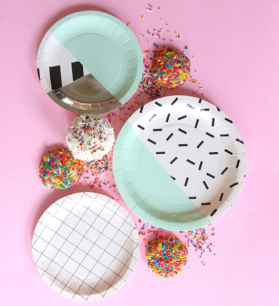
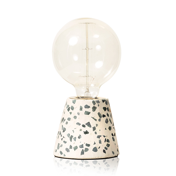
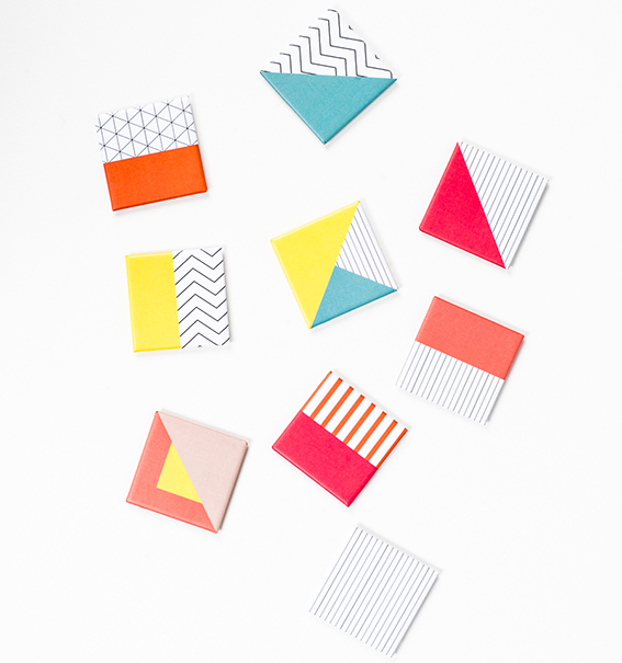
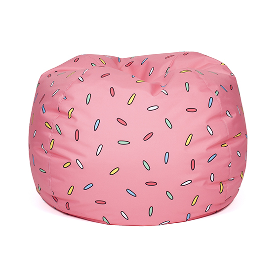
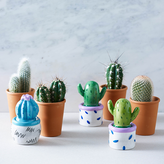
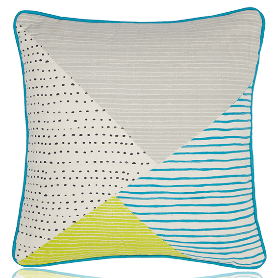
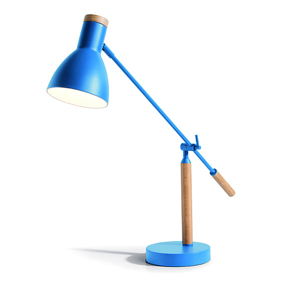
9 Memphis-style home buys
As I mentioned in an earlier post the Memphis Movement has a very big influence on interiors and design at the moment and only looks set to be more prevalent in home shops over the coming months. The style is already emerging in a number of buys, from fridge magnets, trinket boxes and party plates to beanbags, cushions, lights and cot protectors –have a look at my selection of favourite Memphis style ideas that can add a playful on-trend update to your home.
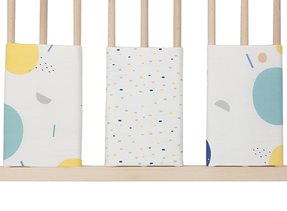
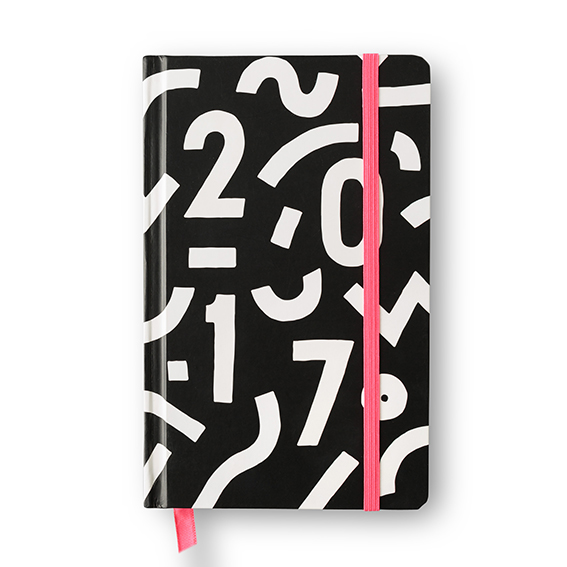
How I added a ‘Memphis lite’ element to my home
Last summer I went to the Pick Me Up show at Somerset House. Every year the show features a fresh line-up of artists and designers who are considered to reflect the best of new illustration, graphic design and related disciplines. It’s a great event for picking up on trends.
Almost every item in the 2015 show was influenced by the Memphis Group, an Italian design and architecture collective founded in Milan by Ettore Sottsass in 1981 that designed Postmodern furniture, fabrics, ceramics, glass and metal objects from 1981 to 1987. Since the show I can’t seem to pick up a magazine or visit an interiors site without reading a reference to this group. This style is big in 2016, so if you’re new to Memphis style take a look at my Pinterest board to familiarise yourself with it.
I must confess that it’s taken me a little while to embrace this particular look – I was a child in the 1980s so anything from that era has to work extra hard to win my favour. However the Memphis look is fresh, playful, fun and actually very easy to incorporate into interiors and crafts projects. It also, even 30 plus years on, looks surprisingly contemporary. You can go all out with it or incorporate little elements of this style to give your home or craft creations a quirky, on-trend edge.
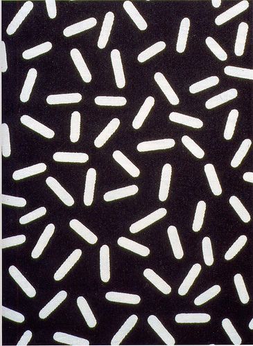
So starting softly, I took Ettore Sottsas’ iconic Letraset design, as seen below, as an inspiration for a quick interiors update.
It’s a wonderfully simple, effective design that works well as a standalone pattern but can look fab layered over different shades. It’s also great at different sizes.
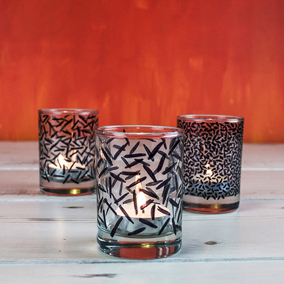
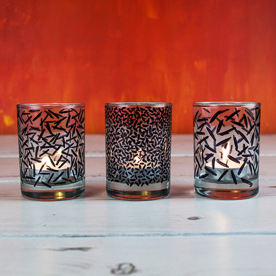
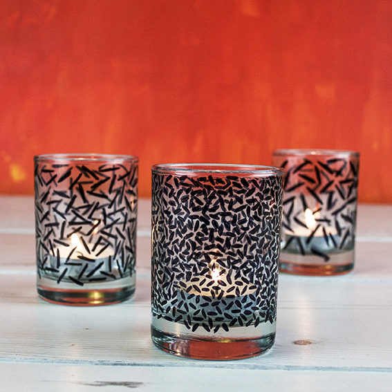
I used this Letraset pattern as a ‘Memphis lite’ starting point to update some funky tea-light holders as a gift for my lounge. I got these little shot glasses from a charity shop and they are perfect lanterns for my tea-lights. However, left plain, I felt they were rather stark.
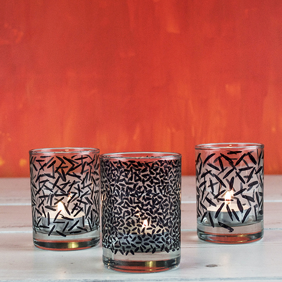
I used black permanent marker (the Memphis Group use a lot of black) to very loosely apply a similar pattern over the glasses. I wanted to play with the scale of the motifs to make the lanterns more varied and create interest when they were arranged together. I literally did this while I was watching telly one evening, and I’m pleased that this easy make made me think more about the Memphis Group’s work and has spurred me on to check it out further.
DIY: Scandi folk pattern boxes
I don’t know about you but I have been addicted to BBC Two’s Great Interior Design Challenge, I love the whole thing; the architectural history, updating spaces, adding special touches and answering client briefs, the reveal, everything. I’ve watched the show since it started and am always inspired by the ideas that the amateur designers come up with and the advice and insights the experts outline.
This series has seen loads of creative ideas and I was particularly struck by Lucy Tiffney’s Scandinavian Folk bedroom. I love the way that illustration, painting, craft and interior design have crossed over in this project and the sweet, rustic lines and simple motifs, executed in a muted colourway. I couldn’t wait to reconnect with some folky drawing myself.
Freshly inspired, I set about studying Scandinavian patterns. Some of my favourites are pinned on my Pinterest board. What’s lovely about these designs is they are so easy to recreate and then add your own twist to. From simple stem and leaf motifs, lovely lace edges and symmetrical composition, this folky style is great for when you want to achieve an effective looking, intricate decoration without feeling you have to be hugely technical or an amazing drawer.
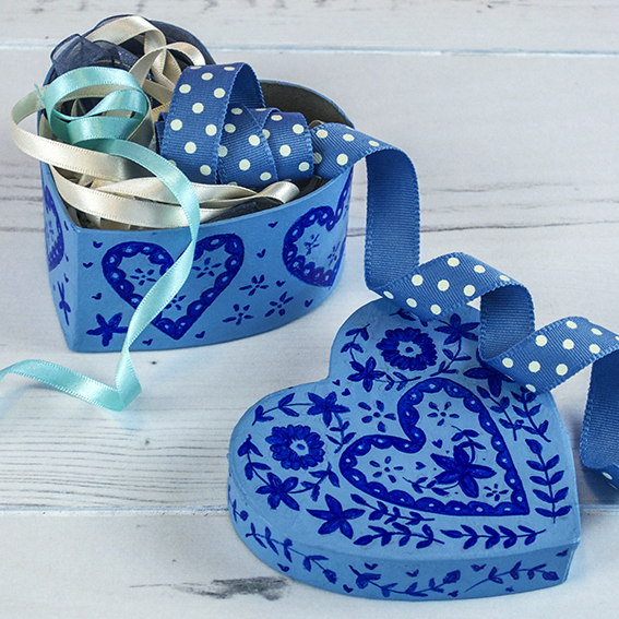
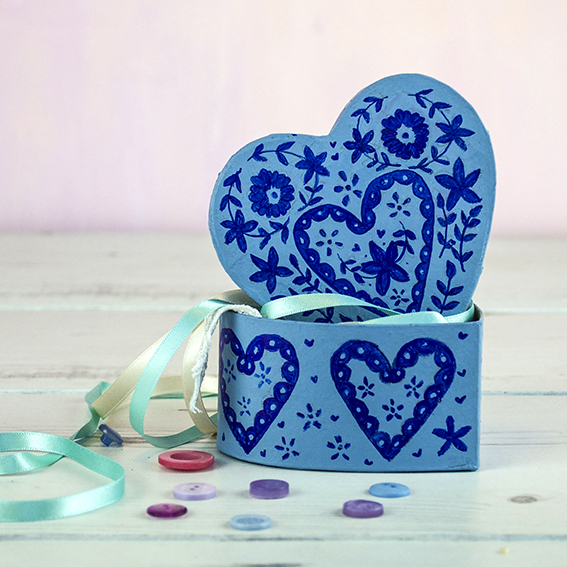
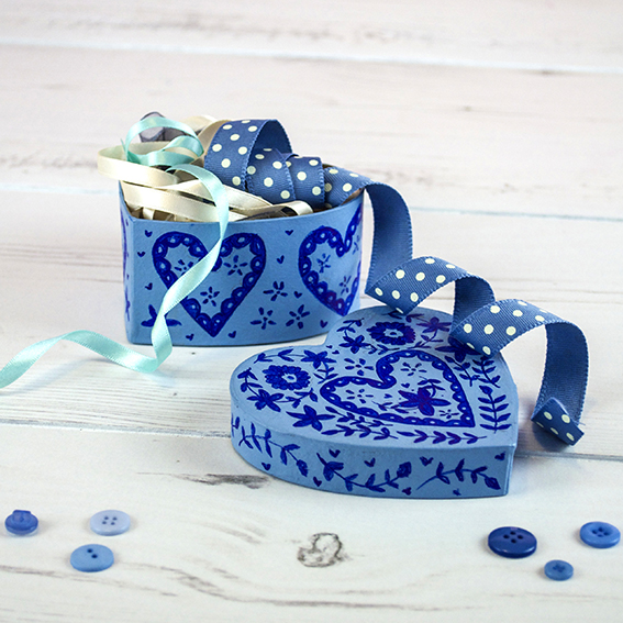
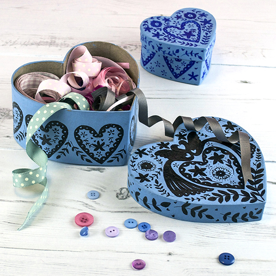
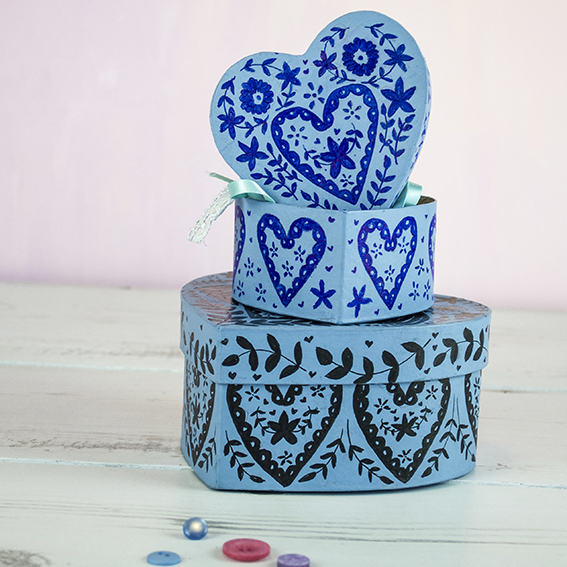
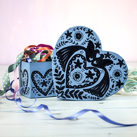
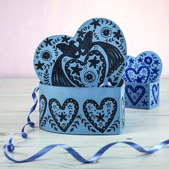
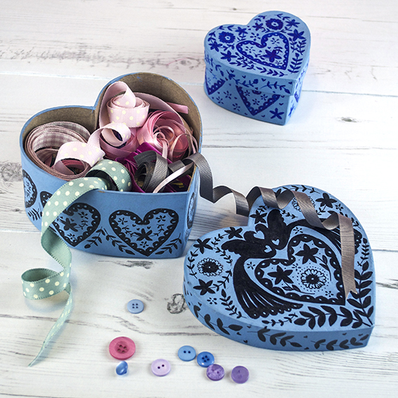
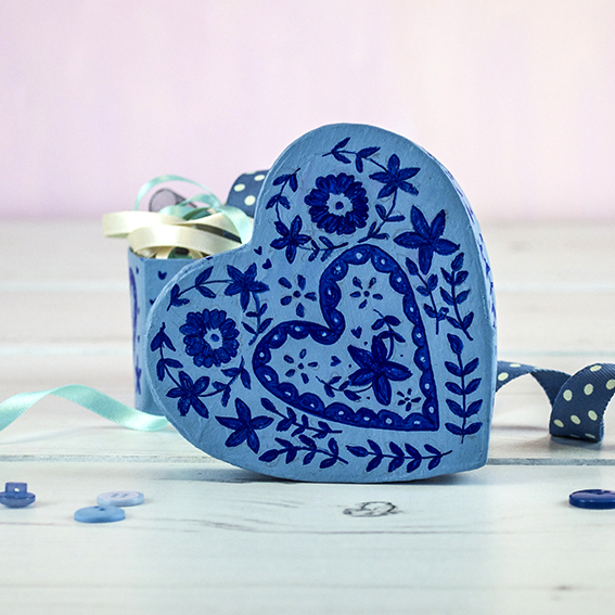
I had some plain cardboard heart-shaped boxes that were in need of updating. I gave them a lick of light blue paint that really suited traditional Scandinavian design. I then set about drawing my design onto tracing paper. I drew half the design then folded the paper to create a mirror image. Then I simply transferred the designs onto the painted boxes.
I finished the traced design with felt-tip pen. I chose to use black and blue pen for a strong contrasting look with the light blue but I reckon this would also look lovely in traditional red and cream.
Had my motifs been larger I would have painted them on – and I am considering doing something with a piece of furniture for a funky little upcycling project. This kind of thing would look really effective on a bedside cabinet or storage box.
I’m storing ribbons and buttons in these boxes (I have so many of both) but I’m sure you could fill these with pretty tissue paper and treats (chocolates or toiletries) for a thoughtful gift. 