Posted on

Monday Moodboard: Dots and splodges

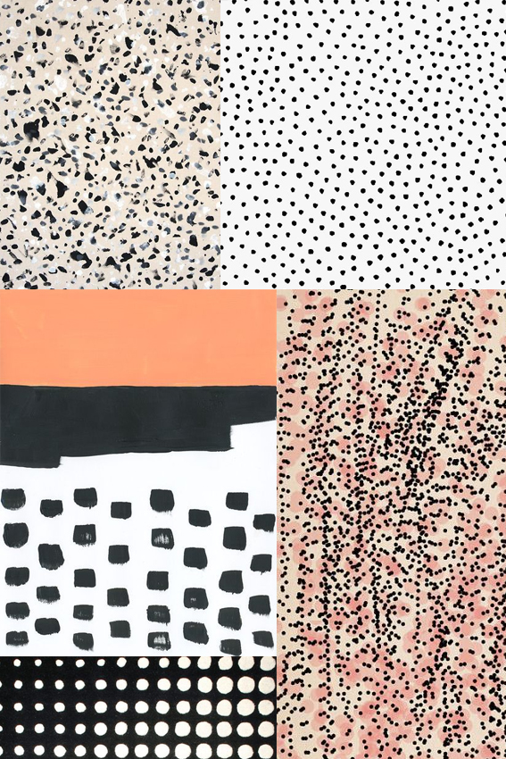
Monday Moodboard Dots and SplodgesAh dots and splodges, my old friends. It’s only right I dedicate a Monday Moodboard to these guys as they are really essential to my creative process.

Whenever I’m in a bit of a rut illustration wise but need to get my drawing head on I make marks with dots and splodges. It helps me explore what patterns to create and allows me to enjoy the medium of whatever I’m working in, be it watercolour, ink or felt pen.

But they’re not just a cool way to play with mark-making; as you can see by the above they are incredibly effective in creating patterns and compositions. I personally can’t resist the combination of black with white, pink and apricot shades.

By the way I need to do a big shout out to Ashley Goldberg as two of her designs are featured here. I LOVE her work to pieces. Check it out here.
Posted on

Monday Moodboard: Soft Shades

Monday Moodboard Soft shades

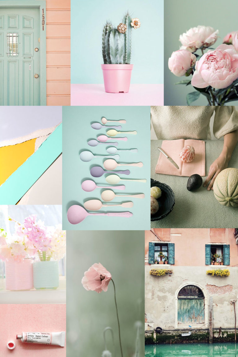
I’m loving this week’s moodboard of sweet, soft shades but you’re probably wondering how I got to it.

I’m on product development mode at the moment and consequently my desk is full of colour swatches, trend reports and tear sheets. Loads of the latter are from last year, which featured these particular shades a lot. I still adore the combinations of greens, blues, creams and pinks – I’m interested to see what new soft shade combinations will be in vogue for spring and summer this year.

Posted on

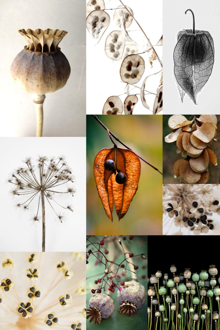
Monday Moodboard: Seed heads

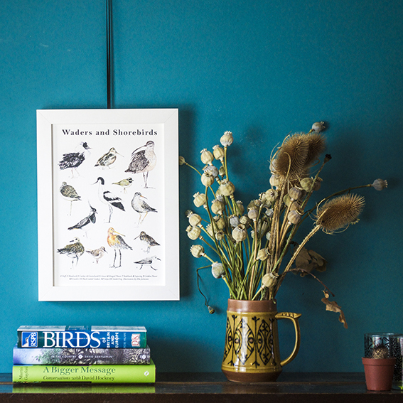
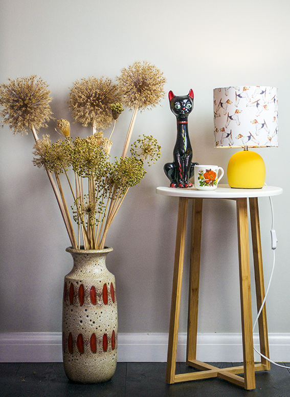
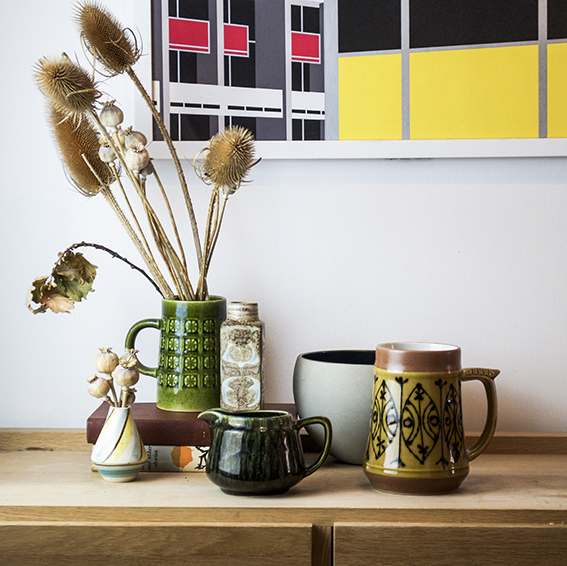
Monday Moodboard Seed headsToday’s Monday Moodboard is a homage to my teenage self. I was obsessed with seed heads when I was doing my A-Levels and after looking at this collection of images I can see why.

In fact I’m tempted to revisit this as a theme for my illustrations. They are structural, almost architectural in their form and the faded colours would look amazing in watercolour. I’ve got loads of dried allium and poppy heads displayed through out my home (see below) so I may have a little bash drawing at some still lives in ink I think the medium would work with its wild, ragged nature – I’ll keep you posted.
Poppy Heads Ella JohnstonDoglamp and seed heads Ella Johnston

Vintage Pottery Vignette ellasplace.co.uk

Posted on

Monday Moodboard: Luxe Florals

Monday Moodboard Luxe Florals

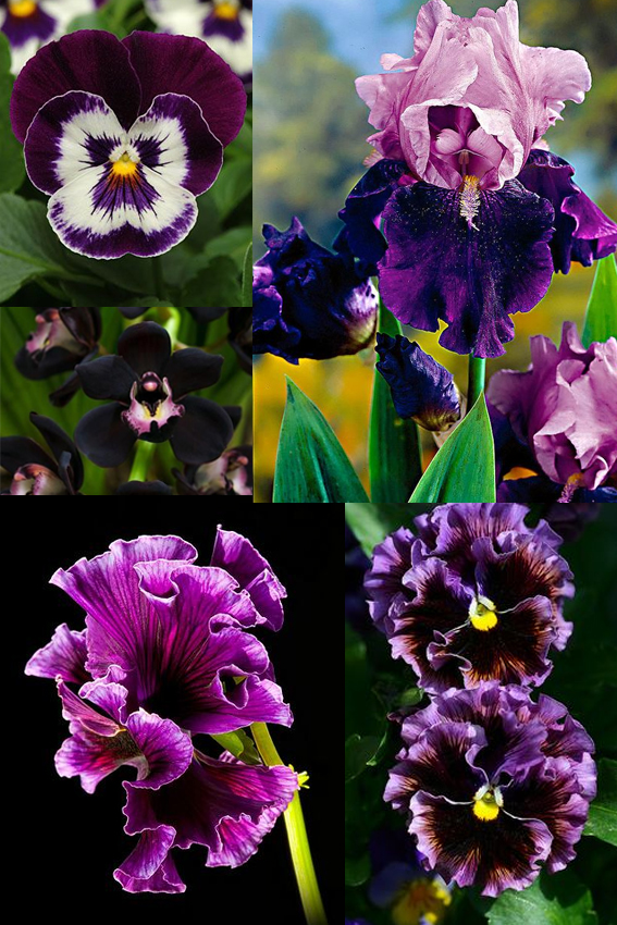
Luxe florals are just the right thing for this time of year, which is why today they have made my Monday Moodboard.

The freezing, wet weather and grey skies are atmospheric sure but the damp and cold can be a little draining day after day (last nights evening walk was a very muddy affair). So I’m warming myself with, and getting creative inspiration from, rich purples, velvety blacks, deep maroons and cerise tones as seen in beautiful, frilly flowers. I’ll be working on some sketches of these in the coming weeks with a view to working up pretty patterns and evocative illustrations.


Posted on

Monday Moodboard: Feathers

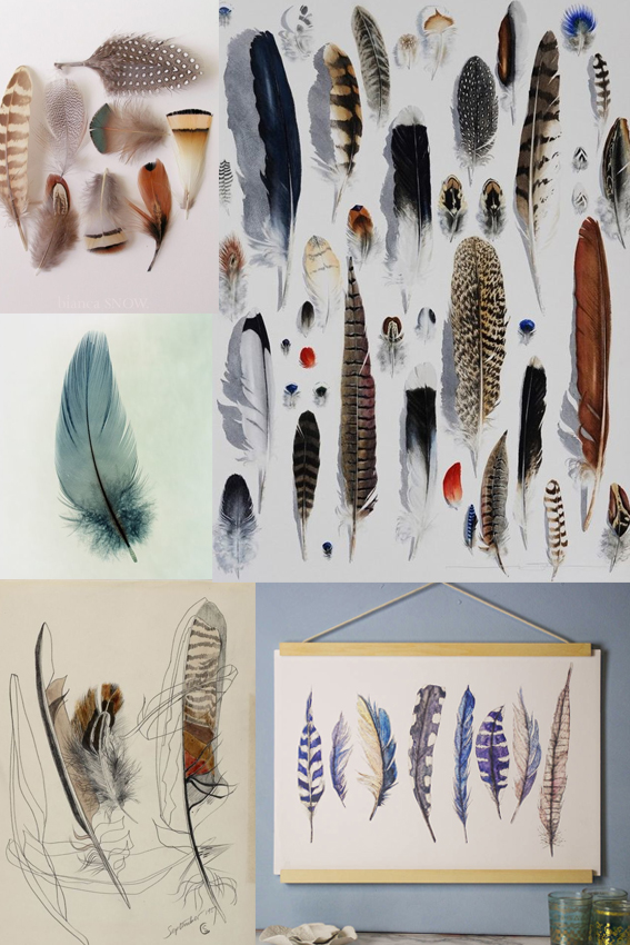
Monday moodboard feathers

Here’s my feather themed Monday Moodboard.

Happy New Year! Yes I know I’m a bit late, I started 2017 with a ton of commissions so I’ve been rather busy this past three weeks.

So 2017 has started really well for me – I hope it’s the same for you.

After a nice bit of satisfyingly new work to get to grips with I can now settle into working on drawings for new prints, gifts and stationery.

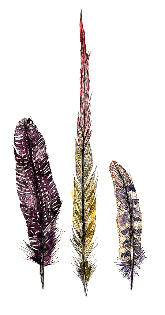
I’ve read a lot of trend reports saying feathers are going to be big motifs over the next couple of years. Which is very handy for me as I’ve been working on feather illustrations on prints for some time now one of which you can see in the bottom right hand corner of this board.

Here are some more feather daubings in close up…

Feather illustration Ella Johnston Feather illustration Ella Johnston


Posted on

Monday Moodboard Bloomsbury

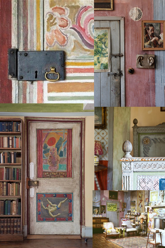
As you know by now I develop little obsessions over the course of my research and this Monday Moodboard is dedicated to my latest obsession, The Bloomsbury Group and in particular Charleston House.

The Bloomsbury Group was a collective of friends and relatives who were intellectuals, writers and artists. They had all lived, worked or studied together in the London district of Bloomsbury in the early part of the 20th Century that include figures such as Virginia Woolf and her sister Vanessa Bell, the art critic Clive Bell, painter Roger Fry and John Maynard Keynes. Artists Vanessa Bell and Duncan Grant (with his lover David Garnett) moved to Charleston House in Sussex at the start of the First World War and stayed there for decades, holding gatherings galore.

The house itself is a work of art in itself; Inspired by Italian fresco painting and the Post-Impressionists, the artists decorated the walls, doors and furniture at Charleston. It’s my mission to visit next year and I will make sure I’ll report back.

Posted on

Monday Moodboard: Pantone Colour of the Year: Greenery

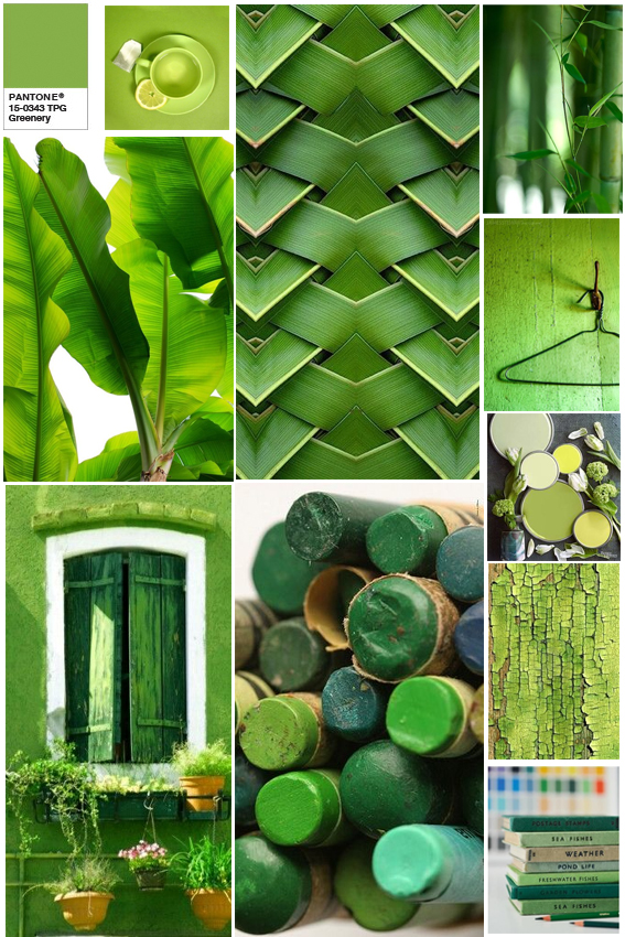
Greenery Moodboard

Last week Pantone announced its colour of the year for 2017. It’s ‘Greenery’ and it makes me happy.

A few design experts have been a bit disparaging about this colour with the name ‘Kermit’ referenced, well as a person who admires the work of Jim Henson I don’t think that’s so bad.

But seriously I  love a bit of greenery, and I was even singing its praises earlier this year. Bringing the colours of nature into your home is a marvellous thing and the vivid shade of this Pantone  works incredibly well with both subtle pastels and equally vibrant hues.

The colour is described by Pantone as a “fresh, yellowish hue” that “symbolises the reawakening of nature in spring and is a symbol for a new beginning”. Great – just what we need after 2016.

I’ve embraced shades of greenery already in my own new print designs (before the announcement I may add) so I’m incredibly happy that it’s not just me looking to find hope in natural colours and forms.

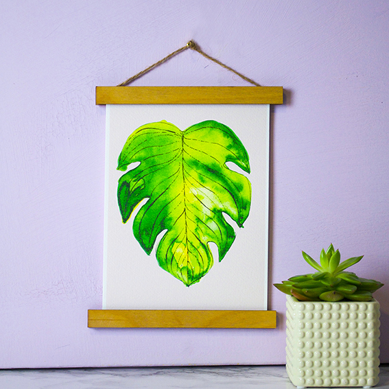
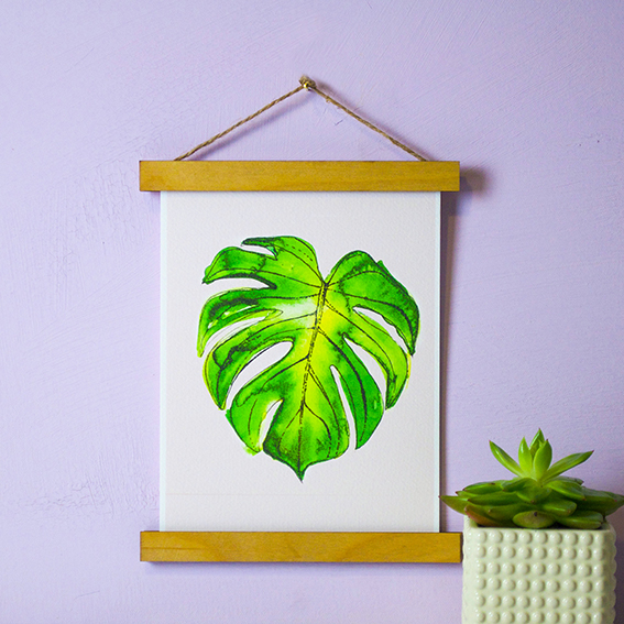
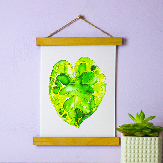
Leaf prints by Ella JohnstonLeaf prints by Ella JohnstonLeaf prints by Ella Johnston

Posted on

Moodboard: Scandi-style Christmas

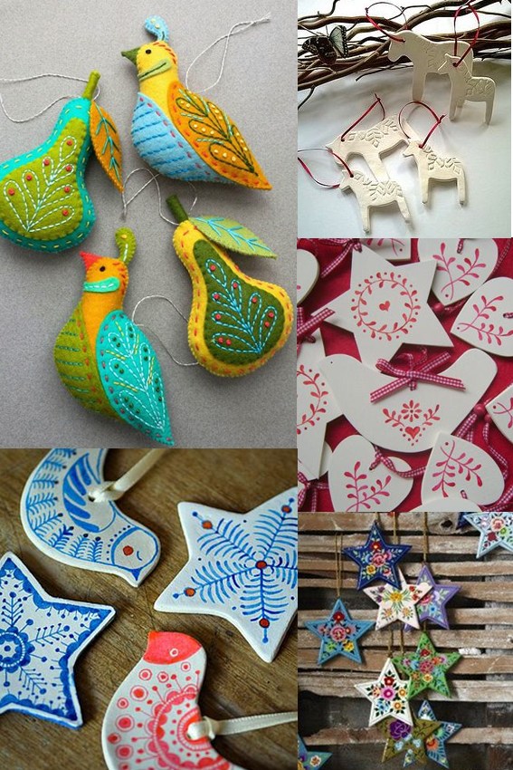
Scandi Christmas MoodboardMy posts have been sporadic of late because I have been having the busiest time sending out Christmas orders and selling my ways in various Christmas markets. It’s been fun but boy has it been full-on.

Anyway, my festive mood, and indeed this Monday Moodboard,  is in total full flow now working on a set of Scandi-style designs and illustrations for Christmas demos for Posca pens and for my Christmas wrapping. I’ll reveal more of this later in the week but in the mean time enjoy some of the patterns and imagery that has been inspiring me.

Posted on

Monday Moodboard: Folk patterns

Monday Moodboard Folk pattern

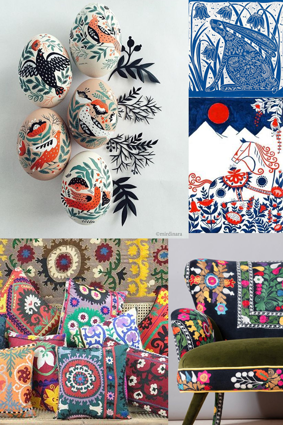
Joyous, colourful and breathtakingly beautiful, my folk art moodboard is perfect for brightening up this grey Monday afternoon. .

Marks, patterns and painting made by ordinary people is a constant inspiration for me. The simple shapes, harmonious composition, strong colour combinations and celebration of birds, flowers and animal life in folk art are timelessly popular in interior design and illustration.  I’ve used them as a spring board for some of the work I created for my Christmas Posca pen workshops and Christmas wrap designs – look out for those next week.

Posted on

Monday Moodboard: Henna designs

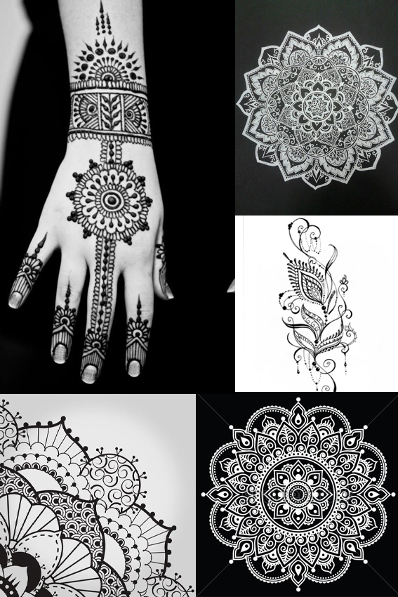
MOnday Moodboard Henna patterns After a busy fortnight with holidays, workshops and Christmas prep, I’m back with some insights from the outside world – a Monday Moodboard dedicated to henna designs and patterns.

I get trend reports and press previews all the time but every now and then a trend comes along that I don’t know about that really excites me. While I obviously know about these beautiful, ancient designs, and have even had these exquisite patterns  painted on myself in the past,  I didn’t know they were capturing peoples’ imaginations right now.

How wrong was I?

Every teenage girl that came to my Posca pen workshops in Manchester and Birmingham wanted to recreate mandala and henna designs.  They were really very adept at creating these patterns and told me that they wanted to place these designs on their clothes and homewares. It’s good to get out there and talk to people – you can always learn something.