Posted on

5 coffee table books that make me happy

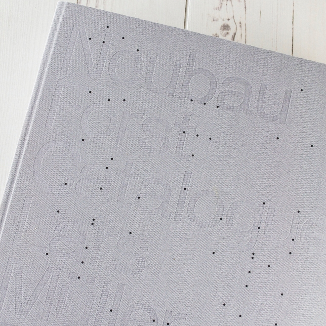
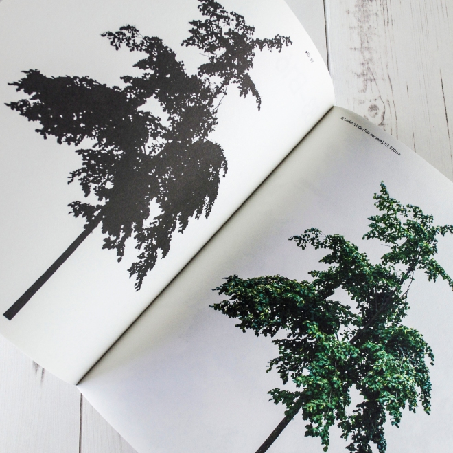
Neubau Forst Catalogue Urban Tree Collection for the Modern Architect and Designer via http://www.ellasplace.meBooks. Beautiful books. Books you learn from. Books that transport you and books that transform you. Books that speed you through a train journey. Books by the side of a pool. Coffee table books. There’s room for them all.

Our coffee table here at Ella’s Place has been starting to groan under the weight of new books that have arrived at recent birthdays. But I love them being there, ready at hand, supplying instant inspiration at unexpected moments. I’m sharing a few of them here.

Above and below is the cloth-bound Neubau Forst Catalogue: Urban Tree Collection for the Modern Architect and Designer. It’s basically a book of trees in Berlin, starkly photographed, stripped of context on a white background (rather like my own drawings), and then pictured in silhouette. It reminds me of how wonderful the conjunction of nature and the city can be – and how I began my own journey of drawing birds and flowers while living in London’s Square Mile and watching a pair of blue tits flit from tree to tree, and balcony to balcony, along our city-centre street. It also reminds me of how I love Berlin.

Neubau Forst Catalogue Urban Tree Collection for the Modern Architect and Designer via http://www.ellasplace.me

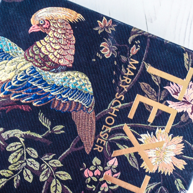
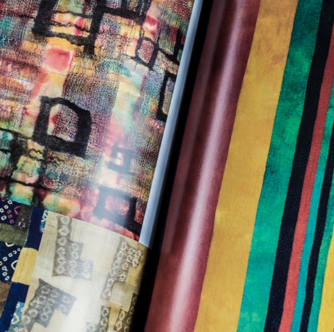
Mary Schoeser’s stunning and sumptuous volume, Textiles, is a real feast for the eyes and huge inspiration and resource for pattern, colour and illustration. It juxtaposes historical pieces with contemporary design and I can lose myself for hours in it.

Mary Schoeser Textiles book via http://www.ellasplace.me

Mary Schoeser Textiles book via http://www.ellasplace.me

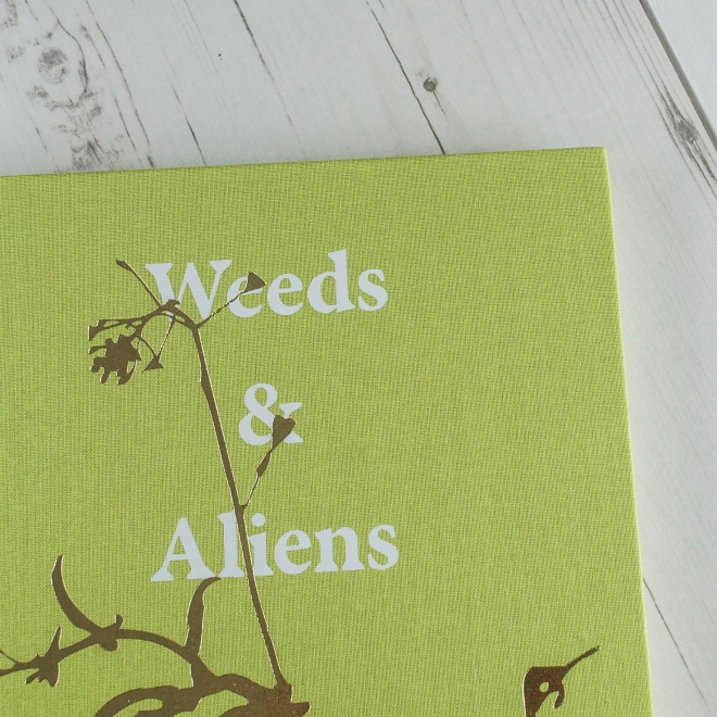
Weeds & Aliens – An Unnatural History of Plants, by B.A. Huseby is a treat for any student of book design. It’s embossed, foil-blocked and cloth-bound. It uses different paper stocks and the typography is both elegant and quite radically laid-out. It’s a collection of minimalistic photography of ‘wrong-placed plants’ (as Dr B likes to call them) and their culinary uses. It’s not exactly a book about foraging for food – there aren’t any recipes as such – but from reading it you can learn about what plants are growing under your feet, or at the side of the road, and how you might use them.

Weeds & Aliens - An Unnatural History of Plants by B.A. Huseby book via http://www.ellasplace.me

Weeds & Aliens - An Unnatural History of Plants by B.A. Huseby book via http://www.ellasplace.me

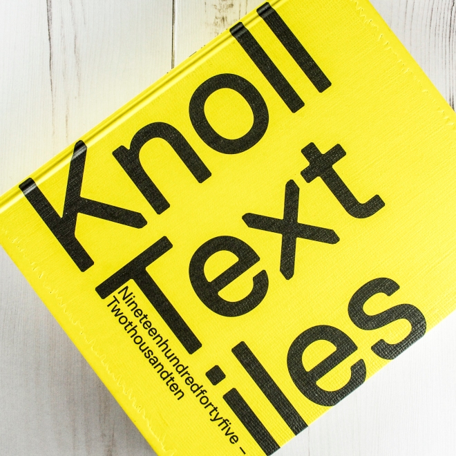
There are two large yellow books in our living room. One is a collection of drawings by Aubrey Beardsley and the other is this big book of textiles by Knoll. Tracing the period 1945-2010 it’s a history of fabric, furniture, interior design and advertising with plenty of evocative photography that captures the high points of mid-century modern.

Knoll Textiles book via http://www.ellasplace.me

Knoll Textiles book via http://www.ellasplace.me

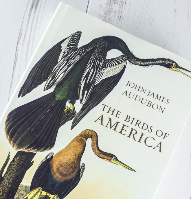
In 2012, an original edition of John James Audubon’s giant, outsized The Birds of America sold at Christie’s in New York for nearly $8 million. My version might be considerably cheaper and smaller, but still manages to capture the timeless quality of his paintings. As an illustrator who loves drawing birds, it’s a real treat.

John James Audubon Birds of America book via http://www.ellasplace.me

John James Audubon Birds of America book via http://www.ellasplace.meSo, what are your favourite coffee table books?


Posted on

Beginner’s guide to the succulents plant trend

They’ve featured everywhere in style magazines recently, but what exactly is a succulent, and how can make them work for you? Here’s my quick guide.Ella Johnston #drawings of #succulent #plants at http://www.ellasplace.me

What is a succulent?
They are plants adapted for arid conditions where they might need to store water to survive. To do this, succulents have thick, fleshy leaves. They come from all round the world – cacti from desert regions and Alpine plants that are more commonly seen in garden rockeries. It’s something of a catch-all, umbrella term, however, and sometimes cacti with needles are though of separately. My drawing, above, illustrates some of the common species of succulent – there are many, many variations within each species.

#Succulent plants pictured at http://www.ellasplace.me
Succulents at Ella’s Place.

Are succulents easy to care for?
Yes. This perhaps explains some of their popularity. They’re easy to pick up from the local garden centre or florist (the ones above came from my local florist and B&Q!). Unlike some plants, they’ll cope with a little neglect. Generally, they like moisture but not being overwatered. Let them dry out completely between waterings and never let the the soil get soggy. If you’re planting outdoors, make sure the soil has good drainage. If they’re in a pot, make sure it has drainage holes in the bottom.

So are they really outdoor or indoor plants?
Some succulents are hardy and fit to survive northern European climates all year round. Some are from tropical regions that need to be looked after indoors over winter. Check the plant label to see which type of succulent you’ve got. Hardy plants can also be grown indoors, of course, and it’s really this that inspires the current trend. They’re great for small spaces and will be happy brightening a windowsill in any room of the house, as well as being a natural point of interest on a vintage sideboard or bookshelf.

How do I style them to look their best?
The fleshy leaves and range of shapes and colours of succulents means they’re already impressive-looking plants. Try grouping them together against a clean background to show off their various forms and textures.

#Succulent plants via theselfsufficientliving.com http://www.ellasplace.me
Via theselfsufficientliving.com

Succulents look great in vintage glassware and ceramics – the silver glassware below reflects the foliage to fantastic effect.

#Succulent plants #vintage at http://www.ellasplace.me via http://www.bhg.com
Via bhg.com

The mini terrariums, below, would look great hanging in a quiet kitchen space.

#Succulents #terrariums at http://www.ellasplace.me via  http://www.homelife.com.au
Via homelife.com.au

And here’s my own test for any flower, foliage and plant trend: does it work for a wedding? The answer, as seen below in a table setting, is yes. Stunning!

#Succulent #wedding table setting at http://www.ellasplace.me via romanceweddings.co.uk
Via romanceweddings.co.uk
Posted on

7 interiors with salvaged wood

Birds by Guy Taplin via essexlifemag.com http://www.ellasplace.me
Via essexlifemag.com

Where I live, by the creeks and estuaries in East Anglia, salvaged wood turns up in many people’s homes – crafted into sculptures of the wading birds that dot the shorelines in winter. Foremost among driftwood bird sculptors is Guy Taplin, who made the birds above. He’s sometimes known as the Bird Man of Wivenhoe. Along the river banks between his studio and Ella’s Place you’ll see upturned tenders (the little rowing boats that carry you out to the larger sailing or pleasure boats anchored further out on the water). Many of the houses are weatherboarded in the vernacular East Anglian style, too. A good friend of ours says it looks more like New England, USA, than Olde England.

The reclaimed and salvaged wood trend has been everywhere in interiors this year, too, cropping up in all kinds of editorials and ads. Used well to complement other materials and colours, it doesn’t need to overpower and can look chic, rather than just shabby.

Here are a few examples of the trend I’ve found recently.

Reclaimed salvaged wood accent wall http://www.ellasplace.me

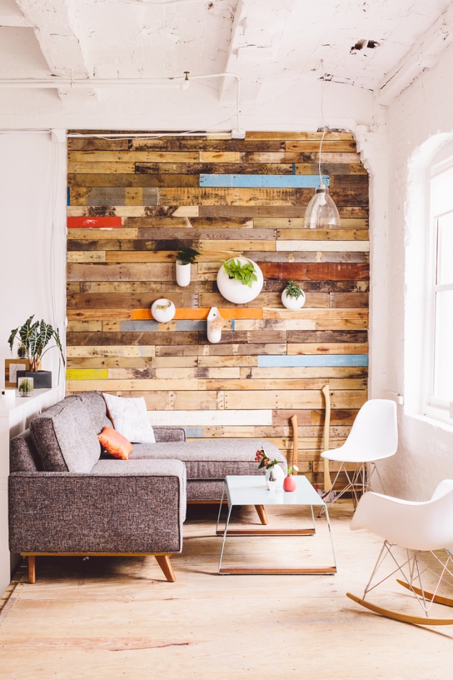
1. The neutral and earthy tones of reclaimed – salvaged – wood can help to soften a room when used carefully. The accent wall above is complemented by the stone, steel and leather, but allows the pop of a red armchair and yellow pouffe to stand out.

Reclaimed salvaged wood headboard http://www.ellasplace.me

2. As a headboard, above, it provides the colour-pop on its own, jumping out to contrast with the colourful wall.

Recalimed wood headboard http://www.ellaspace.me

3. The weathered boarding, above, adds notes of outdoor wilderness to a small space, without turning the room into a log cabin.

Reclaimed salvaged wood kitchen http://www.ellasplace.me
Via atelieram.com

4. Reclaimed wood units and shelves make for a stylish kitchen, above, that also helps to bring the outdoors in.

Reclaimed salvaged wood cupboard http://www.ellasplace.me
Via homedecoranddesign.com

5. A lighter touch in the kitchen with the trend comes with the addition of a single reclaimed wood cupboard, above.

Reclaimed salvaged wood wall http://www.ellasplace.me
Via CarlaAston.com

6. For a calming space, the natural tones of wood look great when set against clean whites and complementary shades. To mix things up, try bringing in different textures instead of colours.

Reclaimed salvaged wood accent wall http://www.ellasplace.me
Via juliarobbs.com

7. And remember that wooden panels can still be painted, even if they’re salvaged. The fun pops of colour above really help to lift the room.

Posted on

Learning the art of Shibori

DSC_1013

It’s always great to learn new craft techniques – especially when they can be put to good use on home and fashion makes. I recently got to grips with the art of Shibori, an ancient Japanese dying technique, during a workshop at White House Arts in Cambridge.

Japanese printing

I went to the one-day workshop with my mum and my sister and we had a go at two Shibori dying methods; Arashi and Itajime.

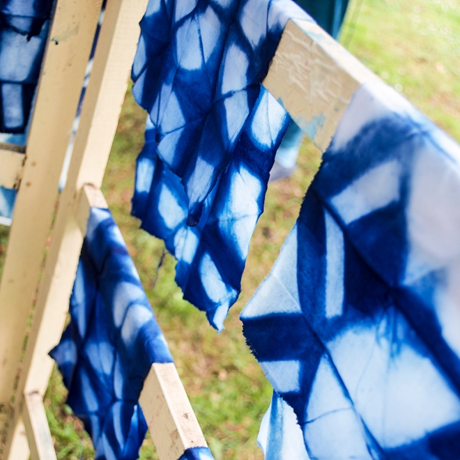
Arashi shibori is also known as pole-wrapping shibori. You wrap your cloth around a pole (which looks like a large section of plastic industrial piping), then tightly bind it by wrapping a thin cord up and down the pole. Once the cord is secured, you scrunch the cloth up the pole and sink it into the dye. Arashi is the Japanese word for storm – and that’s a pretty accurate description of the kind of effect you get from this particular type of printing. As you can see above in the first picture in this post and in the photograph here:

DSC_1015

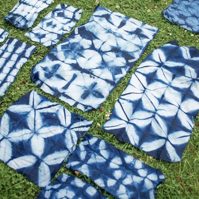
Itajime shibori is what is known as a shaped-resist technique. This means that an object is placed over the folded fabric (for example, a piece of wood) which be used to form a ‘resist’ that stops the dye making contact with the material. Because the fabric is folded (this can be done in many ways) the end result is a gorgeous geometric design that would look great on bedding and other homewares.

DSC_1007
DSC_1009 DSC_1014DSC_1012

Posted on

Colourful little bowls for small plates

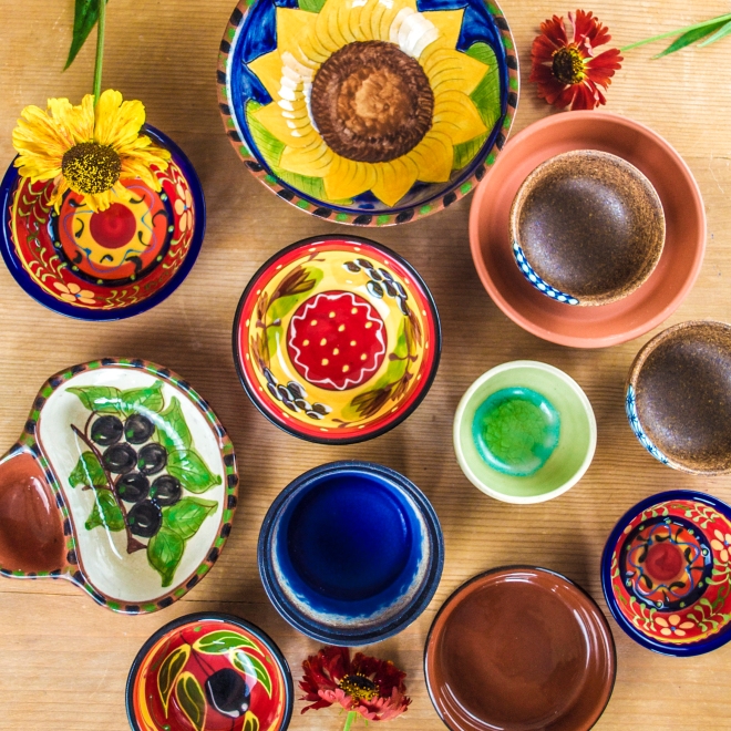
Little bowls for tapas. http://www.ellasplace.me ©Ella Johnston.

Sunny summer weather, the weekend… I think it might be time for some tapas. Winter might make you hungry for a big dish of something slow-cooked in one pot, but at this time of year small plates and sharing food are some of my favourite things. Colourful little bowls are the perfect way to present tapas and antipasti and just looking at them makes me feel the sunshine of a warm evening. A few of mine, pictured above, are ready and waiting for a leisurely Saturday. Fingers crossed the good weather stays.
Heleniums from our garden. http://www.ellasplace.me ©Ella Johnston.

Posted on

Pinning images the old-fashioned way

PinboardI’m constantly pinning images to my Pinterest boards (here) and they’re great for inspiration in my work on magazines, as well as creating mood boards for styling my home. At home I like pinning things too – I have real-life pin boards in my studio space and also in my kitchen (pictured, above). These boards are constantly evolving – they get so full – and they’re great for reminding me of some of the things that I’ve enjoyed and over recent months and years. So what’s on the board above? Well, roughly, from top to bottom and left t0 right:

  • Perfect Match card by illustrator Tom Frost, given by friends as an anniversary card for me and Dr B.
  • Factory Records postcard – I think the world’s a better place for having had Anthony H Wilson in it.
  • Golden Lane Estate, Christmas card, by Stefi Orazi – we used to live here.
  • Norfolk Broads – postcard of a vintage tourism poster.
  • Invitation from Tracey Emin to her private view at Sketch, London. I got rather drunk.
  • Royal Festival Hall Christmas card, by Stefi Orazi – one of my favourite places to hang out.
  • Dedham Vale, by John Constable – one of my newer favourite places to hang out.
  • Paper butterflies, made from paper designed for one of my magazines.
  • Loving Budgies – one of my own business cards.
  • Lucknam Park hotel. We stayed and it was heaven.
  • Bicycle card – with a quote from HG Wells. Dr B is a big fan of the Tour de France.
  • Door 102, Crescent House, card by Stefi Orazi. We once lived at 230.
  • Rose print card from my sister, from archivistgallery.com.
  • Jennings beer mat – Dr B’s favourite brew, from near where he grew up in the Lake District.
  • Alresford Creek photograph/birthday card taken by Dr B. This dilapidated hut is just a walk downriver from us.
  • Matisse blue nude – I never tire of looking at Matisse’s work. The Matisse Museum in Nice is one of my favourite places.
  • Crescent House, again by Stefi Orazi. This shows our old flat.
  • The Beatles – I love this picture of them and George looks great as ever.
  • I Want to Rock Your World – postcard picked up in Barcelona.
  • Bewick Swan – Dr B received the gift of sponsorship of a swan for his birthday. It shares his last name.
  • The Piano Lesson, by Matisse – an earlier work from 1916. We saw it where it lives at MOMA in New York.
  • The Beatles Show birthday card.
  • James Joyce – one of the greatest authors ever. We had a reading from Dubliners at our wedding. Beautiful.
  • Emmeline Pankhurst.
  • Forget-Me-Not drawing by me.
  • Adanaland handprinted stamp, given to me by the maker, Alan Brignull, who lives not far from me here in Wivenhoe.
  • Red Wallpaper card – an postcard from a series of paintings I did a few years ago.
  • Cormorant, card of print by Richard Bawder.
  • Isambard Kingdom Brunel – an iconic photograph.
  • The Rolling Stones – and it all ends with some rock ‘n’ roll!

If you’ve only been pinning to online boards recently, maybe it’s time to do it for real and brighten up a working space at the same time.

Posted on

The best cylinder vases to buy now

Cylinder vases LO RES

My home is full of vases and objects of all shapes, sizes and colours, some designer, some vintage finds and some that I’ve selected as props for photoshoots for the magazines I edit. Some of them are round, some oval, some brick-shaped – and some are cylindrical, like those I’ve picked out in the picture above.

There’s a beautiful simplicity about a cylindrical vase, whether they’re tall or short, narrow or wide, and the classic shape doesn’t detract from the decoration – which allows it to sing.

Here is my choice of some of the best in stores right now.

395-81007205-G80345274_M

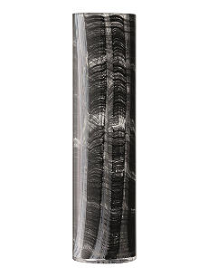
A glass vase painted to evoke a beautiful fragility, this LSA Lace vase, in Linen design, is also available in blue and white. From Selfridges.

Lyngby_25cm_01

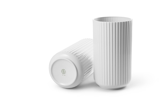
Classic white. An iconic design from 1936 by Lyngby Porcelain, available in a range of sizes from TwentyTwentyOne.

627814_l

I’ve recently been crafting my own ombre effect glassware for a magazine project. Here’s part of the inspiration: Pols Potten Gradient Gold Vase, from Heals.

547-10010-40010594_M

This monochrome vase mixes the traditional with a touch of mid-century retro chic – as you might expect from a collaboration between Royal Doulton and Hemingway Design. From Selfridges.

538-10010-40000059_MWaterford crystal gets a makeover with this Fleurology Tina design from celebrity florist Jeff Leatham. Available in a range of colours from Selfridges.elcombe-cut

The natural world and man-made combine in this hand-turned ash, copper and glass vase by Aelder. Available from Clippings.com.

302LANGDONvaseblue_340084

The Langdon blue and green vase from Habitat features daubs of chalky colour on a black and white background. Each vase is unique and decorated by hand.

Posted on

7 ways to organise your books

Books NLR Flowers 1 MB

This week it’s been Independent Bookshop Week (#IBW2015). I never tire of browsing through the shelves of a local bookshop – isn’t the smell of a secondhand bookshop incredible? There’s always something to be found that I’ve never seen before – a beautifully illustrated cover, a classic Penguin or Pelican, or a work in an edition I’ve never set eyes on. Then there’s that growing list of ‘must reads’…

Over the past year I’ve been building working relationships with independent bookshops, too, as the book I’ve co-edited and written for (published by our own Dunlin Press) has been finding a home in indie stores around East Anglia.

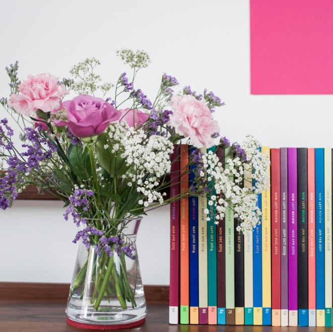
There are thousands of books lying around Ella’s Place – some in almost every room. The jumble of colourful spines in the picture above come from a series of editions that sits in our living room. They, plus some design compendiums, a selection of oversized art books on the coffee table and a complete edition of the Encyclopaedia Britannica from 1974, give the room something of a salon sensibility. I love what books bring to a room – for me a room doesn’t feel right without them.

The majority of the books around Ella’s Place are deposited in the study. I say deposited, rather than arranged, because the floor-to-ceiling shelves are in need of some sorting out.
Book shelves LO RES

I’m not one for following a Dewey Decimal style of library classification at home (think of the work!) and, though it has a certain visual impact, I don’t take pleasure in colour coding the books on a shelf – to me it looks too contrived. In the past I’ve enjoyed grouping books by authors who I thought might enjoy conversing with each other or arguing a point. Yes, really. Let’s just say that Dr B couldn’t always second guess my logic when seeking out a novel. But whichever system I choose, I’d better get on to these shelves soon – a well-arranged bookshelf is a thing of joy.

Here are seven ways to organise your books:

1. Like a library
Let’s face it, unless you’re actually a qualified librarian it’s unlikely you’re going to try this. Just think of labelling all your books (700 is the class code for art, 800 for literature etc) is probably enough to put you off. The Dewey classification model has been around since 1876 and I doubt anyone uses it at home. Little wonder.

2. By colour
This often comes up in style magazines – and it often looks a fix. Once you get into the real specifics of differing shades of orange (tangerine, apricot?), hardbacks and softbacks, tall books and short books and the lettering on the spine, your dream of a beautiful rainbow of books will be a faded memory.

3. By size
There’s a thought that arranging books by size makes a shelf look neat. It doesn’t, it makes it look lop-sided. A good bookcase will have wider shelf spacing for larger books at the bottom and narrower shelves at the top. This should tell you all you need to know about where to put your books.

4. A to Z
Perhaps this is where the aesthete in me comes out. Yes, alphabetising your books should make them easy to find, but it will bring about some strange juxtapositions and overall it feels a little unnatural, a little forced. In any case, your shelves are more than an index, they are a thing of beauty – respect them as such and make them look good. Would you hang pictures in alphabetical order?

5. By Genre
Split your books by genre with art books on one shelf, craft books nearby, novels on another, biographies on another etc, and you’ll start to achieve some of the sense that you get when you go into any bookshop. If you can’t resist the temptation of arranging your books A–Z, do it within these genre sections.

6. By Room
Okay, I’ll whisper it, but for many people (I know, I’ve visited), the smallest room in the house contains a small collection of reading matter – and usually something a little lighter than War and Peace. Similarly, coffee table books are often large, flick-through, pictorial volumes that are easy to peruse while having a cuppa – and in the kitchen, of course, you put cookery books. It makes sense. If you have a lot of books, remember this and split your collection up sensibly. What might be good in a guest room? What should move back to the office space? And, of course, which books do you want to show off in the place you entertain?

7. By Common Sense
Really, there are only two things to remember when organising your books. One, you need to be able to find a specific book easily when you want to refer to it. So, decide on your system of organisation and stick to it, always putting a book back in its place when finished with. And two, remember that books take up a lot of wall space. Treat them as you would any other treasured household object – arranged with care they can bring a room to life.

Posted on

Summer in five colours

Berry head cliff edge TEST LO RES

Last week I spent a few days in South Devon and the weather was beautiful. At this time of year, when nature is starting to reach its vibrant peak, colours come into their own and seem to create a palette of pink, white, green, yellow and blue.

PINK
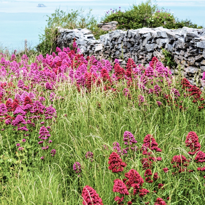
Red valerian at Berry Head PINK LO RES

The hedgerows, meadowlands and walls were full of wild red valerian, which is sometimes known as kiss-me-quick, fox’s brush or Jupiter’s beard. It was everywhere.
Red valerian at Berry Head 2 PINK LO RES

WHITE
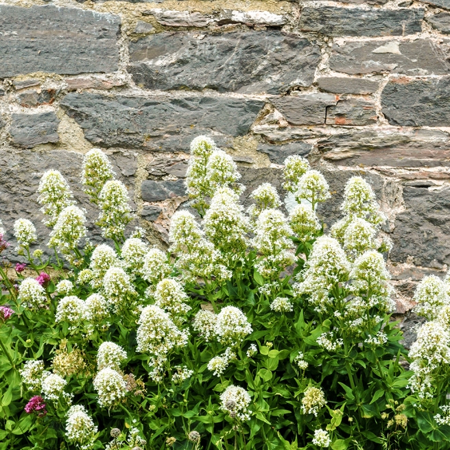
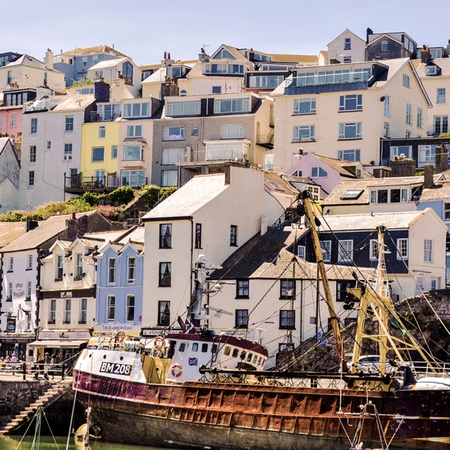
White valerian at Berry Head WHITE LO RESThe white ‘albus’ form of valerian also smothered swathes of the cliffs at Berry Head, while the higgledy-piggledy buildings of Brixham’s harbour reminded me that what we think of as ‘white’ is usually a mixtures of other, softer colours – creams, yellows, blues and pinks.
Brixham Quay WHITE LO RES

GREEN
Ivy blue wall 2 GREEN LO RESSome of those harbourside walls are gradually being ‘greened’, while a walk through the Grove took me back to Andrew Marvell’s poem ‘The Garden’ and the line ‘a green thought in a green shade’.
Brixham Grove trees GREEN LO RES

YELLOW
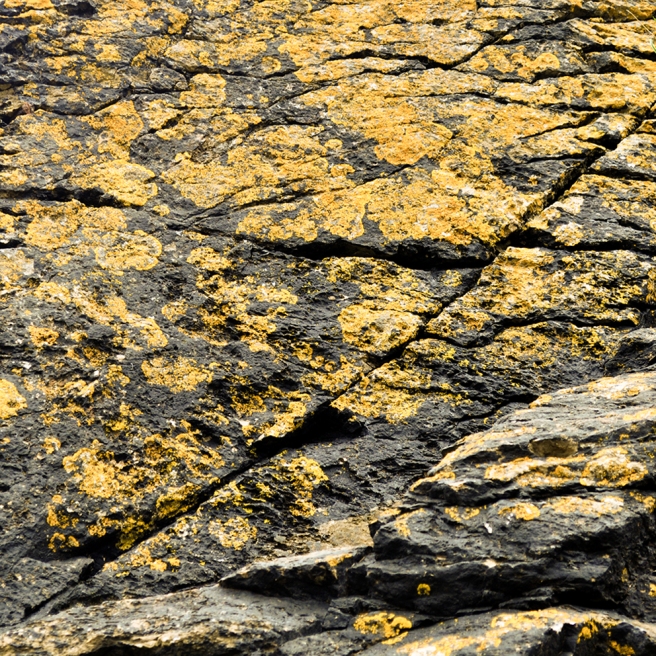
Brixham lichen 2 YELLOW LO RESThe sunny week in June saw me and Dr B spend afternoons in some of the secluded coves along South Devon’s coast. I am fascinated by lichen (it’s starting to cover the roof of my little studio) and on one afternoon the dappled sunshine was reflected in the golden colour of the lichen on the rocks at the foot of the cliff – it’s almost an abstract painting.

BLUE
Fishcombe Cove boat BLUE LO RESAnd of course, when it comes to blue, the sea and the sky around Torbay provided perfect inspiration.
Torbay yachts TEST LO RES