
A look inside my artist studio
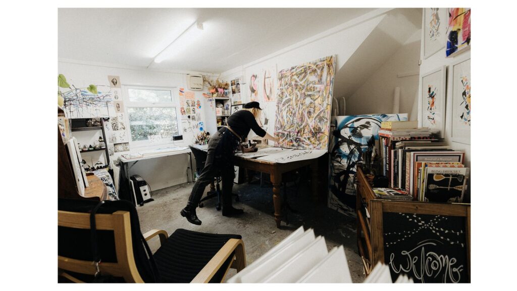
As I said last time that I’d put my personal vanity aside to give you a look inside my artist […]
As I said last time that I’d put my personal vanity aside to give you a look inside my artist […]
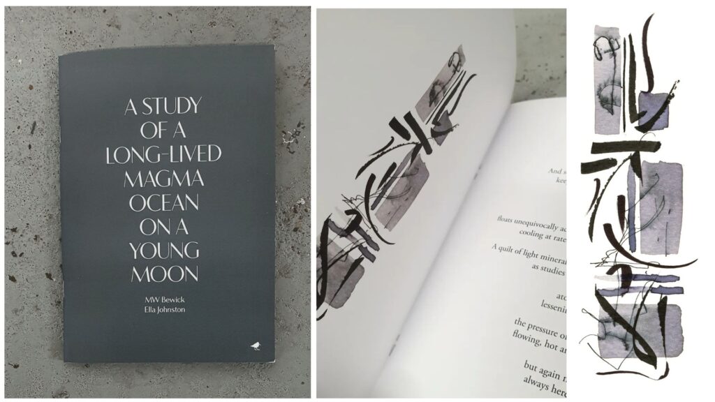
The publishing company run by myself and poet MW Bewick, Dunlin Press, has just released a small pamphlet A Study
Well this is embarrassing. In September 2020 I vowed to write more blogs, but life certainly got in the way.

Over the past two years I’ve expanded my artistic practice into ink drawing. I’ll be sharing lots of posts on

I’ve been recently working on a series of abstract ink works for a new book from Dunlin Press. The book,
As I was prepping for one of my drawing workshops I wondered why I am so fascinated by feathers. I
I’m very excited to share some new work with you. My new ink prints point to an interesting new direction
This year I decided to take part in Inktober. In typical Ella style I haven’t followed the #inktober drawing prompts.
Last week I told you about my new illustrated book (with MW Bewick), The Orphaned Spaces published by our indie publishing
I’m excited to tell you about new book illustration project with Dunlin Press: Lessons for an Apprentice Eel Catcher, by
In preparation for #inktober I’ve been playing with experiments in ink! Ages ago I told you about how as an
Last month, Dunlin Press launched its new book, The Orphaned Spaces; a collaboration with featuring illustration from myself and words
You know last week I told you about the Dunlin Press Waste Ground Project I was working on? Well, here